Search
-
[UE5] Environment Art / Lighting critique – cave ruins with water + torch (aiming for AAA polish)
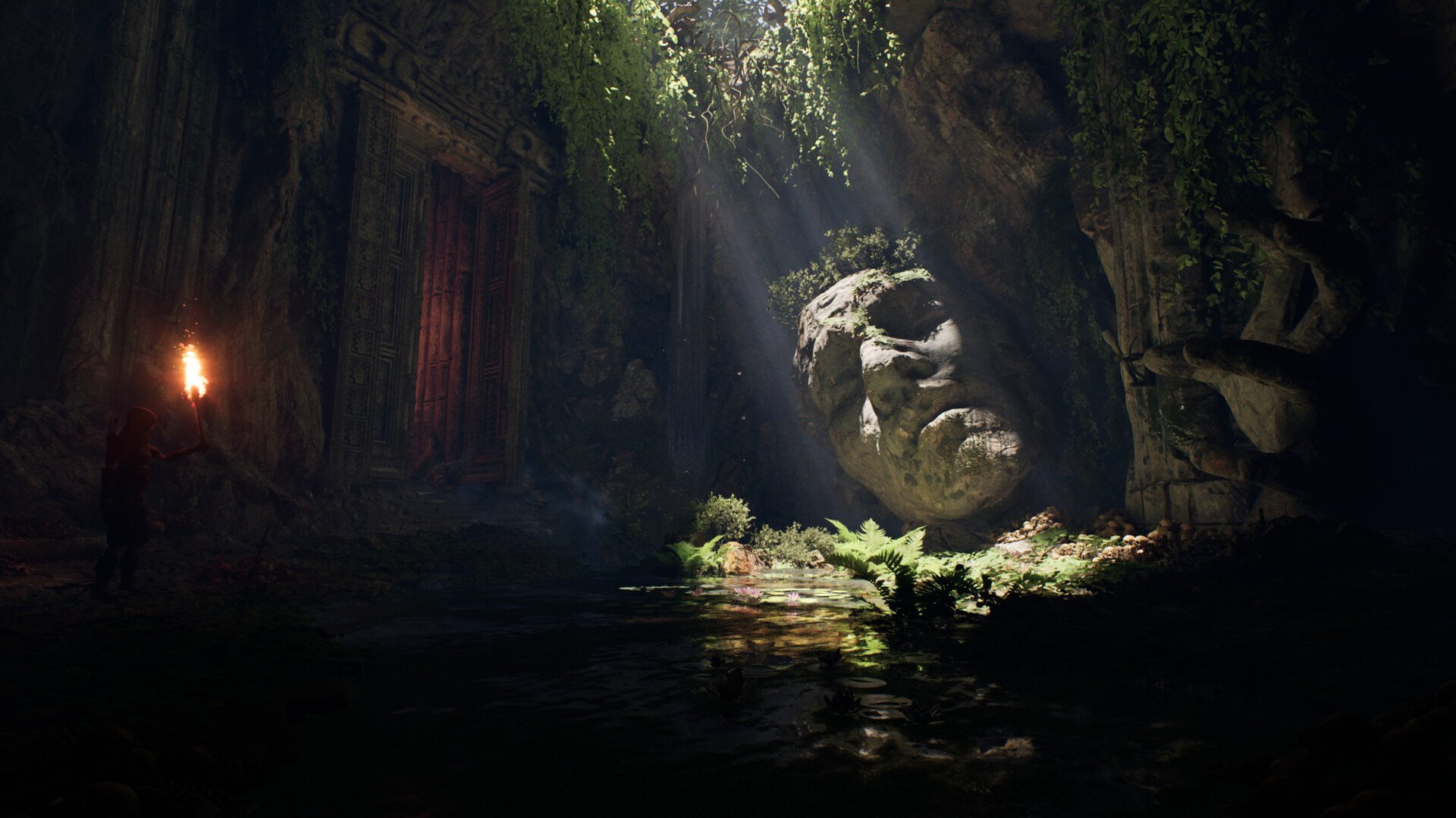 Hi! I’m polishing an Unreal scene (cave ruins with a shallow pond, god rays, big stone head, doorway, torch character). Could you please give me feedback on what to tweak or redo in this Unreal scene so it looks more polished? Thanks in advance! Goal: push it to a more “AAA” look for portfolio.
 -
Re: Paul Wright - Face Painter
 [ QUOTE ] You've basically slapped artists like DaZ in face as a bulk of his work are recreating human likeness. By your definition, the great greek and roman sculptors and Renaissance masters are nothing more than hacks because all of their work was "copied" from what was around them. [/ QUOTE ] Everyone knows that Daz…
 -
|W.I.P| Winter Nights Environment [UE4]

 Hey Guys! So I decided to develop a piece that I had begun but not completed during my time at university and develop a surrounding environment for the completed house model. The blockout is coming along piece by piece. I know it's not much to go off right now but I'm planning to update all my threads on a regular basis to…
 -
Re: lighting ?...fast and quick question..max related
 other way to get to it is to right click your viewport name (upper left corner of the active viewport), go into configure and the rendering options checkbox "default lighting". Note though! It gets overridden with the dx material display, so if you're looking at normal maps in viewport it won't work.
 -
Re: 3D MAX. How to render without lights but with light map!
 Sweet, nice to know that setup works :) I noticed that the lightmap isn't as bright as what the render looks like with the actual lights. How can you tell you're getting an accurate bake, and is there a way to adjust it without needing to rebake the map again?
 -
Re: Megabyte Punch - The customizable electro fighting game
 This looks awesome, love the trailer. Great stuff. Destructible environments while fighting VS would be frickin sweet. The only thing would be readability right now, maybe work on how to make the characters really pop from the background. But man, I would buy this and play it to death ^^
 -
Re: Syndicate's over-the-top bloom lighting
My pet peeve of modern graphics is kludgy realtime ambient occlusion. Either do it properly when processing the assets/building lighting, or don't do it at all! I fail to see the appeal in smudgy black halos around everything, it just looks awful even when it's done right, which it rarely is. (nicked from another thread on… -
Re: [WIP] BlackSmith Girl Character

 at this stage i would recommend blocking in colour; it'll help with grouping details and getting proportions right; you can drag your concept in as a texture, apply it to a plane, then colour sample the texture (shortcut c) and go from subtool to subtool, rbg > fill
 -
Re: [UE4] Palace Ballroom Scene
 Loving the zbrush work! Very attractive! I will say the lighting isn't doing much for the scene right now. https://abload.de/img/highresscreenshot0000nwsuz.png Since this would be one of the main shots for your environment, it's important to get composition right. Currently, the models are good, but the focal point is all…
 -
Re: Unreal Engine 4 Lighting Units confusing, issues Candela to Lumens
 You can't really judge the light intensity by whether or not it looks correct in the viewport until you expose for it. It being white is expected because you're using a much wider range of intensities that need to be accounted for. You can increase max exposure value to something really high like 10,000 or just enabled…
>89243 results