Search
-
Re: Optiniums works
 Did a low poly axe for DOTA2 over the weekend, submitted yesterday to. LOD0 ended up as 294 tri's and the in-game LOD1 was 216 tri's :D Be sure to rate up coz I love you <3 :P http://steamcommunity.com/sharedfiles/filedetails/?id=195902067&searchtext=
 -
Re: Wonky tesselation results
 Looks to me like you're running the RGB output of the heightmap directly into the offset as it looks like an equal offset on all three axes. Take one of the channels, multiply it by world normal, use that. Also; do not use tesselation heightmaps for strong changes in height, it's better at refining shapes.
 -
Re: primnull werks

 edit nevermind got my basher axe in ddo and did some work my AO has some pretty bad lines on it even though I maxed out fill seams option in MentalRay baker. I'm guessing I should fix them by hand in photoshop?
 -
Re: Border Fill - modeler's dream come true

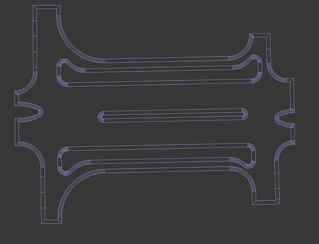 Since that's highly irregular, I'd probably converted the borders to a spline, and either converted that to poly to get the cap (adding Subdivide or Quadify Mesh modifier if you wanted subdivided mesh), or projected that to a plane with Shape merge (cookie cutter). There's also Terrain Axe for stuff that's not all the…
 -
Re: Gaston - Dota2 Thread
 Hi guys, i finish the set ... enjoy Thanks a lot guys ... and plz, give some like on my creations :) Master of the Wild Hunt - Axe Master of the Wild Hunt - Shoulder Master of the Wild Hunt - Arms Master of the Wild Hunt - belt Master of the Wild Hunt - Helm
 -
Re: real time animation input?
 Yeah, the Motion Capture utility in Max works great, you can easily map your mouse sideways motion vs. front/back motion to rotate on specific axes, or one handles move the other handles scale, etc. You get live feedback in the viewport too.
 -
Re: [3ds Max] Use custom working pivot without affecting the transform center
A little hard to understand the problem. A vid cap or animated gif might help. One thing you could try is to lock your selection (spacebar by default) then use hotkeys to change the axes (F5 - F8) instead of clicking on the gizmo. -
Re: Normalmap baking problem on a pipe segment
 First try to align your UV shells and edges to horizontal and vertical axes. This will give you cleaner results. This waviness can be cleaned in any image manipulation programm, just use a smudge tool to clean them up a bit.
 -
Re: Environment Artist Showreel 2014
 Site looks a little better but you really need to axe those videos and just have your thumbs on the main page. Also, in your assets section, get rid of the pig head and the elephant...these are not doing you any favors.
 -
Re: Shading artefacts only in Source engine (normal map related?)
 Yeah i see what you mean, but on something like his axe especially if you have a nice spec map, i don't see how this looks great, as it dims your spec in the centre ! personal preference thou :)
>5462 results