Search
-
Re: [UE4] Modular Ruins Environment
 This is pretty great Kimmo. The only criticism that comes to mind is that your scene is a bit noisy overall. Try to make some space for rest to balance your images out a bit more. A good rule of thumb imo is 70/30 or 30/70.
 -
Re: Your work BOX PIC - Pic thread for 05
 [ QUOTE ] I should say everybody was a geek in the late 70's early 80's. Look at those haircuts [/ QUOTE ] to us 70's geeks, you are the geeks! Somebody ought to start a thread, post your senior year yearbook picture!
 -
Re: Chinese gamer dies of exhaustion
 Considering WoW caps at 70 it was more than likely the push from 70 to 73 that killed him. Soon to be Dead Gamer: "Why iz I notz lvlin'?" Voice in Soon to be Dead Gamers Head: "Because you don't want it bad enough"
 -
Re: PC-CSGO | M4A4 concepts
#6 seems to harken back to a 70s space ship. #3 and #4 have colors that look very 80s, but #4 looks more sci fi. Not seeing any 70s or 80s sci fi theme in #1. Just looks like an abstract design to me. -
Re: The BRAWL² Tournament Challenge: Judgement!

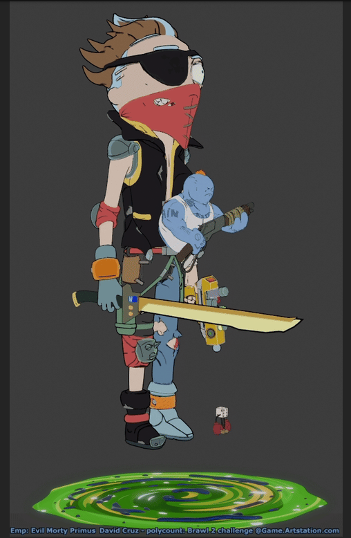 1st iam717 https://polycount.com/discussion/237071/brawl2-character-r-m-iam717#latest Its a hilarious mashup, love it! A lot of thought process went into it as shown by wips. I particularly loved the small details like portal animation, dice with punching gloves and 'pain' written on Kuato. It also shows nice UV layout and…
 -
Re: PC-CSGO | M4A4 - 1970's Sky-Racer + version 2 (finished)

 I am done with the skin and i will upload it tomorrow. I wanted to be something that could be from in Akira with a 70's race/sport feel to it. It is not super in your face 80's/70's sci fi so i hope it still counts. Some pictures:
 -
Re: Post one nice photo you've taken recently
 For that picture of chocolate, I just used the stock 18-55mm lens. I've also got a Sigma 70-300mm and a Nikkor 70-200mm VR AF-S lens. Both great, but the Sigma doesn't auto-focus. So I only use it for landscape shots.
 -
Re: some of the best states to do game dev.
 Good luck. Starting with no experience, unless your a super star, is more like 30k. At least over here on the East Coast. 50-70 is mid to senior. At 70-80 your tapped out unless you're a tech artist, Art Director or making title bonus's.
 -
Re: Building an environment - Evil Genius hidden forest base
 Thank you, and good question! It's about 70/30 at the moment. 70% smooth, 30% hard edge. It's just something I did earlier tonight and liked. I just tested them completely smoothed and am not sure if I like it as much as the hard edges make them feel even rockier..
 -
Re: SCI-FI Stuff and Crates for an upcoming Indie Game
 A good rule I've heard before on sci-fi / hard-surface stuff is to keep the details at a 70/30 ratio. 70% relatively clean surfaces, and 30% greeble / heavy detail. That way your eyes have places to rest and it looks less chaotic. Tor Frick's work has some good examples.
>3624 results