Search
-
Re: UDK - Glacier Crash
 This is awesome, And I agree, you definitely can pull a BioShock feel from this.. Definitely has that eerie vibe! Its coming along very very nicely my friend! GREAT job so far. The concept definitely got transferred exceptionally well. As for the metal texture on the wall to the left, I feel it can use some work IMO. It…
 -
Re: House Rejects Bail out
 Nice find Vassago. It's always funny how politicians fight over what bills where voted for and against amongst each other. This of course being a strong talking point in the debates. "He voted against funding the troops!". No, he voted against the other filler that would be thrown in and harmful if passed. 4 years ago,…
 -
Re: recent thoughts about 9/11
[ QUOTE ] one can definitely imagine how an administration might appreciate, give indirect support to or simply fake attacks at their homeland to rise public support. [/ QUOTE ] or how a small group within the US, only loyal to an allie, would trick the US into pushing the allie's agenda. the administration my even allow… -
Term Project Progress - Dragon-Age Style Blast Furnace Smithery [WIP]

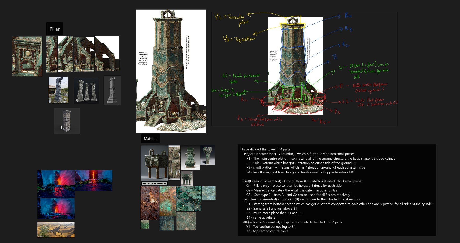 Hey everyone, I’m starting a WIP thread for a hero environment prop I’m building for my MA Game Art “Developing Skills” unit and my portfolio. 🔧 Project goal I’m basing this on the “Blast Furnace and Blacksmithing Equipment” concept from Dragon Age: The Veilguard (Creative Uncut link):…
 -
Re: LeeM Uni assignments + personal work
 Looking good man! I think you can tilt the head back a bit to sell the swaggy feel. Could even try pushing the hips forward slightly and bend the torso back as well, will be very subtle. I'd also experiment with loosening up the clavicles a little... push the forward hand slightly higher, about a palm width, which will add…
 -
Re: UVW head examples plz (my search skill sux)
Thnx! The Waylon site was especially helpful. Sometimes it seems to be a question of knowing which buttons to push. Speaking of which... I've applied a checker patterned material to my head but it doesn't show up in the viewport. I've "applied the material to selection" and I've checked the "show map in viewport" cube in… -
Re: David's Improvement Thread : CC Welcomed!

 @MykulJaxin Thanks for checking in! And I definitely agree with everything you said from pushing forward to me having issues with anatomy :D Im just constantly trying to push it further, please do come by and see if I get better. Anddd hello people of polycount, I've been just jammering this and that but a lot of it are…
 -
Re: Female Photojournalist
 Getting there. I think that the light you are using is to overblown. Is it "Sunlight"? Maybe try out "Pavement"? The bag lacks some material definition besides the grunge. You got any ref for the material on it? I also think that you should push your colors in her face. I realize that you maybe don't want to put that much…
 -
Re: The Beast - Spirit Of The Forest

 Nice, I totally saw Studio ghibli style before I even read your description. I really am digging this so far, one thing I could see with the silhouette that I feel you could push is, that in your 3/4 view it looks like the front legs are very spread apart from each other leaving a big negative space, maybe push the curves…
 -
Re: [P&P] - What Are You Working On? 2009 Edition!
 Medestruit - I think you really need to push the saturation in your colours, the likeness and whatnot is there but youve lost a lot of the vibrant colours. I back Artsy's opinion to some extent in that I think you should push realism and piss about with colours as opposed to a direct copy. So in places like the nose / eyes…
>19455 results