Search
-
Re: Kharon's Summer Project - 2014
 Another day, fairly fresh out of bed. Yesterday's work incoming. Hopefully this google drive website thing works so I can actually embed my images instead of attaching all of them? If so, I'll make sure my previous images are available there and update the earlier posts to embed them. Warmup: Sky Rose: The warmup was a…
 -
Re: portfolio update want critique
 Title currently reads as "Untitled Document" probably want to toss your name up there. Could probably get away with a center tag on this site, might look better. Replace the About page with a proper Resume. Also dark gray text on a dark gray background doesn't read. Fix this right now: The page is scaling all of your…
 -
Re: AO: Unreal Engine 4?
 The only thing that *needs* to be linear space is a normal map, though it makes some sense for roughness maps and metalness maps to be in linear space too. However, there is no requirement there, you can have sRGB roughness and metalness maps, you just need to author and preview them as sRGB. The problems arise when you…
 -
Re: Captain Nemo's office
 Yeah, you unwrap and layout your UV shells once the low-poly mesh has been created. To do this, I typically begin with the high-poly mesh and start removing the support edges, removing unseen or unnecessary faces and edges and simplifying the mesh as much as possible while retaining the overall forms and silhouette. Again,…
 -
Re: Circle is a square. (.png)
 I'm not trying to get the alpha working. Just so we're on the same page. I just want to know why the red circle expands into a square at its boundaries. As I said before, I can fix this easily enough by adding a filled layer at the bottom in photoshop, but I'm not interested in the fix. For the purposes of this, I'm not…
 -
Re: Normal Tools for Max Released

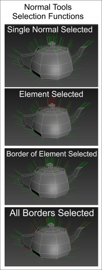 Eric asked me to load some images for Normal Tools. Here are some of the graphics that explain some of the tools. Clicking the image should load a larger version. Selection Functions: you can select all Border Normals. You can also force a sub-selection of currently selected normals to filter out non-border normals. There…
 -
Re: Time for a portfolio review and polish
As a minor point, the images used for the banners are considerably larger than the thumbnail; they'll still display, but you're letting the browser scale them for you. I really only noticed because they were taking a while to load. On your title banner, is there a reason "artist" isn't capitalized? I'd recommend including… -
Re: [Portoflio] - Brian Hong Character Artist Critiques please!
 Initial page shows the gallery which is good, but too much text I think. A lot of this info can be put into some of the images (for example the tri count with a wireframe image, and the texture sizes on the texture sheet) The top logo image looks pretty bad. I'm not quite sure what I'm looking at, looks like some smoke…
 -
Re: UT2004 Player Model - Nali War Cow
 It's pretty obvious that you meshsmoothed a low poly version instead of actually putting in the cuts you need yourself. So you've got a lot of detail in areas that don't really need it and you're lacking detail in areas that do. For example: The knee (or knee area) joint has only one edge loop. So it wont deform very well…
 -
Re: Ding, Another Portfolio Site
 -Move your name and info from the top right to the top left. It will flow much better and whoever is looking at the site won't have to search for your name and info. -Get rid of that image background. No need for it and it doesn't tile very well. It will look much cleaner without it. -You might want to redo those buttons…
>44221 results