Search
-
Looking for a concept artist for a dark sci-fi/fantasy animated series
 Hi, I’m looking for a concept artist who might be interested in helping shape the visual identity of an indie animated series project called CYCLES. CYCLES – Season 1 is a dark sci-fi/fantasy animated series about Aren Solas, a quiet human mechanic who joins a deadly expedition to reach the mysterious Amphitheater, a place…
 -
Re: Apache Helicopter
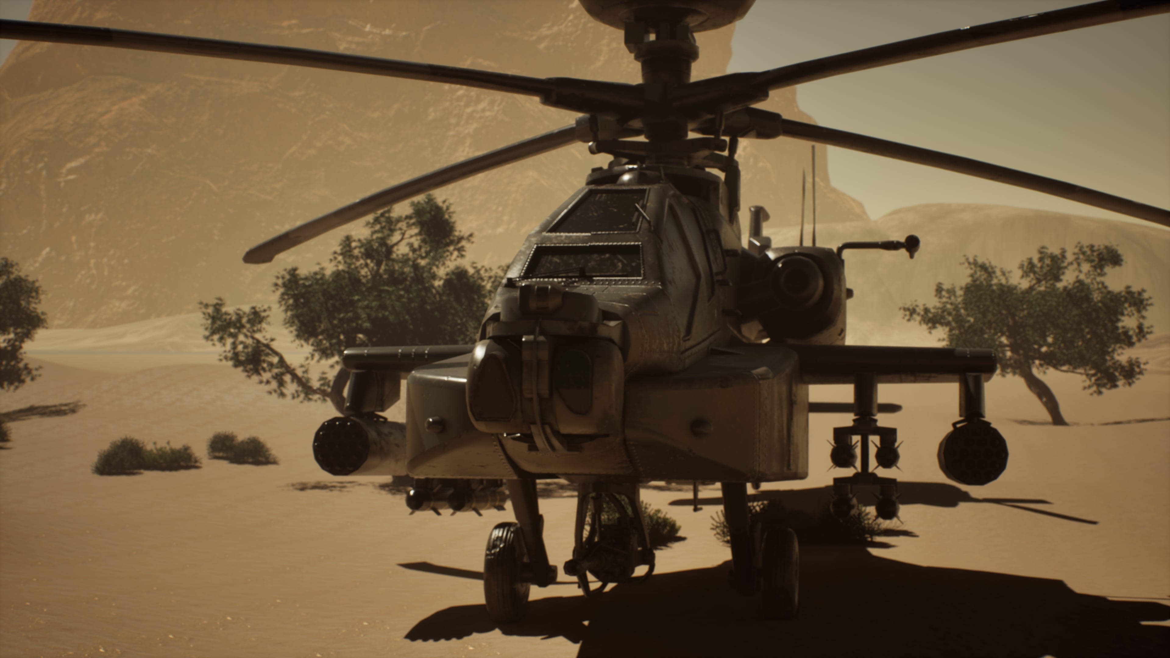 This week I focused on finalizing the project presentation. I completed all final renders and refined the lighting setup to better highlight the materials and overall composition. After reviewing the output, I made several small adjustments to improve balance, contrast, and visual clarity across the shots.
 -
Re: Looking for actual Critiques
 Gonna pop in here for a minute, just rattle off some things. First - to me, your main issue is consistency. Ignoring the death metal logo/any font and just focusing on the rest of the image you've got - it doesn't read to me like a consistent, confident style. You've got parts of it that scream web comic and parts of it…
 -
Re: [WIP] Vampire Librarian Character Bust

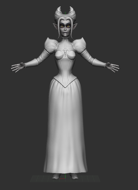 @Quasar thanks for your feedback! i agree, it looks a bit strange, and i can see the difference it made when i started applying some more detail on the skirt. i might go back to refine the blouse a little bit too, but in general i can see the improvement!
 -
Re: Using maya as a game editor for environment art
 Well, for character animation usually you don't have the same kind of strict limits as you have for environment art, so it's a different issue in many ways. For environments, usually you have to pay close attention to reusing assets and materials/textures as much as possible, so you don't blow the memory budget or kill…
 -
Re: [Finished] Numenor Inspired Environment UE5
 Hey nice start! First thing is to focus more on the blockout in graybox state and amtch the feeling of narrowness and depth. Allso focus more on the modularity and defining more modular elements before moving to colors and textures. Check for ref the art in Plague tale requieme, Mafia Old cunntry. ACK Mirrage, indiana…
 -
Re: Hugh Jackman bust WIP
 Hey I'm not perfect at this either but a few things I see wrong. The nose is a bit too bulbous and defined at the tip. The bridge of his nose is not defined enough and too lumpy. The nostrils aren't showing enough (bad reference since it is in complete shadow) which makes it look like he has a hook nose. But part of that…
 -
Re: Robot concept
 Reminds me alot of Kev Walker's Myr design for Magic:The Gathering- Mirrodin. Here's a decent Low poly Limb Deformation guide by poopinmymouth. I'd recommend using the dual edge loops in the center, doesn't add too many polygons and the extra points can further define the joints. Refine the feet more, the edge loop running…
 -
Re: Phoenix Girl
 Overall she's looking good, but still a bit "mushy". Your low-level, big shapes are looking good, but you need to get in and define the medium level shapes a bit more. I'm not saying that every muscle needs a sharp delineation, but a a bit more work at this level before you get into high-frequency details would go a long…
 -
Refinement and Critique
I am looking for constructive critique for the following models. All of the models I am not worried about polycount, but am simply trying to get them as realistic as possible. Models were either made in zBrush or Maya 2014.
>35283 results