Search
-
Re: THRAWHT-KATH - Sci-Fi Beast

 This is the anatomy of the beast in ZBrush. Still needs more definition and I think I am going to add the horns as separate geometry. This is because I started to pull them easily on top of the head, no problem, but then the cranium shape was easily affected. I could use a mask but as separate peaces I could have more…
 -
Re: Baking out Diffuse maps (for quick selecting in Photoshop)
 Most people don't know this because it's not documented in the latest help file. Also, sometimes, your model will share the same mesh of different parts of the model (EI: Your helmet has a 3/4 different sub-objects which are defined as different material, people would like to apply different colors to represent said…
 -
Re: Fantasy Adventure Girl
 Thanks Jigsaw! Your critique and your paintover have been extremely helpful. :) I've been working on incorporating your suggestions and generally refining how the anatomy is stylized... Hopefully an improvement! http://i.imgur.com/IV7gq.png [EDIT: Didn't take the changes nearly far enough in retrospect.] Ah yes, the Varga…
 -
Re: Turanga Leela
 good way to kick off futurama coming back on tv! she has this weird hotness despite being a cyclops. i think she is a bit to defined muscularly. a few points to note. *her knees a a bit to small, *that v shape you have going around the hip and into the thong zone is much to defined and perhaps defined not anatomically…
 -
Re: Sketchbook: Jake Juip
 This is great, love the lighting! The biggest problem for me is that the effects are overpowering everything else, so I can’t really focus on anything but the sparks. And the spinning camera makes it harder on top. I would suggest toning those both way down. The materials have a nice amount of grunge, but I can’t tell if…
 -
Re: [WIP] Assassin (Real Time Character)
 The topology looks pretty good! The head is way cuter now. I would try to give it another pass though, it kinda feels to me like it is in between two styles, some parts are realistic and some parts are more on the anime stylised side. The neck feels too thick, and some features of the face like the brow area or the nose…
 -
Re: Pyxis' Art Dump
I'm working on a sculpt of a Manticore for a project right now, which will eventually be rigged and textured. I'm still relatively new to the art of zbrush, I know my way around but I haven't done a whole lot with it yet. This is my design: And this is the rough lowpoly in Maya. Is there anything that's not looking right… -
Re: [WIP] Gingerbread House
 Very nice, pleasant look. About the icing on the roof ... the second one you showed has a cleaner and more defined look to it, however you are losing size and shape contrast now. With the larger style icing in the original image, the icing had a unique shape that you eye rested on nicely, whereas those little white…
 -
Re: [WIP] Overwatch 'Dorado' Map Environment

 It's been some time since my last update, and I'm excited to share the latest developments in my environment with you! This month has been dedicated largely to the creation of new materials and the initial UV mapping As I mentioned last month, the first one I started with was the roof tiles. Additionally, I created a mesh…
 -
Re: Cyberpunk Female Character WIP

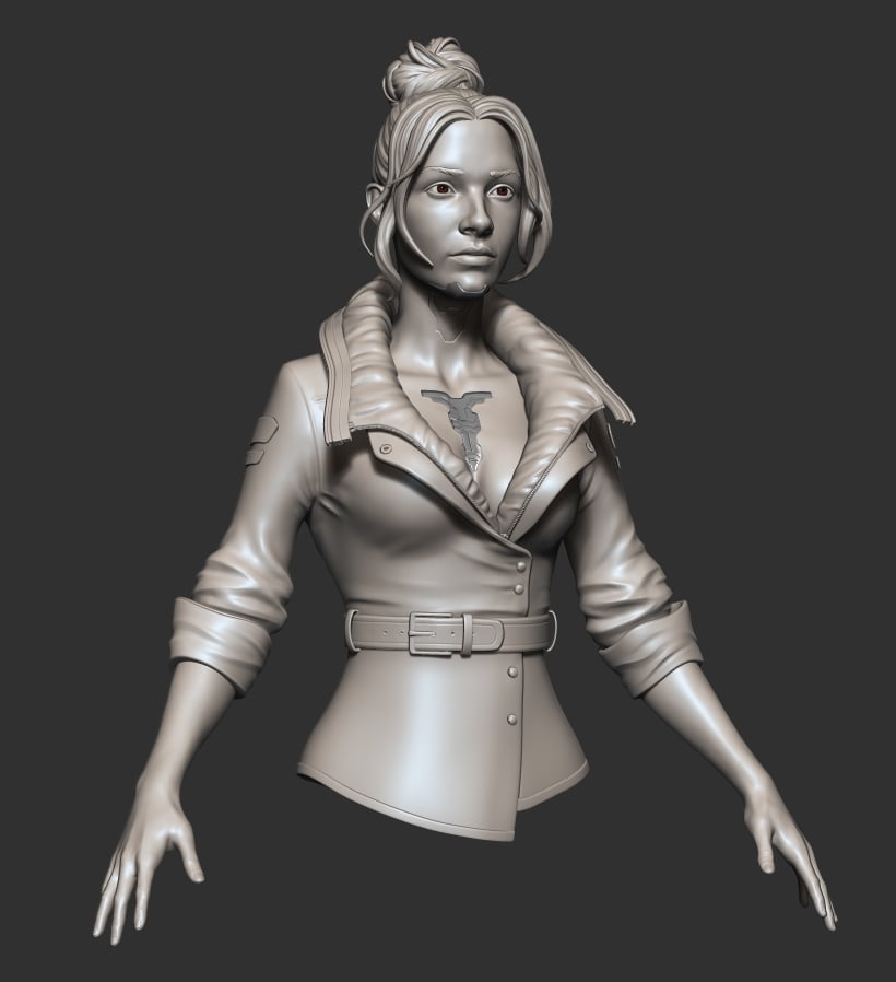 I've further refined the forms and added the hard surface parts modelled in maya. I think It's time to move on to the next stage, it would be better to add more details in texturing. I'm not really sure how to make those lines and panel designs on the skin, I'm trying to find the way artists made these on actual game…
>35283 results