Search
-
Re: [Finished] Numenor Inspired Environment UE5

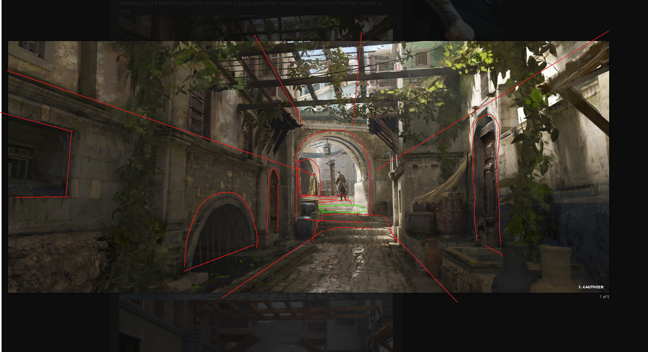 Thats fine but focus on geeting every proportions right and the same feeling of the concept - for example the stairs - they are 2 inclimbs going up with flat walkway between where the arch is. the staris are not that steep so you can have the nice depth and view of the second arch and builings down the strteet. the street…
 -
Re: ZBrush - Hypothetical ultimate feature list
 mmm, well I've had lights breaking when trying to use the mats customize utility to setup a scene once or twice, if that could never happen that would be great, it used to also get "lost" behind that preview sphere (you could click) to put the light behind the object, which kind sucked the 1st few times. Forget why i had…
 -
Re: [FINISHED] - UE5 Realtime Metahuman - Ryan Gosling: Drive

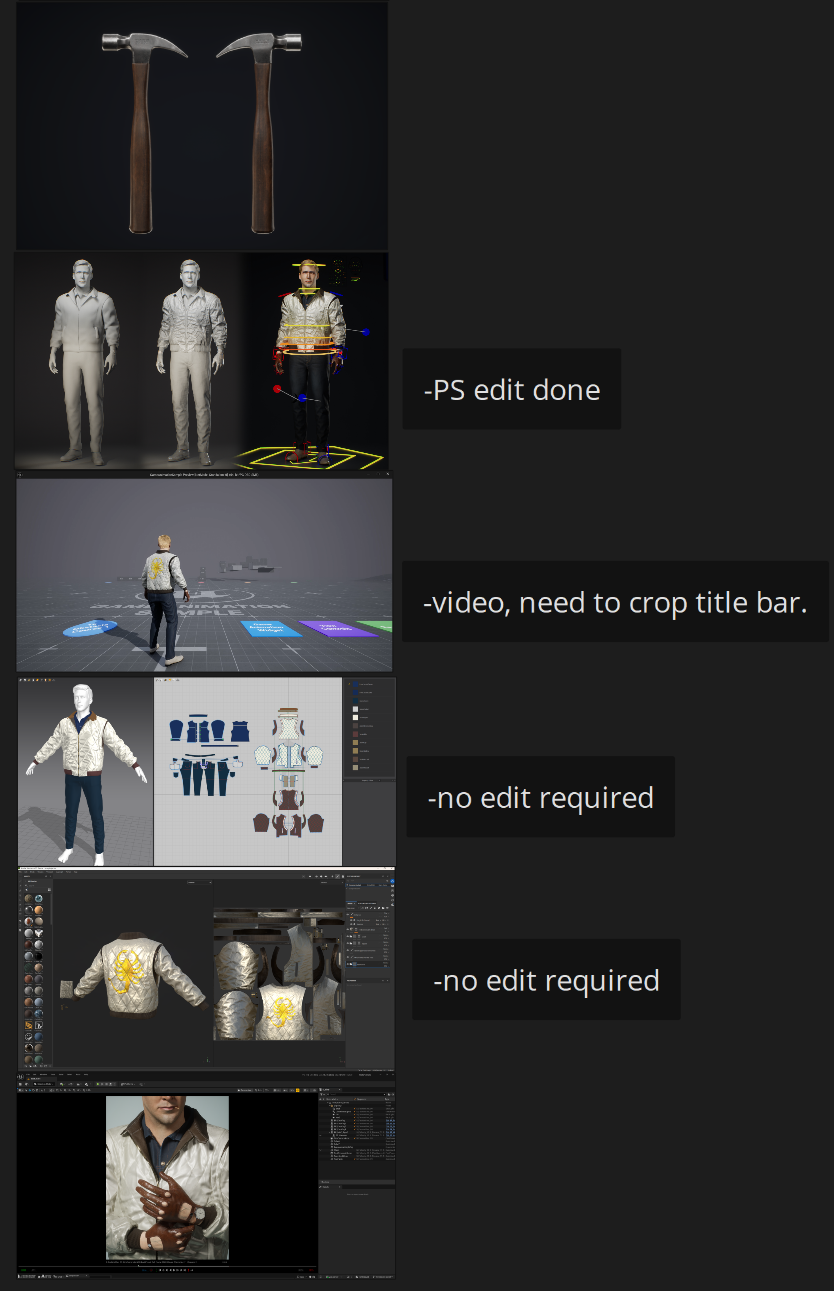 For my Artstation setup I was mainly looking at an awesome, recent character art post: Exiled Pink Knight by SeungHwan Jeong. My character is much simpler in comparison, but I took what I could in terms of how to present work well. So I took some headshots in Sequencer and MRQ, and also took some screenshots of my…
 -
Re: Quick Question on Tiling Textures and Enviro
 Cheers for the examples; I understand the second example doesn't really make sense, I was literally just pointing out how I've been told that UVs can be OUTSIDE the 1-0 space. Cheers for all the examples, but I'm guessing you can as i was told use OUTSIDE of the 0-1 space for repeating walls etc? Sorry to sound simple but…
 -
Re: Why you should NOT trust 3ds Max's viewport normal-map display!
 I can't post that example its under NDA :) The texture has changed from the OS map generated by max, but doesn't match the tangent map from maya, it's still very object-y looking. I'm not going to plough any more time into fiddling with this at the moment, I want to press on with the production work instead, confident that…
 -
Re: Gina (critique welcome)

 A detour or not, depending on how you look at it. I was trying to understand eye refraction. After finding some examples, attempted to recreate the effect... and it sort of looked correct. There was just that one issue I spent a good deal of forever chasing down. The whole thing distorts depending on whether you look along…
 -
Re: How do people get so much resolution in their textures on low poly models?

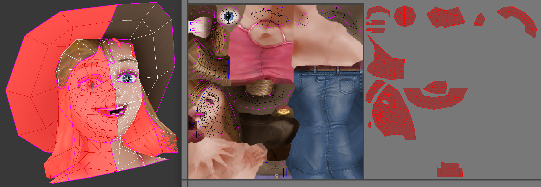 Here's an example, I highlighted the reused UVs in red, and the UV seams are pink. The reused UVs are offset in UV space 1 whole unit, which is purely optional. This way they reused bits are easier to see in a UV editor, but because the texture is tiled, they end up getting the same texture anyway!…
 -
Re: Efficient Use of Texture Sheets
Right. So the reference isn't for any one specific item. I understand the principles of efficient UV use, but the reference is more for providing a visual example to other people. Good packing is easy to find, but getting examples of reuse is what is tripping me up. People are happy to reuse textures in modular environment… -
Re: Interior with Hero Asset WIP Thread
Looking nice so far. I would suggest adding some variance in detail, adding some lower-frequency areas for the eye to "rest". For example not using the same rock models everywhere, but having some differentiation. The roof opening looks a bit odd with the same high frequency rock as the lower walls, like it could cave in… -
Re: Light tactical vehical

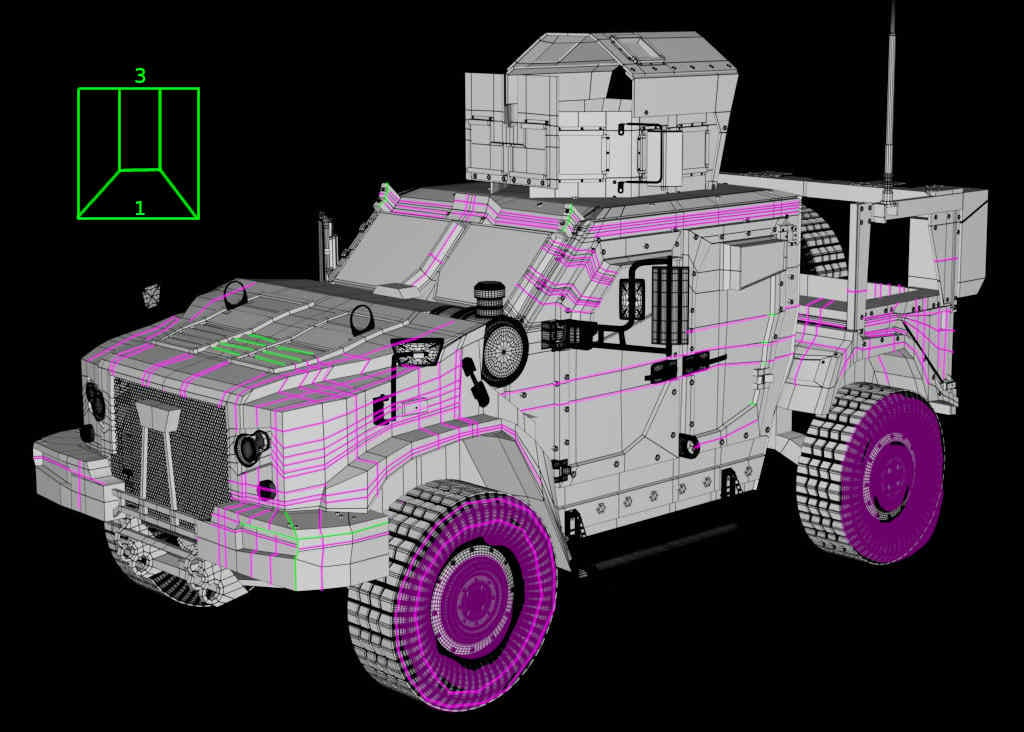 Some of the needed edge cuts seems to be distibuted all over the model ? Maybe good for concepting but this may should be optimized (for example showing the 3 to 1 quad transition) especially when there are so many planar areas (then even triangles are no problem).. the hood seems to need some of that details (green).…
>27386 results