Search
-
Re: The Bi-Monthly ENVIRONMENT ART Challenge | March - April (65)
 @Dinka This is coming along nicely, I might suggest making the roof tiles a bit larger they get noisy from this distance from the object. Lighting is flat at the moment, other than the obvious composition focus there isn't a lot of focal point in the lighting or contrast. In the concept you can see there is a fairly dark…
 -
Re: Hello, I am Sumit Das. Here goes my WIPs
 you should try to get some different values into the wood and the small house fI is with a different hue than the big wooden part aloso the proportions of the chimneys are not correct check the red rings and the upper part of the smaller chimney is far smaller and thinner. the small house is a bit too high and wide, the…
 -
Re: Building up an environment portfolio
 Thanks for the feedback Crimson, you are right i think I should brighten up my props a bit and dim the floor, they mainly got dark because I was trying to rely on my dominant light mostly for the lighting, and of course as the props are under the roof they got a bit dark. Ill have to throw around some point lights to have…
 -
Re: Previous monthly challenge
 Hey Voroldryn, one thing I noticed with your scene (since I have the same problem myself when texturing) is that it could really use some material separation (or dirt) to make things look less flat, and a little more realistic. With your scene having a lower poly count, adding a little bit of grunge to the texture can…
 -
Re: UDK Alleyway Environment WIP- crits requested
 JoscelinFrost- Thanks for the input. I purchased a foliage tutorial series from 3dmotive and the trees are the result of it. The material for the leaves has a lot of bells and whistles and allows for a lot of tweaking and adjustment. I guess this means I still need to tweak some settings! I wanted to spend some time making…
 -
Re: [UE4] Venezia - Overwatch inspired Environment

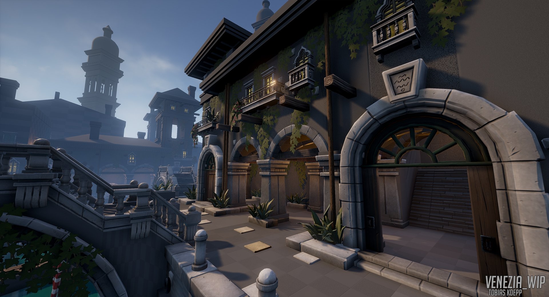 Done some more work to the environment. A lot of small pieces added and some First architecture attempts. I am still working on a way to easily create a variety of buildings using a modular system and then adding windows, arches, and other decoration to make them look unique. The very square buildings are still very…
 -
Re: UDK country village environment
 It's an awesome scene, I hope you don't have a hard time breaking in, otherwise the rest of us might have some difficulty. :P I know you're not really looking for more critiques, you can nitpick and tweak forever/(true art is never finished, only abandoned) But the added smoke is a huge detractor in my eyes. It's really…
 -
Re: Personal Work
 Really cool stuff, but I'm going to have to agree with Earthquake's and others' comments about excessive detail. Detail for detail's sake is not necessarily a good thing. In fact, extraneous detail can distract the viewer from the elements that are actually important. It just ends up looking like white noise, and none of…
 -
Re: [UDK] <<SUPER PROJECT!>> Post apocalyptic trainstation with a spices of asian flavour
 nice stuff! I dont have a full on crit or anything- I just wanted to say I think you should take a second look at the white plates along the edge of the platform. It would appear as if the block is all on one smoothing group, causing a large shading/gradient effect across the plates. The end result makes them look…
 -
Re: Monthly Community Noob Challenge May 2014 (19)
Coming along nice Jack M, I would say the floor is maybe a bit too shiny, but the texture looks good. Been learning more about PBR lighting and Ive made the chairs at the back. Still not sure how specular maps work now, they just seem to make my whole texture darker. I changed the material on my sofa a bit. Made the vents,…
>15259 results