Search
-
Re: Grusti's progress thread
 The bolt and especially the cover over the bolt don't seem quite right. If you look closely at the concept, you can notice that the cover is more of a rounded octagon than a cylinder. The rear of the bolt should be simpler - just a cylinder tapering in a single segment; the extrusion in yours isn't in the concept. Many of…
 -
Re: FINISHED : Durga, Hindu Goddess

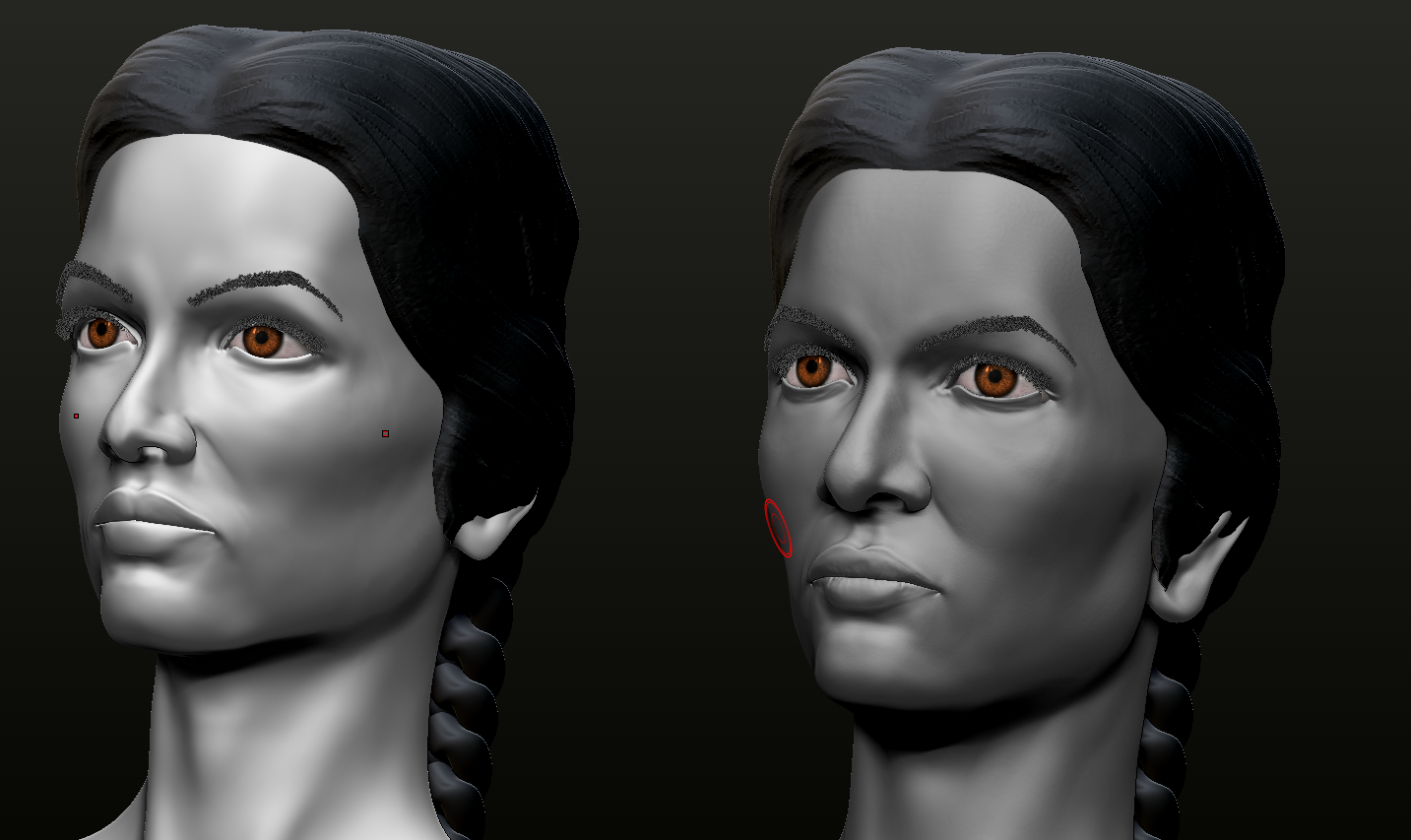 building up a new head from scratch just for the sake of more practice, also it seems beneficial to have a couple designs side by side -- gives a better perspective about what's working or not than just having one. Also built a new low-poly designed to give a little easier time sculpting the little corners on the lips and…
 -
Re: Thread for polycounters who are really bad at drawing and feel embarrassed about it.
 One of the things that excites me most about my Industrial Design course at the moment is that I'm finally learning to sketch properly. We're only a little way in so I don't have much to show for it yet, but they're very big on weeding out bad technique quickly. One thing they're very big on is confidence of linework.…
 -
Re: Among spruce trees and mountains
 @PixelSuit Yeah, looking at it I agree. Considerding I use the small rocks alot I really should make sure I make them look more varied in the shape and size. Maybe even denser as well. The spruce-trees to the left of the 2nd image do look a bit squashed as well. I'll take a look at it! :) @odium I will probably post some…
 -
Re: HK 416
 I hate doing paintovers on such small renders so I'm going to point them out the best I can... 1. The buttpad of the stock is incorrect, so is the bottom of it, it needs to extend out more. 2. The buffer tube doesn't look round and there are more threads in it than 2. 3. The ring around the safety switch (on the right…
 -
Re: Ysalex new portfolio construction thread
 Hmm, you're overdoing it again a bit The double headliners are too much, and if you put the descriptions inside the linked pages instead of the frontpage, it be a lot clearer aswell. Either put all headlines as bitmaps and give a little hint that they link to more images, or write it all with your webfont, but mixing both…
 -
Re: UDK-Tomb Raider Based Environment
 Can you post the reference you're using as well? I love Tomb Raider so I want to see this again when it's complete. What's lacking right now is contrast. Everything is white. The other color you do have is ok, but it should be saturated more. Give it more of that orange fire you're looking for. You can make parts of the…
 -
Re: Web page help
 (Scoff) Oh sure, you can take some of the easier, pre-made solutions. But then you will be slave to someone else's system. Far better to understand some of the basics and have control over your site long-term. A major cause for the complexity of web design is the numerous browsers available, and the lack of standardization…
 -
Marmoset - Weird Lines appear on imported psed character
 New to marmoset and I am trying to render this character. She's rigged in maya and after posing her, the imported fbx (right) appears with all these weird lines! Compared to the unposed model on the left, which looks fine. They have the same UVs. I tried copy pasting UVs from the t-pose onto the new one, tried posing the…
 -
Re: In-progress: shared folder not running export scripts properly?
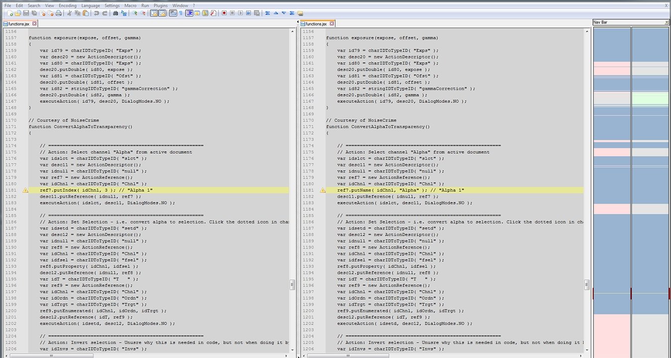 Yes I had run into this as well, and ran some tests and found the problem and solution to both your threads. But if you use the C:\Users\****\AppData\Roaming\Quixel SUITE\presets\Workflow folder there is a bugged script that needs replacing first. First off the Wiki sends you to the wrong folders and not the wright ones…
>42847 results