Search
-
Re: Mira - Wood Elf Assassin

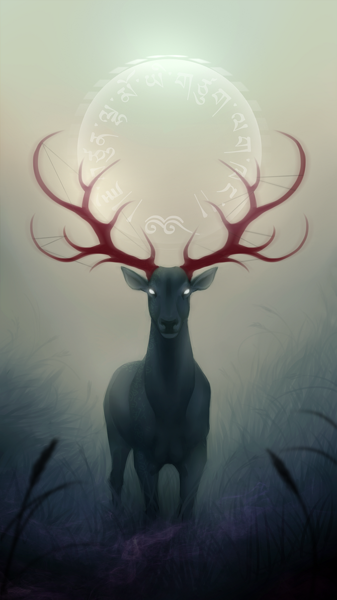 Not sure I love the black eyes. Given the elemental woodsy mystic creature vibe, maybe they could glow? I think a simple scene with grass and a hint of woods in the background would put this over the edge....walking through the mist for the pose.
 -
Re: Adjusting Mesh bounds in Max
 Utilties tab (little hammer) > Reset Xform, collaspe your stack. The bounding box actually isn't messed up. The object was rotated in object mode and then again in Element mode, which is what makes the bounding box look all wonky.
 -
Re: UTMC - Mid-tech Industrial
 Good to see this one wasn't forgotten as a WIP never to be finished it has some totally unique architecture with very contrasting elements. Everything is more curved on the white side and harder angles on the black side but as a whole it works together quite well.
 -
Re: The Courtyard – Contest Questions/Answers
 How extensively can we add our own models to the scene? For example if I wanted to add a roof to enclose the open ceiling, would that be allowed? It would be adding a larger scale element without re-positioning any of the existing assets.
 -
Re: Powerglove 2.0
arrangemonk- wow, I don't think I can ever outdo that one. :( LlamaJuice- Thanks a lot! I definitely was looking for more of those design elements and wasn't getting many ideas from just the powerglove. Newly inspired now! -
Re: [UE4] Caatinga Environment
 love it man. the only major issue i see that's an easy fix would be to refine your vista elements. the arrangement of assets on the horizon line. the scale of the rocks (large,med,size) these are some things that you can play with a bit more.
 -
Re: [WIP] My take on a stylised Luna Lovegood.

 I think I'm finally happy with the patronus design. All elements are essentially in place and, with one or two more wholesale passes to sharpen everything up ( The scarf especially needs work ) I'll be ready to get her ready for real-time.
 -
Re: TREASURE STAR: ULTIMATE BLING KING
 Sadly it's only single player dude, but otherwise you got it completly! The missile command elements have kinda gone away a bit and it's expanded into a larger game. Shark Soldiers, Vicious brutes that like nothing but to eat cat food and fight.
 -
Re: Banner
 It I think largely because the navbar is over a fair amount of the banner, on desktop, the <body> element should ideally have a padding-top: 50px; so that so much of the banner isn't hidden. A result of having a fixed navbar with no padding on the body.
 -
Re: The Bi-Weekly Substance Challenge (Challenge 7, 8, 9, 10, 11 & 12)

 WIP on the window. In the polishing stages now, not sure what to make of it to be honest or what to do with it next. I think the metal elements need more work especially. The frosting is a bit extreme too. Feel like there needs to be more contrast in general.
>11042 results