Search
-
Re: Triple Hit Combo - Looking for feedback
 I'm excited to see this finished. Here's a hodgepodge of notes: The third strike is pretty cool. I really like the big pose change as he goes down with one hand on the ground before jumping back. There's a lot of character in that moment. The first strike isn't working for me. It's not easy to follow to the sword because…
 -
Re: Rigging a flexible weapon bone
 Hey Rmunday, weapons are particularly challenging in 3d, as I'm sure you've discovered. I've played around with a lot of different solutions, but having it game ready adds a whole different level of complexity. Below is a solution where the sword is pinned to either the world or shealth, and the sword drives the IK hand…
 -
Normal Map Issues at UV-Seams
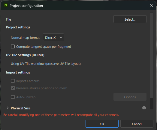 Hi! I wanted to ask about an issue which occured to my normal map through baking in Substance Painter (2024). The UV seams of my mesh are clearly showing, which doesnt let it be solved through using triplanar projection, using Smudge or Stamp Tools or a brush. This tex is baked in 4k, but will be still too visible for the…
 -
Re: Mine shaft, or something..
Looks way better now! It feels a lot more filled with live through those color additions. One thing I have left to critic is that some areas seem pitchblack. In some areas that feels pretty nice because you're getting some silhouettes but in others it feels like to dark shadows, especially on the left hand side of the last… -
Re: Takedown from Above!
 In terms of composition, I would maybe look at reducing the amount the camera moves when you cut. Its currently moving about 180 degrees from the first shot, and this means that the jump starts with the character moving screen left to screen right, but then you cut and they are moving screen right to screen left. If you…
 -
Re: Texture Leveling
 Yes. The gamma comments came from people saying "sprunghunt: Interesting. Though the point about Photoshop giving values in gamma space is confusing. My version appears to give RGB127 as mid gray and not RGB186" If people rely on photoshop to tell them what is 50% grey, they will be wrong. Photoshop says something is 50%…
 -
Re: [Riot Art Contest] - Chris Shepherd
 Reply by C.K.Shepherd · · Home› Contests & Challenges Archives› Riot Art Contest› Riot Art Contest - VFXSome simple mesh work in the material editor to achieve the appropriate effect with the hoops. The recorder didn't do me any justice with this one. ;) Went through a short trial and error period finding the right noise texture. Pictured on the left is the first attempt. It came out a little too stretched and left…
 -
Re: Waterfall Environment
 The scene is really coming together and is looking great, but the waterfall is a bit odd yet. The left side is awesome, but on the right there's an emitter that just really throws the whole thing off in my opinion. The one where it looks like puffs of smoke are just coming out of the rock and slowly falling down.. and ends…
 -
Re: What colour is this dress?
I see both as black and blue, the only difference is that the one on the left looks like an obviously overexposed photo. The only image in this thread in which it looks to me like it's white (or light blue) and gold is the XKCD image. A friend suggested the reason why they look different is because the photo on the left… -
Re: Final character/work for portfolio
 Really, really awesome work! Very inspirational and I love the texturing. I love the energy in that first pose but there's something a little off with his left arm and his torso. It looks like his upper left arm is twisted too far forwards/down for where the rest of his body is, and his chest/stomach look bent a little…
>42840 results