Search
-
Re: My first personal project! Stylised market diorama.
 Subdiv it 100001 times? It's really the only way aside from reprojection, though in the future splitting off things like bricks into subtools is probably a better way to avoid this issue. :) If there's not going to be any camera way up in there, even if you can't subdiv any more it should be fine, really. It's looking…
 -
Re: Texture and render
 Those cracks really add up to the rock impression. Wood doesn´t crack like that, it always cracks in the directions of the grain. Or at least I think it should be in your textures :) Plus the brick shape is still very odd, you should lengthen them into planks. You could also add some knotholes! :)
 -
Re: Handpainted house WIP
 painted edges (bricks, roof tiles) are too thin and it causes two problems: - textures look really flat. - when scaled, they start look all jaggy and pixelated. also, you might want to get rid of pure black color in your textures. its unnatural, and shouldn't be used on hand-painted stuff.
 -
Re: 3Daily - Swizzle

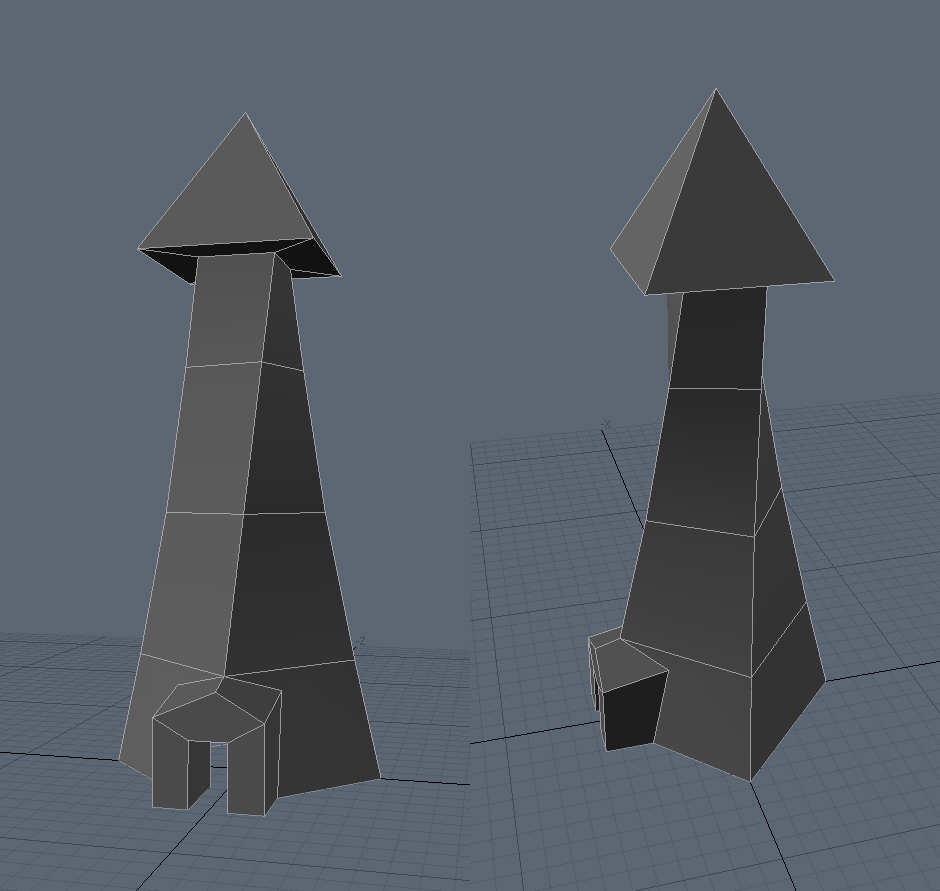 Did a suuuuuper early WIP of the wizard's tower that all these props are going into. I still need to figure out how I'm going to do bricks, timbers, and roof tiles without any sort of textures, but I'm sure I'll be able to figure something out. If nothing else, I'll just model everything.
 -
Re: Can I salvage this piece for my Portfolio?
 I think you need to rework your textures a lot. The bricks are very clearly tiling and don't make much sense at all, and the cogs look rather boring with that simple texture on it. To me the castle like thing has a clear fantasy vibe to it so matching the textures to that would have been a good idea.
 -
Re: 'Hand Painted' Step by step thing of some sort.
 I would like to thank all who contributed to this post. I learned alot! I used really suck and painting textures. Now I feel confident that I can push it way further than I used to. Here are some examples: Here's the bricks tiled Again thank you much!!
 -
Re: [UDK] Desert Scene Environment
 Looks good. The place where the water fall meets the ground, the tiling of the brick seems to not match up with the water catcher. maybe some grass could cover up the seam. But u are definitely just tweaking what is already pretty solid Oh sand decals and weeds could really add to the realism of the scene
 -
Re: Skyscrapers
 you might want to try and use a bunch of small textures. a brick, window, trim etc... that tile of course. I'd say nothing larger than 512x512, prolly could get away with 256 or 128 for some stuff. be easier to give pointers if you had an example of the style of building your going for too.
 -
Re: Confusion over UV mapping with texel denisty in mind
 The density itself is less relevant than everything having consistent density. If everyone sticks to the same density a team can be pretty certain everything will look similar in terms of fidelity and that if they're sharing texture resources (eg. a tiling brick texture) then they can be sure there's not wild…
 -
Re: Hand Painted Textures - WIP
 also with the big gaps between the planks it looks more like a brick wall than wooden planks. agree on the size and length of the lower ones. and why are they getting thinner at the bottom shouldnt they be averagely same wifth? i would also define the edges more and as deathstick said add more color variation.
>12286 results