Search
-
Re: Ronan the Accuser
 I like it! Do you have it a screenshot of it in studio lighting? I think right now it's mostly tweaking the look of the materials and getting some glow on the hammer stone for the beauty shot. If it's in more neutral lighting, that might help us diagnose what sort of contrast the model will need.
 -
Re: U4 - 'Welcome to Campobasso' looking for feedback

 right now the lighting is really flat and dull. boost the overall exposure and get some more light bouncing around in the shadows. for such sunny blue sky day the overall brightness is really low, and the shadows are super black/not nice. did a quick Photoshop adjustment of what I mean.
 -
Re: Convincing 3d that looks like 2d.... Wow
 Shadow on the white clad guy's back under the half cape does not change. Nor do the shadows under his shoulder pads even when the right one goes vertical at the end of the move. Shadows do move on the flowing cloth. Also in the lower gif the shadow and light on the ear appear constant while the face does change. Hair is…
 -
Re: Feudal Japan Environment

 You're welcome :) Ah, yeah, I see those steps now. I couldn't quite tell when I was looking at it before. The main thing I was noticing was that the profile of the hill was looking different from the reference image, like I show in the image below with the thin red lines, which is great if you were wanting to do it that…
 -
My stupid friend
 I got this email from a friend of mine yesterday and thought someone else might get a kick out it: Killing some time...I went to linksys.com....went to their Live Chat support...and told them I was Bruce Wayne and needed some help. See the epic adventure below. ( eventually they saw right through it....) Jeg Mark P.…
 -
Re: Sketchbook: Hudson Guilmette
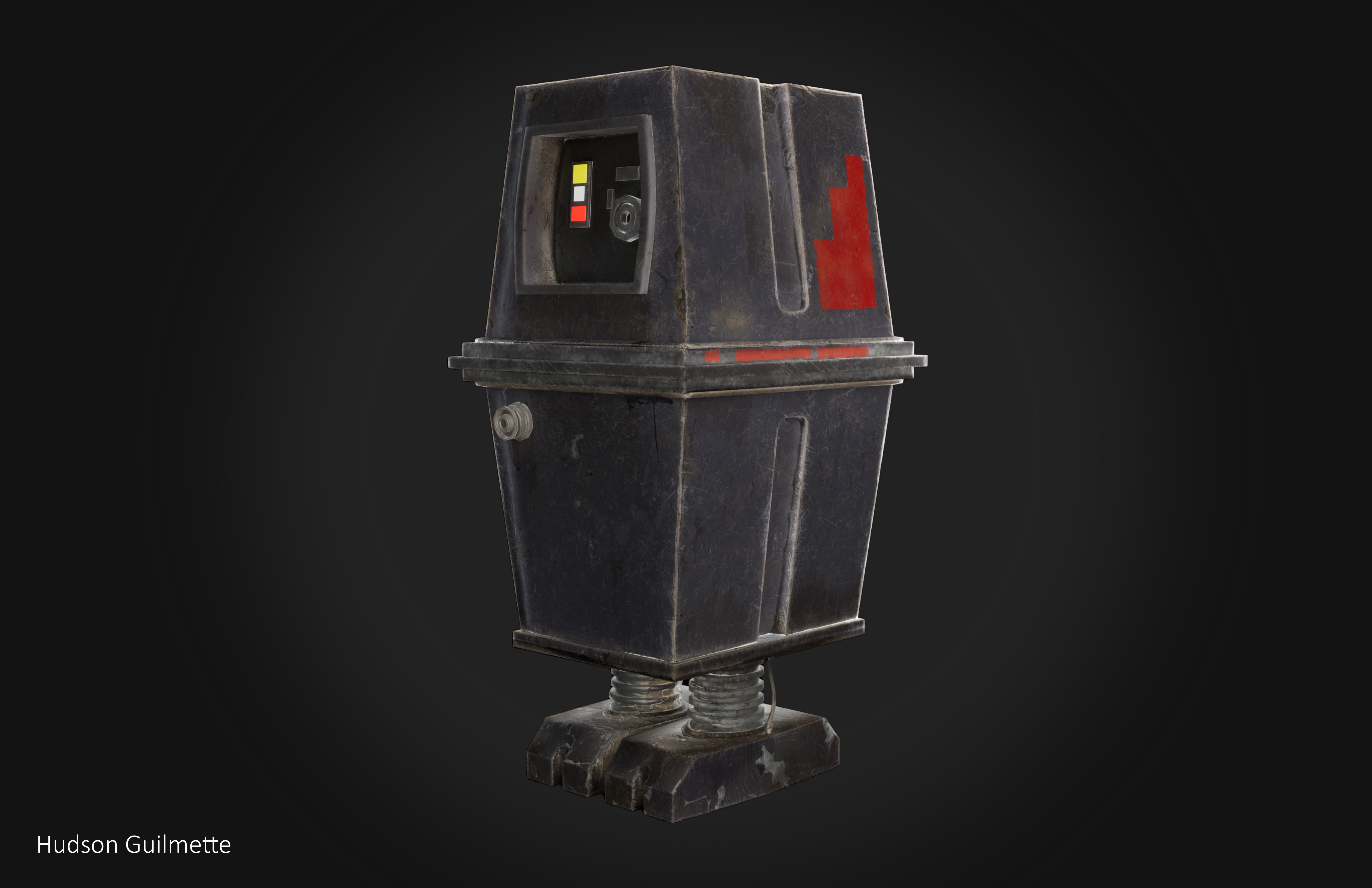 This is a model of a GNK droid from Star Wars. Modeled in maya and zbrush, textured in substance, and rendered in unreal. This was a really fun project to work on, going through the pipeline from start to finish through programs I wasn't too too familiar with was a lot o fun and makes me feel more confident in my abilities…
 -
Re: Light passes trough some faces of geometry

 I fixed your image for you. Just right-click on your image and copy the image URL, then click the Attach Image button and paste it in. This is the button: You can also just drag-and-drop an image right into your post if you want.
 -
Re: [WiP] Papper toy scene
 I agree that the composition could be tighter. Regarding your light. It lacks contrast and directionality. You have some kind of light source coming from the lower left quadrant that is almost as bright as the desk light hitting the little paper guy. Your key light (the desk lamp) is not much brighter than the fill light.…
 -
Lighting Critique Needed
I'm worked on a Relight project and would love to get some feedback on my lighting design. Could you please take a look and let me know your thoughts? https://www.artstation.com/artwork/oJbZqw https://www.artstation.com/artwork/y4DZen Thanks -
Re: Warm up fun (deus ex 3 scene)
 Thanks everyone :) I WILL get that gold tone in there, but currently I want to make sure all my textures are "done" with the current colour scheme, from there it is very easy to adjust the colours once I can see everything in the scene. I think total I have 4 lights in the scene right now, 2 mimicking the top lights (I…
>89258 results