Search
-
Re: Environment Artist Portfolio- Scott Petty
 Good stuff. Not much to crit about the actual portfolio, since it's carbonmade, but here's some things I notice about the fantasy environments. The fantasy environments the strongest parts of your portfolio for sure, but they're not being presented that well. The lighting is really flat and the shaders look like basic…
 -
Re: WIP UDK: Walking Dead Inspired Hospital
 Thanks for all the encouraging comments everyone! I'm glad it's headed in the right direction and I'll post updates when I make some more significant progress. Mark - I had been playing with the amount of bounce (I think it's limited to a single bounce now, when the default was 3) and kept going back and forth with how…
 -
Re: Getting into 3d scanning
Yeah I was trying to make a more affordable setup by creating a light tent (basically white light coming evenly from all directions) and using a rotating model in the hopes that I could maybe get away with using one camera taking multiple pictures as the object rotated. I understand that the lighting isn't supposed to… -
Re: Unreal project advices (Room 1408)
 Try using a "skylight" if you haven't already, as well as baking lightmass for global illumination (which you could even boost if you feel like delving into that) A couple of the brighter lighting setups and particularly the blue one looked closer to the films lighting in the video. You might also want to possibly look…
 -
Re: Stromberg's Gameart book
 First, can you post some of your reference? You can never have enough! Moving on, no-holds-barred crit time: It has potential, but it's just very boxy and undefined. It's the extruded-box syndrome that we all fall into when we model sub-d. The only part that looks like it is designed to be used by a human is in the back…
 -
Re: Aldo's First Post
 That last one looks mighty ambitious, but I think the composition and lighting could use some work (mostly on that first image). The focal point (which I'm guessing is suppose to be the island and the top figure reaching for it) gets somewhat lost. The figure skewered on the left stands out because it's a dark silhouette…
 -
Re: [UDK] Piccadilly Slum - Environment
 are you taking screenshots with tiledshot? also you really should do something about the sky in both shots, the day is too bright and the night is a little bright and the city doesnt have enough contrast like a city at night. Both night and day could be more focused on the main building front with a few tweaks. Hope you…
 -
Re: Gun High Poly - H&K G3 Wood Furniture - Critiques Welcome
 Solid execution, details seem pretty spot on, well done man. Going to echo Josh's comment about lighting looking a little blown out in the renders and I know they're just high poly materials for presentation sake but Josh's points about materials might be worth addressing for a sexier presentation. As for the model my two…
 -
Re: SHIFT - Final Year Game Cinematic Trailer Project

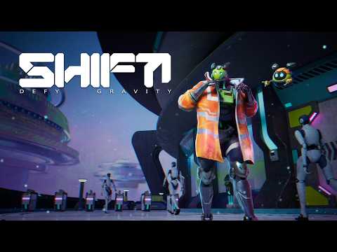 Hello everyone! I would like to announce that we’ve finally completed our final year project film! I haven’t updated this thread in a while since we were fully focused on production and polishing for submission, but I wanted to share the final result along with some behind-the-scenes progress. Huge thanks to everyone…
 -
Re: Environment - The Ottoman Workshop
 Right, I think I had more success with UDK today. I broke the scene up into about 12 logical combinations, and gave them some quick UV's for the lightmap. Let me just clarify that lighting is purely there for lightings sake right now. Lighting is probably my weakest part of UDK knowledge and I'm gonna take a few days to…
>89258 results