Search
-
Re: kiosk
 I think the tiles on the roof need more depth, this could be done by adding darker shadows between/under each tile or by baking (stronger) normal maps. I'm not sure what the texture on the wall is supposed to be, looks like an amalgamation of brick, plaster and mud. You should define the material better.
 -
Re: Random Tough Guy
 The indent at the temple is way over defined, the temporalis muscle should fill that hole. Legs feel a bit thin too. The head should be wider at the back, his head is box shaped atm. Good work though, I especially like the style of the face (doesn't look very tough though :) )
 -
Need Direction/Help/ Advice Modeling a Car
 Hello there! I've been trying to refine my modeling skills by going outside my comfort zone and doing a car. I specifically picked one that had some smoothness that would be a bit tougher to do. However, I seem to have bit off more than I can chew! I've been playing with it for about two days and don't seem to be making…
 -
Re: Can one person do it all?
 If you need licensed music try something like audiojungle. There's alot of crap but some aren't terrible for $20. Unless you already know how to play an instrument/compose I don't think you'll have time to focus on it professionally while focusing on your visual arts and technical skills. I could be wrong as there are…
 -
Re: Elf bust sculpt

 I like your project but the head need more defined shapes. The back of the head is to flat and the top is to height for "normal" human skulls. Also I noticed that the cheeks are to flat. and her nostrils are to big. Also her upper lip needs more shape. I made an operpaint hope that helps :)
 -
Re: Getting into 3D Environment Art
 Find a beginner tutorial that takes you through the entire process of creating an asset so that there's a defined start and finish to the project. If you are a total beginner aim for an asset that's made entirely in Maya, then move onto game assets that go into low poly and baking. You can probably find stuff on youtube.
 -
Re: Sony tps - l2
 @CybranM thank you :) Glad you like it and good point about the foam its something I wrestled with during the texturing stage, in the end I decided to go for a cleaner look to the foam but a bit of dirt/grime would definately be good here also, thank you for the feedback much appreciated :)
 -
Re: down_limit's workshop
-
Re: ZBrush beginner question - very blurry, unfocused model.

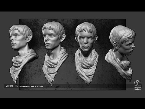 It looks like you hit zremesher or something. To get sharp detail you have to sculpt with a mesh that has enough polys to support that detail. Usually you would start to define the sculpt at a low poly level then increase the subdivision level to sharpen the sculpt https://www.youtube.com/watch?v=mSYH9NYFoes
 -
Re: How Do You Make a Flow Map?
thinking a method that does it right in maya or max is better anyways, since that way you can see your level geometry as you work. also would be interesting to generate these gradient right in udk, maybe using a sphere mask with the "World Position" node and a vector3 defining the world position of the distortion.
>35319 results