Search
-
Sculpting and Rendering a likeness would like tips and feedback

 Hey Polycount, I am trying to make a likeness of a friend of mine. Right now I am at the stage where I started doing the pores. But I thought It might be a good Idea to get some kind of rendering setup going to get an idea how visible the detail is that I am sculpting onto the model. Right now this is how it looks in…
 -
Re: We finally launched CGHub.one
 Hello everyone and thanks for all the previous comments and support! Just wanted to keep you updated about Cghub We are still working on the website, here are some notes on whats going on: 1) 3d models library increased to 920K+ assets so far B) (almost 1 million!) 2) The main issue we are currently facing is website SEO…
 -
Re: [UE4] Office Days (WIP)
 Awroecreative, looks like a nice project :) I would try to stay true to the original Proportions. The concept has lots of vertical lines (like windows going almost floor to ceiling, getting picked up by trims), which is something to be conscious of. If you take too much of this away the room might feel different. In your…
 -
Re: [WIP] Tree Trunk, PBR learning
 What engine are you using? The bark looks really neat. If you want more vivid colors you should play with hue&saturation? Also, you need to calibrate your albedo correctly, because in your daylight picture it is way to bright. By that i mean you need to lower the levels on it too make it darker. It's going to look wrong in…
 -
Re: This is a tricky one - decals and displacement
 Haven't used or done anything like this myself yet :sweat_smile: .. but as i just now re-searched (a little) some snow shader setups where the actual player seems "to paint" on some "track" map.. couldn't the tire track "simple" be added to this already ? Or the problem might be somehow more complex as i understood this…
 -
Re: [WIP] Modular in-house level - Hand painted style
 Thanks mate, really appreciate it. I'll do my best to keep things simple, and hopefully manage to keep everything at the same level. As a general rule of thumb, I keep myself bellow 50% brightness and preferably bellow 70% saturation, not completely sure if its a bad or a good thing to do though. By lighting the…
 -
Re: Urban Environment
 I think the hues from the lights from the post and the fire drum should be more different from each other. Right now it looks that you just copied the light entity over and it doesn´t look interesting as it could be. Maybe make the post light a bit more focused and bright, and the fire a bit more diffuse with a lower range.
 -
WIP – Chemical / Paint Waste Disposal Bin (Practice Prop)

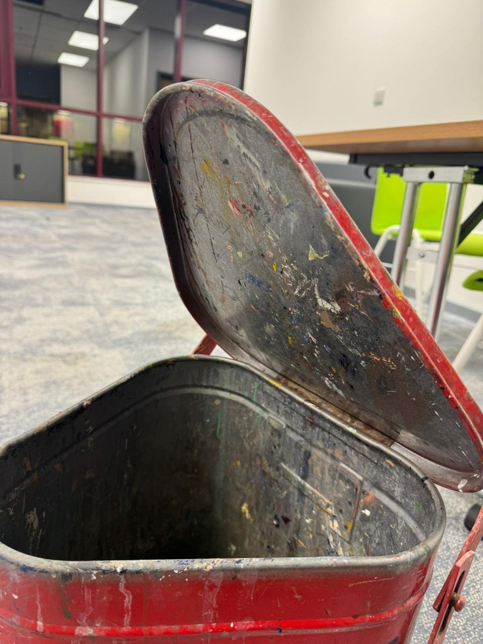 Hey everyone, I’ve started working on a new practice prop. Its a chemical/paint waste disposal bin. I found this one and thought it would be a great study piece because it has a lot of subtle form changes, surface damage, and material storytelling. My goal with this project is to: * Keep as much real-world detail as…
 -
Re: UE3 Materials: Is this kind of Translucent Material Possible?
I didn't choose a very nice texture, but here's what the cave meshes look like when put together right now: My UV mapping is nice and seamless now thanks to the Triplanar projection, but of course it hasn't solved the abrupt lighting at the mesh seams. I want to achieve the same lighting effect as this guy: I know he is… -
Re: WIP - VR Chamber Corridor
 I think your materials need some work. The light is hitting all these different surfaces and they all have the same quality on them. Speaking of lights I think you should turn them down. The lights might also be your weakest model in the scene. They really dont even look like they belong. So to condense what i said.…
>89258 results