Search
-
Re: Blender to 3DSMAX : A few questions
 2 - not a fix perhaps, but a help: the cut tool has two slightly different cursor icons depending on how it is cutting. 3 - [ctrl]+[c] creates a camera in the scene. You can then set any viewport to render from that camera. Using MMB will still move it around, but then you can [ctrl]+[z]. Maybe freeze/hide the camera or…
 -
Re: warhammer 40k - table top
 I've mainly used it to fill gaps after I glue my guys together, and I've done stuff like add hair to bald space marine heads but I have no idea how people sculpt all that fancy stuff. Green stuff is super sticky so you have to keep your tools wet BUT if things get too wet the green stuff won't stick to the figure you're…
 -
Re: Vehicle - 1980s Landrover Series III
 the modeling looks pretty solid to me. I'd say you could round out the wheel wells a good bit more to make their c curve match that of the tire. why have so many polys around the tire to make it look round but not the wheel well? Texture wise I'd personally say some more edge wear and detailing would benefit this model a…
 -
Re: [UDK] Ignizione Racing
 Looks pretty nice, but yeah I'd say a little too much saturation. Our environment modeling teacher says it's important not to go over 90% saturation, and that red is really popping. Save that intense red for a part of the track where the player might get confused. Say the road takes a sudden left turn, but it's hard to…
 -
Re: Riot Art Contest 2014 - Q&A
 Hello! 2 questions here.. -As for the Environment art Contest, does the Inhibitor/towers NEEDS to be purpler or blue team? Or it can be yellow, green, etc.. And if we do can change the colors, do we need to show the base with the two different colours? No. It is up to you what colors you use. -And is the ground for the…
 -
Re: 3D used too much in films?
 I think for me it's the integration, a lot of actors just don't have any idea what's going on in the green screen, not that it's their fault. Or the direction is just too shitty to get the proper interaction between the two. For example wrath of the titans remake, where Perseus is fighting those giant scorpions, looks like…
 -
Re: Josh Lynch Substance Designer Sketchbook

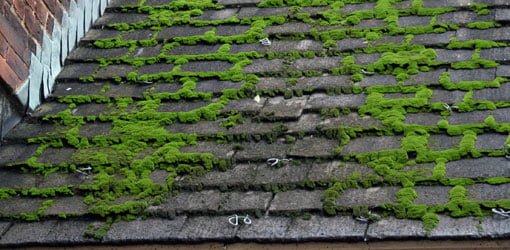 Hey Josh, Great work as usual dude, one thing I would say is the moss and algae look to be either one or two colours, the dark green or more yellow green. There are also quite a lot similar sized circular spots which seem quite uniform. It be good to get those to be slightly different in shape size and tone. I wonder if…
 -
Re: UDK Yet Another Scifi Corridor (with glowy bits)
 Autocon is pretty spot on about things looking slightly out of place. But I think even though the style of the two different wall supports differ, the shapes a fairly similar - what really draws your eyes to the differences is the colour. You have a rusty orange a light orange and green - and the way colour is applied…
 -
Re: UDK - Huge Sci-Fi Foundry [WIP]
 Looking at your portfolio and the progress on this scene I would say be aware of an overly busy environment. The eye will need a place to rest and right now it just looks like a bunch of ambiguous noise. I know it's still in the early stages but adding human scale pieces would really help to determine scale as well. Using…
 -
Re: [UE4] Cargo Spaceship Corridor -- Star Citizen-Inspired

_014_VincentLim_Portfolio2013.jpg) It looks great so far and I agree with all of the previous comments but I would also recommend some more work with lighting. Sci-fi scenes give the artist an opportunity to play with whatever lights he or she wants. Right now everything is an overall white wash and that is futuristic yet its not appealing in this sense. I…
It looks great so far and I agree with all of the previous comments but I would also recommend some more work with lighting. Sci-fi scenes give the artist an opportunity to play with whatever lights he or she wants. Right now everything is an overall white wash and that is futuristic yet its not appealing in this sense. I…
>10595 results