Search
-
Re: iuliae: 2D Art Thread

 Another screencap study: A wip exercise I started to try coloring from black and white, but I rushed too much the sketch part and it took me ages to fix it. I underestimated how difficult is to get portraits right. This is the progress so far: And another pencil sketch I did while away from home ;)
 -
Re: Shrine of Peace
 Hey @BIGTIMEMASTER thanks for checking it out! I understand what you're saying about the proportions. I'll be adjusting the gate to be a bit wider, and I'll put the shrine a bit higher up. I'm not sure if I'll crop the final renders to have the same dimensions as the concept, since instead of a beautiful portrait image,…
 -
Re: Junior character artist portfolio needs critique
 I agree with BARDLER. I think you could improve on lighting in general. Try to use more of the entire luminance range. Took the liberty to do a little comparison. Not all there is to it, but it does show something I think. The middle picture is Mike Kime's "Velbor" and the right portrait photo is from Marianna Santikous…
 -
Re: Underworld, Selene WIP

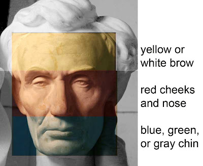 You skin looks a little bit dead/waxxy, and could do well with some more colour variation. Have a look at pictures like this for portrait painters to get an idea of what colours to use where and one pic to show a female, but it is a long one so I'm gonna leave it as a link: http://imgur.com/VqZz0
 -
Re: SW E3 teaser poster
 I think a better poster would have been a King Kong sized George Lucas ravenously shoving fan boys into his gaping maw while money was simultaneously shooting out of his ass. Would have been a more accurate portrait of what the past 3 movies have been about as well.
 -
Re: [Civil lol] ICE vs Born vs :-] vs Ponk vs Juzwa vs Kotisded vs P3k+
 Day 4. So. On monday i need to draw 50 people poses 5min each, 10 ended photoshop paintings, self portrait, 2 projects of rotoscopy in AE, 2 animations-20 sec of robot and 15 of facial, and poses one. AAAAAAA!!!! Dunno when I`ll show next progress. Hate mondays.
 -
Re: Virtua fighter 5 screenies
 The characters have the same blocky looks and moves they've have since TTT. It's like 'Oh New Tekken, lets subdivide the models ftw!' The backgrounds are less than innovative, and some of the choices they've made in the past for character portraits are strange. Tekken 4 Xuing-whatever chick looked like she was hit in the…
 -
Re: Am I overcharging for Art Assets: Freelance Question
 i think eric has it spot on, i have always been active in art communities, years ago much more so than now, especially in german ones. when I lost my job I was known by the local artists, I publically said i will be out of a job soon and will be going freelance. But I didn't go freelance 100% straight away. My former…
 -
Re: Any tips on how to make my character's render look more realstic using VRay/3DS Max
 Yes, anatomical inaccuracy is the first thing that stands out. Once you get the sculpt down, try working on color zones for both the base color and the sub surface scattering color. https://alvalyn.com/using-color-zones-portraits/ The lighting could use more pop, it's very dark and grey and flat right now Last the render…
 -
Re: BladeofEvilsBane Concepts
 That design is amazing! The hair and spikes would read really well in the portrait view, and I think the skirt would read well from the in-game view. My one suggestion though, would be to make the ghosts a bit more green. They're really really small in game, and the skirt might make it not instantly recognizable, since…
>2561 results