Search
-
Re: [WIP] Purgatory Knight

 That's actually a pretty interesting mix of ideas ! I like it :) Modeling wise it also looks quite good already ! I would even go further and develop the concept a bit more, it might give you ideas/pointers for the overall design: ○ When I think about purgatory I think about the temperature of the environment (fire or ice…
 -
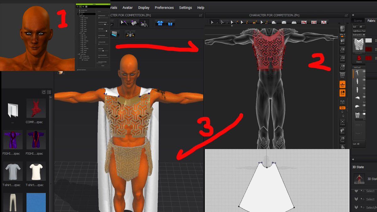
Re: Paul-Improvement Thread Doing some VFX! Critiques welcome

 Thanks @pmiller001 these screens helped get a better idea. Nice work so far, your ref sheet is good, but also has a pitfall that there isn't a central piece being followed from what I gather. -1) Edges on armor are sharp, maybe you are keeping it like that for the editing phase, final should be rounded off and apply some…
 -
Re: Warcraft Orc
 @rhinokey i love uruk hai, specifically your berserker there :D . but ya that is more MY style, i'm just sort of trying to stick with blizzard style (which i'm slowly drifting further and further from...so i might just stick with my style on this guy :D ). 1. finely crafter armor: ya i know what you mean. however, i really…
 -
Re: Reallusion Character Design - JoeLoXYongChuang

 Reply by JOELO_YONGCHUANG · · Home› Contests & Challenges Archives› Reallusion's 3D Character Design Contest 2016DAY7-13 MAKING ANOTHER CHARACTER WHICH WILL SHOW ON SCENE Since the reallusion competition will soon come to the end, I try to post my WIP once a week only. Now, let's me summarize what I have done this week. As this will be bored for Amy Lee to act alone, let's me created another hero in my scene. His name is Oneirol. In…
 -
Re: Help me be become not-so-sucking artist :3
 Ok for the anatomy/proportions... First off. Remove the head and armor from the body and check proportions to a human female of the same build of your character. Not the concept art, but actual human photos. You can find good resources at 3d.sk if you don't have any reference already. Look at the image and your model from…
 -
Re: Seforin's Self improving thread(sCulpting/anatomy)
 That armor is looking great, the anatomy is improving nice work! Crits: Copied form IM for posterity, yeah I'm cheap like that... - The eyes and brows could be moved up the head. The face is sitting pretty low in the head and the nose looks kind of short. - The space from the outer corner of the eyes to his ears seems kind…
 -
Re: Titan Quest
 Hopefully we will catch most of the issues in the patch. I think we did go a little crazy with the graphics but we wanted something that could hold up graphically for a while to come. Try to keep the shader quality on high as medium drops out the bump maps all together (low kills the poly grass). Im going to be posting…
 -
Re: Brutal Knights - Game Project/Learning Experience
 Very nice! You probably could push the highlights on the grey parts of the armor some more, e.g. the ridges, but perhaps you wanted to contrast that with the golden parts.
 -
Aqua Knight
 I'm starting a wip thread since i've been working on this for 2-3 days. It's Aqua Knight by Yukito Kishiro, a manga comic: I'm no big manga fan, but this is one of the freshest and most original universes I've come across so far. very light-hearted and well-designed with detail put into every aspect. I just love how it's…
 -
Ceebee Stuffs - Time to get crackin'
 So I have the habit of not posting any of my work anywhere, which I need to start breaking especially if I ever intend on becoming a good character artist. I've got about 8 months left of school and I want to make the best of it outside of school as well. I figured the best place to start posting stuff for crits would be…
>6843 results