Search
-
Re: My low poly environment.
 I like the style, two things that jump out to me: 1) I think the gradient you have on your buildings isn't working, especially how it goes dark through to light and then dark again. 2) Everything is very stylised in a fairly simple way, apart from the rock texture. It's much higher in detail when compared to all the other…
 -
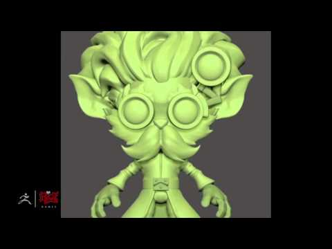
Re: Sketchbook:TeriyakiStyle
 I'm looking at it, for what it's worth! I really love the direction this is going in. If you manage to keep the simple shapes you've got in the concept for the end result, and don't over-complicate it with the texturing, this could turn out great! With the little toy robot though, I feel as if that's already a bit too…
 -
Re: Granny [WIP]
 Nice job! Maybe the hairline should go back slightly on the top and the reference shows the hair the be pulled back the the point where we don't really see a bump for its starting point on the forehead. I know it's a stylised piece but maybe you should try implementing some simple wrinkling around the neck and chin as the…
 -
Re: Handpainted Fantasy Sword

 Wraps are really simple to do! just need to problem solve!, This is a great video to watch from Josh Singh, he uses Zbrush in a very simple but effective way in this tutorial, great for beginners. Skip to 28:30 and you can get an idea on how he does wraps. super simple, great results for stylised meshes…
 -
Re: [WIP] Anthro Tiger + Fantasy Armor (feedback welcome)
 First off, that armour looks awesome! But the tiger looks very cartoony in comparison and the two pieces just don't match. I would either pick a more stylised concept for the armour or go for a more realistic tiger head - with tiger like teeth - instead. I would find some references of anthro tigers and real tigers and…
 -
Re: [WIP] Sea Of Theives Fan Art - Pirate Lord's Staff

 Testing the Stick! Just a quick test for how the staff is looking with some basic map bakes (Normal, AO, Curvature) I can see a lot of issues just beneath the middle of the staff, so some TLC is needed there but overall it's not as bad as I thought Any texture artists wanna give me some advice for stylised wood I will love…
 -
Re: Gcanlas WIP assets
Thanks, We're trying to styalize it in a weird way, referencing games like el sheddai and insanely twisted shadow planet and the like. The game over all might turn out flattish but might fit in with the style. its fustrating for me to say the least. was playing with this again. but I'm still not happy with it. messed with… -
Re: Lunch hour Mudbox doodle - Old man head
 I think the forms and facial anatomy in general need to be worked on more before going into wrinkles, as right now it looks very 'blobby' even for a stylised piece. The wrinkles on the forehead for example look especially odd. Also, the random veins plotted around the face don't make much sense - it would be better to…
 -
Re: Watermill_House_Game_Asset_WIP

 Hi, So i worked on a lot of things for this update.. Updated my textures, added bricks and cement sheets behind. I did a bit of lighting too so i know the colors and the mood is set correctly. I am going into getting this into something more stylised with lighting and the mood. I am happy with the result right now. Any…
 -
Re: [Riot Art Contest] - Xerath
 Reply by Kel-Shaded · · Home› Contests & Challenges Archives› Riot Art Contest› Riot Art Contest - Character ArtSharpened up my block out and started adding my vines, Also quickly added the skin for his green glow, though after a while of calling it a skin and the white glow inside it the skeleton, I've decided to actually make a stylised 'light' skeleton to sit inside the green glow next. It sounds pretty lax, but it was a well…
>8493 results