Search
-
Re: Need Help Please!
 I agree with cryrid, the UV layout isn't helping at all. It's wasting space and wasting pixels. You could make a few adjustments, straighten some pieces out and utilize more pixels. There is way too much lighting, highlights and shadows in the diffuse material. The diffuse is just color information with hints of lighting…
 -
Re: [UE4] Star Wars: Droid Control Ship

 Hey Seehr! Nice to see you here! Sorry for the late reply, I wasn't notified about yours, don't know why, so I only saw it now -_-' . I was trying to do it with an exported full animation from Maya because the door has this animated piece that moves along with it, so it seemed to me it would be tricky to parent one thing…
 -
Re: Fantasy Graveyard Mini Scene
 Jmt is right. Your backside looks best, your frontside lacks story, and clarity. With a graveyard scene, it should probably be immediatly visible whats going on. I really had to look twice before identifying the open-grave as an open-grave and the 2nd stone as a gravestone. The lamp is in a quite odd position (i wouldnt…
 -
Re: Anyone familiar with Gameloft's hiring process?
Looking for work is like... trawling for crabs (no I don't mean down in the red light district), you take your boat out to a spot you think has a lot of crabs and you drop a few pots and then go to another spot and do the same thing. Later you come back and pick them up and see what you have. Normally you find some crazy… -
Re: New Member-Feedback on car model
 It looks pretty good in hi poly. And as for having it at 2 iterations, it wouldn't matter on high poly, so long as it doesn't give you problems. I can see where topology might be issue in some areas. I believe you're NURBs modelling in a way if your utilizing turboSmooth to create the high poly? For this situation, since…
 -
Re: CG Character reel 2020
 @theycallmedualian In your first post on this thread you called Ashish's work "lame" instead of "tame". If that was a typo let us know, but that might be part of why Teodar 23 thought your first comment was meant as an insult. @AshishVerma, sorry we didn't realize you were looking for critiques earlier but you didn't…
 -
Re: [CE3] Abandoned View
 Dear Mat (and your effect), This scene is really coming along. Your sculpt is lovely, and it looks to be making a great little vignette. Two things stand out to me: Your colors and your lighting. Your colors are all coming from that same warm tone family - Reds, browns, oranges. I think the scene could use a little…
 -
Re: Burrill's WIP Thread
Lighting is built, lightmap resolution is turned up to 64 (but it could definitely be lower), and the lightmap UV's are on a seperate UV channel (Texture is on channel 0, lightmap is on channel 1. I just have a simple point light right above it, I have a feeling it might be a light setting. Here's my lightmap UV: -
Re: [UE4] The Library (WIP)
 @ANamedUser I really like this update! Definitely feeling better! Personally I would choose Layout B. - Layout A feels to cramped, although I like that perspective alot, as it feels pretty powerful and focused, but you lose alot. - Layout C just doesnt feel right losing the height. Somethings I might consider addressing: -…
 -
[WIP] [UE4] Hospital Hallway

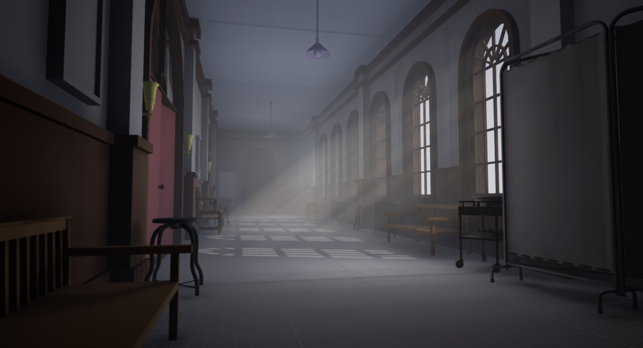 Hi everyone, recently I have started working on a new personal project. The main focus of this project is to work on my lighting skills, while also trying to improve my other skills. The simple plan for this environment is to create everything and then come up with a few different lighting scenarios. I currently have 3…
>90535 results