Search
-
Re: Guilty Gear XRD shader in Unity?

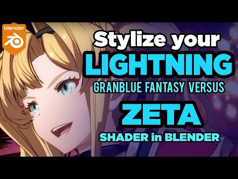 Just in case anyone else is reading this thread, I was an ex Softimage user for 15+ years, and I transported the principles of the Guilty Gear Stylized shader series into Blender as a Blender Foundation Certified Trainer. Check this out >> I also started the GranBlue Fantasy Versus stylized shader playlist >>…
 -
Re: Pro Bender (ala Legend of Korra)
 While the stylization of the proportion is really nice it doesn't fit the style of the Legend of Korra at all. If it wasn't written in the thread title I would have never guessed it was based on that show =/ So what is your goal for this character? Do you want it to fit in the world of Avatar or just make a nice stylized…
 -
Re: [Mobile] 2D sidescroller
 Butthair: I agree about the leaves now that you point it out. I will try to get them to blend in with the rest of the pieces. About the waterfall, I had a more stylized version before but it stod out, I will give it another try to mix the realistic variant with something more stylized though. Thanks for the crits. Btw nice…
 -
Re: Critique on my first Female 3d model
 It looks janky most likely because you decided to do stylized so you could take some loberties with the mountains. Do a one to one study of real life human anatomy. You’re not quite ready for this kind of study to be as successful as you want it to be. Stylization works best when you know what complexities you’re…
 -
Re: SOS, My portfolio needs your help!
 While stylized is fun man it all stems from realistic right. If you understand the forms and rhythm you can transfer the skill to make a stylized piece. I would say it does not really work the other way. I would stay away from the simpler models your portfolio should showcase how awesome you are as a modeler.
 -
Re: Feedback on 3D Modeling Portfolio
 I think that you should start focusing on creating a bit more complex stylized characters, right now both characters have very basic textures which is fine but you want to show recruiters etc that you also poses more advanced stylized texturing techniques, take a look at stuff like this…
 -
Re: Bertie... The Robot
 Looking at the upper right ref, which seem to be the revolver, and comparing it to yours: The overall gun style is a bit beefier. Yours is not as stylized. The cylinder should be a lot bigger / longer. Also falls into the same category as keeping it stylized. The front sight is to low compared to the concept. Overall, go…
 -
Re: Environment Artist, Building Design and Asset Design
 That's nice of you Luke. Actually, I'm not really interested in Photorealism; It's supposed to be a cross between something stylized and something more ‘‘realistic’’.
 -
Re: Which PBR is really physically based?
 why? because we can't do many materials with this, and stylized stuff become even more complicated. colored highlights? mix some metal in, make it brighter to compensate! xD
 -
Re: Late Night Posts

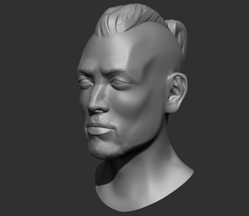 Re-worked/stylized an old model and for some reason I keep ending up with a half baked man bun for the hair style.
>7190 results