L3xicon - art dump
hey guys and gals ")
well this is my first time posting my work here, but I have been a long time lurker on polycount
I am going to be updating my portfolio, and I plan to spend the next few weeks finalising a few projects for it and a show reel. so here is was I have so far, and any advice, crits, or ideas on how I might improve my work, please post it! It will be greatly appreciated.
my apologies in advance for the amount of images in this post, i got carried away!
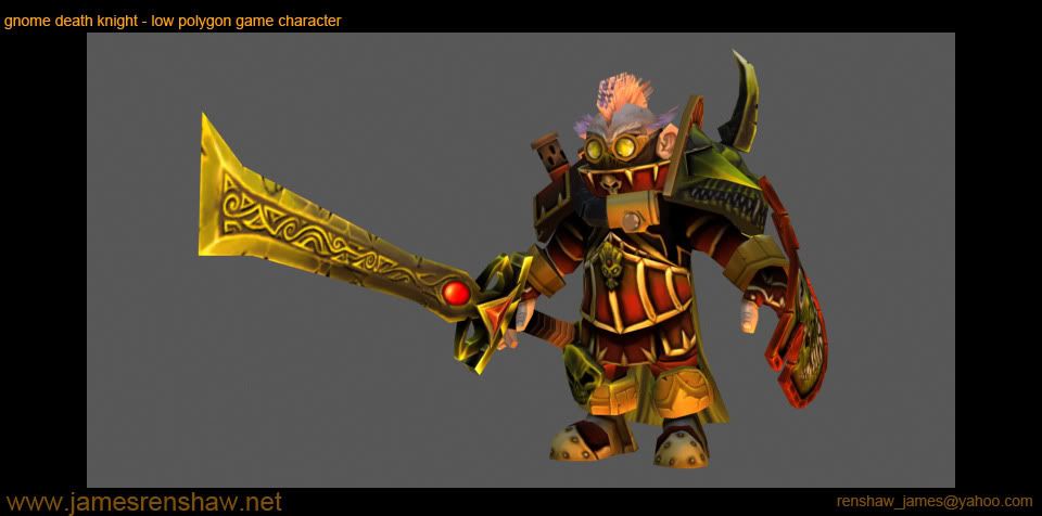
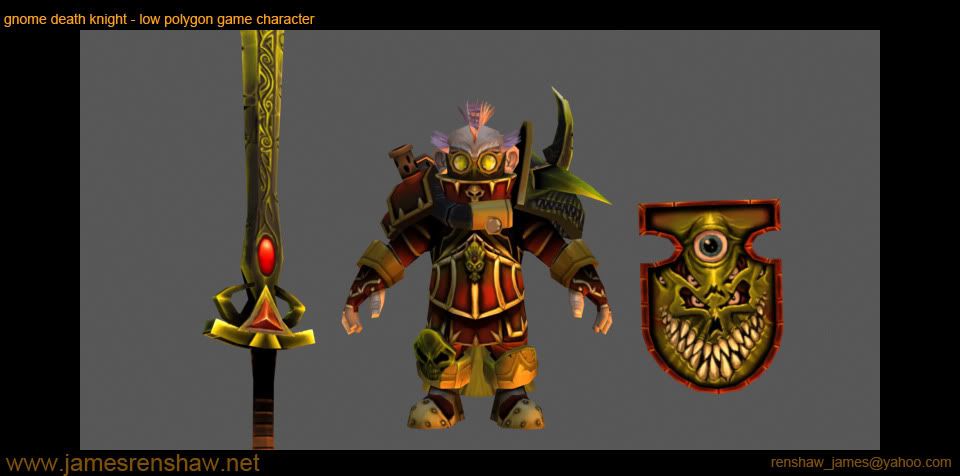
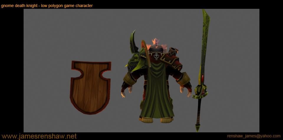
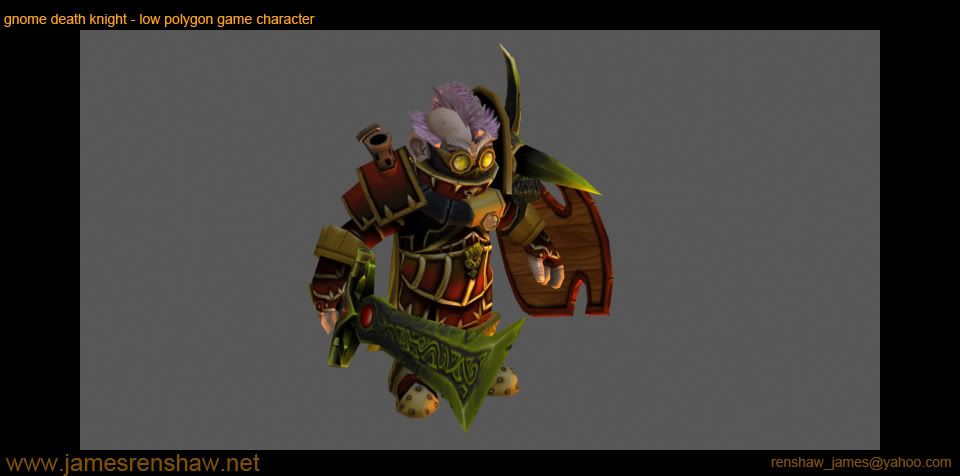
first off, a gnome death knight I started for a low poly modelling challenge and completed this weekend.
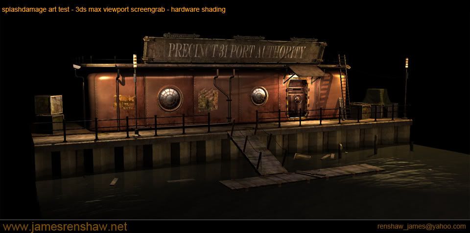
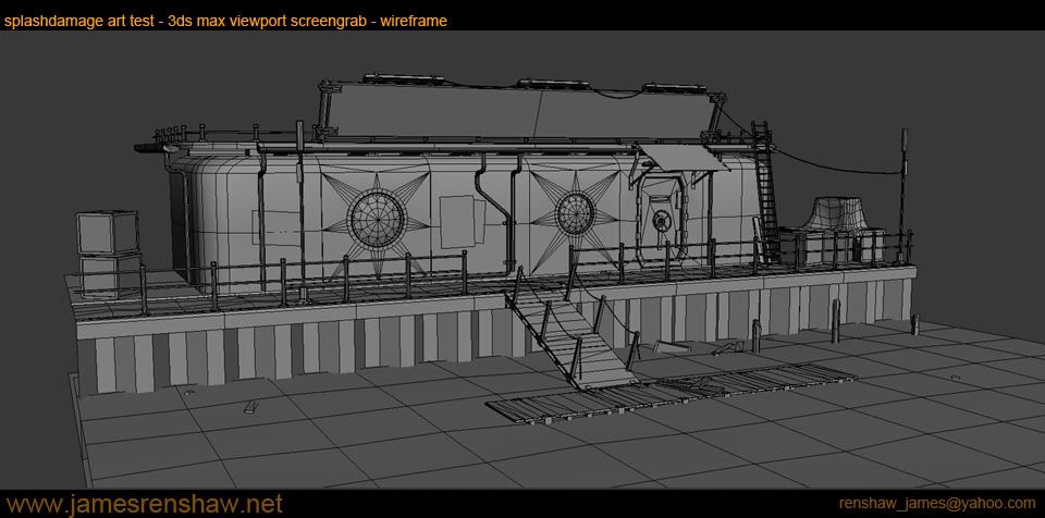
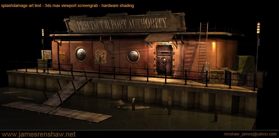
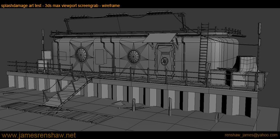
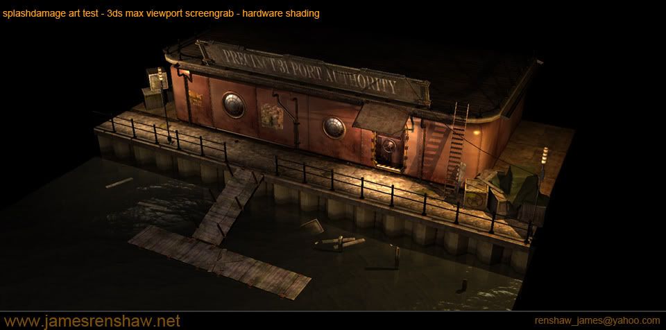
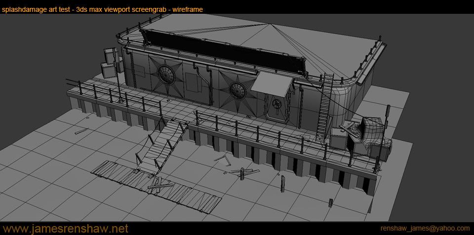
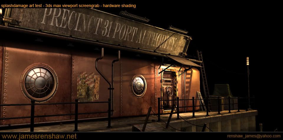
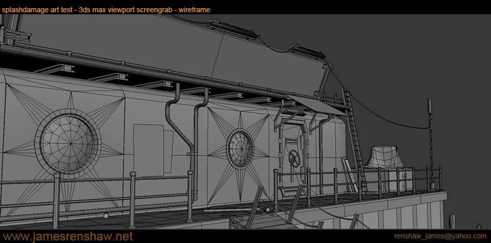
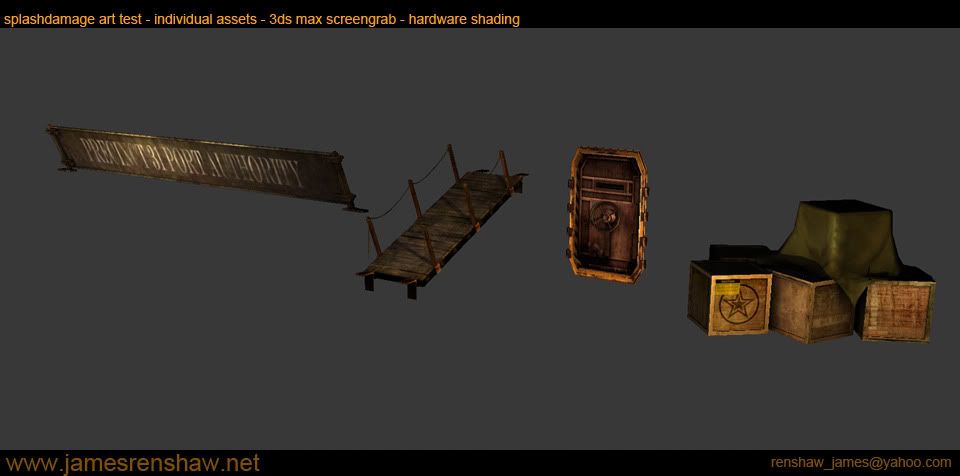
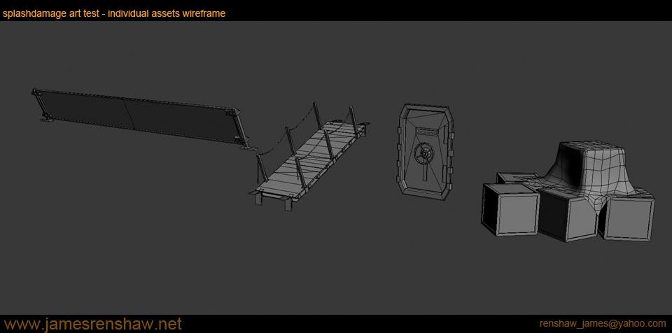
secondly an art test for Splashdamage Studios.
video fly-through's:
[ame]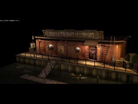 http://www.youtube.com/watch?v=yGsco9Fg6tU[/ame][/URL
[ame]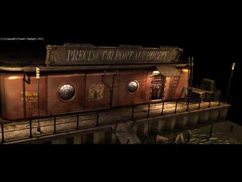 http://www.youtube.com/watch?v=dWUtiwY1LpU[/ame][/URL
well this is my first time posting my work here, but I have been a long time lurker on polycount
I am going to be updating my portfolio, and I plan to spend the next few weeks finalising a few projects for it and a show reel. so here is was I have so far, and any advice, crits, or ideas on how I might improve my work, please post it! It will be greatly appreciated.
my apologies in advance for the amount of images in this post, i got carried away!
first off, a gnome death knight I started for a low poly modelling challenge and completed this weekend.
secondly an art test for Splashdamage Studios.
video fly-through's:
[ame]
http://www.youtube.com/watch?v=yGsco9Fg6tU[/ame][/URL[ame]
http://www.youtube.com/watch?v=dWUtiwY1LpU[/ame][/URL
Replies
video fly throughs:
[ame]
[ame]
and finally for now, an art test for Ruffian Studios.
again, if anyone has any suggestions on improving my work, please let me know!
As for the windows, I've had this pointed out by a few people lol. originally there was going to be some kind of basic interior area, then the window itself goes in further than the wall, so I was going to deal with that with an alpha.. the wall behind then became part of the same tiling texture as for the rest of the walls so the cuts got added to allow for the hole.
that being said, with no interior now, I think it is not evident that the window frames are deeper than the wall, and I think you are absolutley correct, I can achieve the same effect I have now with floating geometry, and save all those tri's
thanks
Other than that, seriously some nice work. Lots of art tests these days huh?
[EDIT] scrap that, see that the problem is with the videos rather than the image links :P thanks for the heads up
I get this: http://www.http.com//www.youtube.com/watch?v=rA52t-ZIB-I
in my address bar when clicking one of them.
You have a LOT of stuff on your web site too. Whats your focus?
Much better now since they're all right in the post. Super convenient.
That gnome death knight was nicely done. Very warcarfty. The shield however does not seem to fit, it is a cool painting, but looks like a painting not a shield. Keep it simple and cool like his armor. Also, the shield has no handle, how is he holding it?
Splash damage art test- Great take on the concept, nice atmosphere and feeling. The wall however seems to have a few problems. All those polys wasted cutting the window into the wall, just have it be floating over top, no cutting needed. And I see the style wall you were going for, which is awesome, but you didn't quite hit it. It looks like leather and not metal. Some tweaking of the spec should fix that. Get some sharp highlights like you have on the window frame going and it should be good to go. Save what you have there to use on a leather chair! And bam!, one more prop for the portfolio.
The star wars modular set is neat, but should be textured. It seems unfinished and unimpressive without some textures, g-unit.
Building is looking okay, but I think you can make it look great with some changes. First off, I don't know what the concept they sent you was, but you got like 5 brick styles going on here. The other problem is the texel density is all over the place. The standard wall brick has tons of detail while that vertical dark brown trim brick is blurry and stretched out. There should be one main style of brick, a border/trim style and maybe one accent style. Keeping it simple with a few accents here and there on that building should make it look a lot better. Pick you accent spots carefully like entry and maybe top floor center should draw attention to the right places and really help the design.
Hope these were helpful, didn't mean to write a novel there, it just came out. Looks like you are on the way to a kick ass portfolio. Keep it up!
thanks, I'll take a look at increasing the size of the renders. I think the originals are all 1280, so should be easy fix
Cody, fantastic crits, and great ideas on all pieces. thanks! I ll be certain to take a look at making your suggested changes.
First off, embiggen-ise those pictures!
The Gnome Death Knight looks nice and bulky, and his hair does hold up fairly well at most angles - the only exception being the front, in which there's some artifacts.
You did a nice job on his texture, too, although I don't much like the colours. There's a bit of a mix between oversaturated colours and really undersaturated ones, making it look at once as a toy, as well as dirty. One example of this is on the sword: it goes from a sort of grey into almost pure yellow.
The actual shading is nicely done, it's just the colour-use that I'm no great fan of.
I also agree with cody that the shield --while nice-- clashes with the rest, and just reads as being a flat painting. It also doesn't mirror any of the chunky shapes you used in the model
Splash Damage art test:
A big pet peeve of Oldmanmurray.com used to be crates, and how exactly they got to their current location. They're a pretty convenient space-filler, and certainly do make sense on a dock, but did you consider adding pallets?
One thing that was mentioned a lot when I posted my art test is that there weren't visual clues as to the ebb and flow of the tides, and the water-damage that it does.
No crits on the Star Wars-scene, I think you did a really nice job on that. It screams out for a texture, but that's besides the point
The Ruffian art test is really nice, too. I think you did a good job within the constraints and technical limits of the art test. The spec/diffuse combo works really well, I think. The spec is quite strong, but then --without normals-- I think that's a good thing. The high spec does a good job of setting it apart stylistically, rather than making things look like plastic.
Edit: oh, and what Bulls_eye said. He really summed things up a lot better than I did. Succinct!
I made another quick pass at the splashdamage scene and modified the window walls as you guys suggested to save those tri's
thanks again for the crits and comments. any further suggestions as always are welcome.
smooth work, great colors and style