Gladiator Planet

polycounter lvl 17
For my senior project i'm creating characters to a world of gladiators. I'm going to post all of them in this thread as i make em.
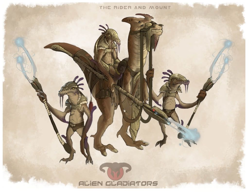
It's basically a planet of aliens, creatures and beasts centered around millions of gladiator tournaments.
The first are the moderators of the fights. They aren't the main inhabitants...but they are from this planet. They ride on their mounts in the arena, making sure no one tries to escape. Since they are small, there are many of them in the arena at once.
The Lowpoly is done and baked...I just have to post a picture of it. I'll do that after class.
Replies
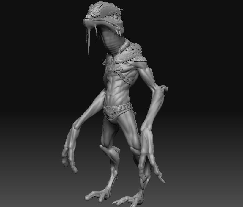
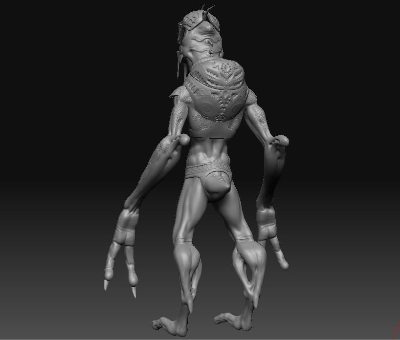
The only thing that stands out to me is that he's got really long forearms and it seems like it would be really hard to hold up those massive hands/forearms with such a little bicep. If he's going to be in the arena, I would be concerned.
Looking forward to seeing more.
You can probably just scale the forearm+hand down in the lowpoly model.
Thanks guys.
Looking good man. Low and high turned out pretty legit. Keep up the good work bud. Finish that mount and weapon!
I'm a fan of the massive forearms :P
yeah, i like the massive forearms too adam hah. im going to make them smaller and see how it looks. i'll probably keep em big though. Just cause i think it'd look rad having his arms kind of hang from the mount.
My mentality going into this project was that i wanted it to be high detail, high frequency detail. I'm doing it on purpose...although i understand that it should serve a purpose.
But looking at actual gladiators, roman warriors and stuff....the symbols and marks they had on their armor, shields and swords were pure decoration. Be it for luck, religion or what have you. So they are just designs, made by the aliens...religious or cultural.
Honestly, i just wanted to make my shit look cool haha.
But i will put in to account on the other models....its functionality.
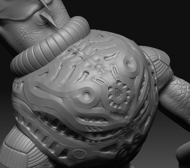
I think the back armor does make sense, because these guys are riding on animals that seem to be running fast and if they fall it will protect their back from the impact, just like you see on motorcycle riders.
Good work so far Wes, I think you got good detailing work going on. By far the best characters I've seen in school so far, cant wait to see them textured. Keep it up dude.
Some of that you could likely get away with in texturing, but having a specific motif or pattern that is recognizable as decorative (to humans.. as they are your actual audience) can really help sell your intentions. Even based on say the alien's head, or their mount, or some symbol that is readily repeated in their banners or architecture.
Almost done with this little guy. I have alot of work to do on his skin texture though.
His armor isnt even textured..it's just a solid color for now to see how itll work with the rest of him.
Have you tried experimenting with using more patterning along other parts of the body, his arms for example, to try and break up some of that more monotonous brown tone that tends to run along the back half of the character?
Yeah im going to really spec the armor up alot. Since it's made of brass/copper, i'm going to really push and pull those highlights and lowlights.
I am actually looking at other animal references to find some good patterns to put on his arms, side of his legs and back.
It reminded me more of a dolphin when I first looked at it.
Looking great, really nice work! The forehead might be a little too bulbus compaired to the concept but its a change I like.
Vig: haha, definitely does look abit like a dolphin with that snout. I didnt even realize. I guess my sub-conscious mind is a dolphin lover, who know. yeah i wanted him to have an interesting profile...the bulbous head was a conscious change
Thanks guys for the crits. I'm excited to see how you guys like the finished product. He's almost done so stay tuned!
I'm diggin the work thus far. Really looking forward to your textures and shaders. Keep at it!
Finished the armor textures. I'm moving at a snails pace unfortunately, but im working on it. I still have some stuff to do on his body textures.
Working on the weapon right now, when im done with that im going to finish up on his body textures. I'm trying to have him done by the end of the night.
compared to before:
The long arms were a design choice i thought would look "cool" with him sitting on his mount. It would really create an interesting silhouette with him on the mount.
agreed on the feet being too small...they should be abit thicker.
The only problem i have with your paint over of the design as a whole..is that i like the dangly pieces of flesh. It breaks the silhouette making it more interesting IMO, and will add for secondary movement when animated.
The holes in his leges were also a design choice i thought was nice. I didnt want him to have boring legs, so i thought ways i could make him look more alien.
Thanks man, i'll make some of the adjustments when im done texturing everything.
some presentation critique though if you don't mind
your rendering has a gray layer which is common if you leave everything to default at rendering like just white lights (main source for grayish renderings) but also environment settings can change the outcome of the rendering.
I took your last rendering and applied a quick light shade pass in PS (just some soft light layer blend with a warm light colour) and some minor blooming effects. The background has also some warmth so that the overall image transports better life and a warm climate.
just a screenshot from the PS layer stuff:
if you want to render those with MR you could use for example the glare shader which creates nice blooming effects. Also I would place a background light (behind the character) in a cold or darker colour (green would work too but looks sometimes odd). This little extra light in the background makes your character pop out even more because you have 2 light sources from different angles with different colors giving a better contrast over the body. And the front key light light yellow with a touch of orange if you want to fake warm climate.
yeah i've had alot of problems with my rendering, yah know it's not really anything i've had time to get around to. I love that Unreal looking blooming effect too. I'm not sure how to do those things in 3ds max. Could you give me a quick run through of how to get the glare shader?
I'll work on the rendering tonight and post it up! Thanks for the paint over too man. Looks so much better than my render ha.
Check it out:
http://boards.polycount.net/showthread.php?t=61346
Thanks
Some complete walkthroughs are available here:
http://masteringmentalray.surpass.nl/content/view/36/10/
http://www.dmmultimedia.com/3dtips_04c.htm
http://www.evermotion.org/vbulletin/showthread.php?t=39551
as for the warm cold contrast - its one of many to add more depth and information to your rendering,
you basicly have 2 opposed color groups that create contrast when using against each other. A typical interpretation would be a dawn or night scene in where the environment is already blue or pink tinted and a key light in fron of the object would be a fire.
Or if you have a daylight the skydome reflecting blue and the self illumination or sun reflects a warm tone on the object from the front - because often in photography one would like to have the sun in ones back and not in front.
there is some rough basic written in wikipedia
http://en.wikipedia.org/wiki/Color_theory
(scroll down to Warm vs. cool colors)
Some popular examples of this technique (used a lot lately)
1.) very obvious used here:
http://www.bingegamer.net/wp-content/uploads/2008/12/duke-nukem-forever.jpg
2.) in the earlier screen of GOW it was more visible - after that they often went more towards brownish and orange
http://storage.canoe.ca/v1/blogs-prod-static/mediam/GearsLove.jpg
The 3 point lighting was mastered in the film noir genre back in the 1940's till late 1950's. Because most of the media was in Greyscale and color contrast's for example where simply not possible they used this technique in order to pop out the characters better. Modern film noir's like blade runner use this technique alot - but its a general standard in filming today anyway.
http://en.wikipedia.org/wiki/Three-point_lighting
the way I use it in combination with the cold/warm contrast is to use the blue color as backlight and the warm one (usually an orange or yellow) more in the front or at the side.
Rendered in Max still. Trying to figure out Marmoset at the moment.
Not really feeling the blade end of the weapon atm. I dig the way you did it in the concept. Seems slightly flat and boring without some electricity surging through it. You planning on a particle effect or post render touch up? But the staff part of the weapon is looking pretty dope. I like that addition of the hand guards.
Now just finish that mount and you'll be set. Keep up the good work.