Test Fail , but gonna fix it
polycounter lvl 18
ok so you might have seen this test floating around here before, but I got offered to do this test at net devil.
so the test specs were a bit unusual but.
Specs:
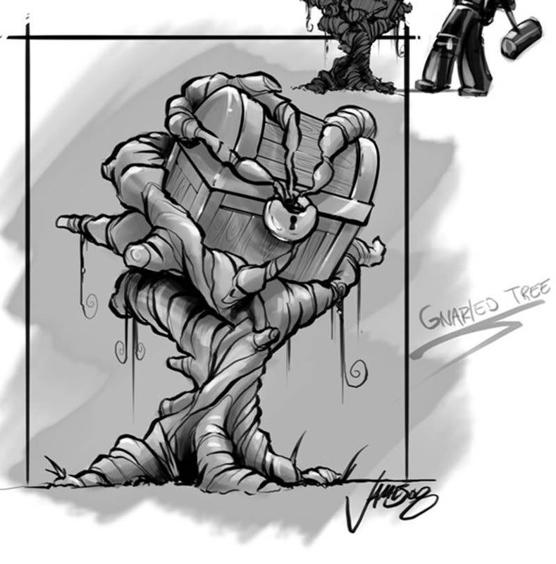
Model, texture, light and render gnarled tree image or couch image (NetDevil_test.jpg) or (NetDevil_test2.jpg)
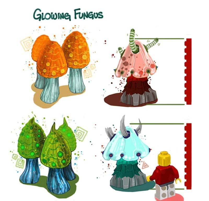
Use Glowing Fungus image as style guide for some of the color use that we use in our game zone (Color_Use.jpg)
No poly limit- (if you think it looks good in High or low poly trust your gut instinct).
512x512 map(s)
Due Monday 10-27-08 10am MTN
3 view Jpg, Texture files, plus maya or max file.
Note: Style over photo-realism. Im not looking for photo-rips for textures. Use color or vert tint to add life to the models. You can use any techniques you need to create a clean efficient game ready model. Really concentrate on making the very best textures you possible can and dont rely on model to show all details.
Based off the concepts given and the color pallet I was figuring this was for a more MMO based spec and I tried to keep it nice and still low on geo and such.
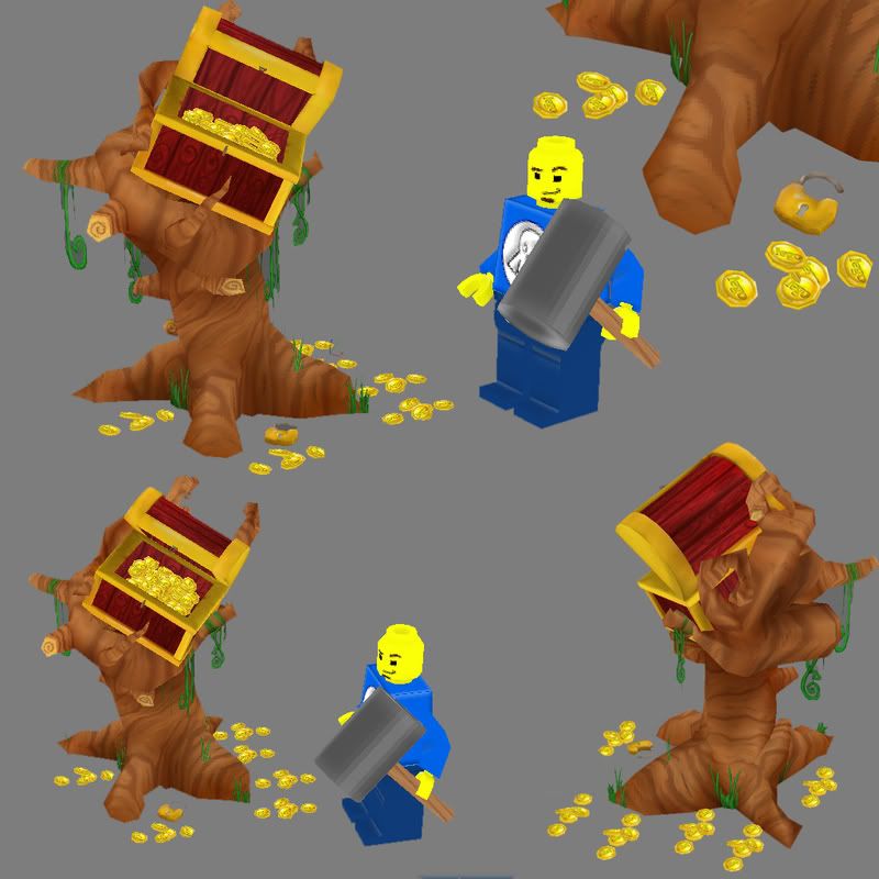
so this is what I turned in using vertex lighting and such (yea I decided to add in the lego guy , which did wind up shooting me a bit in the foot but not majorly)
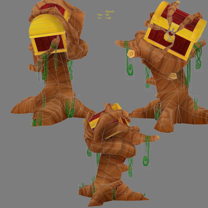
So after I got the email today I emailed back asking what exactly they didnt like, there major gripe from what they told me was that the colors were to ambient light and not enough shadows or highlights in the texture itself and not enough lighting baked in.
So after talkign with a few people today and getting some advice I re uniquely unwrapped my model and baked out a pass of lighting into the texture itself and a AO pass on the model (keep in mind now there is no overlaying parts)
And this is without any Vertex lighting to the model at the moment....so better step in the right direction or no?
I really wanna see// learn what I did wrong so I can resubmit this maybe make a impression or something.
so the test specs were a bit unusual but.
Specs:
Model, texture, light and render gnarled tree image or couch image (NetDevil_test.jpg) or (NetDevil_test2.jpg)
Use Glowing Fungus image as style guide for some of the color use that we use in our game zone (Color_Use.jpg)
No poly limit- (if you think it looks good in High or low poly trust your gut instinct).
512x512 map(s)
Due Monday 10-27-08 10am MTN
3 view Jpg, Texture files, plus maya or max file.
Note: Style over photo-realism. Im not looking for photo-rips for textures. Use color or vert tint to add life to the models. You can use any techniques you need to create a clean efficient game ready model. Really concentrate on making the very best textures you possible can and dont rely on model to show all details.
Based off the concepts given and the color pallet I was figuring this was for a more MMO based spec and I tried to keep it nice and still low on geo and such.
so this is what I turned in using vertex lighting and such (yea I decided to add in the lego guy , which did wind up shooting me a bit in the foot but not majorly)
So after I got the email today I emailed back asking what exactly they didnt like, there major gripe from what they told me was that the colors were to ambient light and not enough shadows or highlights in the texture itself and not enough lighting baked in.
So after talkign with a few people today and getting some advice I re uniquely unwrapped my model and baked out a pass of lighting into the texture itself and a AO pass on the model (keep in mind now there is no overlaying parts)
And this is without any Vertex lighting to the model at the moment....so better step in the right direction or no?
I really wanna see// learn what I did wrong so I can resubmit this maybe make a impression or something.
Replies
I'm sorry you didn't get the job Seforin. You're in good company though. I actually applied and was rejected from NetDevil a few weeks ago. Generally what I've found with art tests is that companies aren't really looking for a lot of embellishment; if they give you a piece of concept art, they want you to match it as closely as possible.
All in all though, you've made a great first-pass on your test. The model is good, it just needs a few tweaks on the texture.
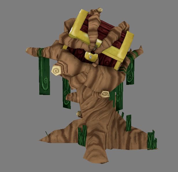
So a friend of mine showed me a method a method to bake lights in to the vertex coloring (I never knew you could do this till just a bit ago)
so he showed me a quick setup and gave me a idea of maybe making this a bit of a darker time of the day and such.
so heres the more newer angle im going with, really playing with lighting and baking in vertex colors.
Im thinking something a bit more swampy during the daytimeisk...
better or worse at this point?
ghost: Im believe the texture should pop but I believe what they wanted to see more is more depth with the lighting of the textures...so gonna see if I can add in what you said
polaris: Thanks man , but to be honest the people who gave me this test just seem to nice to me about reapply so I think im going to just push it the extra step even if it is a waste of time.
It's a good start, but I wouldn't called this a finished project. with a little love and attention it stands to be a nice little set piece, but you just need to buckle down and paint - forget the fancy work-arounds.
To be honest I think your first one was headed in the right direction. You weren't auditioning to be a lighting artist, you were auditioning to be a model and texture artist. The company told you the problem was that you didn't even enough contrast on the model itself. Look at your original model, there is hardly a change of contrast anywhere from lights to darks. Just slight variation.
For Example. The red inside of the chest is the exact same color as the red outside of the chest. This doesn't look right and it's that kind of detail that the company probably didn't like.
Otherwise, I think it's pretty cool and I wouldn't beat yourself up about it. It is really good. Just missed on one element.
But after reading some of their feedback, I agreed, the base texture needs some lovin and I think uniquely unwrapping a lot more of it would give you that freedom. Expecting vertex lighting to pick detailed shadow info on a really low poly object? I'm not sure that would turn out better then hand painting in some details. I don't think the texture reuse is really helping the piece if its keeping you from getting specific with details and lighting.
A lot of the UV pieces could be scaled down and others blown up and rearranged with very little impact to the current pixel density. At the very least pieces could be sewn together to reduce the seam count.
Also it looks like this would be placed in a swamp so it needs to reflect that. Wetness, dirt, grime, moss, slime ect, but keep that painterly lego feel. It might be wise to go a bit over the top and impress. That way they know what you can do, and its not hard to have someone dial it down a notch. I
Right now you have each color firmly locked into its place with very little hue and saturation difference, paint bucket fill style. The concept says "gnarled tree" but the gnarls aren't really pronounced.
The shape of the tree is off also. The trunk is fatter then the concept. The concept looks almost like a bunch of vines are clinging and twisted together in the shape of a skinny tree.
paint over:
I'd suggest you just keep working at that first version, adding contrast and depth. Also, you might want to try to add some sharpness and angularity to your texture, as the concept has more of that going on than your final texture, which reads more like something from Kingdom Hearts. As a base it's good though, just work some more 'bite' into that soft-edged first go.
is this looking a bit better?
first version is with vertex lighting and shading on and some additional lights in the area to add to this
2nd version is just the diffuse with no vertex lighting and shading turned off as well to just show how much AO I painted in and how much I darkened to add it
(im like really lost at this point to be honest guys)
This needs some work, but it's a solid base. Check out vig's paintover, it's spot on.
You're kindof vaguely adding color or lighting in hopes it changes things -- that's not what is needed right now. You need real depth and color variations in the forms.
It looks like you got a good base and are scared to mess it up. Just start a new layer, 100% opacity brush, and start painting. Bulk up some form, detail, and color in those shapes. Imagine you're sculpting -- you wouldn't just cut thin lines into a smooth surface, would you? Those knots and lines in the wood need depth and thickness.
Again, reference vig's paintover, and just dive in and start painting.
I'd do more big veins/ribs/vines and not so many small strands. big vines will read better at a distance, small vines blurs into visual noise.
Look at vig's paintover. notice how he has greens, reds, and oranges in the wood. It makes it much more vibrant. Look at the mushrooms - see how the green one has different greens and yellows and browns?
you should be painting with those colors and stop trying to mess with different lighting techniques. The problem is the monotone textures. Adding AO (which shouldn't be black, especially for this) or vertex lighting is just putting lipstick on a pig.
I will be working on mine again tonight, trying to nail it down better also. Skype me later if you feel like it, and we will talk it over
Take the time to take a step back and look at the screengrabs and try to point out what work and does not. There is always a fix!
more or less just elaborating on what i said earlier.
just a FYI: Vertex lighting this asset WAS part of the test. But I believe the texure will bring this out more...I'll do what I can later tonight...is the newer version (bottom one) going in a better direction to anyone though?
my .02 cents.
first off I painted in some more colors (reds and greens and some yellow hints)
I then took some the of the advice given above and some of the paint overs and took a combination of what I liked best
and I also fixed up the model proportions a bit...
so this looking better or am I just going backwards at this point?
For the record I want to break any lego I see now.
Some of the root base chunks still seem fat compared to the ref. The chest could use some tiny bits of green grime and wear. It still looks pretty much paint-bucket-fill. But the work you put into the trunk is paying off.
I also think you should add in the details on the chest Sectaurs painted in, rivets and corner guards. for the corner guards you might want to toss a few floating polys in that area, uniquely unwrapped. Might be able to get away with just doing the one corner?
I thought the same thing but they said more details and lighting in the texture itself so Im doing what they want
Real life scenes never have lighting that illuminates everything equally, and the majority of hue changes in real word objects does not come from their color but from the variations in the color of light that bounces off of them, and the level of intensity.
Your original test image did not have a shadow on it. It looked like everything was ambient, meaning, the color that was on the texture is the color that was emitted. This doesn't happen in real life.
Stop reading this and look at the room around you. Look up in the corners of the walls, notice how the walls change color as you get closer to the corners? This can be emulated with AO passes baked into the textures. Look at shades near a window. Notice how if the blinds are drawn, the color of the walls near the sides of the window have blue in them?
Now, your latest try just adds variation to the colors which is somewhat of a good idea, but if you look at the work as a whole, it hasn't changed the elements the company was talking about. The lighting is flat, the texture is just darker.
Set up a good lighting rig to really add contrast to the scene, add an AO pass to your original texture to bump up the shadows. And then once it's looking really sweet, render the lighting to a texture. I know there are tutorials that show you how to do this, but this is what they are talking about. Your 2nd attempt merely shifts the tone from bright to darker, it doesn't add much more to contrast.
Sectaurs paintover is below. This is the direction you need to move in. Notice the right side is much brighter than the left. Which side you choose and how you choose to place your highlights depends on the lighting. Use your reference images from the company to make these aesthetic choices.
need to fix gold more...
doing what I can for the wood...
vertex lighting on..
Repainting more again tonight....
The more I do this the more I just think im doing this incorrect to begin with.I wish I had help with mentors around me so I could push this more...Thanks for all the help everyone.
agreed
well I sent out this version last night (I promised I would resubmit to them by wednesday so I couldnt stretch it out anymore)
I sent out the max files but heres a screen shot
fixed vertex lighting , AO , and gold before one final send out, I did the best I could in the time I had with the wood, I appreciate all the help everyone gave me, I hope this new version makes these guys happy!
That said this is definitely higher quality painting than the previous two iterations, good luck.
Good luck, I hope it pans out this time!
2 cents too late:
- The new version is pretty dark. But has more contrasting values. First you did full bright hardy any shadows, now full dark with lots of shadow. (Which might be what they're looking for?)
-I think if they are looking for something slightly more realistic?
- I think you did a pretty good job of getting some shadows in there but going in and painting some high lights might help it pop a little more and provide some light direction.
You made the contrast much better now, but I don't think you've really nailed their stylesheet at all, and that's probably the thing you did right the first time around.
Frustrating to hear, I'm sure, but a mix of old and new might be best.
Examples:
The Buildings in Mos Esley
Dagobah
More Dagobah
Even more Dagobah
Even more Dagobah
Indiana Jones Swamp
Indiana Jones Jungle
Buildings in Indiana Jones
More Buildings in Indiana Jones
So I think its safe to wonder if they where looking for something a bit more realistic for something that blends into the background which more then likely won't be made out of lego blocks...
BUT it is a bit worrisome because someone else did this same art test a while back in a more next gen realistic style and they didn't bite either. So I'm interested to see what the hell it is they're looking for...
well to be honest I agree with all of you but well see what happens at this point still no email yet
im hoping that someone from there might see the frustrations/determination I went through to make this look better and maybe that might mean something to them? All I can do is hope for the best right?
Something tells me the frustration/determination might work against you. They might want people who can effortlessly crank out props, not have to do them a few times over =P