The BRAWL² Tournament Challenge has been announced!
It starts May 12, and ends Oct 17. Let's see what you got!
https://polycount.com/discussion/237047/the-brawl²-tournament
It starts May 12, and ends Oct 17. Let's see what you got!
https://polycount.com/discussion/237047/the-brawl²-tournament
Traveling Warrior Guy WIP
polycounter lvl 17
Hey Polycounters!
Been a lurker for quite a while and finally gathered the guts to post a WIP thread of my own. Been working on this through several redesigns and failures for about two years and I'm slowly getting sick of it never being as good as it could be. So I came to you for some C&C on the current design and the one I'm starting now. Here's my current level of skill.
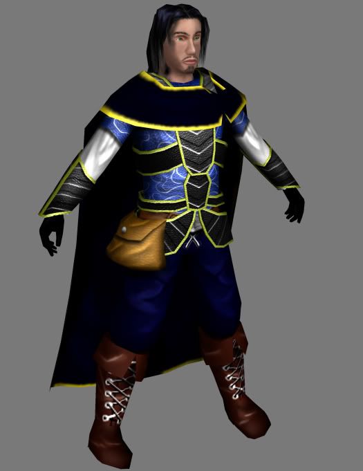
Diffuse and spec only.
Now, in my humble opinion, that blows. So here I am, restarting from scratch. Currently working on a new base to build upon, then starting the concept art. Mind ye, I can't draw worth a damn, so the concept is gonna be done completely in PS with a tablet.
I'll have a wireframe of the base up for crits later. In the meanwhile, any crits and comments on the current model and texture are very welcome.
Been a lurker for quite a while and finally gathered the guts to post a WIP thread of my own. Been working on this through several redesigns and failures for about two years and I'm slowly getting sick of it never being as good as it could be. So I came to you for some C&C on the current design and the one I'm starting now. Here's my current level of skill.
Diffuse and spec only.
Now, in my humble opinion, that blows. So here I am, restarting from scratch. Currently working on a new base to build upon, then starting the concept art. Mind ye, I can't draw worth a damn, so the concept is gonna be done completely in PS with a tablet.
I'll have a wireframe of the base up for crits later. In the meanwhile, any crits and comments on the current model and texture are very welcome.
Replies
ok seriously
the design itself is not the problem atm imo..
i would focus on texturing and reading some good texturing tutorials..
show please your texture flat for crit, it´s easier this way
some generel tips
disable texture filtering in your 3D app if possible (esp if you're working on low res textures)
and set your texture material to fullbright
try to free-payint more (do you have an art-pad?) rather than build it with selection->fill, filters an so on
use textur overlays very very subtle as long as you're working on lowres stuff .. it always tends to look odd
but keep going.. it needs some time, but you will get better
Yeah, I completely forgot to use texture overlays. Although the pristine look didn't bother me before...
Anyway, flats. Tons of unused space.
Body
Head
At first the face wasn't going to be mirrored, but in the end I figured I'd mirror most of the texture anyway, so...
EDIT: Linked the images. They're huge.
rollin suggested some texture overlays, which would be a big helper on this, but beneath those overlays you want to have some additional color variation as well, so that it wont just look like a boring flat color with an overlay on it.
Visit cgtextures.com and get some leather overlays for the boots and stuff, make sure your overlay materials and grunge maps coordinate with the material you're trying to represent.
HOpe this helps, cheers!
there ARE texture overlays.. even if it´s just some structural bump 2d-app whatever.. the thing is.. if your texture looks bad without overlay it will look even worse with it
overlays are just finishing stuff.. not a rescue operation
and I recommend reducing your textures to 512 each.. that's better for learning..
Anyway, dirtied the textures up a little. Still tweaking.
While I understand that character design isn't paramount right now, I'm still going to redesign it. I will, of course, keep working on the current one.
What size texture maps are you using? (guessing from the texture sheets 512x512 head, and 1024x1024 body)
Personally, I would create the textures off photo references if I were you, unless you are going for a cartoon style. Some people think its like cheating but plenty of people in the game industry do it because of harsh deadlines.
Like Rollin said, there isn't enough color variation right now. Like if you take a photo of just about anything and blow it up, you will see a huge array of different colors. I also think that you color contrast is too high right now. Your bright colors are too bright, and your dark colors are too dark.
Until you get a really good grasp of texturing real life objects, painting them from scratch might not be reasonable.
Personally, I am a huge video tutorial junkie, I would suggest you watch some of Eric Maslowski's free training videos at:
http://forum.cgarena.com/viewtopic.php?p=18974
He goes through, in depth, how to use photo references create a human face texture. The same theory can be applied to just about anything.
If you are interested in finding any other video training dvds, pm me and I would be happy to help.
http://www.pig-brain.com/tut01/tut01_01.htm
the question is really.. WHAT is he wearing? those black parts look like clothmetalleather and I can't really figure out what it is. once you know what he is actually wearing.. google some references and mimic!
also your folds are making no sense to me at all. it looks like the folding fairy came over and randomly put some folds here and there. on the arms it looks like his biceps jumped down to his elbow area (his left arm).
this is a good tutorial for painting. check out the materials section esecially:
http://itchstudios.com/psg/art_tut.htm