Hoverbot - Game Project
polycounter lvl 17
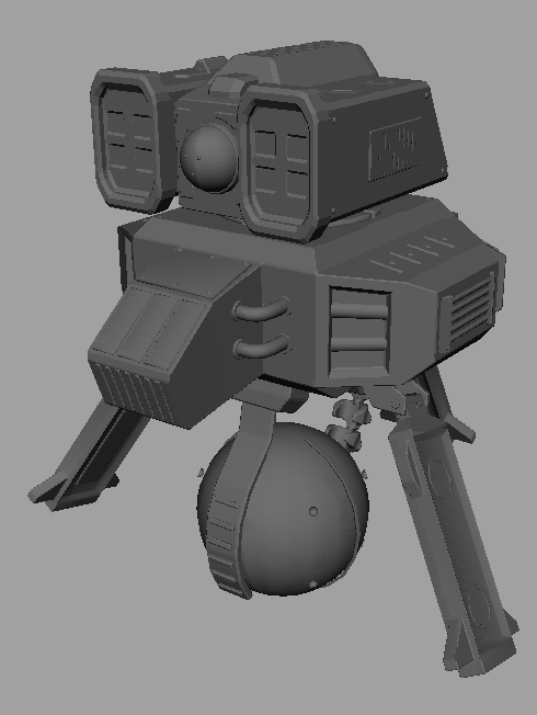
So we recently got a new game project going in school, and since I'm about done with one of the high poly-models I'm doing I thought I'd drop it in here for some comments and critics.
It's (supposed to be) a kind of hovering robot set out to destroy other robots while backing up his own robot friends in his team.
That ball there? That's his electro magnetic hover-ball which uses those flipper/wing things on the lower part of it to kind of channel its energy towards the ground.
(Yeah, don't ask me in detail how that's possible since I really haven't got a masters degree in any of that sci-fi stuff)
It's head is that big blocky thing on the upper part of the body, and while the ball thing in the middle works as an eye (think the tachikomas from ghost in the shell) the blocky things on the side is rocket launchers put there to... yeah, you know.
So, to get to the point of this thread here - please tell me what needs to be fixed, ask me about that "weird" thing you see that needs explaining, tell me it would look a whole loot cooler/more realistic/whatever if I changed "that" bit there to make it look more like "that". You know. The usual stuff.
Oh - and also, I will try to post updates on my progress.
Since this bit is almost finished (depending on what people think of it of course) I will move on to making the low poly version of it, the normal maps and the rest - and I am hoping you can give me some honest guidelines along the way.
So uhh, yeah. Wall of text there mainly says "look here and tell me what you think of it all".
Thank you for your time!
Replies
Bear in mind, it looks like I totally butchered your model, but it's really more just a collection of concepts I think might help - just kind of went nuts so that you could go ahead and see if there are any changes you might like. Most of my suggestions deal with adding some more interesting angles to it.
By no means do I think the model is bad as it is - the only area I would seriously consider adding on to is the corner with the two pipes - the pipes don't fit the rest of the look, and it looks really barren there.
I really like where this is going.
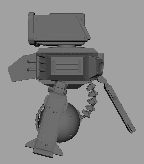
I started working on the lower thing yesterday, but I had a really bad day and didn't get anywhere with it.
That was yesterday though, and today I feel will be a bit different.
Thanks to the paintover I managed to get a more interesting and not that blocky look of the robot.
I just thought I'd show a pic of some small progress I've made today.
After I'm done with adding details and such, I will start working on the lower part of it.
I really agree with you Oobersli that the flippers are far to boring and blocky looking, so I will look into that (and post some pics of it) as soon as I get somewhere with it too.
edit:
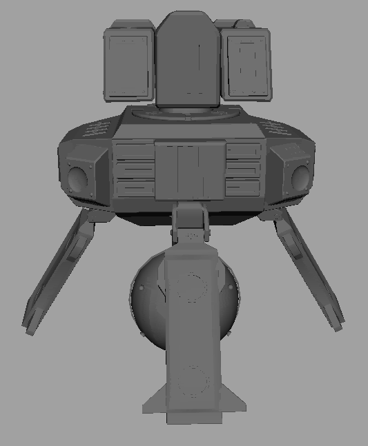
I should probably have waited for it to be more finished before I posted another pic of it, so here it is again - this time closer to being just that (finished that is).
Keep up the C&C guys. It matters like crazy much!
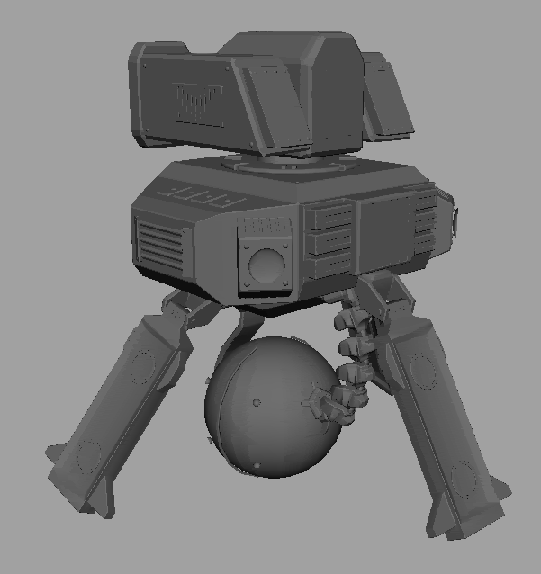
Pretty happy with it, but wouldn't mind some crits anyways.
Shoot!
I like the new wings, as well, but I think the old style blocky fin worked well for the one on the back. See what bringing back the rear one does for ya.
I like the new hub on the sphere where the spine connects, too. Good stuff. I'm looking forward to seeing this guy mapped out onto low poly with some cool textures. (:
Anyways. If you can give me any good pointers as to where I've made errors - please let me know.
It's (currently) counting 2570 tris, which in my opinion isn't that much, so I will probably add some later if/when the normal map screws up.
PICTURRRRRRES:
Paintoverz:
Thanks though!
There are two edges on the back that I can't really see any use for (dotted lines where I think there might be additional edges hidden in the shadow).
You might be able to simplify the geo of the spine - it looks pretty dense as far as the overall poly distribution goes. Also, the little shelf on the wing, boxed in red - this could probably be handled with normal maps as it doesn't affect the silhouette, but keep the part that pops out at the end (marked in green).
Looking clean - keep it up!
This is not not NOT the final texture or spec, as it's just a test!
Mostly posting to prevent thread death.
The normal is about 80% finished.
I really HATE the ball-thing being all red and all, but I kind of have to keep it like this for team-visibility.
Tell me what you think!
(bear in mind this was a really quick paintover so it's not the coolest stuff ever, but I'm sure you get the idea)
It's really starting to come together, though. (: