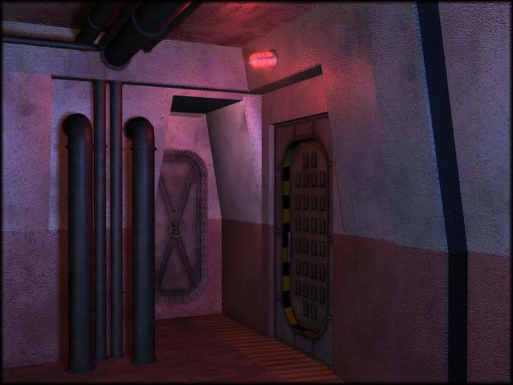
Since u r concentrated on this small area it could have some more details in textures, like dirt around pipes or under the doors.
However, it is hard to comment with just one shot like this one. Maybe u will post some more?
I'm curious about more screen shots too. Is this going to be a still frame from only this perspective? If so, then I'd focus more on the design aspect of the piece. Like why are you here, what are you focused on? things like that.
Also, there seems to be too much red. I'm not sure if it is your light or the textures, but a little more of some other color would be cool to break things up a little.
good start - thats my two cents cuz i don't have much room to talk. But more information about your direction with the project would help the crits and comments.
I'm pretty sire this is only one tiny part of an environment he's working as it is very compact.
One thing I'd suggest is that pull the camera further away...but adding more stuff like everyday items that people use, posters dripping grime from the wall edges would be nice.
And yeah what's the direction of the project? It kind of looks like a walkway on a sub or cruiseship.
Without saying what's already said, my only real comment is to focus on camera angle, object* composition, and lighting.
*You'll need more objects first.
As well, please tell a story. Right now its just some walls, pipes, and a door and no matter how fantastic you make those 3 things look it will fall short of being impressive. The reason for this is the lack of visual interest. There's not for the viewer to wonder over, visualize, or otherwise be creative within their own imagination as to what this 'compound' is used for.
thanks for everyones response, its been helpful. That shot originally was going to be the end environment, but i decided to expand it into a hallway so i could pull the camera back. I also built a couple props for the scene, and i plan on putting a few more in. I am still working on fine tuning the scene with more details.
my idea for the scene is it an underwater compound. more military than science. I am planning on adding water marks to the wall to indicate that it had recently flooded. Anyways, im still working on it but heres an update.
might want to try and do something different with the huge hose on the ground. Accident just waiting to happen. I would imagine a place like that would have grate flooring with the pipes, hoses below that so there is a clean, safe walkway. Since its underwater, maybe some stress cracks on the walls, water puddles from a ceiling leak?
Crits:
- The corners on the door arch are too sharp, beveling them won't really up the poly count that much but it will help the sharpness. You did it on some other pieces but not on a hight traffic wear/tear area?
- Cracking one of the doors open just a hair, not so much that you see anything past it but enough that you can put a light behind it and create some nice dramatic shadows/lighting. As well as create a place that the viewer wants to explore. Right now I'm looking at a dead end, it looks neat, but nothing is propelling me forward to explore.
- oobersli makes a good point about the floor and the hose.
- Hanging wires running down the length of the wall?
- In addition to the crate, think about putting a pipe elbow joint coming out of the wall and going into the floor. Or if that is too many polys just a vertical pipe from floor to ceiling.
- Unless the crate is going to open you can get rid of the indent around the lid, it isn't helping the silhouette that much. Or make the indent more pronounced so it impacts the silhouette more.
- The textures are looking great, are you using tiles or are they custom unwraps?
- The alpha details you have right now are a great idea but the stains look like they are a one time thing. Like something leaked out once, just a little and that was it. You could push them more and have them impact the scene quite a bit. The one on the pipe that does a 90 degree turn and goes into the wall doesn't appear to be doing much. You could scale it up 400% and have it take up a big chunk of the wall. Helping to break up the large blank concrete area. Remember you can use alpha planes for cracks also.
oobersil/vig - it's been recently flooded, i'm guessing that's a hose from a pump used to get rid of the water. Nice detail for the "telling a story" part
looking good, and largely convincing - it could probably do with a bit of trim around the base of the walls to help seat it into the floor, it's a bit of harsh transition.
Conceptually speaking, what are the yellow/black chevrons around the second hatch about? It's 2007, chevrons for chevrons sake died with decent CRT televisions a good few years ago now
yeah danr is right, adding a sign telling what kind of room is there will help sorting that out though and once again help tell the story, is this the power supply of the complex behind that door ? the ammo depot maybe ? or a secret lab ?
also on the flood part, how has that corridor been flooded, where did the water come from (crack in the wall ? broken pipe ? explosion ??)
am i the only one that thinks the red light is too bright? I'd suggest adding a falloff range on it and incorporate other lighting. The cracked open door is a good idea to keep the viewer interested. Maybe even have the pipe coming out of the door?
It would be better and make a little bit more sense to blend the color of the lights with a secondary source...say from the side walls...red is too often seen and gets weary.
Should make it flicker by adding one or tow broken lights.
the idea behind the tube is that it was used to drain the area of the water. i fixed a lot of the problems and added some more props. I am planning on going back and adding some cracks and possibly some water puddles along the edges of the room, if i can figure out how to do that [making water puddles in maya (any suggestions?)]. then i should be done unless some other problems come up. thanks again for everyones critiques. heres my update:
the floor, ceiling, walls and pipes were made using tillable textures, all the props were made using custom unwraps.
The barrel and box just seem randomly placed in the way. I'd early tightly position everything with other small props like in the above images (make use of all available space), or totally ran-sack and age the place as though nobody has given a damn about it in years (or post attack). This could really add life and character to the hall. Just be careful not to just clutter the scene.
The entire scene looks like it was made for a B-grade ps2 game. You could stand to put more detail in with more tries. Also I think you should work on the idea behind the environment more like why exactly it's there and what it was used for and more importantly what dramatic event if any changed the mood. I found a bunch of places you could be more efficient with polies as they do absolutely nothing to the silhouette and just make your wire frame look sloppy.
you should look at franks thread for inspiration cause I know that the level of quality hes aiming for is the same as yours.
Replies
However, it is hard to comment with just one shot like this one. Maybe u will post some more?
Also, there seems to be too much red. I'm not sure if it is your light or the textures, but a little more of some other color would be cool to break things up a little.
good start - thats my two cents cuz i don't have much room to talk. But more information about your direction with the project would help the crits and comments.
One thing I'd suggest is that pull the camera further away...but adding more stuff like everyday items that people use, posters dripping grime from the wall edges would be nice.
And yeah what's the direction of the project? It kind of looks like a walkway on a sub or cruiseship.
*You'll need more objects first.
As well, please tell a story. Right now its just some walls, pipes, and a door and no matter how fantastic you make those 3 things look it will fall short of being impressive. The reason for this is the lack of visual interest. There's not for the viewer to wonder over, visualize, or otherwise be creative within their own imagination as to what this 'compound' is used for.
Keep going.
my idea for the scene is it an underwater compound. more military than science. I am planning on adding water marks to the wall to indicate that it had recently flooded. Anyways, im still working on it but heres an update.
Crits:
- The corners on the door arch are too sharp, beveling them won't really up the poly count that much but it will help the sharpness. You did it on some other pieces but not on a hight traffic wear/tear area?
- Cracking one of the doors open just a hair, not so much that you see anything past it but enough that you can put a light behind it and create some nice dramatic shadows/lighting. As well as create a place that the viewer wants to explore. Right now I'm looking at a dead end, it looks neat, but nothing is propelling me forward to explore.
- oobersli makes a good point about the floor and the hose.
- Hanging wires running down the length of the wall?
- In addition to the crate, think about putting a pipe elbow joint coming out of the wall and going into the floor. Or if that is too many polys just a vertical pipe from floor to ceiling.
- Unless the crate is going to open you can get rid of the indent around the lid, it isn't helping the silhouette that much. Or make the indent more pronounced so it impacts the silhouette more.
- The textures are looking great, are you using tiles or are they custom unwraps?
- The alpha details you have right now are a great idea but the stains look like they are a one time thing. Like something leaked out once, just a little and that was it. You could push them more and have them impact the scene quite a bit. The one on the pipe that does a 90 degree turn and goes into the wall doesn't appear to be doing much. You could scale it up 400% and have it take up a big chunk of the wall. Helping to break up the large blank concrete area. Remember you can use alpha planes for cracks also.
looking good, and largely convincing - it could probably do with a bit of trim around the base of the walls to help seat it into the floor, it's a bit of harsh transition.
Conceptually speaking, what are the yellow/black chevrons around the second hatch about? It's 2007, chevrons for chevrons sake died with decent CRT televisions a good few years ago now
also on the flood part, how has that corridor been flooded, where did the water come from (crack in the wall ? broken pipe ? explosion ??)
Should make it flicker by adding one or tow broken lights.
the floor, ceiling, walls and pipes were made using tillable textures, all the props were made using custom unwraps.
http://history.nasa.gov/EP-165/p25b.jpg
http://www.prismnet.com/~moki/20051228.104030/interior.jpg
http://www.ericsiegmund.com/images/fireant/airsho2004/b17interior.jpg
The barrel and box just seem randomly placed in the way. I'd early tightly position everything with other small props like in the above images (make use of all available space), or totally ran-sack and age the place as though nobody has given a damn about it in years (or post attack). This could really add life and character to the hall. Just be careful not to just clutter the scene.
you should look at franks thread for inspiration cause I know that the level of quality hes aiming for is the same as yours.