CG_Society_Merc (WIP)
polycounter lvl 18
Hey everyone 
I've been a member for a little while now, havn't been around to post any of my work around. But after being adjusted to everyones great nature in honest and well put critques I find this place great to post work for great feedback by both professionals and amatures of the game and film industry.
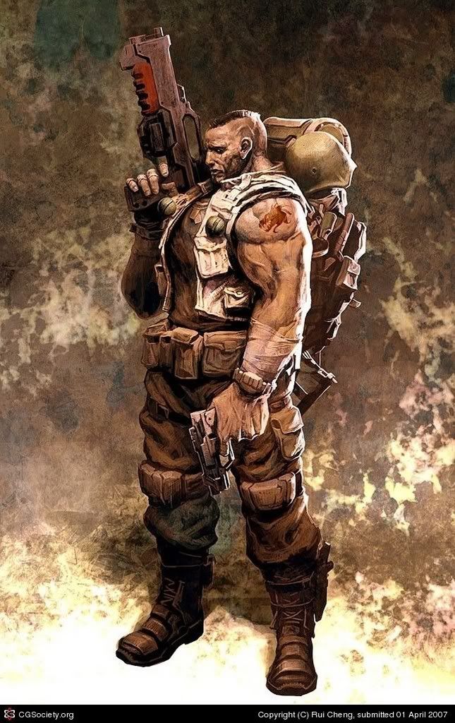
I recently took upon myself to work on a character I found while looking through the 2D concept art winners (Rui Cheng) of the CG Society Gallery and have been working for a few days on this person. Adjusting to a different style of realism, exaggerated yet comic book like or GOW art style.
For this character i've been using Zbrush 2.0 and Maya 8.5 for several tweaks and passes.
Here is a couple images of what I've made so far. Please feed me your inputs i'm one of those individuals who craves criticism for ones work
<u>Reference</u>
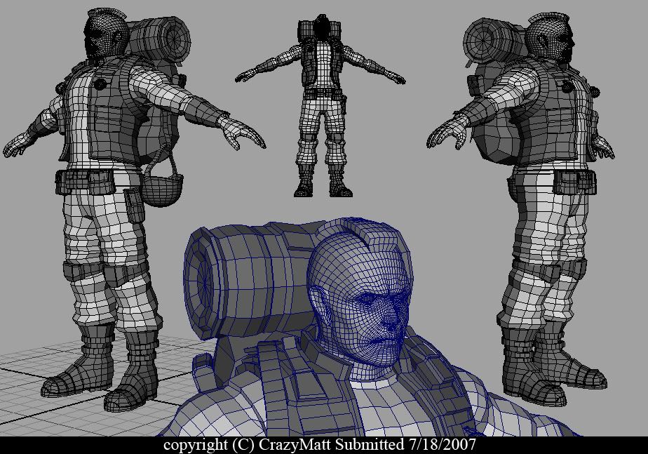
<u>Work In Progress</u>
I've been a member for a little while now, havn't been around to post any of my work around. But after being adjusted to everyones great nature in honest and well put critques I find this place great to post work for great feedback by both professionals and amatures of the game and film industry.
I recently took upon myself to work on a character I found while looking through the 2D concept art winners (Rui Cheng) of the CG Society Gallery and have been working for a few days on this person. Adjusting to a different style of realism, exaggerated yet comic book like or GOW art style.
For this character i've been using Zbrush 2.0 and Maya 8.5 for several tweaks and passes.
Here is a couple images of what I've made so far. Please feed me your inputs i'm one of those individuals who craves criticism for ones work
<u>Reference</u>
<u>Work In Progress</u>
Replies
Crits:
- The silhouette of the legs is kind of tubular. The pants should pinch in a lot more at the knees, especially since he has kneepads and straps. The wrinkles on his pants shouldn't be all the same height. Areas like around the mid thigh they would be much thinner and less pronounced.
- In the concept the thigh pocket helps give the look of more muscle bulk to the leg. Either bulk up the thigh muscles or reshape the pocket to get the same look.
- The toes on the boots are rounded, when they should be more square. Also in the concept the sole turns up as it reaches the toes, almost like a running shoe. But on the model it is flat across.
- The arms and hands seem kind of small. The hands specifically look more lady like, than manly square'ed off fingers. While the concept doesn't show you the fingers it isn't hard to imagine they would be about the size of a large Cuban cigar, or maybe a med sized sausage. Be sure to give the knuckles some shape.
- Suck in that gut soldier. In the concept the shirt and jacket help define the massive man-teets. Suck that shirt in a bit, blow out the pecks and give some shape to the jacket.
- You might want to model out some separate objects/pockets for the backpack. you'll drive yourself mad trying to sculpt those details from one blobby mesh.
Looking good, nail down a few of those anomalies before heading off to Z-Brush land and you'll have a better time of it.
Adding those little fixes helped give it more of the look that I was hoping to aim at giving it in the first place. I suppose that I doze off into the distance and went my own way and forgot most of what I was originally to be working on. :P
Well here's the next of the updated progress. I'm pretty eager to jump into Zbrush 3 now and go nuts on the details. Let me know if there's anything else I may need in fixing.
<u>Work In Progress #2</u>
notice the heel should line up with back of the head
if between u and urself u know it's not there - then honest critics from polycount are good but just be honest with yourself eh?
At first Shotgun I had a hard time understanding some of your critique but I added more muscle definition (large muscles) with somewhat of a tight pant wrap form around what is shown on the body.
This is #3 of the WIP so tell me whats up. Because in the end of all this modelling. My real goal is to be a professional Character Artist in the Game industry. So any feedback from anyone would be appreciated.
<u>Work In Progress 3</u>
Well i'm done with my passes in Zbrush. And now am going to uv map the model and back several passes on it such as (Ambient Occlusion, Normal, Cavity/dirt map).
Enjoy
-
-
There are a few problems I see with the head structure. The upper lip is strangely shaped (the lips don't curve inward below the nose, but rather outward), and the laugh line begins below the nostril - it should start right above. The eye sockets look a bit odd too, but it's hard to judge them without eyeball sphere in place. I also find the shape of the ear pretty strange too. I think you could really give this guy more charisma, but instead of trying to get his features from the concept alone, just use some reference photos to help you out.
The cloth wrinkles are not very convincing in some places, and I think it's especially noticeable on the backpack where you have fabric that loosely wrinkles, whereas if the backpack was full, that fabric would be tightened around whatever it is inside.
Overall, you've done a nice job, keep it up.
His chest needs to be touched up, right now it looks like a plastic chest extender. Define some musclulature and planes there.
Try to get some reference for the cloth.
The head needs a lot of work and is not up to the quality of the rest of the model. Get rid of the face details and define the head more; right now its a lumpy sphere with surface noise. The head here should have a lot of character, and definition, but not through wrinkles and pockmarks. Look at GOW for example:
The model is coming along nicely, though, like poop said. Just fix these things up and the quality of the work will improve immensely. Cloth especially is one of the harder things to do in CG, so if you get that right... but if you get it wrong...