Greek Bath

polycounter lvl 18
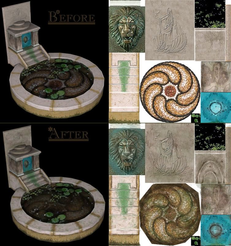
This is one of my weaker pieces that I have included in my portfolio. It's about a year old, and back then I was still just learning to texture my models. Now I'm fairly better at it and I wanted to spruce it up a little to bring it back up to my current standard. What do you guys think so far?
I've spent about 3 hours on it(long, I know. Still working on my speed). Criticism and comments are welcome
I've spent about 3 hours on it(long, I know. Still working on my speed). Criticism and comments are welcome
Replies
Maybe devote more texture space to the lily pads, though. Right noew they're bigger than the lion detail yet something like an eighth of the texture size.
SupRore: Does it really look like I used grunge brushes/stamps? I used a speckle brush sparingly and for the most part I just used the default brush in photoshop. Maybe that's why it took so long to get it all done.. :P I didn't touch the image->adjustment menu at all either. What exactly do you think the texture is missing that will make it look better? That's my biggest problem right now as I don't really have many ideas on making it more believable.
Oobersli: What kind of details do you think I should add to the horizontal bricks surrounding the pool? I decided not to add much distinctive detail to them since the same texture is used for every brick.. If you have any specific ideas, that'd help
You should always apply a checkermap of some sort when UVing to make sure you maintain an even texel density, with the exception of alpha shapes, which should have a little bit more space (maybe 1.5x the space compared to the rest of the objects, depending on the complexity of the silhouette. If you don't do that, the uneven focus/detail tends to cause the model to break up and not read as a unified object.
Whenever you're redoing a piece like this to improve it, it's really a much better exercise to remodel and retexture it entirely, because right now you're repeating many of the same problems inherent in the original model.
With the exception of the bottom of the fountain, which is much improved, it seems like you're just adding some grunge and blurring the texture a bit. While adding grunge is good, and getting rid of the overblown highlights and shadows is good, you're softening your texture and not taking full advantage of your texture space.
If I were you I would also add second "brick" to the edge of the fountain, so that you can have two different "bricks" to break up the repetition - right now you repeat the same part 11 times. If you duplicate that section of the UVs, you can significantly break up the repetition, allowing you to add more detail - keep in mind you can flip the UVs for some of the "bricks" to further break up the repetition.