The BRAWL² Tournament Challenge has been announced!
It starts May 12, and ends Oct 17. Let's see what you got!
https://polycount.com/discussion/237047/the-brawl²-tournament
It starts May 12, and ends Oct 17. Let's see what you got!
https://polycount.com/discussion/237047/the-brawl²-tournament
sister xmas present

grand marshal polycounter
I decided to go for a print as a xmas present for my elder sister. It started as a concept piece but ended as a bloke portrait hence I thought it'd be a neat gift 
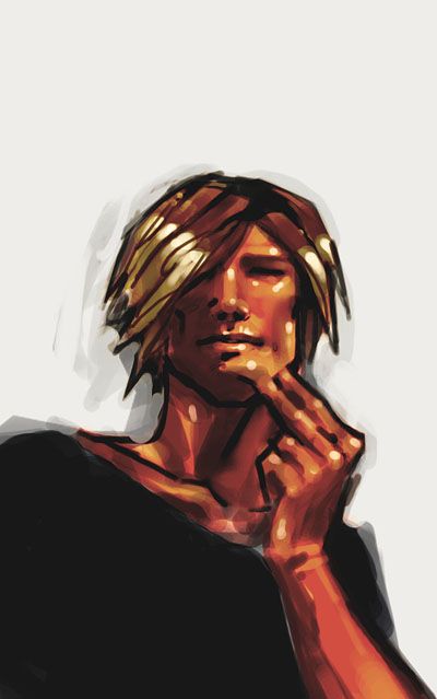
My main concern is contrast and level values since it's supposed to be printed out. I really don't know how it will look like on paper
As for size I think I'll go for 40*80 centimeters (average male figure is 1.75cm if you need some metric system ref )
What do you think? Suggestions welcome, and maybe some of you know a few tricks about the best fileformat choice for printing, color calibration, stuff like that?
Thanks!
My main concern is contrast and level values since it's supposed to be printed out. I really don't know how it will look like on paper
As for size I think I'll go for 40*80 centimeters (average male figure is 1.75cm if you need some metric system ref
)What do you think? Suggestions welcome, and maybe some of you know a few tricks about the best fileformat choice for printing, color calibration, stuff like that?
Thanks!
Replies
and yes, brome's right about that too. you're going to need to uprez it a ton if that's the original image.
One thing to remember when preparing for print is that There's some colors that rgb can display that cmyk doesn't have the range for. Often it's the really bright saturated colors. You can check this by activating "view - gamut warning" in photoshop. That will highlight the colors that are out of cmyk range. It's usually pretty easy to fix it with simple color tweaks. (note that the image you posted here doesn't seem to have any problems in that area but it'll probably need to be brightened quite a bit). I strongly suggest doing this before converting to cmyk to avoid unpleasant surprises.
Sometimes just tweaking the brightness/contrast/saturation of the image will take care of it. If for some reason you want to adjust only the out of gamut colors, "select - color range (set to "select - out of gamut"). This will make a selection of the out of Gamut areas so you can work on them exclusively.
For color calibration, a test printing on an inkjet (epson is pretty good if you have one) gives a reasonably good general idea of what to expect.
A quick and dirty way to calibrate your screen for print is to get an image printed at your printer's, then compare the result to the original file displayed at home and adjust your screen settings to match the printed picture. On my system if I want to know what an image will look like when printed I have to lower the gamma of my screen by 1.31 to 1.47 (nvidia settings, your mileage may vary). There's certainly a better way to do this using color profiles but this gets the job done. If anyone knows the right way to do this, please let me know
For fileformat, most of the designers I know are in love with eps. Tiff has allways worked well for me. Also like Gauss said. It's usually a good idea to convert to cmyk before sending it in. The printer should be able to tell you what dpi the image should be in for best results. (the answer when I asked was almost allways 300 dpi).
Last but not least, this may or may not be the case where you live but the digital printers around here all charge print costs + file processing fee (per file opened) so if I have more than one pic to print, I usually set up a Quark express document with everything I want to print = 1 file processing charge. At any rate it's allways a good idea to do your pagesetting beforehand for predictability's sake. Also, the digital printers where I used to work all had a unprintable margin of about a quarter inch, or 6-7 millimeters all around the page.
Before going to the printer's, if you're using quark, do a "file - collect for output". This will package everything referenced in the file including images and fonts (if applicable) in a convenient directory so nothing is missing when you get there. Other programs probably have similar functions.
Oh, and the local printer has a small sign up saying he doesn't guarantee jobs printed from any microsoft program due to the serious consistency problems inherent in them
I hope this carpet bombing has successfuly answered at least a few of your questions.
actually , do all desktop rgb printers use cmyk colours?
Adam, original size is 518*827 , mainly because I was working on a full size piece with two characters and then decided to switch to a portrait. More about that below.
Gauss yeah obviously CMYN is the key. I've been printing many presentations for school in the past years but we never worried about this for two reasons : first, we usually work in RVB format at school because we handle rather large files and the goal is to save memory usage. (same for the rez, we work at 150 dpi to get files that are only one fourth of a 300dpi one). The second reason is that we almost always print at the same printer which knows how to adapt his hardware to get good results and all (the guy is taking care of the gamma tweaks and all).
However, I'm not near this shop at the moment hence I'm unsure how the result will look like on the protrait. So yeah I'll go for CMYN on this one
LeJomphe, all these tricks are more than welcome
As for the 'homemade' printtest I just have a HP at hand but the result is good so far. I'm loosing a bit of saturation but I like it anyways. By the way your calibration technique sounds good... And it seems more reliable than the complex photoshop calibration process
For file format I'll go for uncompressed tiff as it seems like it gives fast 'raw' data that is easy to handle on the printers side. And only one print job to be done, hence only one file handling fee
Thanks for the useful tricks!
Therm, the thing is about additive/substractive color management I think. Screens use RVB 'light' to create colors -the more color you use, the brighter your color is, and full RVB is white - while natural media is substractive : when you add pigments, light is removed, and if you mix basic CMY colors you are supposed to get black. Printers work the same except that they have an extra black cartridge for better contrast I think.
I didn't know about RVB printers... or maybe I'm misunderstanding? Hmmmmm printed media gives headaches as Steakhouse knows it
Soooooo, here is the final plan. I originally wanted to print at original rez in order to get a slight pixelated look but know I realize thanks to Gauss and Adam's comments that it might look a tad cheapy... I've tried some tricks and here are the results for a 150dpi uprezed image.
As you can see my original image is more than rough
However the GenuineFractals plugin rocks HARD!! The trial allows only 20 image manipulations but it's quite enough for a small project. The plugin saves the original image in a special vector format, which can be upscaled once re-opened. I had doubts about this but as you can see its really convincing. Especially considering that if I had worked at highrez, I would have put too many small details that would have ruined the piece
I'm off at the printers tonight or tomorrow... And then its mounting time !
Anyways nice pic
always a fan of your art style, as always. one day hopefuly i'll be able to replicate it (and sell it as my own hehehehe)
btw, youre drawing roxx ! Remind me a little the style of Hugo pratt (Corto maltese) With these colors put quickly and the highlights which are more like point and small lignes but exactly put where they have to be !
Just brilliant
(A fan among fans)
they are located in the US (Ann Arbor, Michigan)... but have a Lightjet printer there that produces phoenominal results. The printer works via emulsion, similar to how photographs are developed. The benefit of using this style of printer is that you dont have to worry about the limitations of the CMYK color space; contaning a roughly a third... or less, the colors the RGB color space can handle. Since the Lightjet prints essentially with light, your image can stay RGB and still retain all the colors you put in. Gamma and brightness/darkness settings still apply though.
Its a pretty expensive process- it is more worth your money if you plan on printing multiple things, and lay them out on a large sheet, to cut the prints out later as individuals.
I have had a few prints done on the printer, and its WELL worth it!
Go to a copy centre ("printers" are for high volume printing). A copy centre, much like Kinko's, is what you'll need. And if you're bringing this in and want it to be a nice, good, quality I'd recommend bumping it up to 600dpi if you can get away with it. 300 is the norm in my line of work and 600 is the normal if you want perfect (with 1200dpi being a norm for oversize colour).
Anyway, hope it comes out nice.
Toomas, that can be a neat effect for sure, but I'd rather go for a simple image for this one, no ps-like effect especially if its for print. But I might try it on another piece tho
John, thanks, thats some neat words from you guy
Renaud, its funny you mention Hugo Pratt, I've always had a strange feeling for this artist. I used to dislike his works back in the days, and know I'm starting to love his way of stylizing. Go figure!
Moose, this might be handy... One days maybe! But its waaay to far away at the moment
Gauss, yeah, that's the meow actually
Adam, yeah yeah I guess I used the wrong word... I obviously did not want to go to a newspaper-like 'printer', but to a local shop instead. I went to a small firm somewhere between both in the end, they do print some ads or blueprints for professionals, and large photograps for individuals too.
And the result came out great! They did not take any fee for file handling which surprized me, and for *only* 35 I had a nearly perfect print on neat, heavy satin paper
Pictures of the mounted piece asap!
Thanks for all the useful info guys