Enviro Portfolio Project UE

polycounter lvl 13
Hello!
I've been working on this UE scene, currently finishing the major blockout in terms of shapes, composition and colors somewhat. I`ll start on polishing and finalizing assets soon.
Thought I'd get some feedback from you guys. At the moment I`m strictly interested in hearing your opinions regarding composition, shapes and any other ideas, but please disregard the textures because everything is either gray or placeholder or megascans for the time being. I plan to create all of the materials and assets on my own.
The style I`l aiming for is towards Lord of the Rings with some stylistic elements. Thanks!
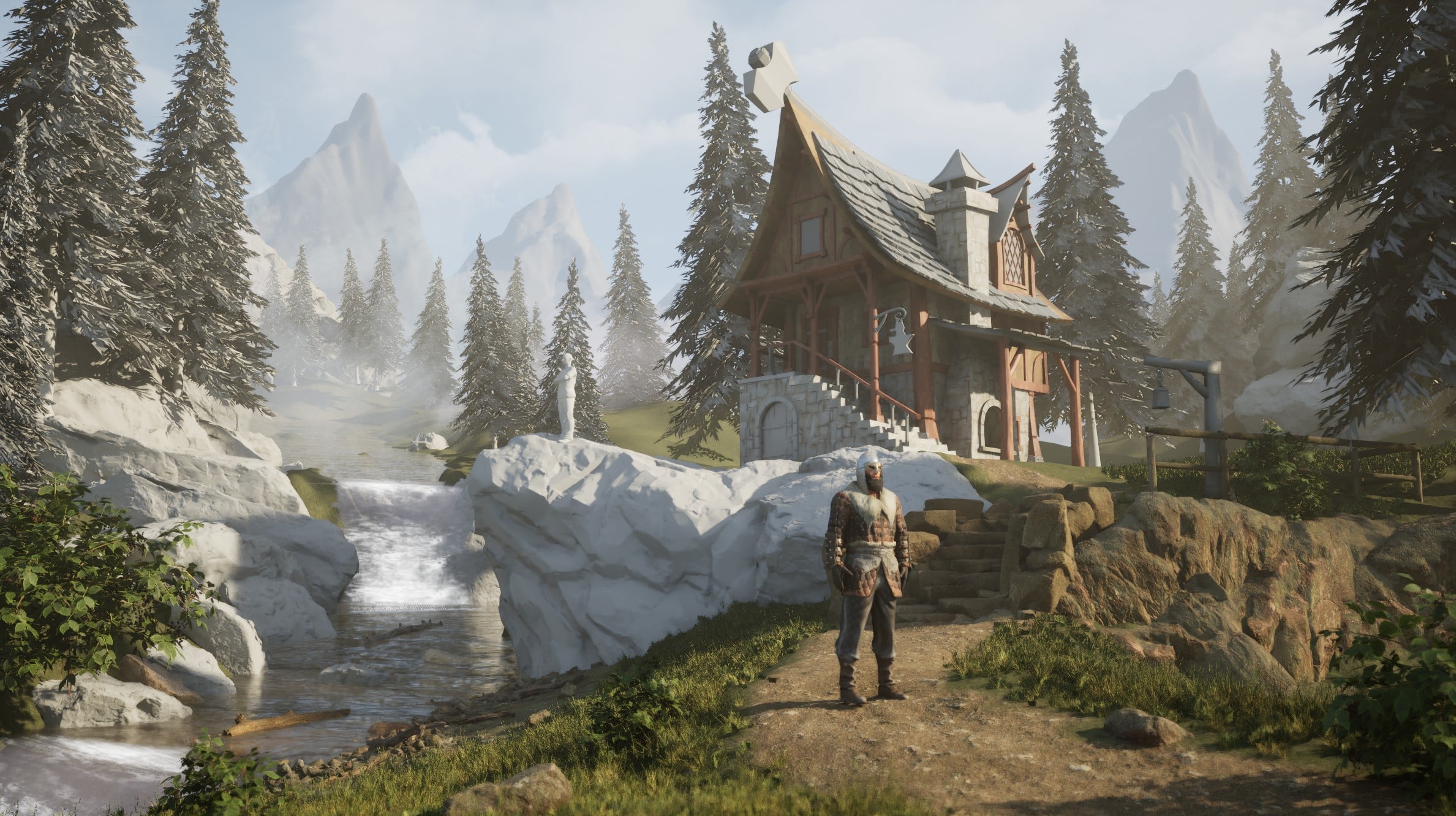
I've been working on this UE scene, currently finishing the major blockout in terms of shapes, composition and colors somewhat. I`ll start on polishing and finalizing assets soon.
Thought I'd get some feedback from you guys. At the moment I`m strictly interested in hearing your opinions regarding composition, shapes and any other ideas, but please disregard the textures because everything is either gray or placeholder or megascans for the time being. I plan to create all of the materials and assets on my own.
The style I`l aiming for is towards Lord of the Rings with some stylistic elements. Thanks!
Replies
1. The large axe/hammer stuck into the rooftop seems really out of place. If it's a sign for a metalsmith, maybe replace the smaller hanging sign instead.
2. The river above the waterfall is placed at a weird angle, compared to the perspective of the house. Is the river really tilted upwards? Or is it meant to be fairly flat?
3. One thing that helps me with composition is to imagine what this would look like at night. Where would the key light sources need to be, and how would moonlight (different key lighting angle) affect the composition. This planning could then affect where things need to be placed, for optimal night and day lighting.
4. If this house/workshop is next to a river, then it would make sense to leverage water power. So, a waterwheel, or a raised trough to deliver water near the forge, etc.
This is emphasized by the (probably temp) character right now, but both he and the lit side of the house face to the right, with a large conifer quickly blocking them in at the right edge of the picture. I'd prefer it if there was a bit more breathing space (ideally the two halves of the image would switch position, but that's probably a big ask. But maybe flipping the house and light might do the trick as well).
Also, the one conifer in the middle kind of splits the image in half and there could be a bigger view of the meadow in the middle ground instead.
My biggest gripe with this is aspect ratio and lens choice. The space is very compressed in the frame, so it looks like you're using a default 35mm in Unreal or something similar? Which breaks conventions of cinematic language when it comes to showing vast open space like this.
I strongly suggest you spend time picking out the right lenses first, because that field of view angle is going to strongly determine how you compose the rest of the frame.
I had to write off entire pieces because of this in the past. If you don't do it right from the beginning - you have to recompose everything. Don't make my mistake
Here are a few references to think about:
~8mm lens
A similar shot in the Witcher using what looks closer to 8mm-12mm lens. And wider aspect ratio is paramount to the cinematic look, especially in these open spaces.Look at how Emmanuel Lubezki would present a similar shot - much wider lens, much more horizontal space in the frame. This is not just due to the aspect ratio - different foreshortening on wider lens.
~35mm lens
Here is a shot where you would use a lens closer to what you have. Notice how background space becomes more compressed.Notice how it's not an establishing shot - it's a mid shot accentuating midground action.
~50mm to 80mm lens
And these would be examples of long lenses used to strongly narrow down the background relative to foreground. Camera is really far - focusing you on one specific thing, making the rest of the world disappear.Long lenses can be really cool but as you can tell - they serve a different purpose.
This video would be a good primer:
Play around with it - see what you find.