[WIP] Stylized Forest Cabin – Lighting Experiments (Maya/Arnold)

polycounter lvl 5
Hi everyone!
My name is Misha
I'm currently working on this stylized forest cabin scene and would love to get your feedback and critiques.
I’m aiming for a whimsical, slightly Disney-inspired or classic stylized look. This is still a work in progress, and right now I am mainly experimenting with different lighting scenarios and moods to see what fits the environment best.
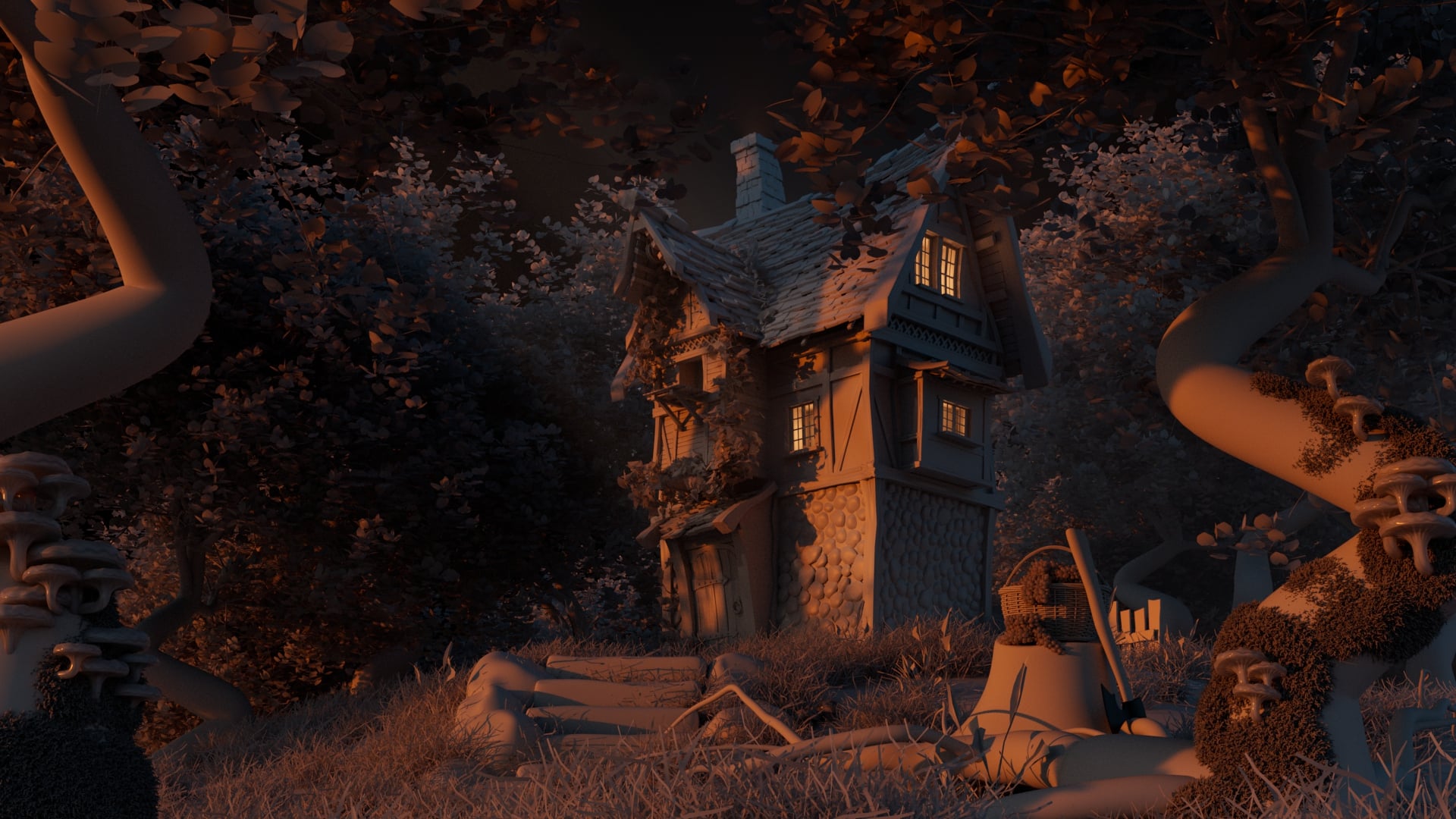
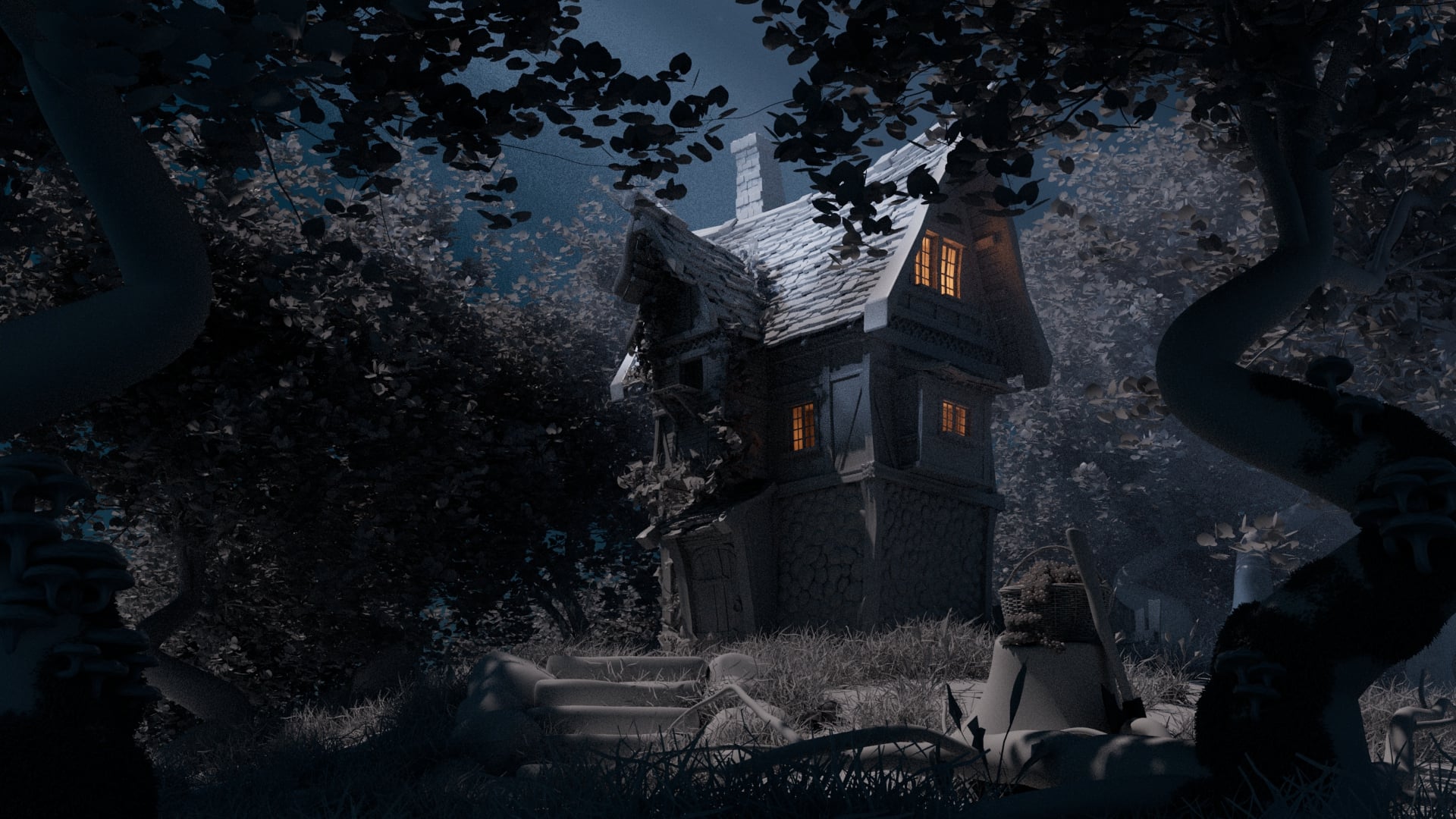
Here are two lighting setups I've rendered so far (Sunset/Warm and Night/Moonlight):
- Render 1 Sunset Mood
- Render 2 Night Mood
Software used: Maya + Arnold.
Since this is not the final version, I'm especially looking for feedback on:
- Composition & Framing: Does the staging of the trees and foreground elements work well?
- Lighting & Mood: Which lighting scenario feels more compelling or fits the stylized vibe better?
- Readability: Are the shapes and details holding up under these lighting conditions?
Any critiques on the models, composition, or lighting adjustments would be highly appreciated. Thanks in advance!
Replies
It would help to have materials in the scene before digging too far into lighting, since the materials will influence your global illumination bounces quite a lot, especially transmissive surfaces like all those leaves and grass which will brighten considerably from subsurface light bounces.
I also highly encourage you to seek out lighting references, rather than just from your imagination.
You could even desaturate whatever you find, and do some simple paintovers with light colors to try things out in a very quick manner. This is why concept art is a thing... it's vastly quicker to iterate in 2D than it is to iterate in 3D.
And I really appreciate the forethought you had in asking for feedback in sections that could make the biggest difference with not that much work.
Composition
Background Depth:
Don't just barricade the background with a bush (of very questionable scale!Forests give an amazing opportunity to create cinematic depth and atmosphere by duplicating the same tree around a few times and a throwing in a little fog. You just need to create a bit more empty space towards the ground:
Show us that the world is bigger than your frame and create a bit of that magical glow towards the horizon line
Foreground / Midground / Background
The foreground right now value-wise really blends with the background to the left. Even without that the silhouette of foreground trees looks quite boring. I feel like more interesting compositional lines with trees and roots could be introduced there:Focal points for story telling
The biggest point that I would accentuate is that the foreground is an amazing space to tell a story and build really cinematic compositions. Right now, your narrative is just the house, but with a simple silhouette in the foreground, you can really create some meaningful story.On the left is example of the general perception a person would get from the current scene. Which is just "a house in a forest". A few little details will turn it into a story. Don't be rendering machine - be an artist, tell stories!
Value, color and details should support focal points
When you are clear on what your focal points are - support them with lighting and color changes! Add fake lights bringing up where you want people to look. And a rim light of contrasting color or a fog card to separate your focal points from the background.Right now if we look at how your value breakdown - you can see that the biggest contrast is the roof - that is where the eye will be drawn first. Unless you want to put a narrative element on the roof you might want to consider pushing the reality a bit to suit your creative needs.
Housekeeping - Albedo (surface color)
You'll get there eventually but spend a little time adding basic textures to help you nail final lighting value and saturation. This could be good reference for you. Notice the fine hue variations in vegetation. And the value difference in wooden beams vs the white stucco of the facade. Once you introduce this in your scene it might impact how shapes read and how you light themLighting reference
If you want to stick with your more off-white look I suggest you check out Disclosure day:Noise control
And finally be careful with noise control. These scatter tools are easy to abuse and it important to remember that too much detail just makes your viewer confused about where to look. Use detail contrast / rest areas to attract attention to where you want your audience to look. Ideally further reinforcing the narrative focal points.You got this! This is a really exciting project and with just a bit more work you can turn it into something that is special and absolutely Disney-level. Go go go!
P.s. Let me know if you'd like a quick paintover to visualize these ideas.
Sounds to me like a class assignment from a professor, in which case you're kind of hemmed in by this artificial (if well-intended) constraint. I think you could do well to push the boundaries a bit by keeping the gray color, but pushing other material settings like normal-mapping and translucency/scattering. Silhouettes can also help here, as pointed out by d1ver!
Hi! Thank you so much for taking the time to write such a detailed and thoughtful critique. I really appreciate the effort you put into analyzing the scene and pointing out specific areas where I can improve it.
Your feedback gave me a lot of ideas, and I definitely see the direction you're suggesting. One point that really stood out to me was your comment about visual noise from all the scattered objects. I honestly hadn't thought about it that way—I guess it looked organic and natural to me, so I never questioned it. Looking at it from your perspective makes a lot of sense.
If I reduce the amount of scattered vegetation and small details, it will actually be a win-win for me since my PC is quite old and not very powerful, so it should also help with performance.
I also wanted to ask about the scale you mentioned. Did you mean the bush in the background? I'm not entirely sure what you meant by its scale. Does it feel too large or too small compared to the rest of the scene?
I'd be very happy to see a paintover if you have the time—it would really help me visualize your suggestions and understand how to push the composition and storytelling further.
Thanks again for your time, encouragement, and all the valuable feedback. I truly appreciate it!
It's actually not an assignment from a professor. I'm self-taught and I work on this project in my free time outside of my regular job.
The reason I haven't started texturing yet isn't because of any restrictions - it's simply because I still don't have much experience with texturing, and I'm honestly a little afraid of ruining what I've built so far. My goal for now was to present the things I already feel confident doing as well as I possibly could before moving on to the next step.
Since I'm learning on my own, I also haven't really had anyone to discuss my work with or ask for feedback. This is actually the first time I've received such detailed critique on one of my projects, so it means a lot to me and has given me a fresh perspective. Thank you again for taking the time to help me improve.
Keep posting your work as you go, posting here has been a powerful time-proven system for people to improve their work, join the community, and make connections.
I recorded a little video for you to explain the theory around contrasts and attention management somewhat holistically because the detail contrast doesn't live in a vacuum. And they are all pushing and pulling on each other.
Let me know if this makes sense.
I appreciate your concern around not making it worse from here! I remember feeling that way as well. Just save off a copy as a checkpoint and boldly go to try new things. You got this.
I'll work on a paintover hopefully over the weekend when I have a little time.