[WIP] Lisbon Street - Unreal Engine 5

polygon
Hello everyone.
I am close to wrapping up a portfolio project and I hoped to get some valuable feedback mainly on composition, lighting and colour grading from you guys.
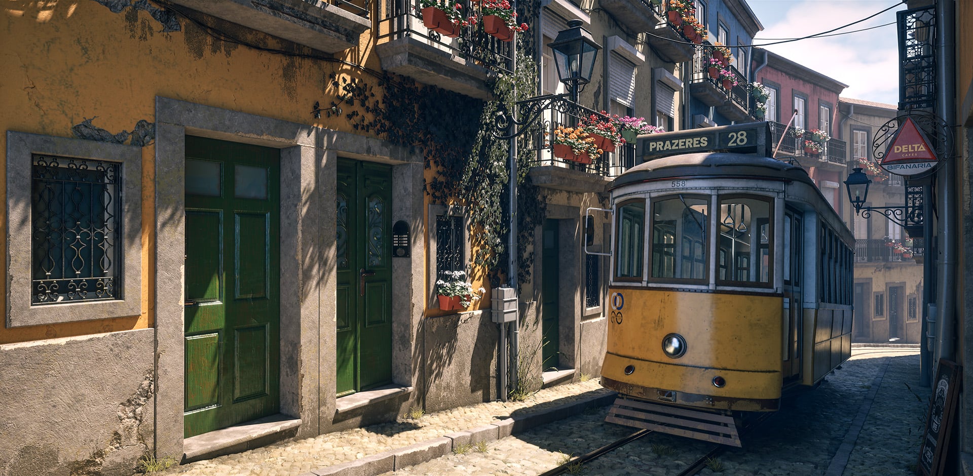
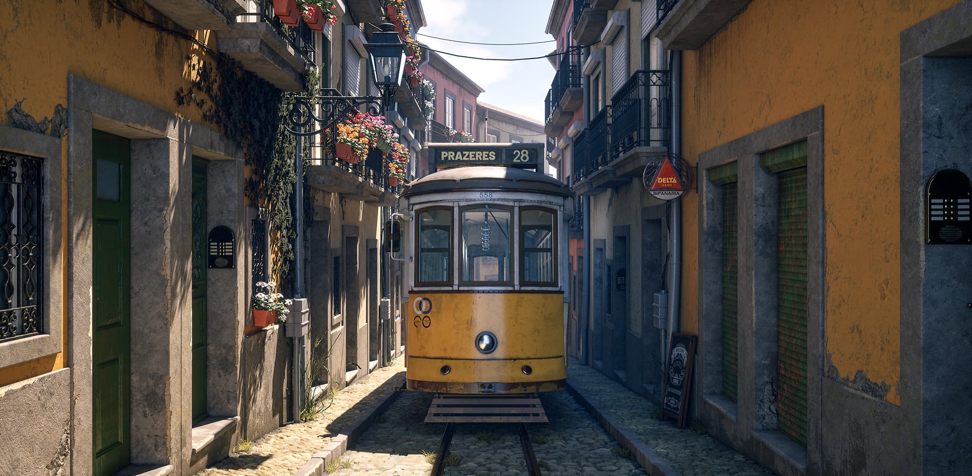
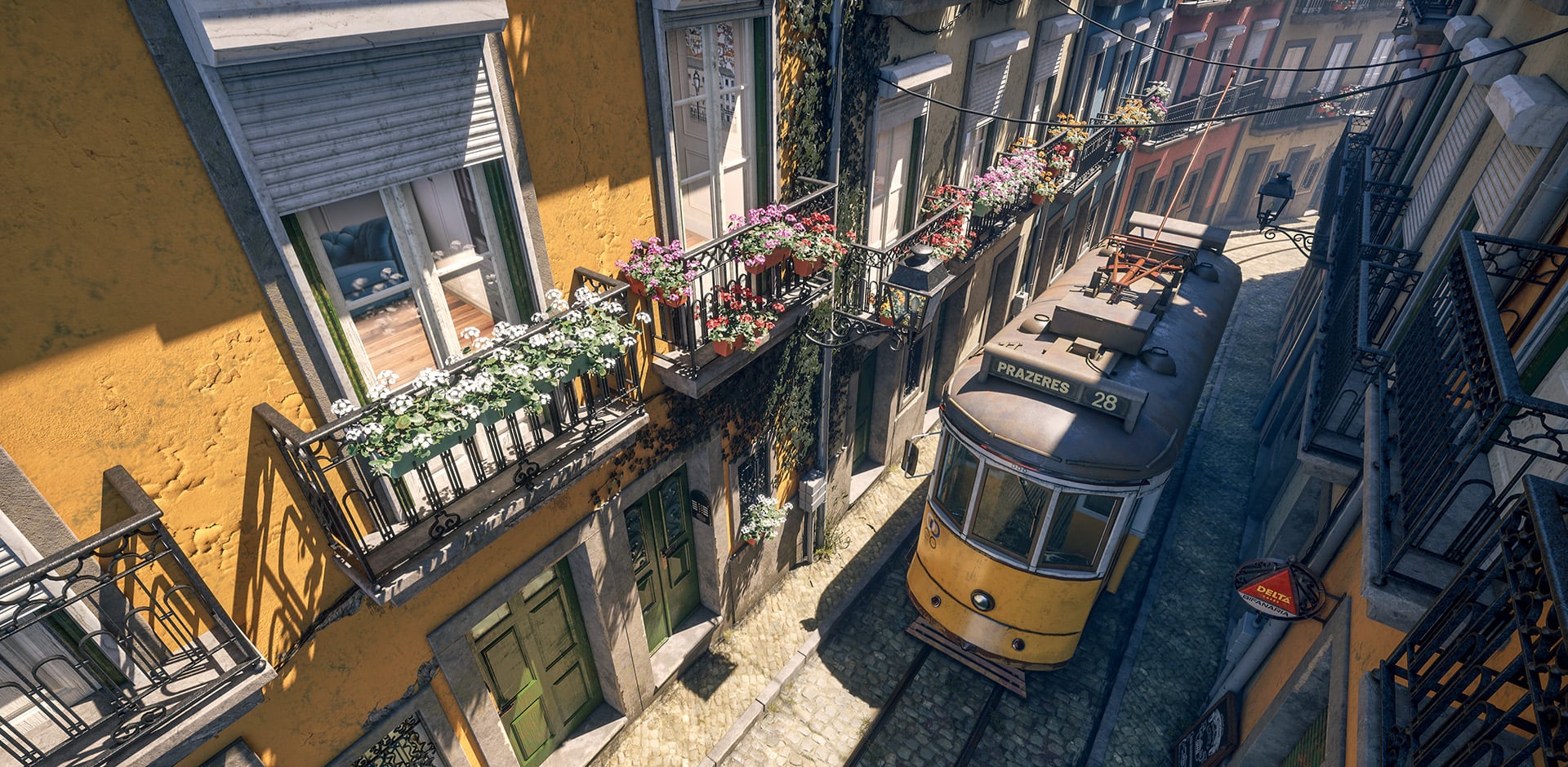
My goal was to capture a narrow, Mediterranean style, iconic Lisbon street in a small diorama, by using only a handful of modular assets.
I textured everything using only two trim sheet (one for the environment and one for the tram), two tiling texture and an interior cube map texture for my windows. The tram also has a secondary UV layout for dirt mask.
Each building blocks were built using static mesh instances and for the down pipes and cables I used blueprints.
You can see my three key shots below. I kind of finalized my lighting, lifted up shadows and done a slight colour grading pass to make the materials more readable.
I am also planning to make a short (1min max) video montage with some closeups and material break downs.
Thank you guys for watching and sharing any thoughts.")
I am close to wrapping up a portfolio project and I hoped to get some valuable feedback mainly on composition, lighting and colour grading from you guys.
My goal was to capture a narrow, Mediterranean style, iconic Lisbon street in a small diorama, by using only a handful of modular assets.
I textured everything using only two trim sheet (one for the environment and one for the tram), two tiling texture and an interior cube map texture for my windows. The tram also has a secondary UV layout for dirt mask.
Each building blocks were built using static mesh instances and for the down pipes and cables I used blueprints.
You can see my three key shots below. I kind of finalized my lighting, lifted up shadows and done a slight colour grading pass to make the materials more readable.
I am also planning to make a short (1min max) video montage with some closeups and material break downs.
Thank you guys for watching and sharing any thoughts.
Replies
Would be great to see texture flats. Are the flowers in the same trim sheet as the architecture?
Thank you for your feedback. Yes the interior projection has a slight offset as my spacing of each room doesn't quite come to an even square so i had to offset it slightly to a more rectangular shape and maybe that is causing some slight distortion in the parallax effect based on the viewing angle.
In regards of the foliage, I forgot to mention, that those assets have their own dedicated 1k textures. The geranium flower i created also utilises nanite foliage instead of the traditional LOD system.
I normally try to avoid using the alpha channels when I pack my textures because of the exact reason that you mentioned so i normally save my Opacity map separately.
The colour variations on the painted metal and wood are controlled by a tint in the material instance. One of the asset that you can see mapped on trim a is the intercom, that i modelled out as high poly modelling and just baked into a plane so i could retain the details nicely.
I wasn't planning on making a night time lighting, but you're right, it could be a nice addition. Thanks.
The interior does look odd, though, also regarding the lighting/exposure. Maybe you wanted to show off the cube map, but either way, it's a bit distracting.
The shadowed parts inside are unlikely to be lighter than the outside of the houses on the other side, even with lights on, but there's a sharp cutoff in the reflections (there's the flowers and then nothing, might be even an exclusion) that lets us look into the room almost unhindered. Perhaps it's a problem with the exposure of the textures as well.
Edit: Sometimes we simply invest time and thought into things that end up being detrimental to the overall piece. Some more reflections and/or sheer curtains would only leave a hint of the interior, but improve the overall scene. As they say: Kill your darlings.
Thank you for your comment. You are right about the exposure of the texture, however it wasn't intentional. When I exported the cube map as static texture from the scene capture cube it somehow ended up overexposed, but i fixed it just by reducing the brightness of the texture. Thank you, that is a good catch, I didn't even notice it.
In regards of the reflection, the "cut off" happens naturally as the direct sunlight hits the surface of the glass. I tired adjusting my roughness, but nothing seems to help. It doesn't have any issue showing the railing of the balcony in the reflection on the other (shadowed) side of the street, only where the sunlight hits. Any idea how to fix that? I'm not using ray-tracing. Could that be it?
I'm not familiar with UE5 I'm afraid. What are you using currently for reflections and how easy would it be to turn on raytracing, just to have a reference or see if the material needs tweaking? Personally, I'd simply adjust values until it looks right to me, but that can cause problems down the line and might need further tweaking depending on the lighting situation.
Since the light literally falls onto a flat plane (which I should know, but didn't really think about, perhaps because the angle makes it kind of work), maybe you could darken the midtones and shadows in the material based on light intensity to suggest the room goes further into the back. Because those are the areas that stand out the most to me.
But there's probably a standard solution to this, so I think I'll shut up now instead of creating even more confusion.
https://github.khronos.org/glTF-Sample-Viewer-Release/?model=https://raw.githubusercontent.com/KhronosGroup/glTF-Sample-Assets/refs/heads/main/Models/CommercialRefrigerator/glTF-Binary/CommercialRefrigerator.glb
I tried to take a picture where the issue is more visible, and here it clearly shows, that my sunlight cuts the reflection.
The bigger problems in the initial rendering were the mid and dark areas that seemed too bright, and therefore also drowned out the reflection except for the brightest bits. This recent shot looks much better in that regard, so adjusting the exposure might have already done the trick.
1. Your sky and ground are at the same brightness level (100%). This would be almost impossible without the sky clipping the white values for a low dynamic range display. While your ground looks really bright, the sky doesn’t reflect the same burning heat.
If I were to make the ground 100% bright, I would add some bloom around it and also have the sky overexposed, which I believe would be more realistic. And even then I'd still probably wouldn't have the ground clip into 100% because that's removes the ability to sell the ski as a dominant contrast. In reality the sky will likely be brighter. I’ll attach a few examples below:
I feel like this kind of tonemapping would make the frame more realistic and really push it into the cinematic territory.
My only other feedback is about the unmotivated camera moves in the video. The way camera moves, just like lighting and color choices, carries a lot of meaning and some of the tricks (like dolly zoom) are reserved for creating specific moods (like discomfort) so seeing them in video game artists portfolios is quite common, yet still out of place.
If you'd like a good primer on camera moves studio binder has some good videos on their youtube channel:
In regards of the camera movement... yeah, unfortunately cinematography is definitely not my strongest suit, but this video is very informative and helps me to learn and develop those skills. Thank you so much.