Hi!
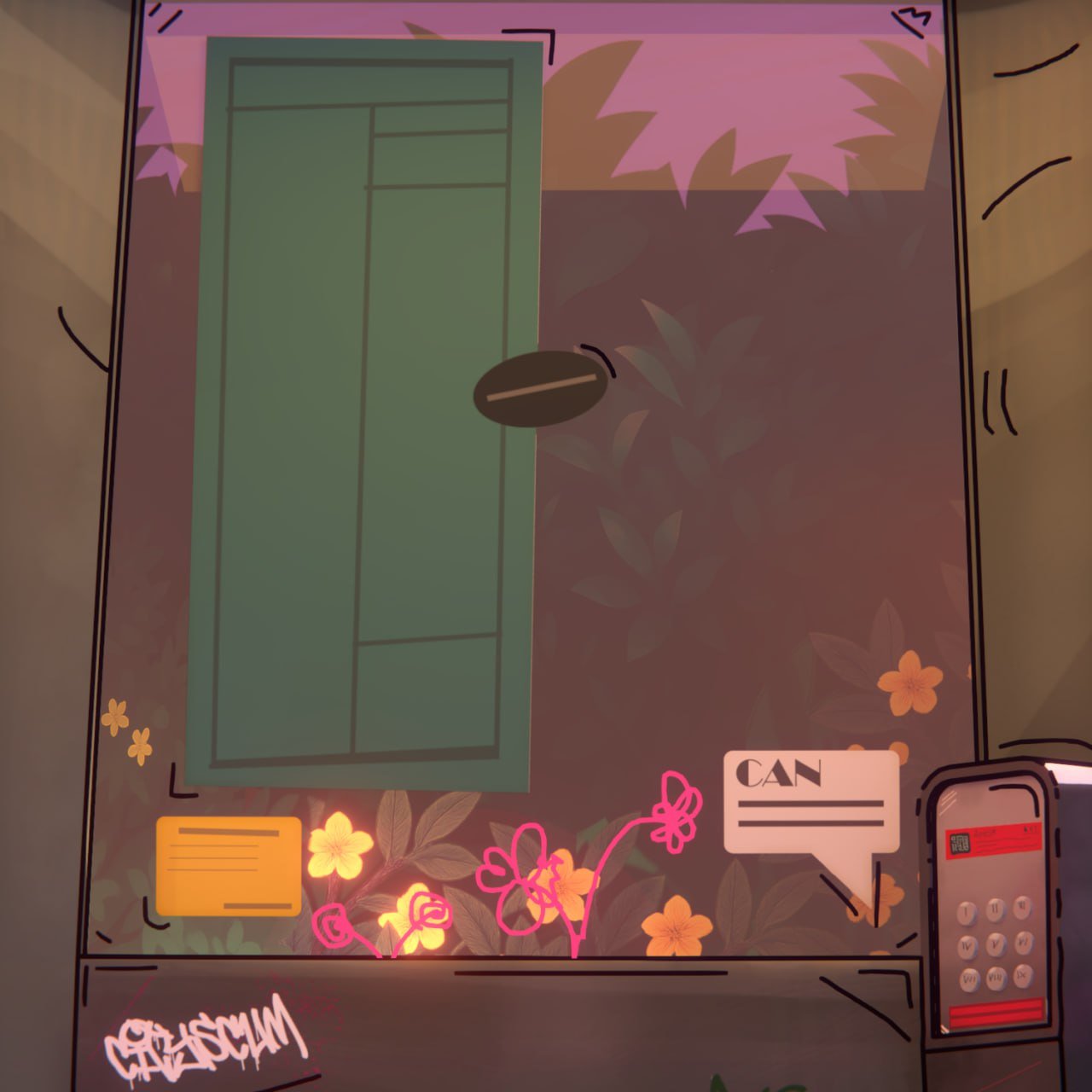
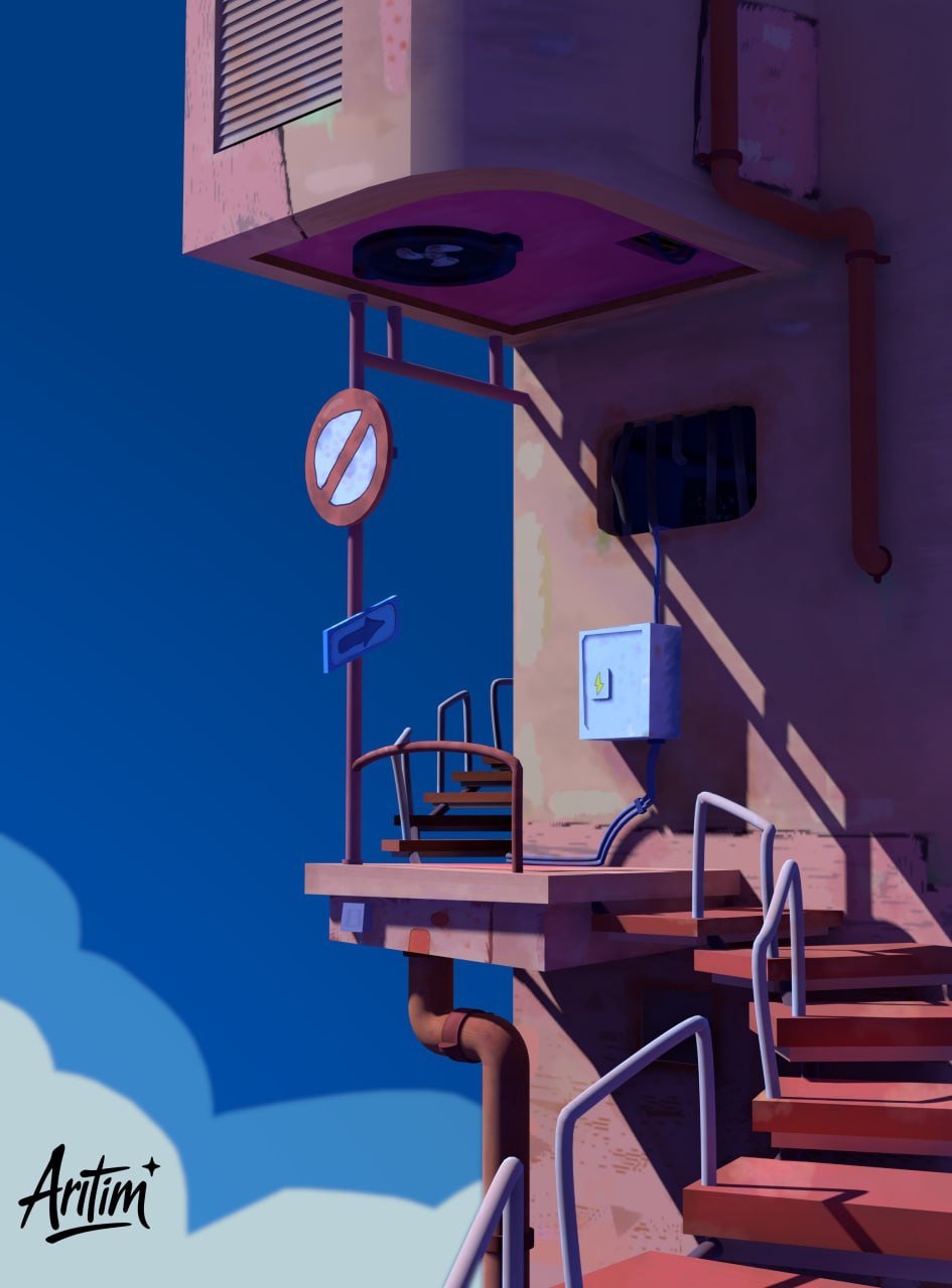
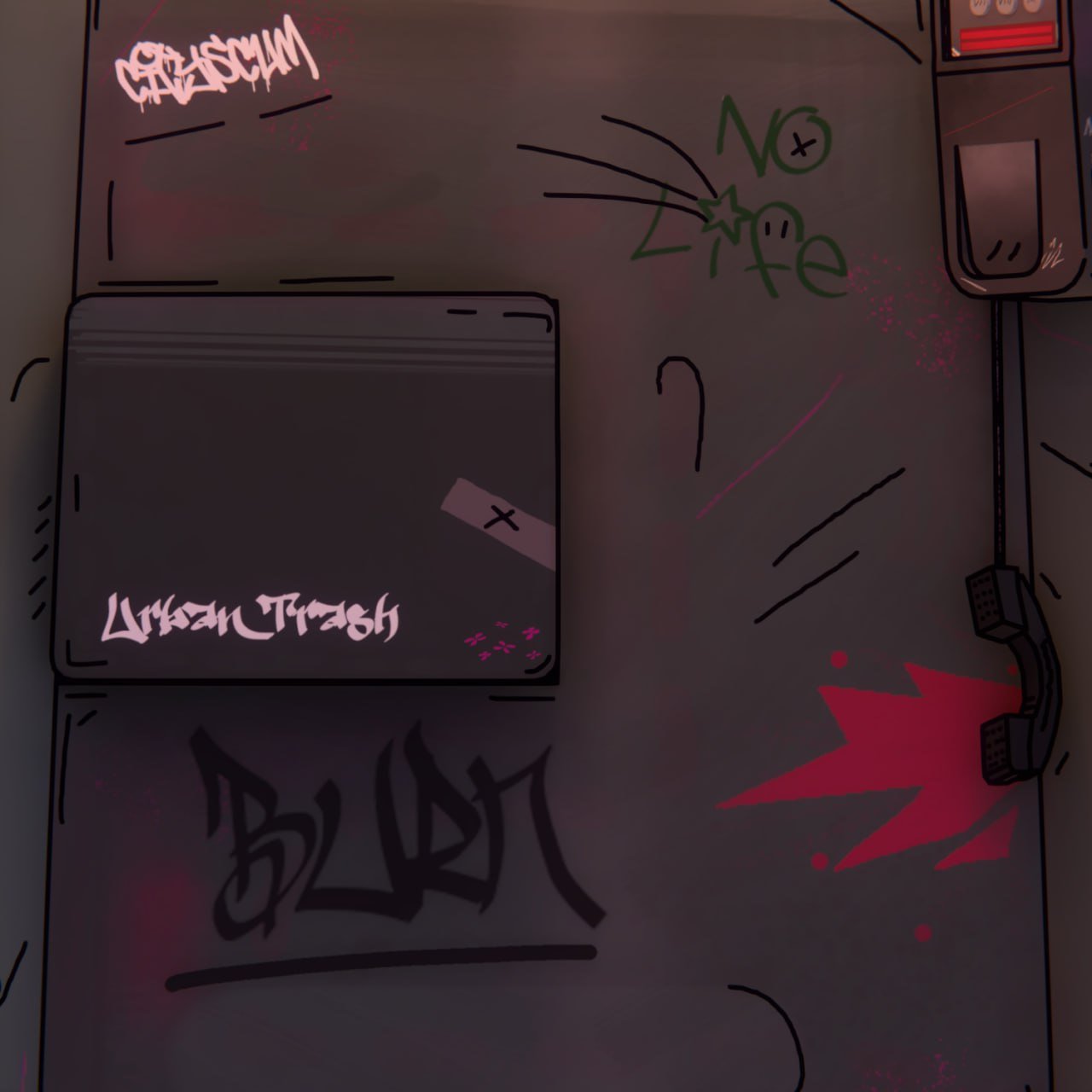
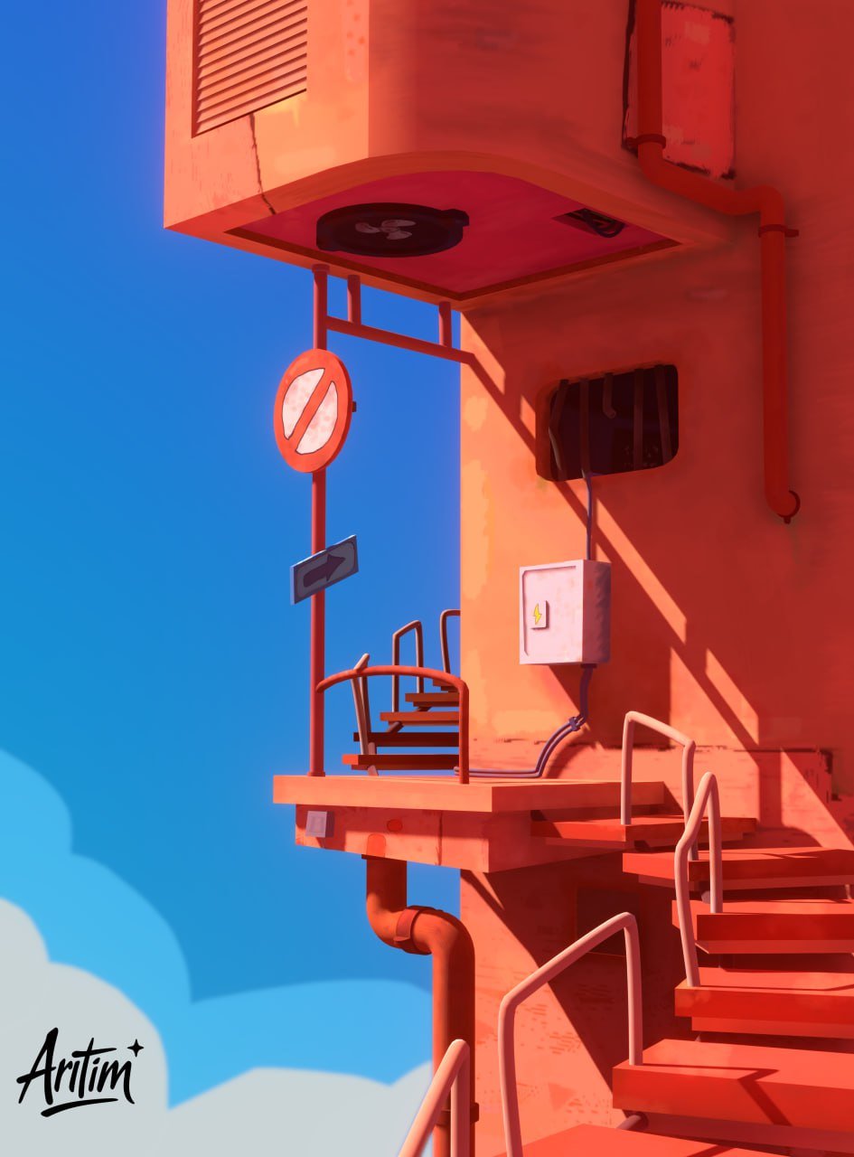
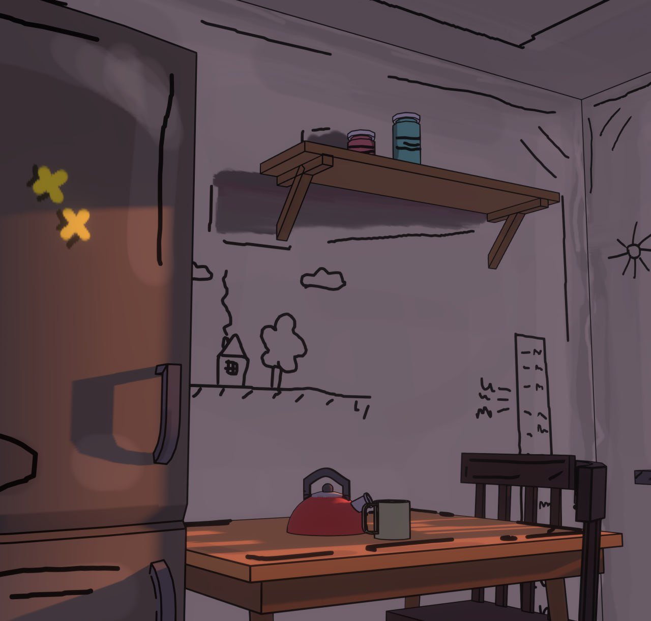
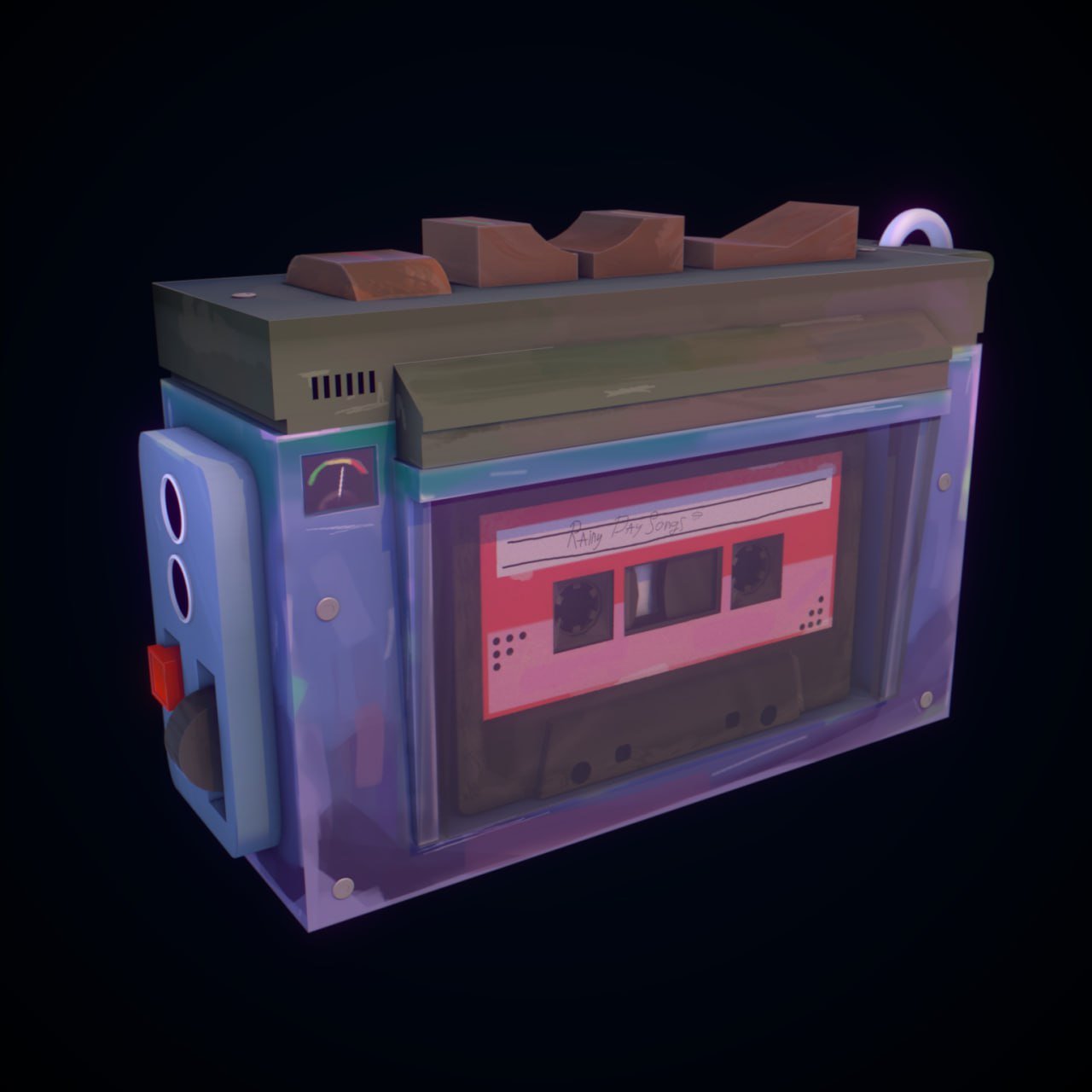
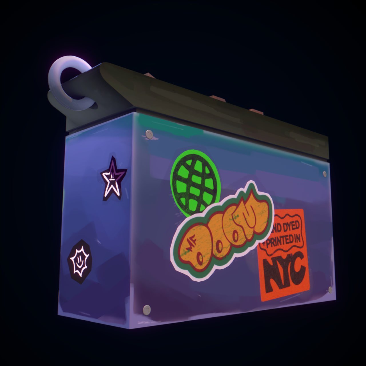
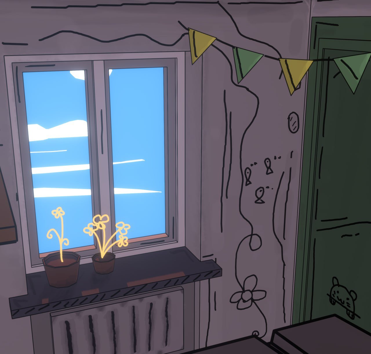
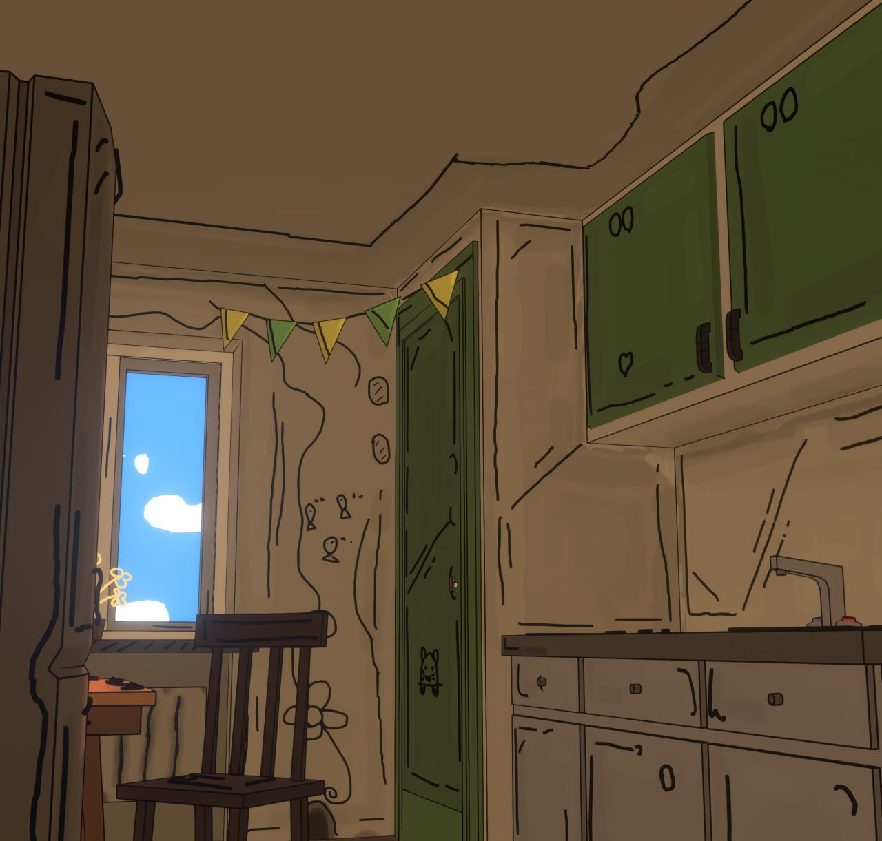
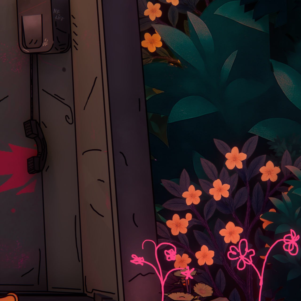
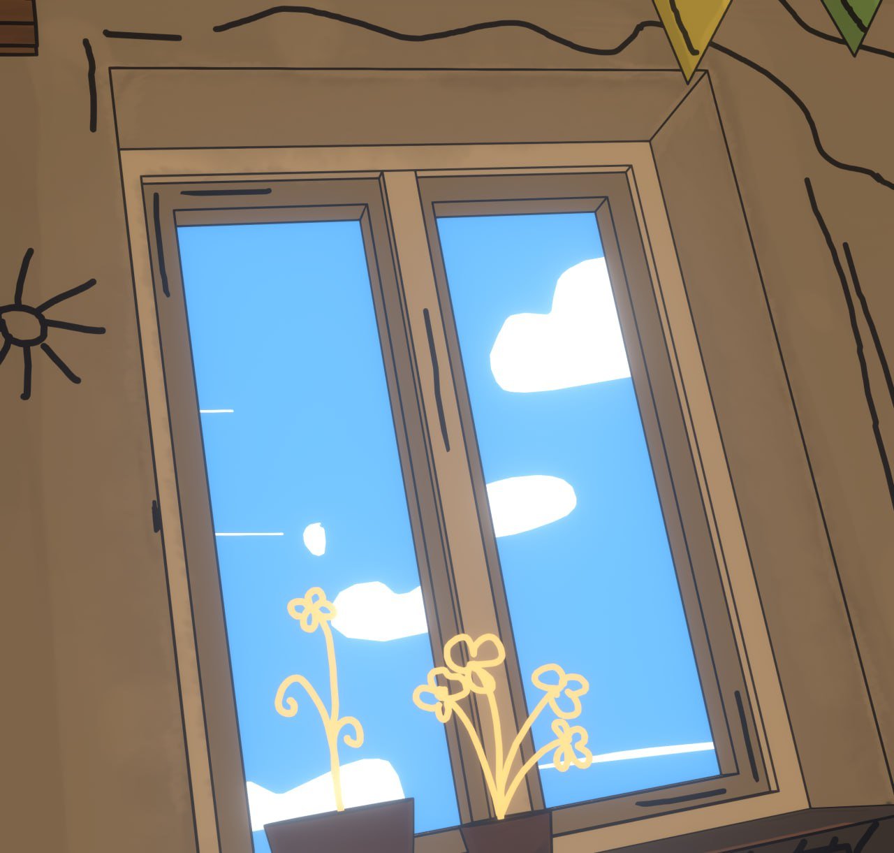
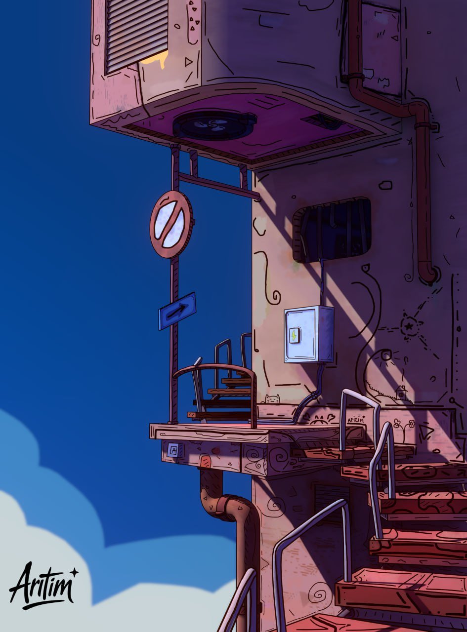
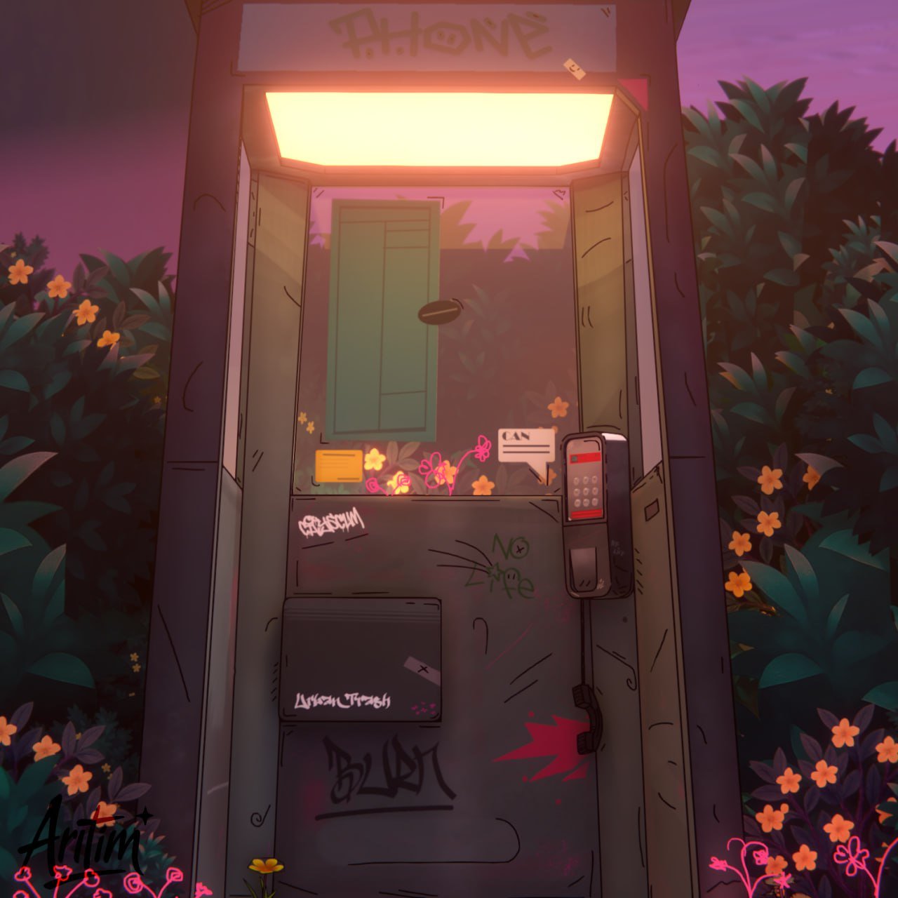
These are my works in Blender for 2025
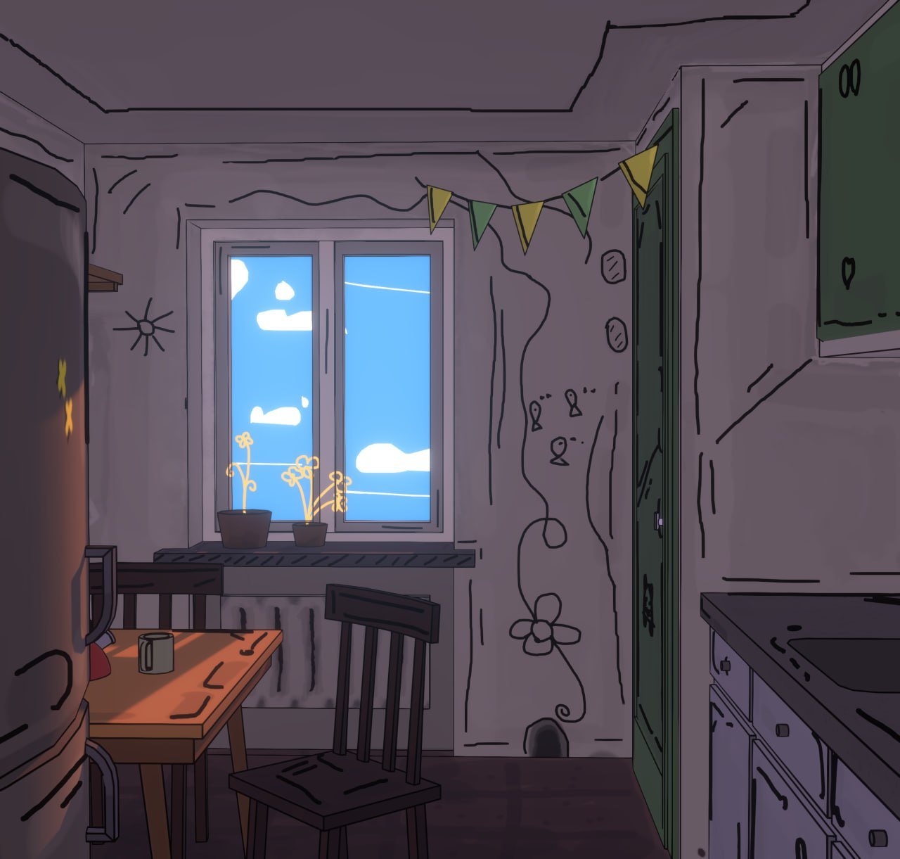
I mainly work with low-poly and hand-painted textures. I like working with stylized shapes.
My goal is to become an environment designer, so I'm currently focused on improving: -scene compositions
-colors and lighting
-stylizations within the framework of the finished game
I would really appreciate any feedback or criticism, especially regarding the environment, composition and legibility of the scenes, thanks in advance for the feedback!
Wow these are really cool! Love the stylization on these, and the mix of 3d and lighting with hand-painted details.
I would love to see more thoughtful attention to variable line widths. You have some different widths, but each line is the same width along its length. Here's a nice example of how variable line weights improves things:
The other thing I'd love to see more of, is the color treatment you made on the tape player. Love the brush strokes! How cool would it be to see that on your environment pieces?! You have some of it going on, but it's really subtle. How far can you push it?
I agree with Eric, variable line width would look great in your work, which is lovely by the way.
Something else are the doodle-like lines in the middle of textures. They bother me a bit because they're too jagged. They'd benefit from stroke smoothing/stabilization, and would look great if some also vary in width and texturing. Check out The Witness short from Love, Death and Robots (very NSFW) for reference. The shading and lighting are different from your work, but the line treatment is in the same vein of what you're doing.
Some of them are chalk-like, some are more similar to calligraphy pens (you could do these with curves tilted 90° from surfaces). More than a few working as outlines don't match the geo. Small details like these make everything look spontaneous without feeling unfinished.
Wow these are really cool! Love the stylization on these, and the mix of 3d and lighting with hand-painted details.
I would love to see more thoughtful attention to variable line widths. You have some different widths, but each line is the same width along its length. Here's a nice example of how variable line weights improves things:
The other thing I'd love to see more of, is the color treatment you made on the tape player. Love the brush strokes! How cool would it be to see that on your environment pieces?! You have some of it going on, but it's really subtle. How far can you push it?
Thanks for the feedback! I agree about the lines; I'm working on those! And the brush strokes, which I only recently started using. The cassette player prop is my latest work; I plan to continue using this technique. I'm very inspired by Arcane's style; I want to do something in the same vein.
I agree with Eric, variable line width would look great in your work, which is lovely by the way.
Something else are the doodle-like lines in the middle of textures. They bother me a bit because they're too jagged. They'd benefit from stroke smoothing/stabilization, and would look great if some also vary in width and texturing. Check out The Witness short from Love, Death and Robots (very NSFW) for reference. The shading and lighting are different from your work, but the line treatment is in the same vein of what you're doing.
Some of them are chalk-like, some are more similar to calligraphy pens (you could do these with curves tilted 90° from surfaces). More than a few working as outlines don't match the geo. Small details like these make everything look spontaneous without feeling unfinished.
Thanks! Yes, I've seen that show, it's really cool! But I'm aiming for a slightly different style, as you can see in my latest work with a cassette player prop. I want to do something in the style of Arcane textures, with brush strokes, but I'll still take your comment into account and rewatch Love, Death, and Robots
Yeah, but I'm not saying you should copy the shading of the geometry, but that you should try outlines and doodling similar to the ones there. They can work very well with your geo shading style. 😉
I agree with Eric, variable line width would look great in your work, which is lovely by the way.
Something else are the doodle-like lines in the middle of textures. They bother me a bit because they're too jagged. They'd benefit from stroke smoothing/stabilization, and would look great if some also vary in width and texturing. Check out The Witness short from Love, Death and Robots (very NSFW) for reference. The shading and lighting are different from your work, but the line treatment is in the same vein of what you're doing.
Some of them are chalk-like, some are more similar to calligraphy pens (you could do these with curves tilted 90° from surfaces). More than a few working as outlines don't match the geo. Small details like these make everything look spontaneous without feeling unfinished.
Replies
I would love to see more thoughtful attention to variable line widths. You have some different widths, but each line is the same width along its length. Here's a nice example of how variable line weights improves things:
The other thing I'd love to see more of, is the color treatment you made on the tape player. Love the brush strokes! How cool would it be to see that on your environment pieces?! You have some of it going on, but it's really subtle. How far can you push it?
Something else are the doodle-like lines in the middle of textures. They bother me a bit because they're too jagged. They'd benefit from stroke smoothing/stabilization, and would look great if some also vary in width and texturing. Check out The Witness short from Love, Death and Robots (very NSFW) for reference. The shading and lighting are different from your work, but the line treatment is in the same vein of what you're doing.
Some of them are chalk-like, some are more similar to calligraphy pens (you could do these with curves tilted 90° from surfaces). More than a few working as outlines don't match the geo. Small details like these make everything look spontaneous without feeling unfinished.