Orc Warrior - Warcraft style cinematic - feedback for my first portfolio post
Hello everyone!
I've been working on a personal project for my first portfolio post (I was aiming to post it on Artstation).
But I am a bit anxious if it's even worthy or what is needed to post it so it's appealing.
My goal was to make a cinematic Orc Warrior in the style of Warcraft cinematics, I've grown up with Warcraft and I am still a huge fan of their artwork and cinematics. During this work I've been heavilly inspired by the Warlords of Draenor cinematic and mainly the work of the artist Wey Wong who did the surfacing work for the model Garrosh Hellscream.
I've modeled and sculpted in Blender, did the texturing in Substance Painter, rendering in Blender and did some color correction in Photoshop.
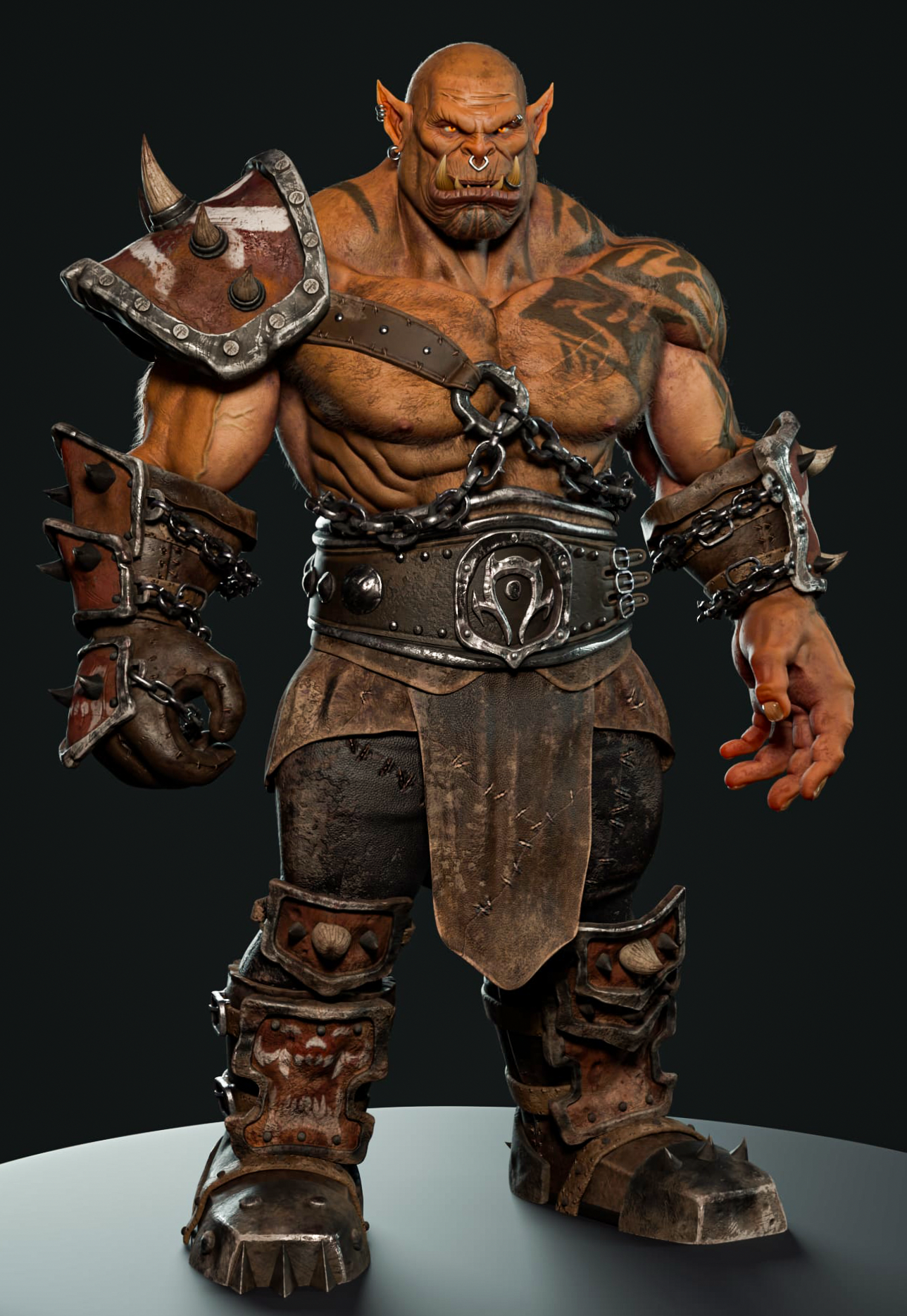
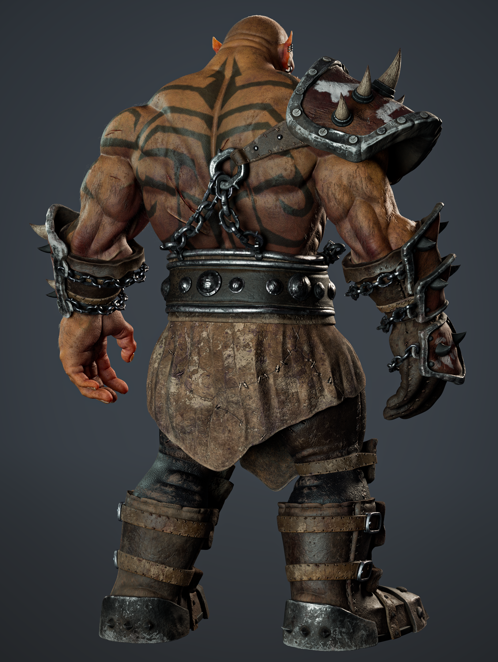
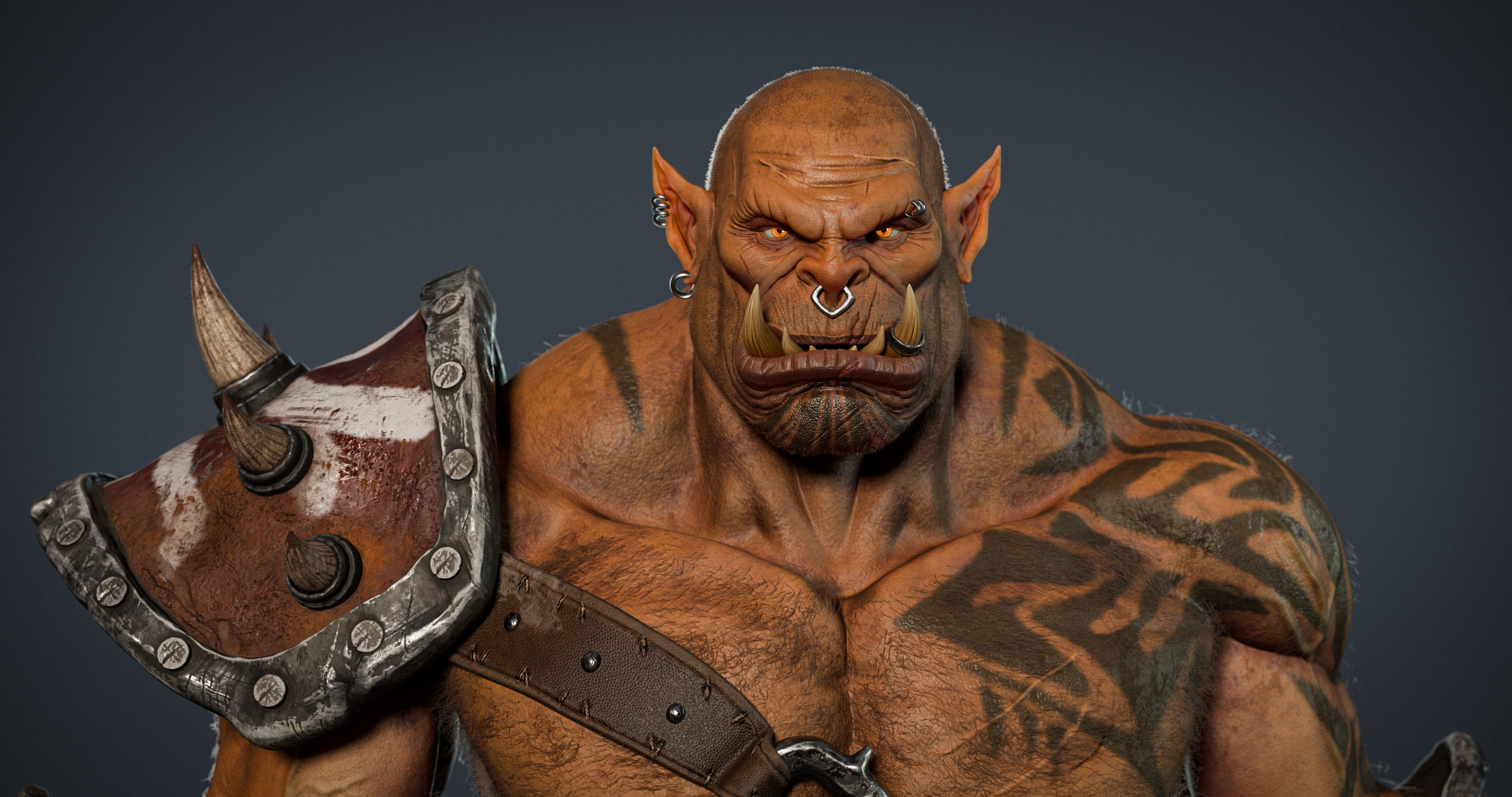
Here is a turntable render of the model
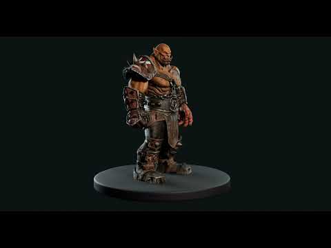 https://youtu.be/LRa3e-dKO5Y
Any advice and feedback is more then welcome!
I've been working on a personal project for my first portfolio post (I was aiming to post it on Artstation).
But I am a bit anxious if it's even worthy or what is needed to post it so it's appealing.
My goal was to make a cinematic Orc Warrior in the style of Warcraft cinematics, I've grown up with Warcraft and I am still a huge fan of their artwork and cinematics. During this work I've been heavilly inspired by the Warlords of Draenor cinematic and mainly the work of the artist Wey Wong who did the surfacing work for the model Garrosh Hellscream.
I've modeled and sculpted in Blender, did the texturing in Substance Painter, rendering in Blender and did some color correction in Photoshop.


Here is a turntable render of the model
 https://youtu.be/LRa3e-dKO5Y
Any advice and feedback is more then welcome!
Replies
Some things I noticed, and keep in mind that I'm not super-familiar with your references, so some of that might be due to those.
The front of the lower legs is very hard to read, the shapes get lost there a bit.
The leather cloth feels like it was meshshmoothed. The borders are very clean and have no damage, even in areas where two pieces are stitched together.
The stitches look like a texture overlay and more embedded than sitting on top of the material. Perhaps due to a common texture overlay or just an unfortunate structure. They also don't seem to really influence the leather.
The outer chain on his left hand looks like it might slip off the gauntlet and onto his skin. Maybe he doesn't mind, though, being an Orc and all.
On the side area under the arms/pecs the forms of the various muscles and ribs flow into each other a bit too much and the resulting larger shapes look a bit deformed and flat in places. Also, maybe some skin would be pushed up by the belt.
Some of the metal shapes like the rim of the shoulder pad look a bit too lumpy/randomly softened, but then again, he's an Orc.
"But I am a bit anxious if it's even worthy or what is needed to post it so it's appealing."
Understandable sentiment, but I wouldn't worry too much about that. It might be your most important piece right now, but after some time it will (hopefully) be one among many. It's good work on a high level in my opinion, but the level is high in general these days. But of course it's "worthy", that's silly talk.
Even though you aren't familiar with the referenced source there are some great advices you mentioned.
I didn't model the stitches they are indeed textured in Substance Painter but I find they act weird after rendering in Blender and they don't really look as good compared to Substance. I didn't find any fixes to this so I just took it as it is and continued my work. I think next time I will add them as part of the sculpt so it's more visually in the mesh.
Regarding the leather cloth pieces I had alot of issues with that part tbh. At first I had them as actual cloth as in linen with some sort of damaged look. But the lowpoly mesh was to lowpoly for the normals to act properly and so there was alot of deforming and clipping happening. So I decided to change the mesh and smoothed out the sculpt + changing the materials to a more leathery look, which I do think fits the character better. It does miss some damages on the sides, that's an area I definitely haven't figured out properly how to make it look appealing.
Also your points are more than noted about how the stitches not looking like it influences the leather. Maybe as mentioned above making it an actual part of the mesh should be a fix, or is it possible with textures?
The look of the metal shapes is definitely intentional on my part, I was thinking about a battered Iron look. I don't see the Orcs being too crafty and just beating their hammers on the iron to make forms. So I also didn't go for shiny metals with clean edges, if that makes sense
The only part I don't really see and I don't mean this rude is that you find that some muscleparts look flat, I would love if you could maybe show me a bit more what you mean?
I can't do an overpaint right now, but what I mean is that the resulting connected "sausages" (also not meant rude) from the serratus to the obliques look a bit sqashed, but that might be the light. Generally, it's not bad at all to have shapes flow into each other or summarize them, but here I feel it's a bit much. Hope that was clearer.
Would love some feedback on the changes and the expression. I think adding a little more asymetry in the brows and one of the eyes wouldn't hurt.
Facial expression is a nice touch, but he's even more orange now.
Color skin is brown with an orange tint on my screen. But i can tweak it ofcourse. Less saturated?
This is the normal texture for the leather parts:
Don't mind some overlapping parts, some tiles aren't used anymore / changed. I need to clean those up.
But the stichting parts are definitely too much in the normals?
This is the diffuse texture for the orc:
I made a Substance graph for normalizing normal maps, usable in most DCCs that support SBSAR files: https://github.com/KhronosGroup/glTF-Sample-Assets/blob/main/Models/ChronographWatch/screenshot/Substance_Normalize3D.zip
Overall happy with the coloring and I made some slight adjustments to the pose,.
Was curious if anyone is willing to give feedback on these two renders.