Organic Environment Inspired by Southeast Asia – UE5 (No Megascans)
-Personal Project-
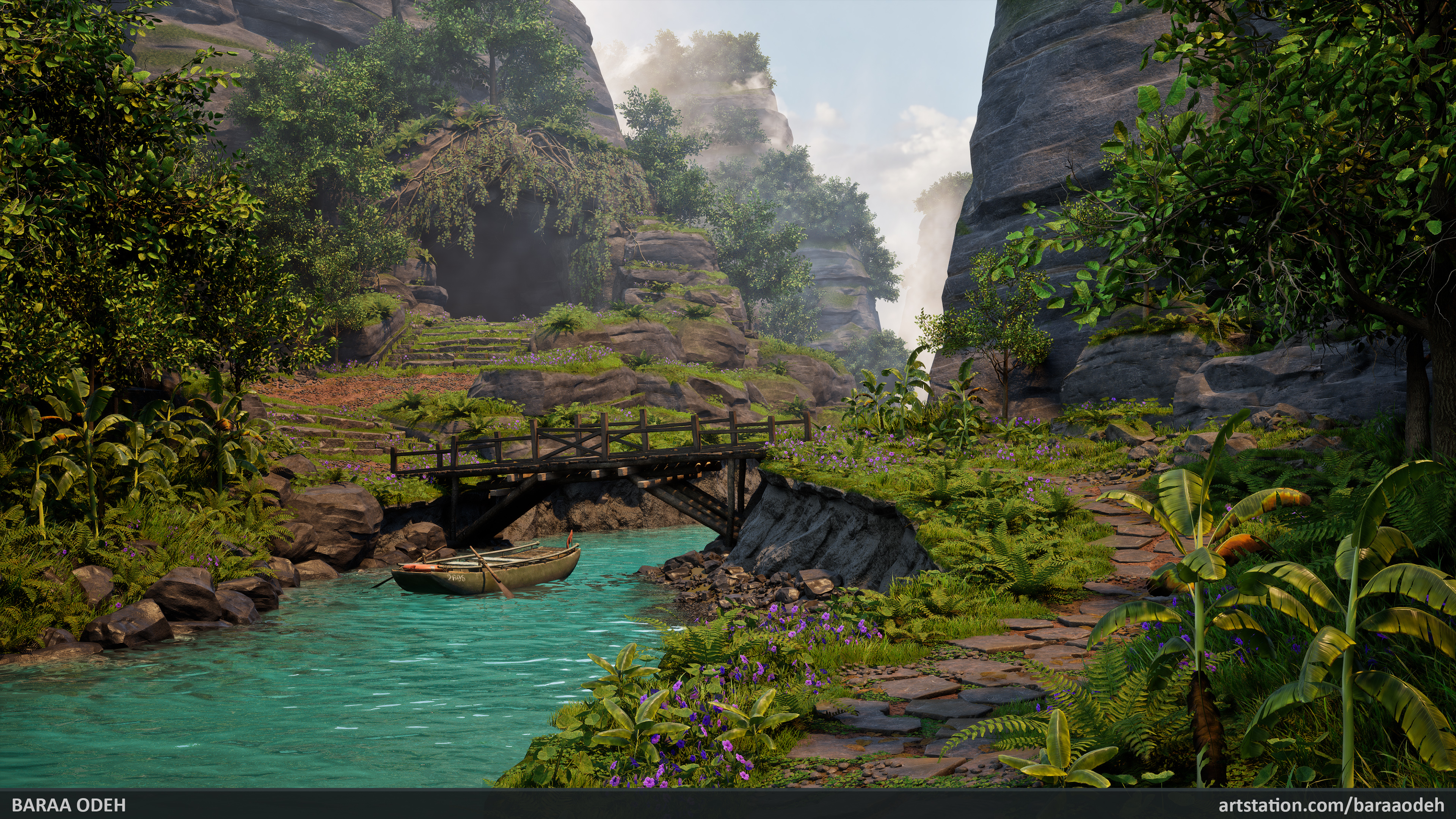
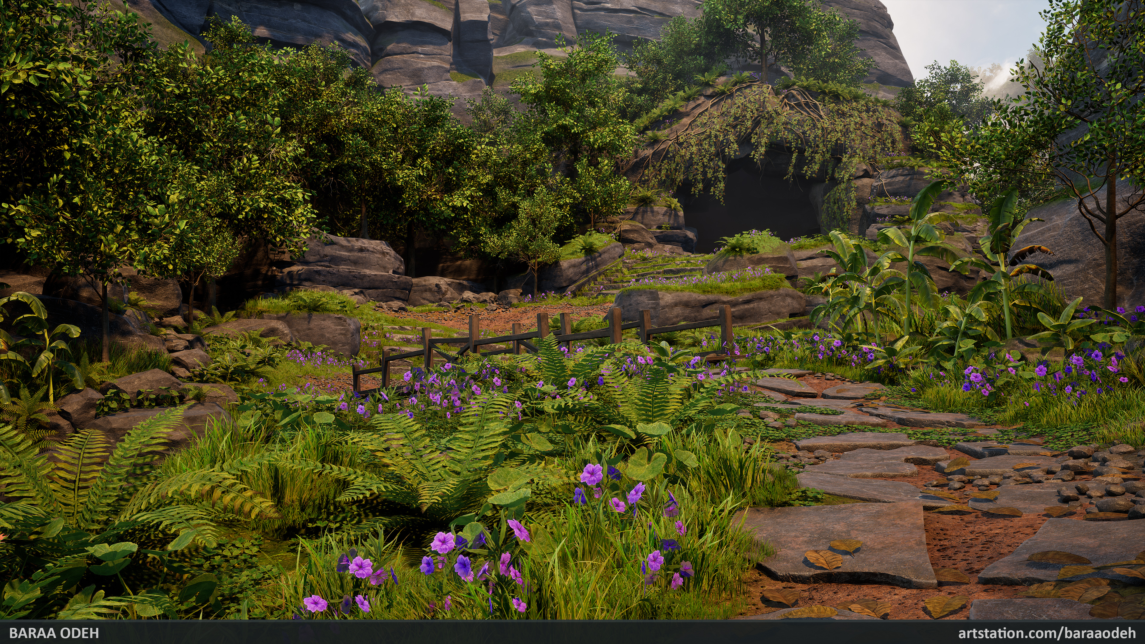
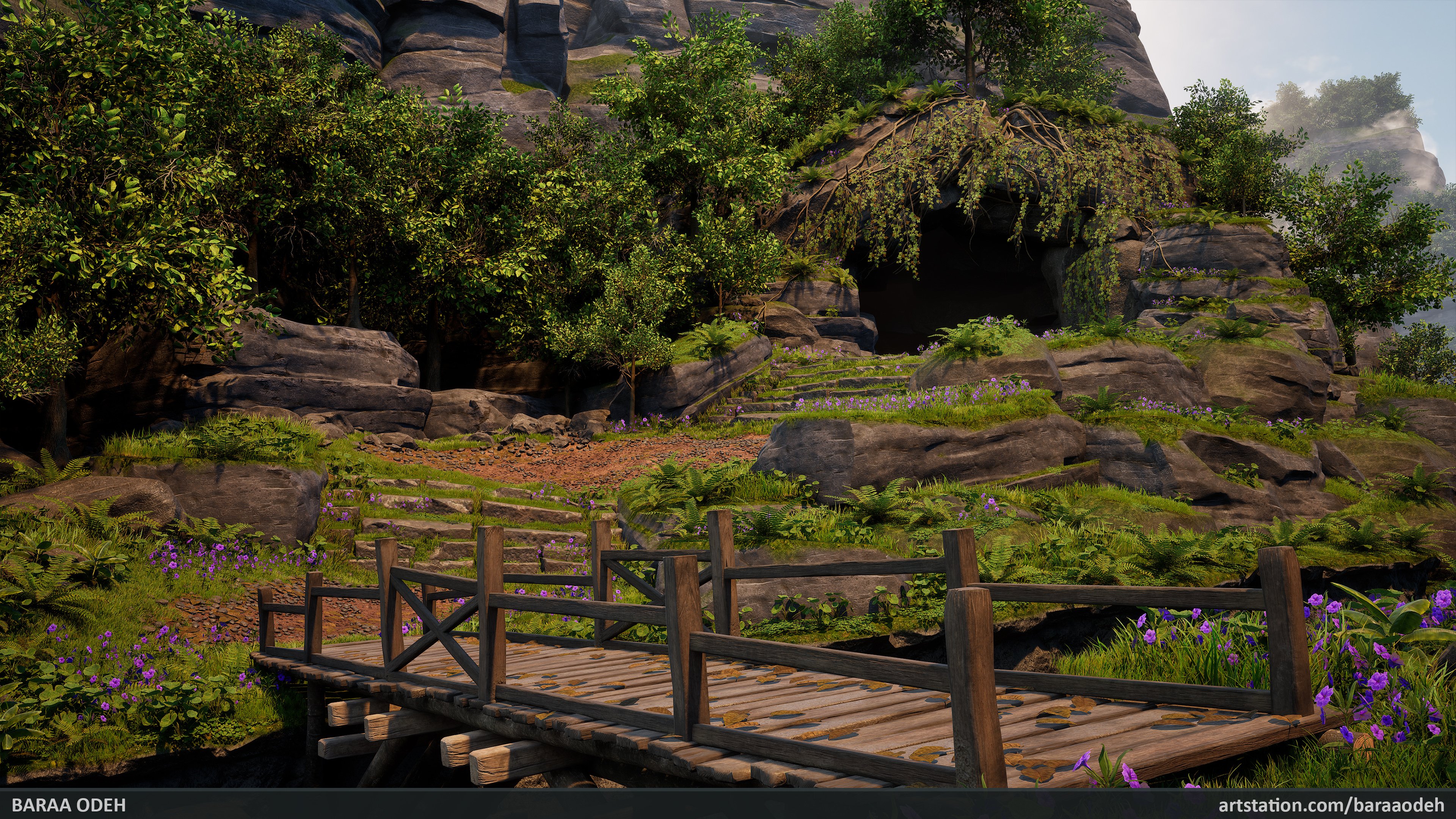
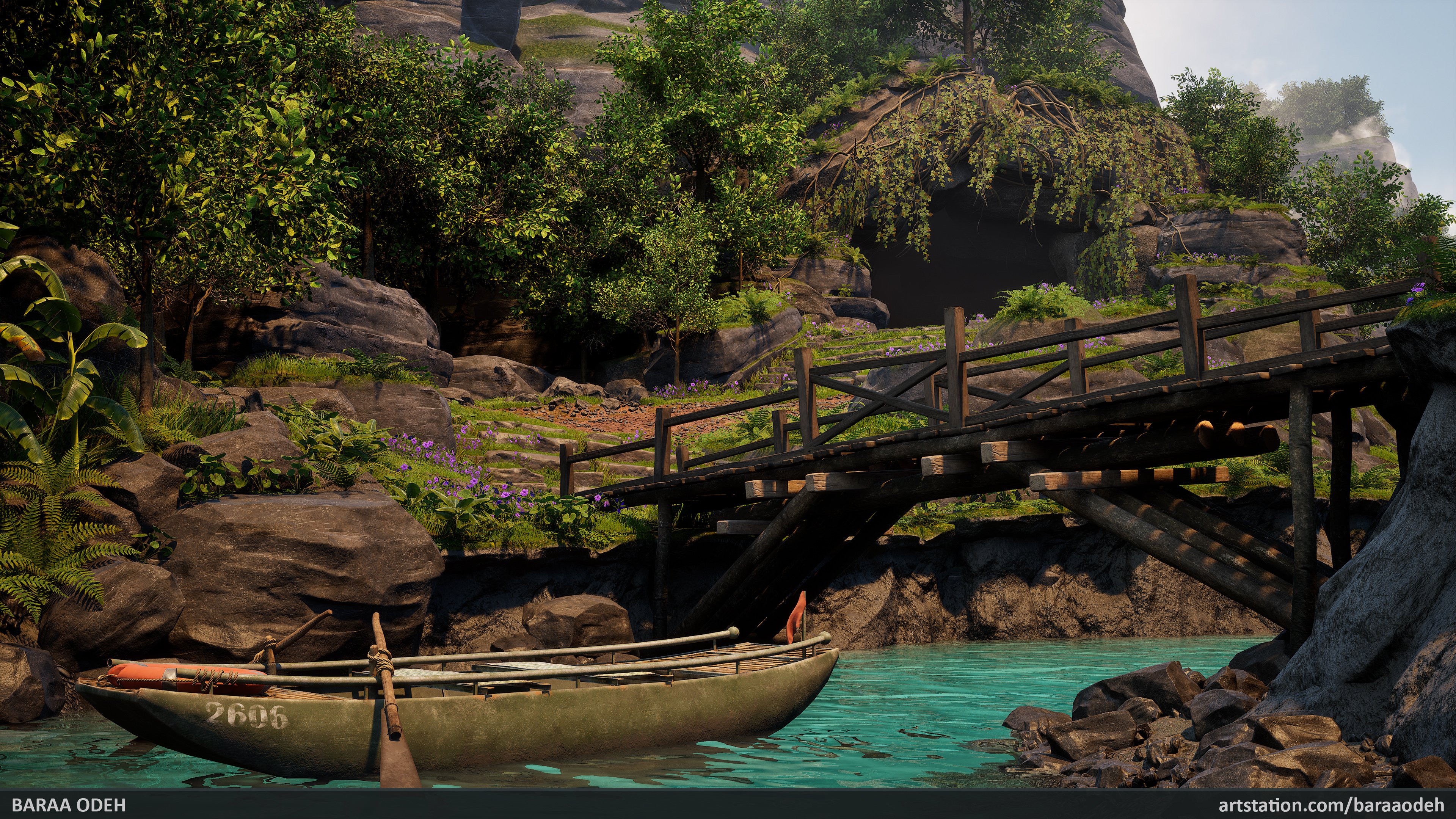
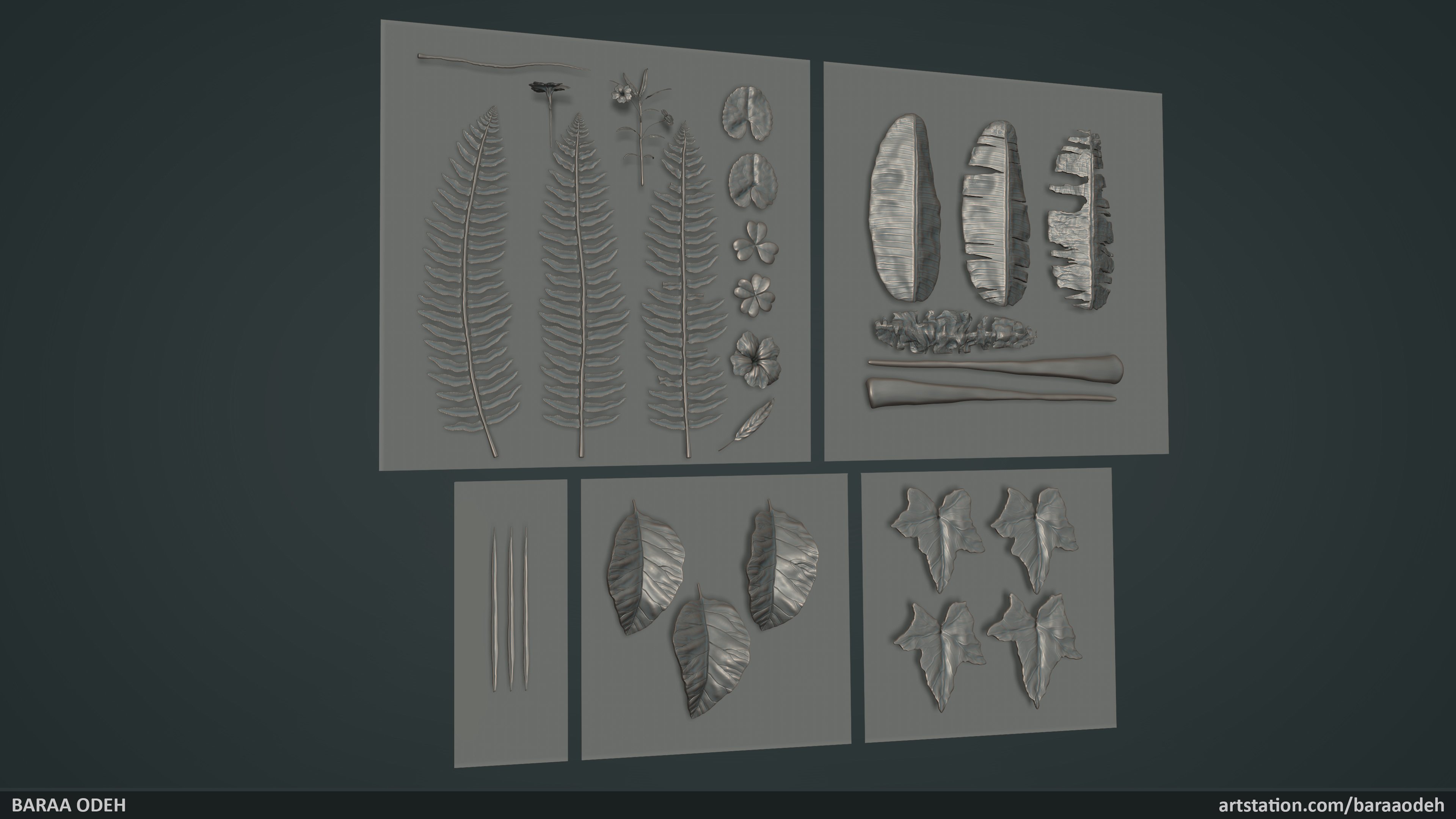
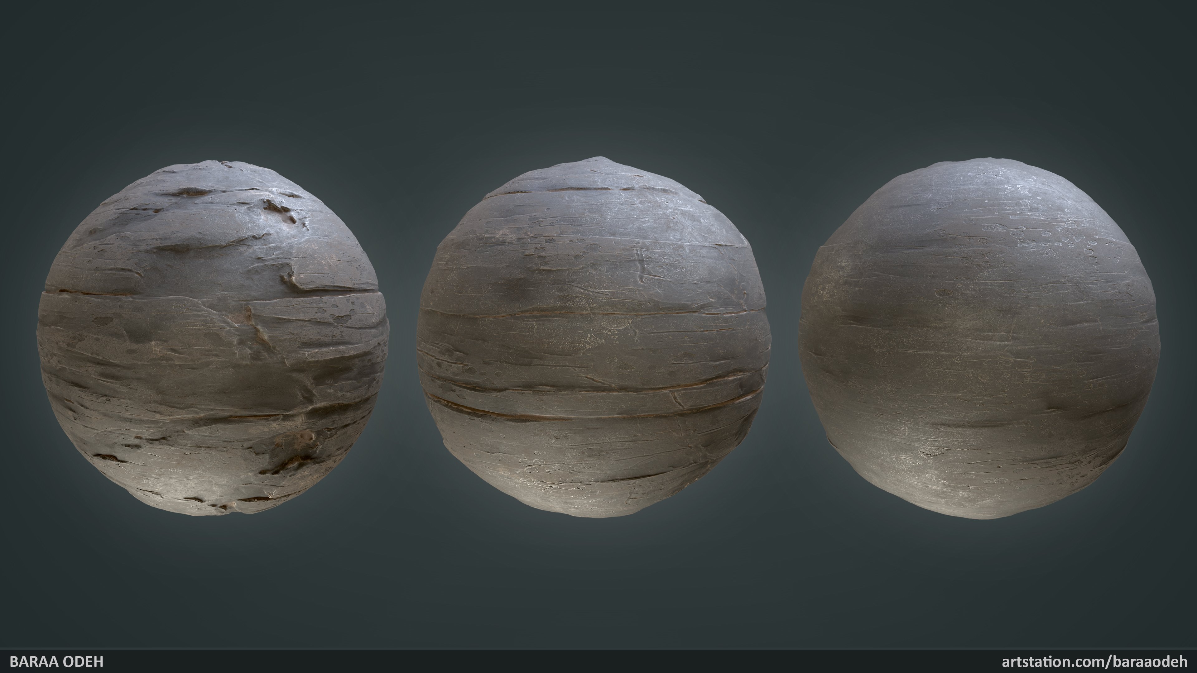
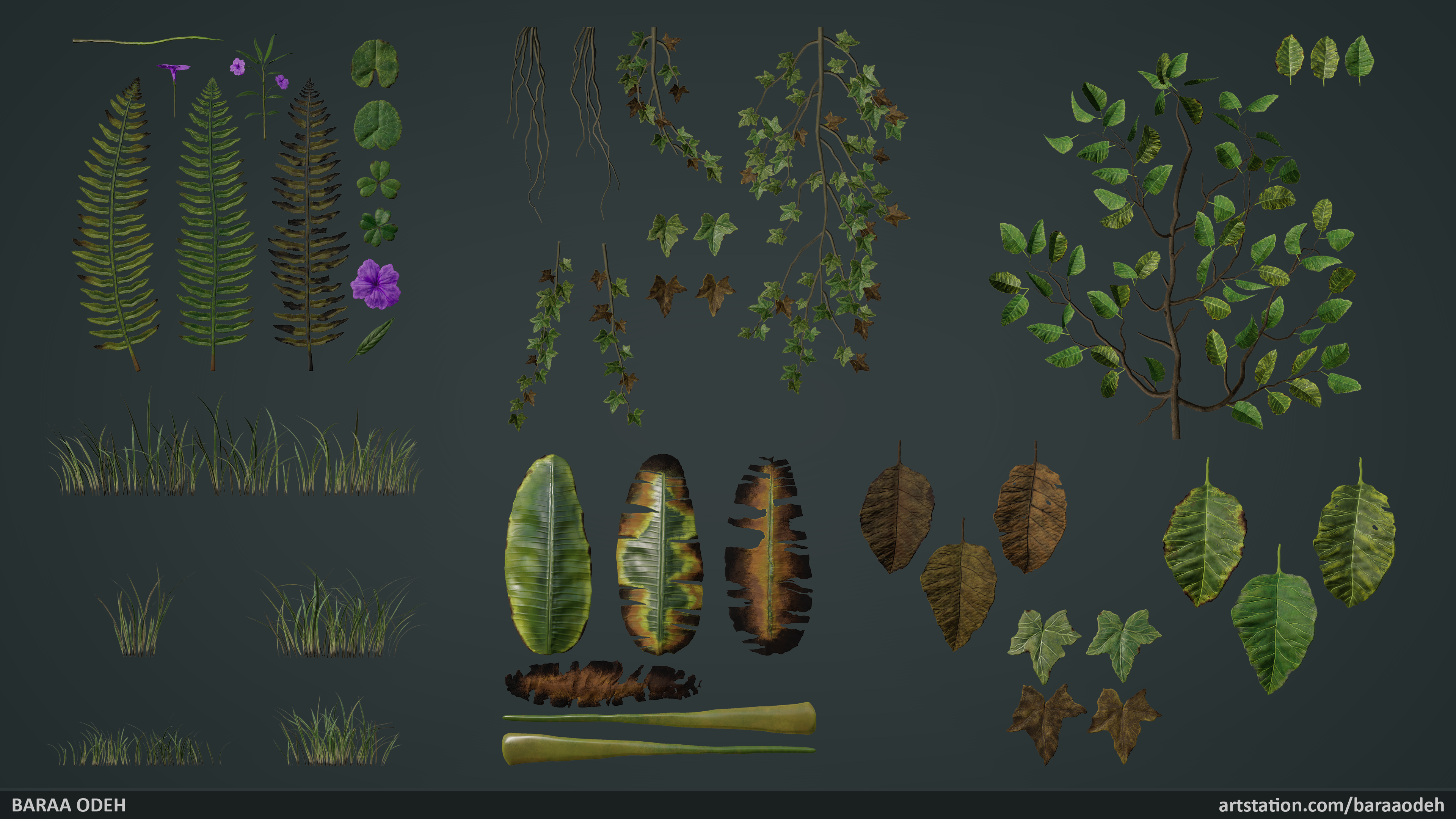
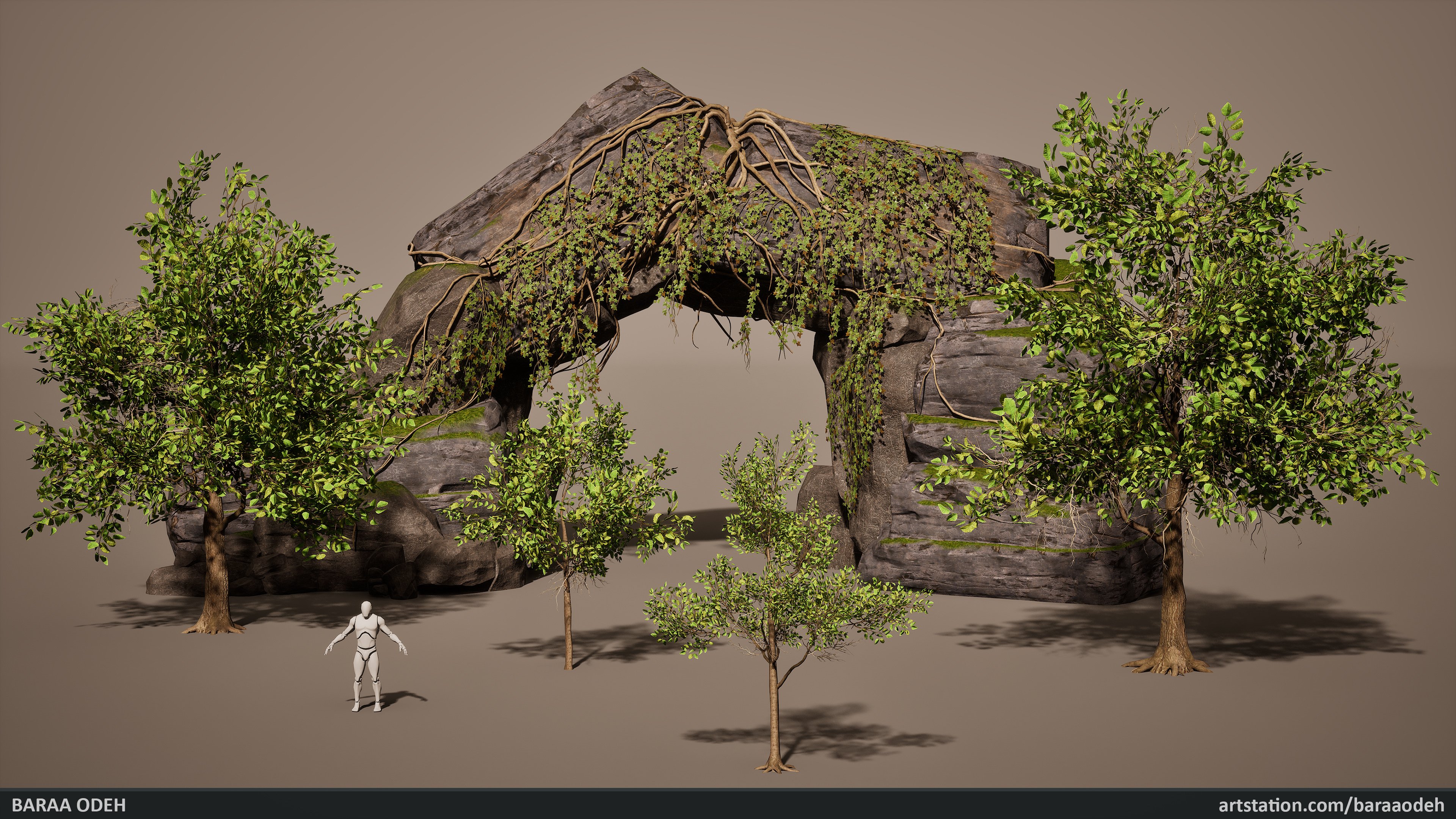
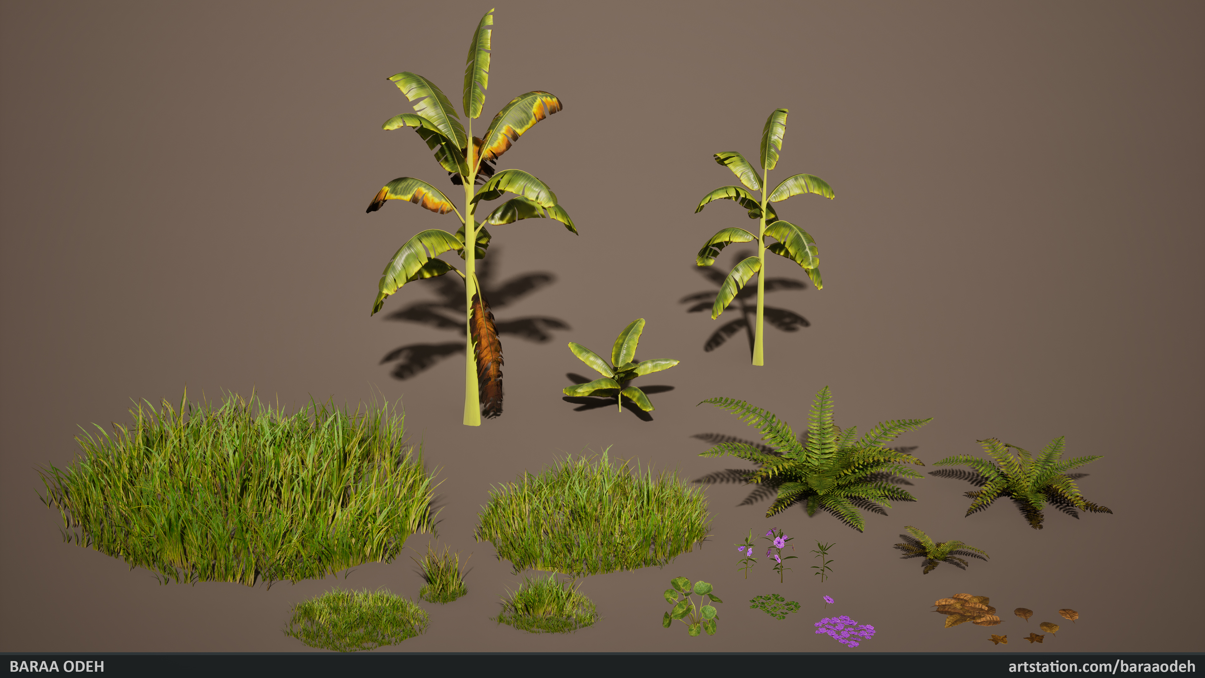
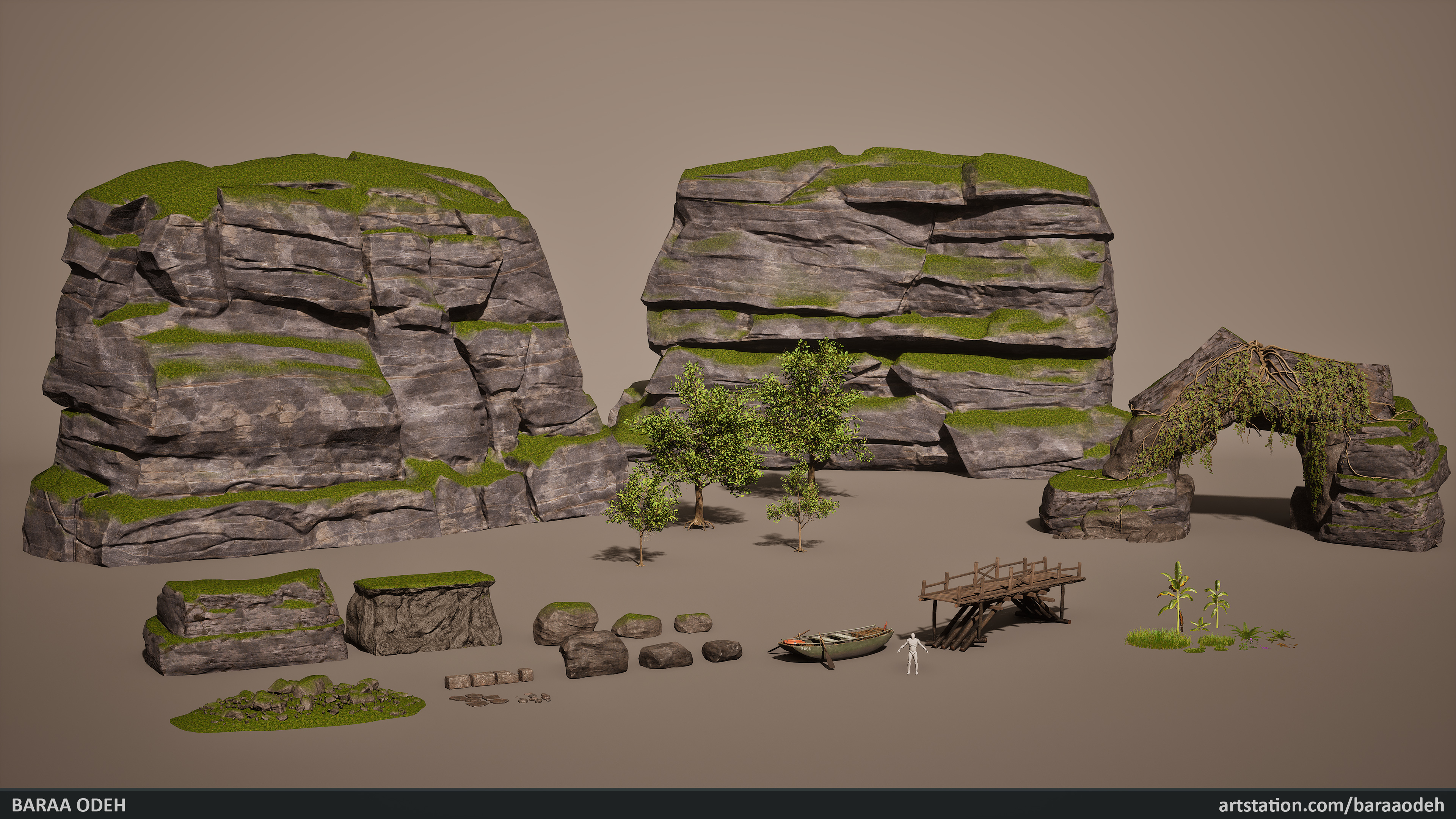
I'm very excited to share my latest project – an environment inspired by regions of Southeast Asia. This project came with many challenges, and everything you see was created entirely by me from scratch, without using any pre-made assets… yes, that means no Megascans assets were used!
The project took 17 weeks to complete.
Software used:
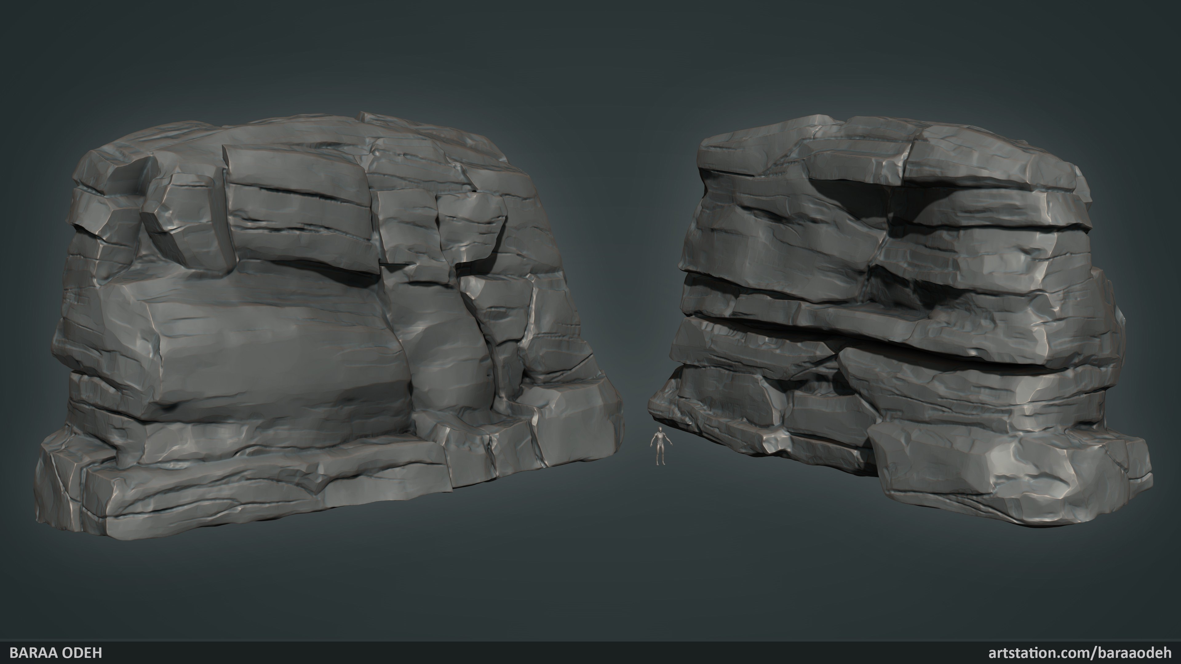
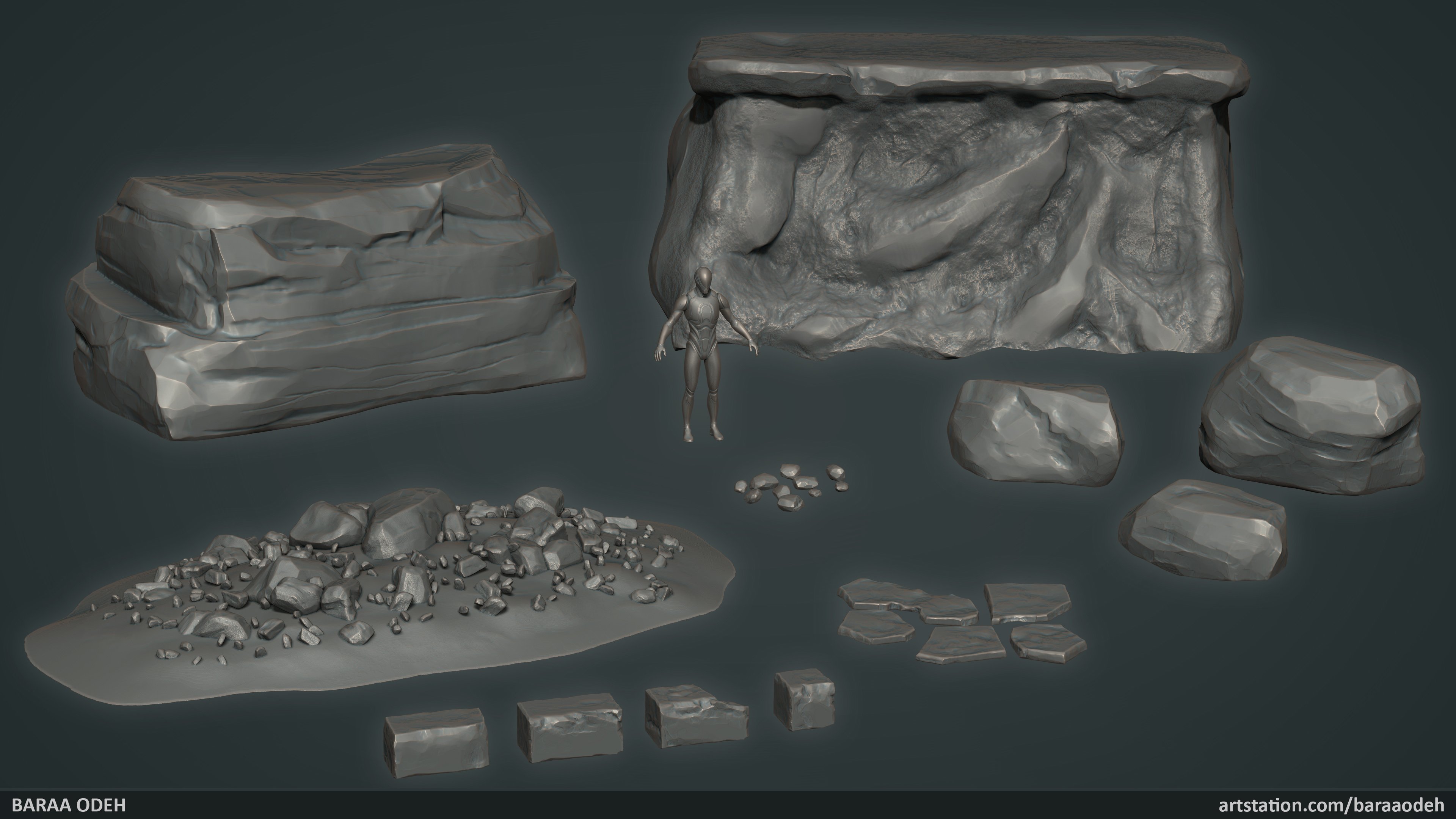
- ZBrush (sculpting)
- 3ds Max (modeling and UVs)
- Substance Designer & Substance Painter (texturing)
- SpeedTree (tree creation)
- Unreal Engine 5 (world building and set dressing)
For the best experience, I recommend viewing the project on a large screen to enjoy all the details.
With this project, I'm now actively looking for new job opportunities where I can apply my passion and skills.
Let’s connect – I’m open to upcoming projects. (baraa_odeh_97@live.com)
Check out the link to see the high-resolution images and more technical details.
I’d love to hear your thoughts – thank you!


Replies
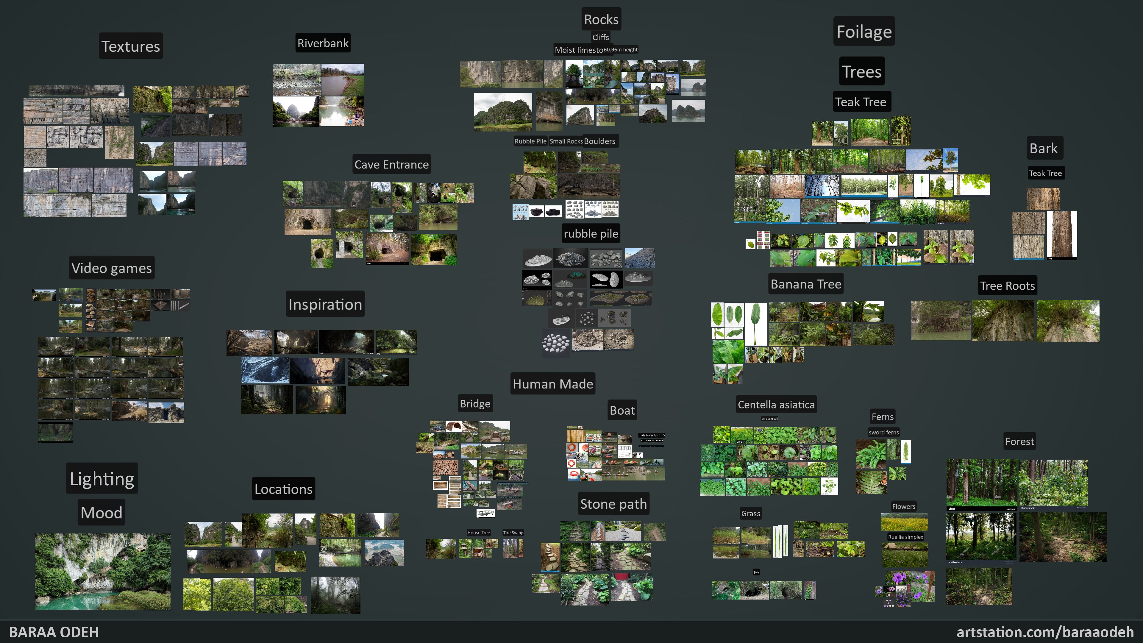
Nothing major wrong with it at first sight, the rock formations look convincing and the distribution of foliage seems spot on for the most part, but perhaps you could play with a couple of different light situations, as midday and very little shadow are pretty difficult conditions for getting an interesting look. Good for showing off your models, but then you do that separately anyway, and if you look at your "inspiration" group, they all have pretty dramatic lighting with lots of shadows, and being at the bottom of a valley gives you an opportunity to do something similar. There's probably a reason you found those to be inspirational and you are doing yourself no favors with your "mood" choice.
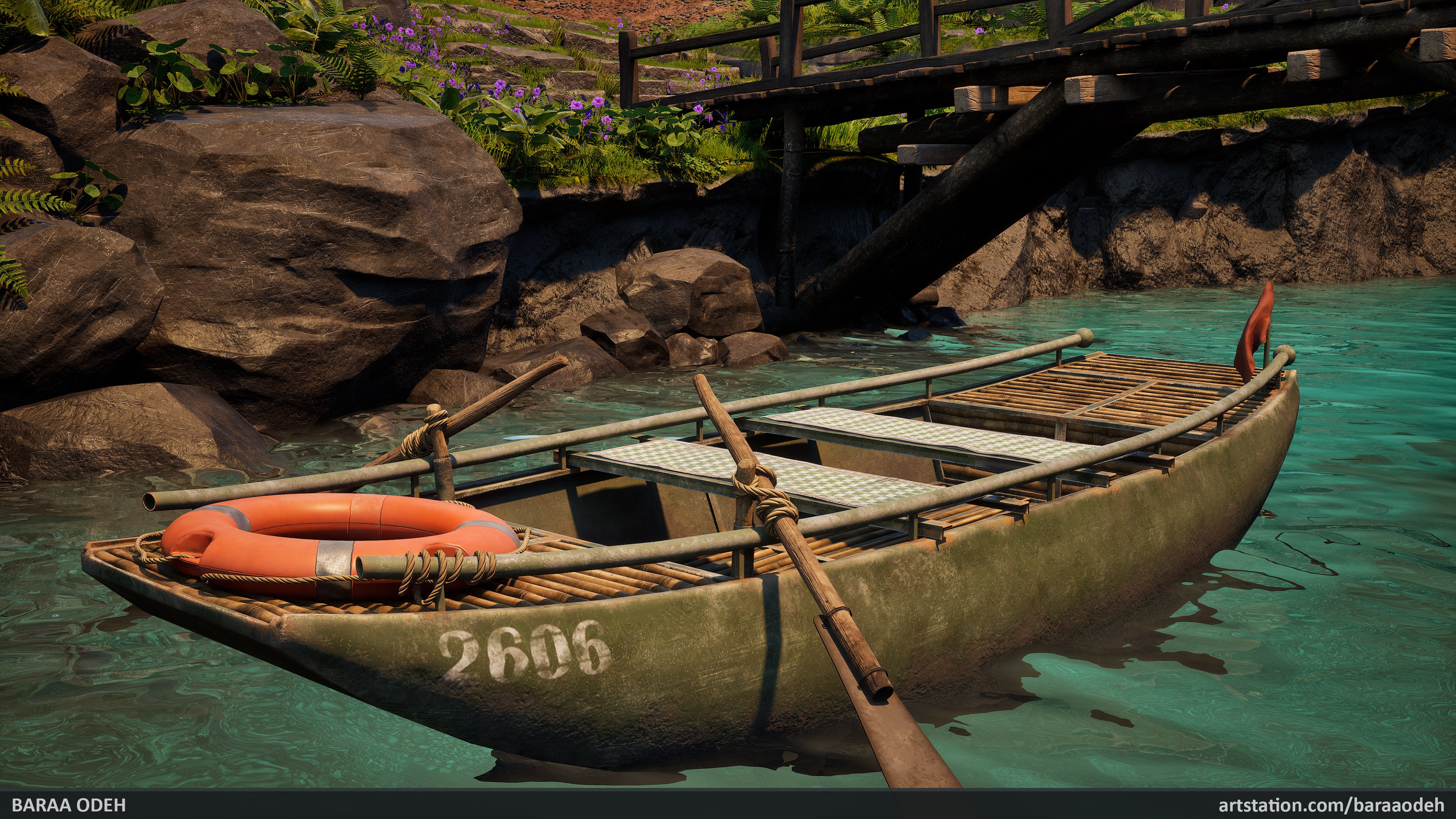
One thing that looks a bit off is the water. No idea how to solve that in UE, but water in the mountains is turquoise because is has a lot of sediment suspended in it, so it should be more opaque or have some fog in it. Yours looks a bit like clear water on a tropical island, but lacking the white sand underneath, so the color seems somewhat out of place and too saturated.
Other minor things:
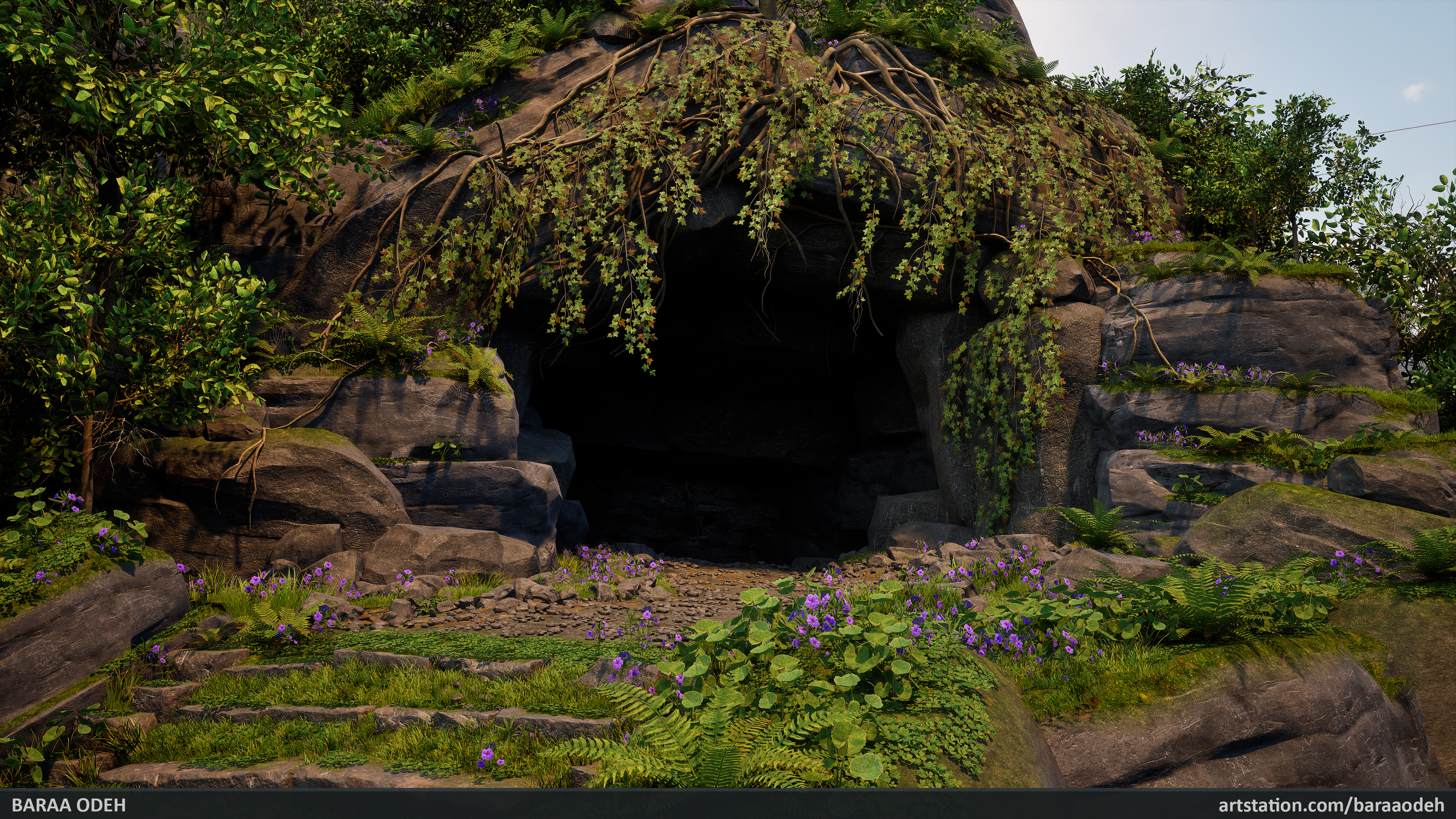
The purple blossoms would profit from having more than a plane (or have more depth if it's not just a plane) for the highest LOD.
The stone path still looks a bit like being in a garden or park (like the majority of your references) with someone taking care of it regularly. You do have some overgrowth, but there are plenty of narrow gaps where no foot would disturb any growth and while the ground is probably rocky, it does look fertile enough, also judging by the foliage in the immediate surrounding. But maybe it got very muddy in the past.
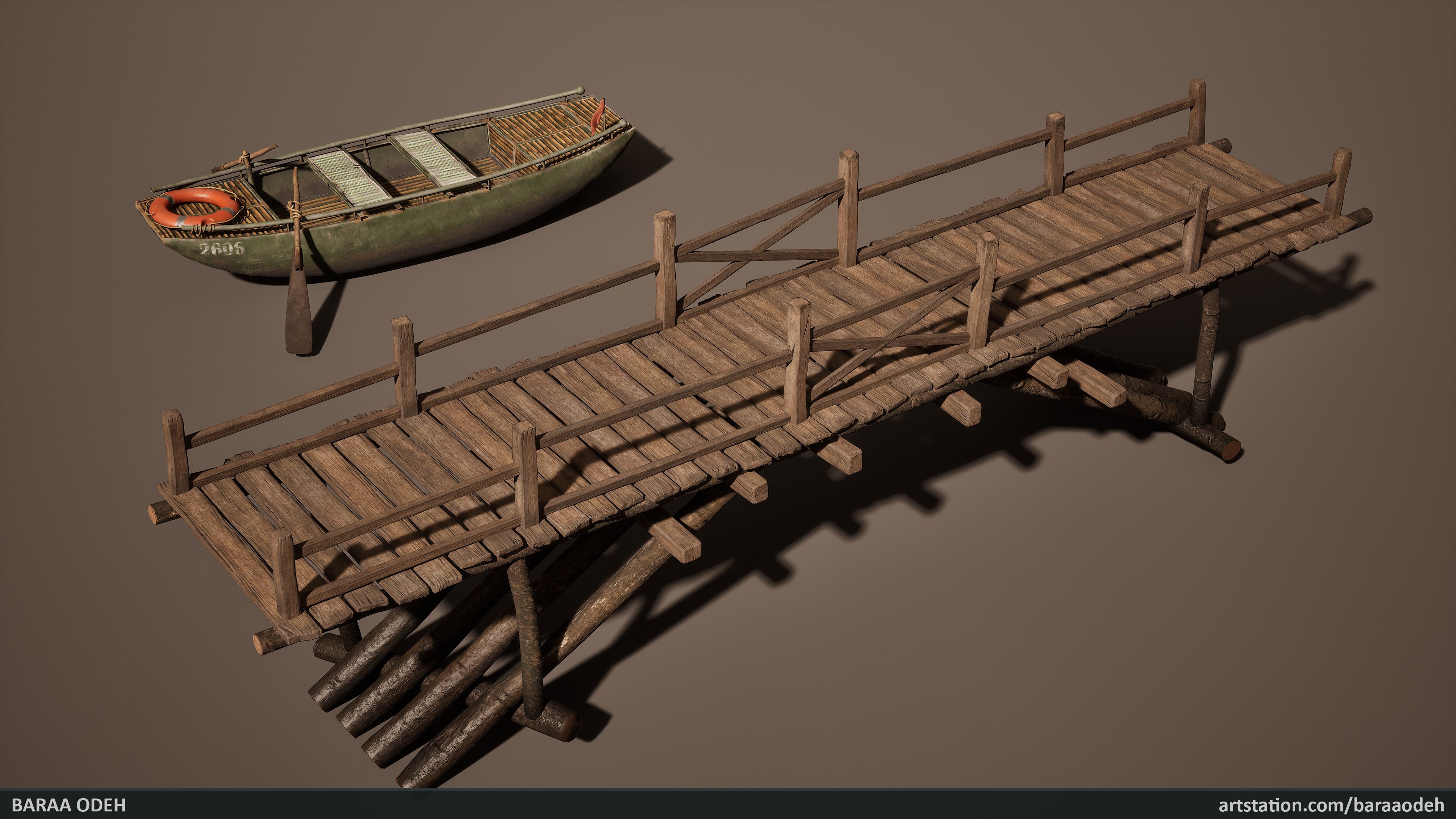
The distortion of the number printed on the boat might be intentional, but it might also be due to the UVs and/or mesh resolution. It also implies a touristy setting with lots of boats, so it might be a good idea to get rid of the number altogether if that wasn't your intention.
Lastly, the creeping plant hanging from the top of the cave entrance looks strange to me since it goes up for a tiny bit, but then downwards exclusively. Maybe there are plants like that, but this looks like you adjusted gravity or growth direction pretty strongly, and if this isn't based on a real life example, you maybe could combine several plant entities or growth stages to hide that a bit better. I'm not very confident about this, and there's a good chance I'm wrong, especially since you seem to have taken great care in creating your foliage in general, but I did notice it. Might also be the thickness of the branches at the base.
Here are a few things I'm struggling with here:
1. Aerial perspective, mist, water and sky
I think you are missing the fact that they are all the same. The sky is "blue" because there are water droplets in the air refracting the incoming light. And both mist and general aerial perspective are an expression of the same. So The color of water, the fog and the sky should come together to create a believable image. I think once you improve this things will get much better.
Separate, on aerial perspective you have a lot of crunchy contrast on leaves around the bridge. Is is too far into the frame for so much contrast. Look at more reference and dial in in the noise level. The darkest contrast is always in the foreground due to aerial perspective.
2. Composition
Your focal points right now are very cramped. The boat, the bridge or the cave - all 3 could be focal points, but they are on top of each other so much (especially the boat and bridge) that they make for a hard read. For focal points
1. Make clear choices of what is the main focal point vs. just features that help lead the eye
2. Use aerial perspective and contrast to separate. For example if it's the bridge change the material to be different color than the rock, add a fog card behind it to separate it
3. Consider strong foreground. Just place shaded vegetation in front of the camera - that will improve depth a ton.
Good luck!
Thanks for the feedback!
You have some solid assets to start. If you nail the big picture you have a really good portfolio peace. Keep going!
While at it think about your color composition. There are no clear complimentary colors here right now.
The big takeaway is that you can add color balance by using sunlight as your warm contrast and your shadows being the cool counter balance. The original lighting was very flat. Now just add a little explorer with a torch in the cave and you are good. Good luck!