

In this journey, we will also visit a newly built kopitiam (coffee shop) shophouse owned by a moderately wealthy family of Chinese immigrants, featuring subtle hints of Peranakan Chinese influence in its design and culture.
Your insights and critiques are deeply appreciated as I continue learning and improving this craft. I warmly invite all feedback from fellow artists and professionals to push this project to a higher standard.
╔═◈══════◈═╗
Links
╚═◈══════◈═╝
Personal Artstation: https://www.artstation.com/ongjianwei.
Project pre-production Document: Tanah Airku_Preproduction.
Project Tracking Board (Notion) : https://ongjianwei.notion.site/Headquarters-1f31557e1fd6805882b5d3bb6d36050b?source=copy_link.
Brief Development Logs (Notion) : https://www.notion.so/ongjianwei/Dev-Logs-2031557e1fd68073b0fddead6d882126?source=copy_link.
Formal Development Blogs (Tumblr) : https://jian-wei-24.tumblr.com/.
Replies
Rough CONCEPT ART
(The concept art are old with minimum research were done when drafting it out. Hence, the final design of the assets would most likely be different with justification and evidence.)
BRIEF EXTERIOR CONCEPT ART (Anushka Ghosh, 2025)
BRIEF INTERIOR CONCEPT ART (Anushka Ghosh, 2025 & Ong Jian Wei, 2025)

Further information about project can be found in Project pre-production Document: Tanah Airku_Preproduction.
Current Blockout in Unreal Engine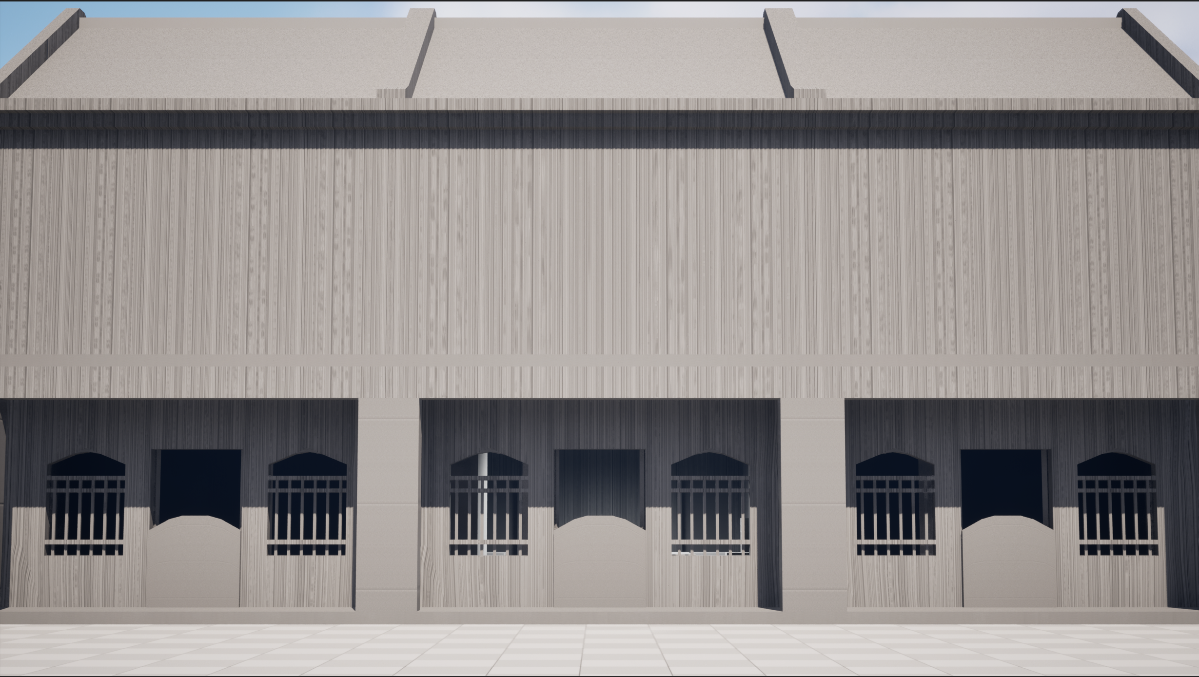
EXTERIOR BLOCKOUT (main focus will be the building in the middle. The buildings on the left and right will have minimum details)
INTERIOR BLOCKOUT
I focused on modelling and UV unwrapping the interior walls and floor, as the interior space is the first and highest priority area to be completed in the modelling process.
~ OPEN TO FEEDBACK AND SUGGESTION ^^ ~
Interior Wall & floor (Modelled and UV Unwrapped.)
Window Wall. Its upper Ventilation and main window are separated models from the window wall. (I am still unsure should I merge them all into one or separate them [If I were to separate them, I can swap out the window and ventilation designs for other building's modular pieces])
The window frame was UV unwrapped with attention to the natural wood grain direction.
Exterior appearance of the ground floor walls. The modelling of the doorway model and its supporting elements are temporarily halted to put more time on creating the interior furniture.
Kopitiam (Coffee shop) Table and Chair.
Temporary textures were applied to verify that the wood grain flows correctly, based on real-life reference images.
I'm currently developing the large cupboard furniture !
For the latest updates and in-depth insights into the modelling process of individual assets, feel free to explore the links in the main post of this thread.
I’d love to hear your feedback and thoughts !
The texel density seems to be a bit inconsistent (maybe exacerbated by the perspective).
The top of the table might be justified if you know for sure you'll stick with the softer marble texture or if it will be covered by a table cloth (doesn't seem like it in the concept, though) but maybe you just scaled the top as big as you could and then filled the rest of the space. The underside being smaller makes sense. The rim/side of the table is perhaps unwrapped as one piece, but it probably wouldn't be one continuous element in real life, either. So splitting that could give you some more UV resolution. You could even tile that if you haven't already, but then you have several tables and would have to be careful that the texture doesn't have elements that stand out too much.
For one table, you'll only ever really see about a third of the edge at any one time.
Edit: There seems to be a seam at the side of the table, so you perhaps split that already if that isn't the "main" seam (but then you wouldn't need padding for a continous piece that spans the full width of your texture). Maybe share your UV layout, if you want. After all, this could be a combination of different textures with different resolutions for all I know, and in the end, the UVs should be somewhat practical to work with as well.
Yea.. I am a bit conflicted on the texel density across all the current models as well. I will revisit this once I have a bit more furniture to see what shall be the common ground. (Do advice if this course of action is not proper or doomed to fail)
The table wouldn't be covered with a table cloth and will have a softer marble texture on the top~
I did split once on the side for extra UV resolution and also for realistic purposes of it not being one single piece. However, I only split the side once, would splitting it more than once be more realistic?
I will keep in mind about avoiding obvious wood texture repetition when I begin the texturing phrase!~
Ah, sorry! I have forgotten to attach photos of the UV layouts! Here are the UV layouts
Thank you again for your feedback, @Noren !
Deciding on / adjusting the texel density a bit later has the main disadvantage of you having to redo stuff, so I wouldn't push it back too far. So now is probably a good time since you already have a couple of elements. Obviously, the texture for the chair would be smaller than the texture for the table.
Splitting the rim more than once would mainly be for texture resolution. But the first thing I'd do is scale that part to span the whole width of the texture and then stack the other half on top of it and see if that's enough.
Likewise, I don't think the legs need unique UVs (unless you have decided on that for a reason). E.g. having 2 unique legs should be enough to avoid visible texture repetition within the object itself. If you have two legs next to each other and rotate that 180 degrees, we'll be looking at the other side of the legs. And if the texture is generic enough, you could even get away with one leg. Just make sure to move the duplicates to the side when baking your textures.
And like mentioned before, if the texture doesn't have too unique features that stand out and wouldn't repeat in the real object, it shouldn't be a problem between objects, either. If people really want to go and find texture repetitions, you can't stop them anyway. Technically, two limbs could have been cut from the same piece of wood as well and share the grain on one side.
Maybe you don't need texture space for the bottom of the table at all and can simply map that to the top if the material is the same?
If you need some pre-darkening with AO, you could do that via vertex colors (but then you'd have to find out if takes less or more ressources overall).
As for the layout, you could be more strict with putting identical/similar elements next to each other. As I understand it, you are trying to skip texturing the highpoly, so the orientation of the pieces matters. Also, you obviously already tried to group your elements, and sometimes moving them apart is the only convenient solution, but at least at a cursory glance, there seems to be enough space to alleviate this quite quickly in case of the table.
It looks like some of the edges don't contribute to the shape as well (bottom of the table looks different in the UVs, though, so that might be an older version).
You don't want terribly long and thin triangles, especially for bigger objects, but e.g. in case of the pillars on the legs, I'd probably remove the intermediate loops. Unless you need it for vertex colors or someone else says otherwise.
As for the marble being a texture with less detail and therefore requiring less texture space: Works for me, but you might still get questions if you show your UV layout, or worse, people might see it as a mistake (there's also the hypothetical possibility of someone asking you to change the texture later or someone else having to do it).
Roger that! Is this Texel Density alright?
Oh I had thought about cutting off the legs and have it duplicated for the other side but didn't come across of doing it. I have done the mentioned changes. Using the image above, The back two legs are a separate model using the same UV.
Ah the top and bottom part of the table would be different material. The top would be marble texture and the bottom would be wood texture.
I am sorry but I am not knowledgeable about pre-darkening with AO.. Do you have any external websites I can read up about this? (If you don't, no worries! I will look it up later)
I have deleted intermediate loops~ There isn't any plans for vertex colours for the tables as the furniture would be new because its a newly built shop. Hence, there wouldn't be too much obvious wear and tear or damages to the furniture. The remaining edges I kind of need them to keep the roundness of the shape.
The current marble texture seen in the previous reply is a place holder as I have not reach that texturing stage yet as there are many other assets that are yet to be modelled x.x
Current updated UV Layout!
(I make room for the chair UV Layout so i can duplicate another chair and has its UV take that empty right slot. Then after texturing the two chair as a single object, then i will separate the two into two unique chairs using the same material [I hope I am making senses >o<])
Sorry if I’ve misunderstood and done something different from what you were referring to. I really appreciate your patience and support! Thank you again!
Also, for now, this only tells us the relative density, not the absolute one. To check the actual density, you'll have to work with pixels. Probably can be inferred/calculated from your checker pattern for various resolutions, but it's better to go with a pixel sized pattern directly.
Assuming it's not an illusion due to the perspective, the rim still needs a higher resolution in my opinion. There could be a rationale, like e.g. the rim doesn't need normals and the feet do, but I'd try to get this a bit more homogenous. And if you haven't nailed down your final texture for the table top, then I would give that a higher resolution, too.
I can't tell 100% what you are doing right now with the rim, but like said, I'd use the full width of the texture and/or maybe even tile this some more. You could also detach the backside and scale that down, but you'd have to decide that while actual having it in front of you (is the gain in texture space worth the inconvenience, maybe you'll split it anyway for normals etc.).
And unless this is for a shooter, where people crouch around or topple over furniture, the underside of the table will hardly be seen, if ever, and even with a different material, the underside "steals" too much texture space from the things that will be seen the most and closest (like the top and the rim). You could half or quarter the UVs, here (pie slice like), especially since there are already beams underneath that would hide the seams conveniently. Or you could do a generic wood texture and squash your UVs (very situation-dependent and not artist-friendly, though).
You could also model the underside as a separate element with fewer segments that just sticks in there. You won't save on vertices since they are already there because of the rim, but this would be a case where there's not need for a lot of long thin triangles. Would it actually matter? No idea.
I don't think that's a fixed term. I was just referring to baking an Ambient Occlusion pass (or some shading in general) into the diffuse/albedo in case the visual quality of the render engine or settings isn't sufficient for your intended use and you aren't using light maps (that often have a second unique UV set, calculated automatically).
What I would probably do is set the texel density, then, ignoring the 0-1 UV space for this step, scale the elements in such a way that most have the same relative density minus the stuff that is hardly seen or farther away from the camera (which technically includes the legs, but maybe you want to show off your handiwork in some closeups). Then decide on a texture resolution for this object and arrange the UVs accordingly. There might be some overlap or back and forth between these steps as well. If you have some free space in your UVs, and the large islands are maxed out, you can scale up smaller elements, but usually there's nothing gained by that other than giving the illusion of a tighter packing and there's always the possibility that you'll need that space in the future.
I hope this isn't too confusing. I know I tend to ramble and offer a lot of caveats.
The planned environment is going to be a first person viewing and allows audience/players to roam around. I don't plan any crouching movement or interaction at this stage of production ( Most probably will implement it when I am done with this project submission by polishing this into a portfolio piece)
The checkers map I used is generated by blender by making an UV grid image. I did the settings of 2048 x 2048 px. This a 1 m dimension cube with the UV grid texture applied along with its details with the Texel Density Checker addon in Blender. I plan to keep most of the objects to be 2k textures and 4k for more complicate objects or objects that will be viewed closed up.
This is the new UV Layout and an orthographic view of the table. The rim and surface top are 9.784 px/cm. Any higher the rim and the surface top would exit the grid.
UV comparison with Chair and Table in orthographic view.
I apologise if you had to repeat any steps or techniques in your feedback that I still have not visibly implemented or reply to. Please feel free to point it out, as I may have unintentionally overlooked it while rushing or got confused amidst researching the terms too fast until I had forgotten. > ~ < !
Thank you again for your feedback and patience!
9.784 px/cm sounds reasonable as well, but personally, I would still slap a checker map with 1024 tiling on there (so 2048 pixels) and move around a bit to see what that translates to in praxis (not really practical to post screenshots of that, though, that's more for yourself).
The edge padding might be a bit small in places, but that might be a wrong impression due to the screenshot resolution.
Here's a link just in case: http://wiki.polycount.com/wiki/Edge_padding
And you can use less if none of the maps has any real contrast in that area (more tricky with normals, though, at least with different island orientations).
It's Noren, btw., not Neron (no worries, though).
Alrighty! A checker map? Would it be the one that I have been using or the colour checked map? Also the checker image is generated to be 2048 by 2048 pixel.
Oh! i have not heard about this before. Thank you for your wisdom! I will do some editing to the UV to leave a bit more room for it.
Thank you for your feedback, Noren! I am currently working on the cupboard model. Should be able to post an update on that by tonight!~
Cupboard's Texel Density (Lower cabinet's interior is lower resolution as i do not have enough space in my UV layout and decided to have those cabinets either slightly open or closed)
Cupboard's UV Layout (4K resolution as i was unable to fit all the UV parts into the 2K resolution checker grid)
Cupboard Lower Cabinet doors (2K Resolution)
Feedback and advice would be appreciated! I currently feel kind of conflicted with the UV layout at the moment
{ > ~ < ll| }
As for the cupboard, I'd probably try to get it all on one texture, maybe 8192 x 4096 if need be, but 4096 x 4096 should be possible as well with better optimized UVs. The table was 2k? (Don't sue me if it doesn't work, though)
You could use a separate material and texture for the glass, or just a separate material. You can do it all in one, too, but it's a bit more optimized if opacity needs only to be considered for the actual glass part.
When using different textures, I would try to adjust the tiling of the UV checkers for an even checker size between different resolutions. So 4k should have double the tiling of a 2k texture. That way, you can see their relationship at a first glance. I don't know how this works in Blender, though.
As for the UV layout, you could try to find parts that can have repeating UVs again. E.g. we are unlikely to see both outer side pieces of the cupboard at the same time (unless there are a lot of them). But in the end, that's up to you and where you want to fall on the spectrum between optimized and unique textures. It would also be more complicated to get the edge damage to match to the mirrored sides on the on hand and a non-mirrored front on the other.
The shelves offer potential for reusing textures as well (you could separate the front facing bits and make those unique). But again, that's all a question of ressources, how much hassle you are wanting to put up with etc. Having it all unique is viable, too.
It's good thinking to keep the inside of the cupboards at a lower resolution if you are absolutely sure they won't be seen, but you might just as well reuse textures from other parts of the cupboard for that. But if someone decided to open them a bit more later, it could be a problem with the current config.
Other candidates for areas of less importance:
The top is unlikely to be seen in the current context.
The backside/bottom you already discarded I assume?
Not all three lower cupboard doors need unique backsides or handles.
You maybe could lay out the parts of the wooden pattern in the glass doors in a straightened out fasion (best to do the UVs already when modeling, though, in case you used splines). Again, that's some additional hassle as well, so up to you. You probably have a deadline.
Those elements and large parts of those doors don't need unique textures for front and back side, either.
What's your plan for shading and texturing? Normals? Baking? Sorry didn't read the project brief.
Thank you for the clarification! I put a temporary wood texture to check. (The main cupboard is 4k and its doors are 2K)
I made a mistake in my last screenshot ! The main cupboard in the previous screenshot was utilising a 2K checker texture instead of 4K. Now with the proper 4K checkers, it seems to look better. Yup, the table is 2k textures.
(Wait what doesn't work?- would it create issue if a table with 2k texture and a cupboard with 4k texture make errors? The cupboard is way bigger than the table so it should balance out right..?)
Alrighty, I will assign a new material for the glass~ They are still using the same UV space as all uv parts are 10.24 px/cm, similar to the chair and table.
Roger that! Yea, its done by changing the preview image from the 2k checkers to the 4k checker in Blender's UV Editor (If i am not wrong x.x).
I planned to duplicate this cupboard twice but they will be placed side by side. so, I would need its outer side pieces to remain unique as one side will be cover by the either (eg. cupboard A's right side will be blocked by Cupboard B's Left side).
At the moment, I want the cupboard to have unique textures as it will be one of the big furniture that stands out in the room.
For the moment, I planned for one or two of the lower cupboard doors to be open slightly but its inside will be filled with big boxes/assets so it will still cover the lower cupboard lower quality textures.
The top of the cupboard is given more resolution because one of the main shot is from above and can see the top of it. (The lighting will be brighter)
I didn't discard it (I assume delete the faces?) but i have minimise the back and bottom face to super low resolution as those faces would be seen.
Oh good call! I had forgotten about the backside of the lower cupboard doors and handles. However, I have enough UV space for all parts of those doors and handle.. Wouldn't be having more unsure space in an UV space be not optimising? (I do have a question, if using tile-able wood texture on the whole cupboard, it will be more optimise than baked textures for the whole cupboard?)
I dont quite understand the straightened out part..
Each door currently has its own UV layout with a Texel density around 10.24 pixels per cm, which is consistent with the rest of the assets such as the chair and table. I understand the suggestion about not always needing unique textures for both the front and back sides. However, in this case, I was able to allocate UV space, so there was no need to scale down the back side UVs. The layout stays within the intended Texel density, so I felt it was reasonable to maintain a unique unwrap for the entire door.
I plan to mostly bake textures in substance painter for majority of the assets. However, I was thinking of texturing a plane with 4k wood texture then apply on the cupboard like a trimsheet as there will be two cupboards (to make the two cupboard's textures less identical) then use UE's material layering system and RGB masking to get the details.
Thank you for your feedback, Noren!
But wouldn't that mean that you only ever would really see one side at a time? However...
...that's perfectly fine as well.
Perfect, that's what I wanted to say (you could also collapse those completely to one corner of your UVs if you wanted or map them to another generic wood part of your texture.
It's not more optimized if you fill it with stuff that will never be seen or doesn't really matter. It will only seem more optimized at a first glance (which might be a viable tactic at times, if all you want is just that). And it would give you a chance to consolidate some of those separate textures into a common one or add different stuff later.
A tilable wood texure for the whole cupboard would be much more optimized in principle (as it could be much smaller), but then you'd have to use other ways to add detail and unique elements (e.g. decals, vertex textures and blending, light maps the mask you mentioned) so in the end, it's the "cost" of the whole object that counts and it might be less straight-forward as well.
Basically like this: It could be packed tighter that way. It will add some distortion, will require additional UV splits. Will prevent you from using a wood texture as if the whole thing is carved from one board (which it might or might not be) if you don't have a separate UV set for the object you're baking from. Again, up to you if you think that's worth the hassle.
Do you plan to use normal maps and do you know how to split the UVs for those for hard edges?
For now, I will keep it as it is but I will take this advice for the other assets! Because maybe i want to put something between the cupboards later that would expose the sides.
Alrighty! I am sorry if this sounds dumb.. > ~ < but how do you map them to another UV piece? Wouldn't it overlap and create issue if its baking textures?
oh alright.. I would like to be seen as doing my best to optimise when this project is graded.. I will do the necessary changes after i receive your input from the previous question. (By not making it unique would be to overlap the uv on existing uvs to get similar textures without too much performance cost?)
Ahh.. i get it! Then for now, I will bake two unique texture sets for the main cupboard body while for the larger or hardly seen surfaces, I will use tilable textures. Oh i had taught about this but didn't really attempt it because I thought it would distort the uvs. I didn't realise it could be solve with a bit more loop cuts. I will use this for the star-like shape of the cupboard because its wood gain flow looks weird. Thank you for your guidance!
I do plan to use normal maps. (wait i thought every assets need to have a normal map or would it is not really necessary?) Also.. i do not know how to split the uvs for those hard edges.. Please do advice :'0
Thank you again for your continuous support and wisdom!!~ :']
https://polycount.com/discussion/237228/uv-performance-cost-when-packing-vs-tiling-uv-islands#latest
Other than that, you simply look where it might fit. Or you could plan a small part of your texture as a tiling/repeating generic wood texture to begin with. Generally speaking, they should only expect what they taught. It can't hurt to go beyond that, of course, but it might be a good idea to check with them beforehand. Yes. But how necessary or critical that is depends on the circumstances. Like said, you can go unique for a hero prop or for other reasons. Doing two texture sets for two more or less identical cupboards would seem like a poor allocation of ressources to me, but maybe you can work quicker that way because you have to worry about less things or you can do the variations easily in substance and it is important for you to see no repetition. You could also do a fairly generic base cupboard and then add decals for unique damage and details, but that's probably not worth it for such a small environment and cost you time as well. Other than the things mentioned in the previous paragraph, that sounds good to me. For a mostly boxy model like a cupboard, you'll need normal maps if you want to have surface details like wood grain or ornaments that react to light or round off edges via the textures, otherwise you can get away without it. Clean topology will be more important without and the mesh might show up in the shading a bit more as it will be interpolated between the vertices.
You could also do face weighted normals, but I mention that only for completeness sake, so don't get distracted too much: http://wiki.polycount.com/wiki/Face_weighted_normals
Regarding hard edges, you basically wan't to split any UV island along edges that are hard in the model as the normals will have to follow that edge perfectly to either side and any interpolation across the edge will show up as an artifact. So you'll want to leave some room for padding, there. See the section Texture Coordinates on this page in the Wiki:
http://wiki.polycount.com/wiki/Normal_map
(It's always a good idea to check there first if you have a question as you might find your answer directly.) You're welcome! However, I'll probably have less time in the coming days, but with a bit of luck someone else will answer.
By moving right , down or left, would it still be within the UV layout grid or outside? I shrank the back part of the design bc it won't be seen by the camera and place it wherever there was space. (The UV Layout in this picture isnt properly done as other bits are not combine yet.)
In the postgraduate Game Arts course I'm enrolled, a lot of the learning happens through the feedback we get during progress presentations, which I do find helpful. That said, the guidance can sometimes feel like an indirect way of saying "Learn it yourself", so we often end up figuring things out as we go. They do expect us to go beyond and present what is at the forefront of the industry x.x However, thank you for your advice!
Hmm I, too, feel that its weird for two identical cupboard being next to each other but having just one cupboard seems a bit awkward in the screenshot above (viewers can also enter the environment via FPV, this screenshot is for presentation/WIP progress video purposes). Then i will change a bit from my previous statement, I was thinking of one wood tile-able map (Then later RGB masking to add details) for both the cupboards so that the wood texture can give the feeling that both cupboards are different and I would place things inside the cupboard to make the cupboard less identical. (The cupboard upper main doors will have a glass window to view inside)
[I also completed modelling the interior lighting and the room's wooden screen, seen at the back of the room in the screenshot above, I will make a post once I'm done with their UVs!~) I see! Thank you for your advice regarding this! I always thought every model requires a normal map or it will feel flat.
Ah.. I understand now! Thank you!
(Also thank you for this advice! I wasn't aware that there is a wikipage in polycount as I am new to polycount ^▽^)
No worries! Good luck and I hope everything goes smoothly for you in the coming days! Thank you again for assisting me in this development journey!
(^▽^)ゞ
Completed and UV Unwrapped the ceiling lights.
Completed and UV unwrapped the wooden screen.
(temporary wood texture to check if the wood gains are flowing correctly)
Texel Density comparison with other assets. (Uses 2K checkers but the UV would come off the UV layout grid but plan to use tileable wood texture for the wooden screen)
Modular parts of the screen. (8 individual pieces)
Feedback and advice would be appreciated!
Feedback and advice would be appreciated!
Completed the kopitiam's cashier counter and UV unwrapped! (5 Modular pieces)
1 Calligraphy picture frame, 1 rectangular picture frame and a square picture frame was also completed and UV unwrapped! (The picture part of the frame is given more resolution to ensure the picture isn't too blurry)
(Texture testing.)
Completed and UV unwrapped 2 different height glass jars! (A higher resolution was applied for the glass jar so that that the glass texture would have a better visual quality)
Completed and UV unwrapped a Chinese Abacus!
(The texture seen below will be the final texture for this model. The wear and tear is to inform the audience that it's an old abacus and possibly the merchant family's heirloom.)
Thank you for your time and continued support!~
"Particular big as in big file size?"
Resolution and file size, yes.
I was pondering for a moment if you could have baked the screen ornaments to a flat geometry, at least at the top, but I think you made the right choice.
Yea, I wanted to model the screen ornaments because I wanted the depth and it's the centre piece too look at when you enter the room~
I have started texturing for all the assets created so far. Here are some interior screenshots from fixed cameras.
Several textures were done using Substance Designer, Most of the assets are using the same textures or trimsheets. The gold cravings on the wooden screen are decals.
(I am going for a 1935-ish era. Hence, the currency at that time would be the Straits Dollar as the environment takes place in Malaya [Nowadays Malaysia]. Also, the 10 dollar bank note at that time is that big according to online sources.)
At the moment, i'm modelling more smaller assets to be place in the screen for storytelling. Also, struggling with making a mirror asset to work as it keep reflecting the lights to look very weird and solid instead of the soft appearance seen in the screenshot above x.x
Screenshots from fixed cameras.
Screenshot from unfixed camera. (I count the door and gate as exterior assets)
Close-up screenshots!
The radio and helmets are online assets (The radio is by Mik Santos and the helmet is by
Shader Complexity (The white and red bits are glass translucent materials)
At the moment, I have started modelling exterior assets. (I have 2 weeks left before my deadline x.x)
The exterior is completed!
Two new tile textures were created in Substance Designer. The wood plaque above is made from an old asset from Semester A.


 Normal Decals usage for the ground outwards edges.
Looks like the UVs of the wall visible in the close-ups of the lamp might be a bit funky. They look smeared out in places (planar mapped?), squished in others. Are you using decals, there, too?
Which part of the wall? is it the corner piece connecting the arch and the window wall? The arch does look quite smeared.. I will get it fixed soon!
Hey @Noren ! Sorry for the late reply! been busy finishing up the project as my duedate is on the 18th August x.x
I fixed the walls for now (yea.. the ceiling is kind of flat as well as the other edge details. I will fix it after submission, along with other improvement.)
These are the final lighting for the environment~
The mentioned wall still looks a bit strange to me, although I can't put my finger on it. The UVs are improved, but still show traces of the old problems. Maybe the UVs need to be split in a couple more places to allow for less distortion, but you'll have to deal with seams then.
Maybe the normal maps have a flipped channel, or the normals are too strong or need to be normalized or something is off with the vertex normals. If we look at the arch piece itself, it almost looks like ti would be mapped from the camera. The pattern on the underside looks like the pattern on the vertical pieces. Perhaps it's due to the lantern/light source being so close to the camera.
Either way, probably not worth getting hung up on. Pick your battles wisely.
The wall behind the wooden ceiling beams could use some dirt or AO at the transition.
I will do the necessary changes after my submission as I need to start rendering the scene for submission.
Thank you again for your continued support and advice. Your guidance since the start of my project has made major improvements, and I’m very grateful!
More information regarding the project and its breakdown (ArtStation) : https://www.artstation.com/artwork/vbWPXx
New Promotional Video (YouTube) : https://www.youtube.com/watch?v=C2Twtvl7bmk
Do you have an ArtStation account that I can tag in my ArtStation post? ^.^