Home 3D Art Showcase & Critiques

[UE4] Sarebo Island - FYP Environment Art Dump!

polycounter lvl 4
Offline / Send Message
pasco295 polycounter lvl 4
Hello everyone,

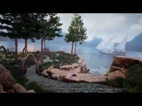
Just finished  up my final university assignment. The project came to just over 200 models created within the last 10 weeks and around 460 hours during that time. A lot of the objects in the final version were created during the last half because I decided that the original version looked boring and generic. (Original 5 weeks in: https://trello-attachments.s3.amazonaws.com/56b0282ed24af84d48f972dc/1925x1114/2b0247b8dd9d25f07a65da57db95670a/upload_2_2_2016_at_4_18_54_AM.png
After a bit of brainstorming I decided to use a lot of oranges to compliment the blues of the tower.

Website: http://www.paulscottdesign.com/

Any crit is welcome so I can make my next project better!

Video : https://www.youtube.com/watch?v=a3gZeuWcTF8


[Revised] Images:


Replies

  • pasco295
    Options
    Offline / Send Message
    pasco295 polycounter lvl 4
  • mickeyvpn
    Options
    Offline / Send Message
    mickeyvpn polycounter lvl 8
    Hi @pasco295
    I think this work have a nice colors, it builds a good atmosphere. What breaks the impression for me it's very simple wood material on bridge pillars. It's too clean(compared to shark hanger) and have incorrect mapping(near water). Also in this shot foreground trees appear very blurry.


  • pasco295
    Options
    Offline / Send Message
    pasco295 polycounter lvl 4
    mickeyvpn said:
    Hi @pasco295
    I think this work have a nice colors, it builds a good atmosphere. What breaks the impression for me it's very simple wood material on bridge pillars. It's too clean(compared to shark hanger) and have incorrect mapping(near water). Also in this shot foreground trees appear very blurry.


    Updated all the images.
    Thanks for spotting the blurry trees!  Turns out I was just on the border of its billboard LOD and yeah the pillars were a bit out of place, so I have fixed the uv maps and applied the dirt masking from the shark tower (Don't know why I didn't just do that anyway).
  • NomadSoul2501
    Options
    Offline / Send Message
    NomadSoul2501 polycounter lvl 10
    Great work, seriously fantastic!

    Most of my critique will focus on the presentation of it though.

    Your stills: There is no reason for them to be 8k!
    Offer them in standard quality and if you feel it necessary, offer a download link to a zip file in 8k.
    Also, I looked at the stills before I watched the video and they're not doing you many favors.
    A lot of the shots in the movie have way better composition that most of your shots.
    Actually I didn't like any of them except maybe for the last 2 of the first batch.

    The video: It's about 3 minutes too long!
    I'm very opinionated on cameras and I'll tell to anyone that listens DONT MAKE LONG TWEENY SHOTS WITH A CONTINUOUS CAMERA!
    However you totaly own it! I love the camera!!!
    In most places, that is;

    Your first few seconds and the fly-through over the ship let you down because of screenspace reflection issues and popping.
    Also, I'd either start way higher looking down or way lower with a fly-over the water.
    Right now you're getting the worst parts of both worlds as the composition is kinda centered and kinda fills the screen but I can also see that there's nothing really in your background.
    Please don't fly through things, true for the ship, true for later parts of the tower and especially true for the ending!!!
    Love the little creature and the fly-through the caves.

    1:23 Do you have time to make another asset?
    Compared to the level of detail on everything else, I feel that the rock sticking out of the cobbled path should have some impact on it.
    Maybe it pushes through or displaces some bricks?

    Absolutely love the inside of the tower!!!
    Great 'magicky' particle effects.
    Personal opinion: unreal lens flares are garbage and they're distracting.

    1:54 Creature pops up but is out of view

    2:15-2:30 some akward 'jerky' movement; a simpler assend that follows the staircase might be better.

    2:55-3:02 jerky camera motions break the flow of the movie.

    Long shots of light shafts and everything in the garden after the tower aren't adding anything anymore.
    Lightshafts are a standard engine feature and are thus unimpressive and the second part of the garden is very empty and looks unfinished when compared to the awesomeness of the tower.

    I love the shot at 3:53 but maybe instead of rotating around the z axis and moving down just go out and up and fade out?

  • pasco295
    Options
    Offline / Send Message
    pasco295 polycounter lvl 4
    Wow that is a lot of helpful feedback, thanks! Personally I would like to move onto a new project and keep will what you have said in mind with my final renders. I think you're right about the end bit, initially I wanted to add a small set of village homes but cut it out to focus more on the tower assets so it's quite lacking. I'll make a version of the video with the end section trimmed out and that screenspace pop removed.

    As I go I'm rendering off new images of places in the scene, so any suggestions on ones that could be very impressive?

    Part 3:


  • Kid.in.the.Dark
    Options
    Offline / Send Message
    Kid.in.the.Dark polycounter lvl 6
    Hey Paul,

    Just wanna start off by saying bravo on clearing such a massive workload in such a short amount of time... being an artist currently based in Hong Kong, I know a thing or two about building a batch load of assets against the clock... So mad respect for the effort you've grinded through.

    As for critique now, I'd say the thing that strikes me most about this piece is the lack of material definition... I feel like almost most if not all of the materials you have come across a bit flat, I could be wrong and it could be more to do with the lighting but I feel like everything has a lack of reflection/specularity.

    The windmill blades are completely bleaching out your end shot which imo doesn't do your ending much justice and there are several moments where the camera clips through objects or has a few jolty camera movements.

    I'd also say a lot of your objects are just a tad bit too low poly, some models seem like they're set for previous gen games with really low subdivisions, etc... Optimization is definitely a factor worth considering but being a games environment for showcase and not actual play-ability I would've gone for a higher subdivision choice for this.

    But hey, it's a FMP.. it's done, just some food for thought on your next piece..

    But seriously bravo to the scale of this, it definitely caught my attention seeing so much in this one piece and how unique each area is divided up as well. I would've expected a full scale modular set with each zone in co-ordination with the last but you actually went all out and built a different set of assets for each zone. (Y)
Sign In or Register to comment.