The BRAWL² Tournament Challenge has been announced!
It starts May 12, and ends Oct 17. Let's see what you got!
https://polycount.com/discussion/237047/the-brawl²-tournament
It starts May 12, and ends Oct 17. Let's see what you got!
https://polycount.com/discussion/237047/the-brawl²-tournament
Which color theme?
polycounter lvl 7
Which color theme??
Looking for some input on which color theme to choose for my cargo bay, a piece I am doing for school.
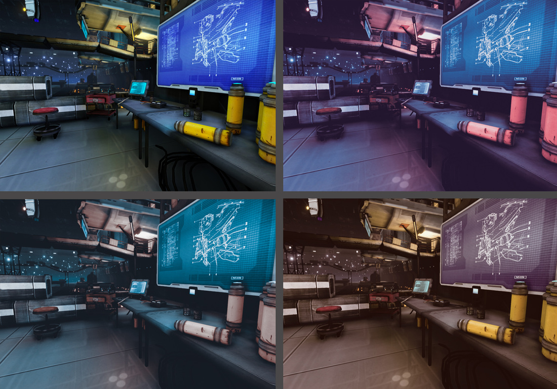
Looking for some input on which color theme to choose for my cargo bay, a piece I am doing for school.
Replies
With the clear colors the lights are very nice and add a lot to the scene.
Any chance to see a little more from the scene?
(The bottom left one feels like it made screen the only "Selling point" [instead of botttles to screen to ship/ corridor or whatever it is in the distance].)
(The bottom right has the hated/ overused brown color, plus it gets rid of the nice color gradient you have on the other ones.)
your color intensity defines breakup areas. The bottom left is more contrasted on the screen which is nice because it direct eye attention.
It looks like there is a general leaning towards the top left or bottom left, with a few who like the top right.
Thanks for the BW contrast pic, Deforges. I didn't realize how much the filters can affect the contrast in various parts of the shot.
In the first image I posted, the top left is straight from UDK, and the other three are using color lookup tables in photoshop.
I am posting two more screenshots of a side by side comparison of the top left and bot left color schemes. If I go with the more turquoise color scheme, I was hoping that a post processing volume might give me a little more control over the highlights, mid tones and shadows.
Between the two- which side do you prefer?