The BRAWL² Tournament Challenge has been announced!
It starts May 12, and ends Oct 17. Let's see what you got!
https://polycount.com/discussion/237047/the-brawl²-tournament
It starts May 12, and ends Oct 17. Let's see what you got!
https://polycount.com/discussion/237047/the-brawl²-tournament
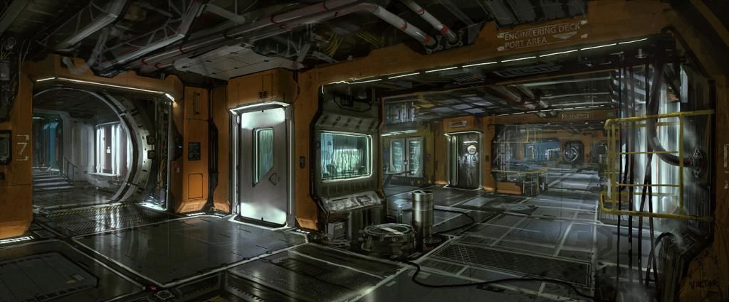
Industrial SciFi Environment (WIP)
polycounter lvl 4
I started working on this about a week ago and I was hoping I could get some feedback along the way. Its based on a concept by a piece signed "Victor". If anyone knows who the artist is I'd like to be able to properly credit them.
Everything below is baked low poly and the scene is just over 10k so far. I also included some first pass textures in UE4.
Any comments or critiques will really help me out. Thanks!
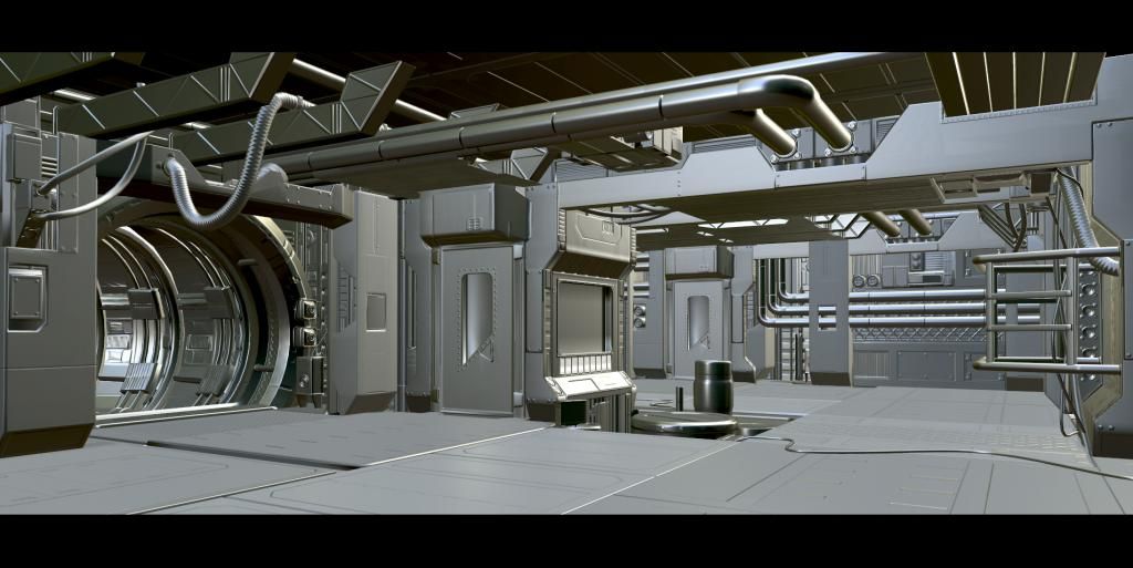
concept

**LATEST**

Everything below is baked low poly and the scene is just over 10k so far. I also included some first pass textures in UE4.
Any comments or critiques will really help me out. Thanks!
concept
**LATEST**
Replies
Progress looks pretty good so far!
Its somewhat modular in the sense that certain models are being reused throughout the environment, but because the scope of the project doesn't go beyond this one scene the pieces are not made as part of a fully modular kit.
For texturing I'm actually trying out the Substance Designer/Substance Painter pipeline. I'm also doing a lot of touchups and detail work in Photoshop. Trying to learn whatever I can, I really need a job! Its rough at entry level..
Anyway, here is more low-poly bakes:
Here's after some post processing effects in UE4:
I think that the ground you've got going might actually be the weakest when it comes to material definition... your current ground panels look like they are made out of plastic as opposed to being metal panels. In the concept, they looked more metallic at least.
Composition is pretty strong as it is, however you could benefit by pushing the "Far side" (on the right 3rd) back about 1000 UU and filling the rest of that new found space out. Essentially you would need to fake that there is another corridor, as in the concept. Right now in the image, we are getting decent foreground and great midground, but almost no "distant" things that we see in the concept. Just recycle the pieces you have and make it a bit deeper back there.
The ceiling could benefit from having dangling microwires like in the concept, though I'm not sure how you could approach that. In the concept it almost looks like a bunch of exposed yellow cat5e cables that are just strung around... I think that would help amplify not only your color palette, but also the total image for that next level of "small detail" that believe may be absent.
Lighting and mood, I think you've got it down pat. Keep goin!
I really wish I was more technically inclined because when I look at your latest screenshots, there are things that are.. off.. but I have trouble explaining why, but I'm going to try
The things that bug me are:
- There's something really weird going on with your flat surfaces near the left open hallway. For example the box thing extruding out from the top of the door, the way the light hits it, sort of makes it look like it's slightly round. It almost seems like there might be a smoothing group issue. But also might be your roughness map is too contrasted? Or maybe its where you placed your lights? I look at your high poly, then I look at your baked with texture, and the flat surfaces don't look the same
- IMO you went way over board with your scratches. I think you got too excited with Substance Painter
- I find it odd that you interpreted the floor panels as being black. To me, from the concept, they look like shiny metal. I think you missed an opportunity to have cool reflections by changing them to black
- I really think you should have transparent windows like in the concept. I think the opaque saturated blue you have right now is... well.. a lazy way of dealing with it
- Overall, your scene has sort of ... muddy look. The concept has more ambient/bounce light. You can try to fake some ambient lighting by unchecking "Use Inverse Square Falloff" in the point light, then adjusting the intensity to a very low value and place some around to light more of the room.
- You have harsh hot spots on the ground from your point lights. You can try adjusting the "Minimum Roughness" value to soften them. The thing is that, I can see your lights are straight and rectangular. But the hot spot is round, which doesn't match. You might also want to try adjusting the "Length" value to make it long like a flourescent light. Or, you can turn on Use Emissive for Lighting, it's turned Off by default
- I think you need to match more the color of the concept lights, which look like flourescent lights. So, almost pure white but with a slight green tint (or other slight colored tint)
- I didn't like that you closed off the room, where the concept continues on further, giving it a nice depth
- You're missing detail in the area where the barrel is. Right now, you have the cylindrical shapes, yes, but you're missing some outer detail that's in the concept. Same goes with the barrel. I know it's small and nit picky, but things like that really add to scene.
- You have a big bloom spot up top near the left door way. Did you place a point light very close there just to do that? Because it doesn't seem natural... I'm not sure if all those flat rectangular lights that project light downward could hit up there to cause that?
I hope this at least points you to the areas where some attention is needed
First off let me say thank you for all the kind words! But I agree there is still some stuff about the scene making me uneasy...
In addition a lot of content is temporarily cut from the concept art, simply because I need to have something ready for GDC next week. As soon as GDC is over I plan on kicking open the whole scene, but there is simply no time now (2 days of work)! This includes modeling and texturing the distant objects and the objects behind the glass. So I suppose I should have labeled this the "GDC Version!" or whatever haha.
moving on,
I also read the floor panels as being metallic and believe it or not they are actually a variety of different warm and cool metal colors,.. however they all show up black in engine. I'm honestly stumped as to what might be causing this! Making the material more metal makes it blacker, but reducing the metalness makes it more plastic as Limewax said. I'm really not sure what to do about it...
I did take a lot of liberties with the lighting in an attempt to make the scene more "dramatic". I'm hesitant to return to full florescent lighting as depicted in the concept art but I could definitely work up a compromise if I'm over doing it!
Adding in more yellow micro-wires is no problem and ill get right on that!
As for the hot spots on the ground, do you think I could maybe pull in the attenuation rate so they don't even show up at all? I've thought about doing that but left it because I was hoping to balance out the really bright spots on the ceiling, but I don't know..
Again thanks so much for taking the time to write such well articulated feedback, I really appreciate it!