Sci-fi Evironment/level WIP
polycounter lvl 9
Oh hai... Mostly looking for input and feedbackish stuff on this little project of mine. Modeled in 3DsMax, built up in UDK (unreal3) and textured with photoshop, mostly with RGB masks.
I've been fiddling about with this for about a month worth of time (though in reality it's been in my hands for 2 months I had school retakes and this particular one I started to love a bit too much and gave a full overhaul over the previous two weeks)
I figured out quite a bit of things on grid based work since I did all the assets from the ground up in max. I could use a bit more practice on that matter, but I grasp the tools and means to make this happen properly now.
Found out about potential pathing issues with scripted things like doors and just in general with ladder volumes, had ton of fun with making a big fat material for everything ever and managed to add in some nice flickering lighting.
On a little side note the original goal for the exam was to make a playable unreal level for 2 - 4 players. Own assets were highly optional, but I decided to get jiggy with it and then it grew out of proportion becoming pretty much unsuitable for 2 player play.
Replies
The scanline on the left screen is controllable and removable. The camera part of it can flicker or not as desired and easily replaced with other instances of the base material which has grown grossly out of proportion but still serves my every need.
And the 3 base texture maps that are still being expanded and fiddled with.
The currently unused space will hopefully/should be filled up with the props to come. Spec and gloss have been repeatedly forgotten by me and are on my todo list now.
There is a normal map mostly to account for holes and miscellaneous things not very special and mostly generated in photoshop with height maps.
Depending on the art style you are shooting for, the lighting feels a bit flat and uninteresting. It looks like you are working modularly, which is good.
A few critiques I have for the textures you have right now are:
- Floor panels look extremely flat, with no normals/spec/gloss visible.
- Try to avoid putting in pure blacks in your textures unless for very specific applications, especially avoid them in large cracks/gaps between hard surface materials and objects. Small cracks/gaps are ok, but larger ones become increasingly unrealistic.
- I really like your Tron-style illumination, but I would put more time into lighting them intentionally, to further sell the effect.
- Spend some time on each material you are working with to achieve the desired effect. This will deter from everything looking very plastic-ey.
Hope this helps. Looking forward to the progress!
You literally made my day!
I'm currently running blind on my gut feeling with what I already knew. One of the things I knew and still know very little about is lighting so every time somebody points anything out on lighting it's a big fat experiment trying to get the idea out.
Anyhow lets see what your input can give me as a result.
And the attempt at reaching a better light set up. I like to think I have at least managed to insert more of what the glow map looks like into the light set up as wel.
I've also seen allot more of the specular pop up not sure if the screenshots are representative of this or if I'm having a case of wishful thinking. The only real change to the material at the moment is making the dark blackish stuff more greyish. I'll probably redo my dirt/damage maps soon-ish so these parts don't feel left out or under-defined which I kinda think they do feel like now.
Lighting is still a big yes for input =3
I've also let more indirect lighting play a role. Still kind of toying with the idea of inputting some soft soft fill light to make the green cast of on the white floor less strong.
Also noticed during my own plays of the level as intended and that of others that I often ignored or forgot that the weapon pick-ups were there. So I made a slight attempt of changing this with some lighting work.
I can absolutely understand and see your point on the art of the level in relation to how most meant to be played as UT3 level works look, especially compared to the official maps.
However, seeing my peers doing exactly the same thing prompted me to attempt to do something different. I might also have been influenced by timesplitters since it's one of the games I have fond memories of, but then again I didn't touch it in some years.
Anyho in an attempt to adress your 'show the light actors' point.
Also need to put more thought in the pipeworks in general.... Anyhow INPUT WELCOME =D
It's by an artist named Ruth Kim (as per google, anyway). See how they put some extra time and effort into the textures, and planning the scene out so it still looks interesting even when it has so little in it? You may want to do some research and look up some reference to add some detail to the scene.
I think another thing that really may be killing the lighting in your scene is Global Ambience. If you have it turned on, try either turning it off, or way, way down.
But first and foremost, work on the modelling and texturing to make your level more interesting before you tackle the lighting. Lighting should be the last thing you do, or close to.
Agreed. Tell a story with the environment. Reference other well designed scenes. What is the story with place? What goes on here and why? Show us.
All the input is really appreciated. I'm not used to this (reasons: 1) new to polycount and 2) only 2 years of 3d experience)
I'm going back to work right away =D
I've mostly fiddled with the world properties for lightmass towards a somewhat darker feel, decreased the number of light actors some more. Desaturated the green material instance somewhat.
As a note currently everything (except decals) is derived from one material and what I still want to add in will normally not add more than one more material.
And I actually managed to combine two channels of the textures I'm using into one freeing up more options to use for the screens which admittedly still could use allot of work as things stand now.
I'm probably going to experiment with the world settings some more (not sure if I want to postprocess atm) and work on the textures (not the glow maps last time they sucked up a ton of time that they don't need at the moment in my opinion. Something the rest needs more... In my opinion)
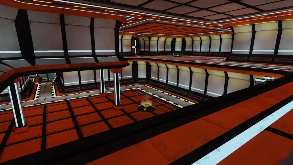
I am focusing on finishing everything zone by zone now, which means I didn't redo the lighting everywhere yet. I removed allot of light actors but that's about it... I also realized I never gave a full layout overview of sorts. I'd use the wire views but... I personally find it hard to read at this point.
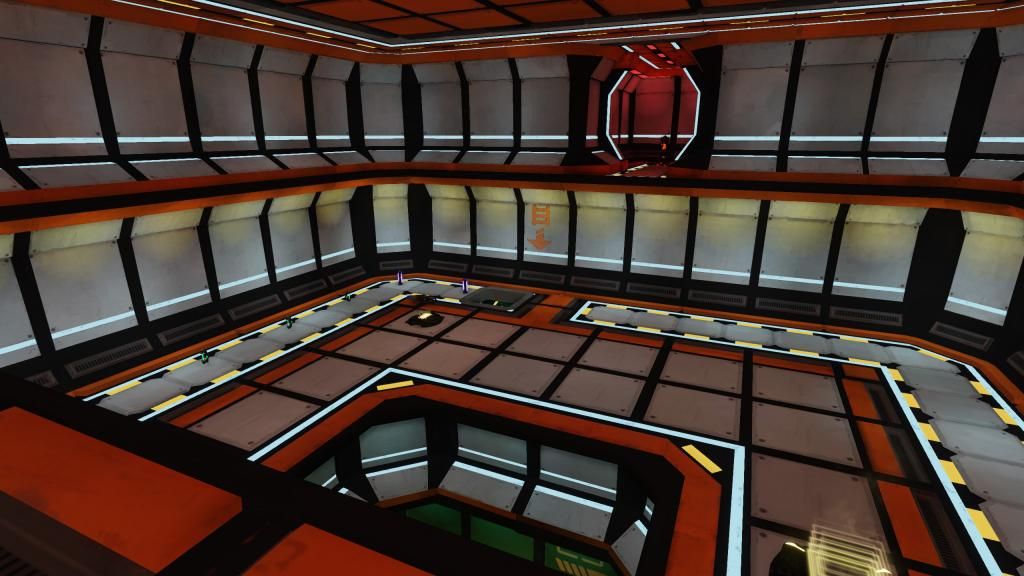
I'll neglect to reshow the A room since that's where I've been doing the majority of shown changes to begin with.
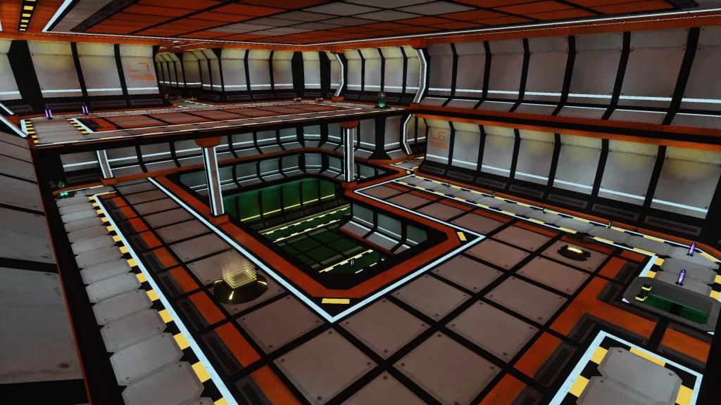
Screens of the B room
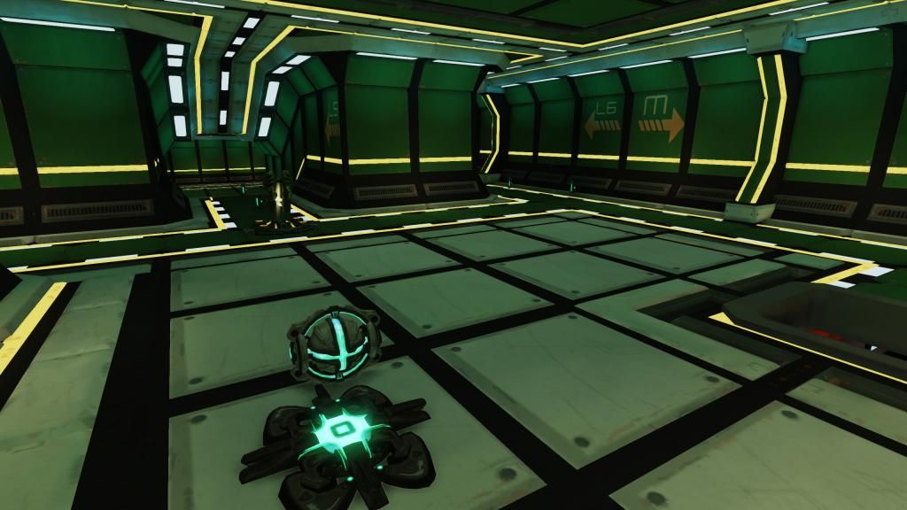
C Room
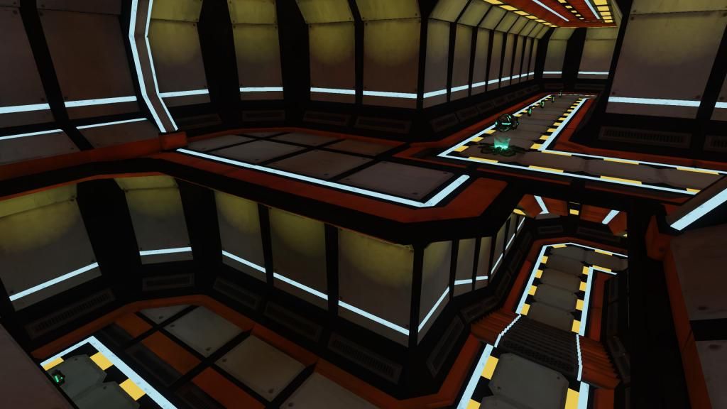
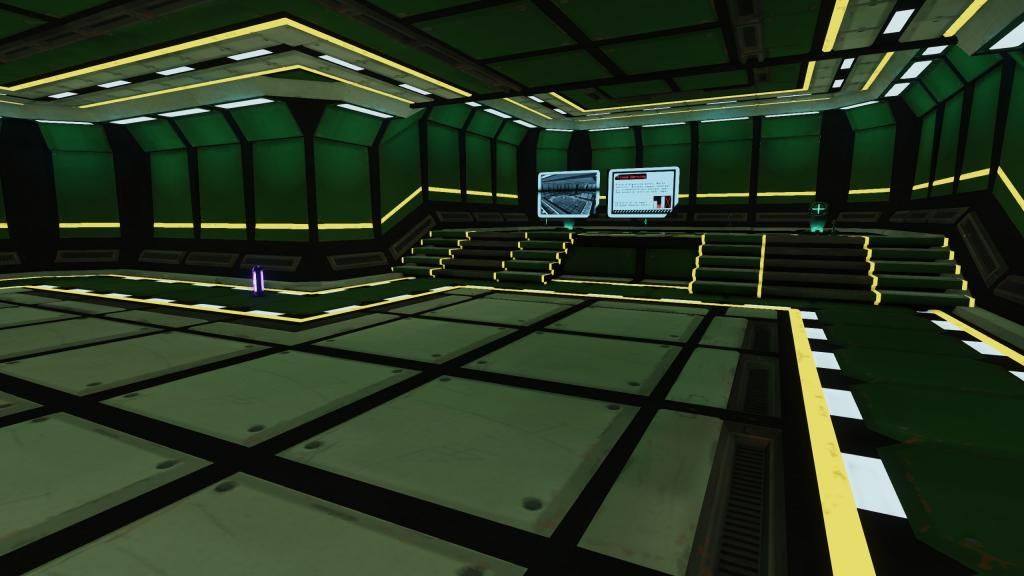
The inbetween rooms
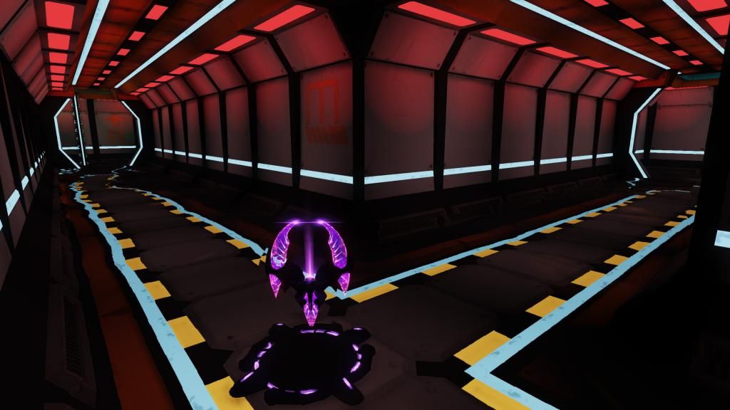
Submerged room. I've set the light to flicker here.
Most important to me, though? I want to thank you for remembering that the future will still have colors. I have seen SO many scifi rooms/hallways that are white/gray/black (in order of frequency) that I was starting to wonder if I was the only one who knew.
I'm glad you're making the visual clutter comment. Somebody else said something along those lines to me personally, but I was kinda in doubt about the statement as was. Having somebody independently echo that gives something I'm not entirely for more validity.
The colours have proven allot of fun to work with =3
+1. It's better, but in a "little tweak here and there" sort of way. Look at other artists work and look for contrast and variation of shapes. You have a LOT of squares and a LOT of the same size pieces. What makes the work Zieg posted much better is the contrast between elements. Everything here looks the same so their is no hierarchy to the composition overall.
http://4.bp.blogspot.com/-3kSFS66kkQA/UIFIXsnVzWI/AAAAAAAAAQw/y_bWVJoYOvM/s1600/tron.jpg
http://img1.wikia.nocookie.net/__cb20100309035547/tron/images/e/e9/Tron_legacy_city_2.jpg
The main goal of learning has definitely been reached, but I don't see the point of spending the sort of time I think I'd need to reach more than just acceptable on this work and tile set. Not to mention I came here for feedback quite too late in the process in retrospect.
I might revisit the base idea in the future, but I'm going to try and finish decorating this and call it a day. It's definitely of a better level than some of my other rushed works of the past years where for example lighting often just fell on the last line of to do or not enough time was spent looking at reference (still a problem here though)
Bottom line is I understand this is highly flawed, but thanks for the tons of feedback it's much appreciated. I'll still post some screenshots as I try to find a decent-ish end point. At least I'll have something not hand painted that will fit on my limited to-be-portfolio that I'll need for this year.
Edit: I'll definitely have to spend more time in designing and researching than I did this time.