Shift Happens - Art Dump
Hi there fellow polycounters,
we're Klonk, a small German indie game dev team currently working on a two player co-op platformer called Mercury Shift 3D (working title). It's a more advanced implementation of our initial flash game "Mercury Shift" release in 2012.
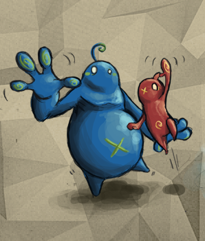
In Mercury Shift 3D grab a friend (or play solo) and accompany our two blobby characters Bismo and Plom on their journey through an imaginary polygonal environment coming directly out of their minds.
Here's some current in-game environmental art:
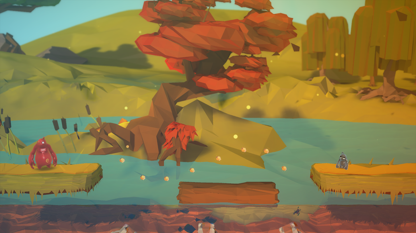
Forest Stage
The first stage where our two heroes are confronted with real challenges.
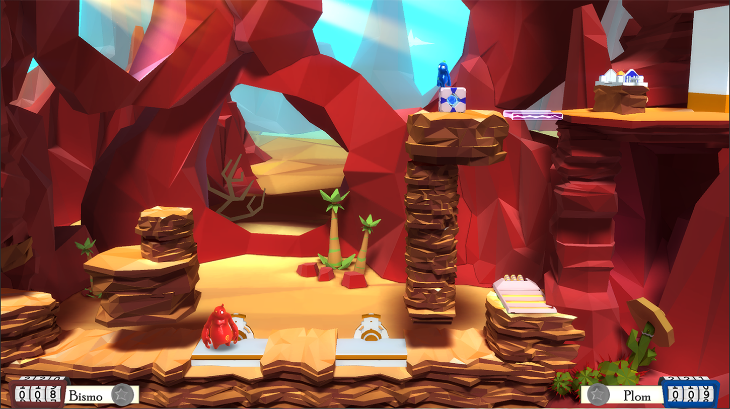
Canyon Stage
In the second stage after the forest Bismo and Plom need both dexterity and puzzle skills to conquer the canyon.
Tutorial (2 Player)
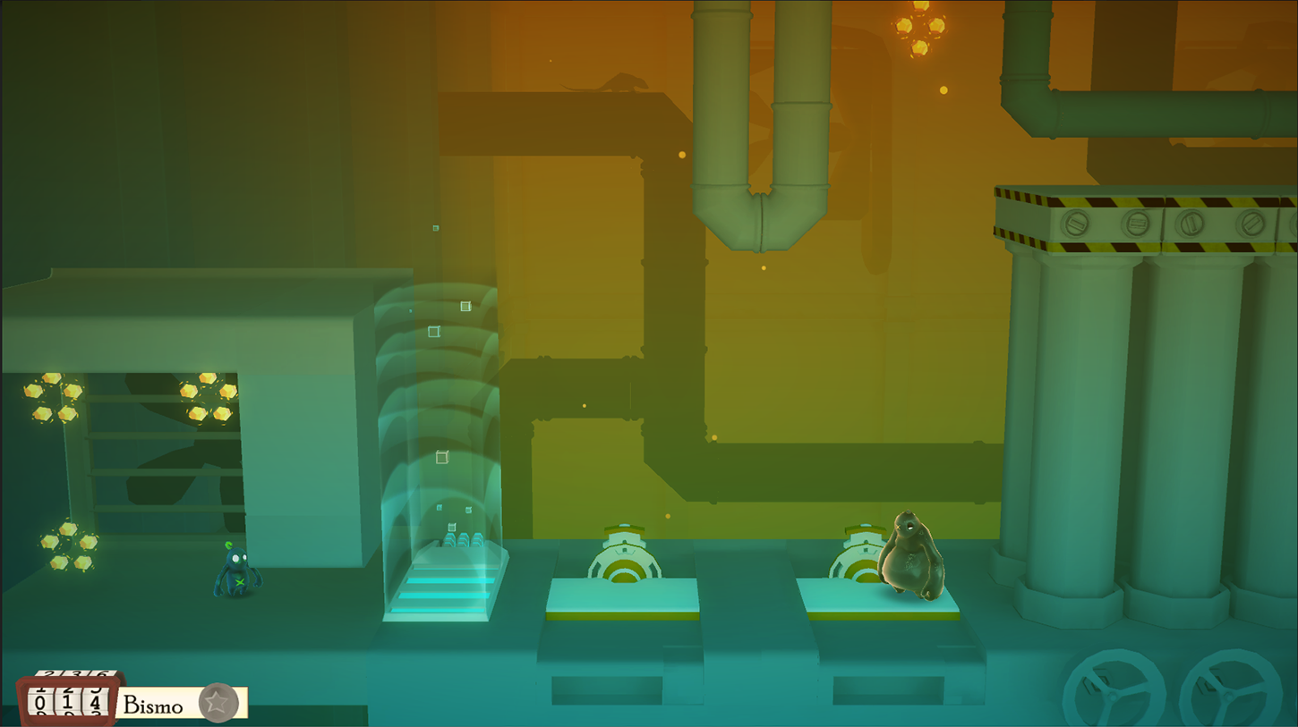
Mercury Shift 3D contains quite some complex gameplay mechanics that our game designers developed and are properly taught in the small chamber called the tutorial levels.
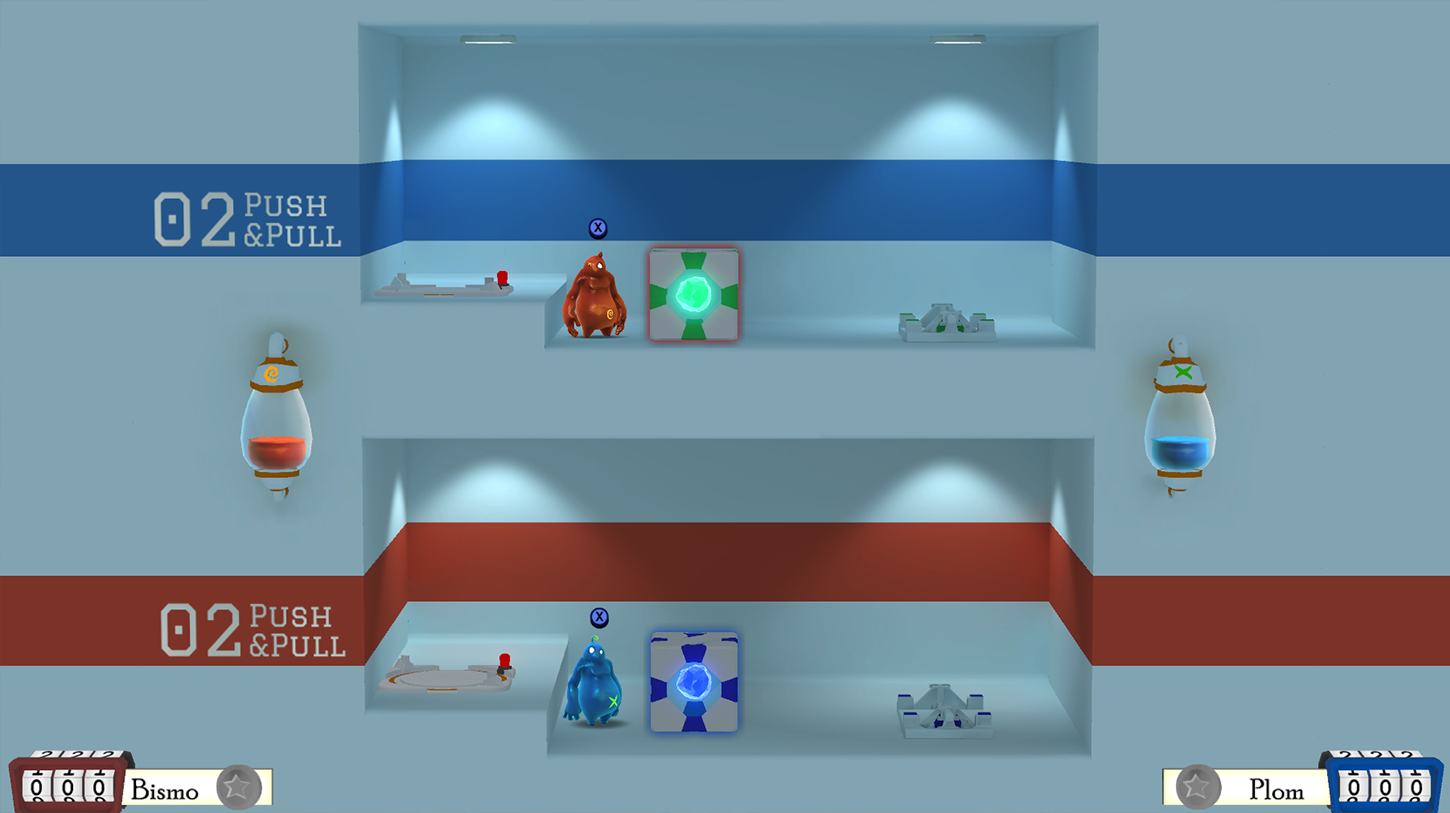
Training Stage
No-one is born a master. And that's what the training levels are here for
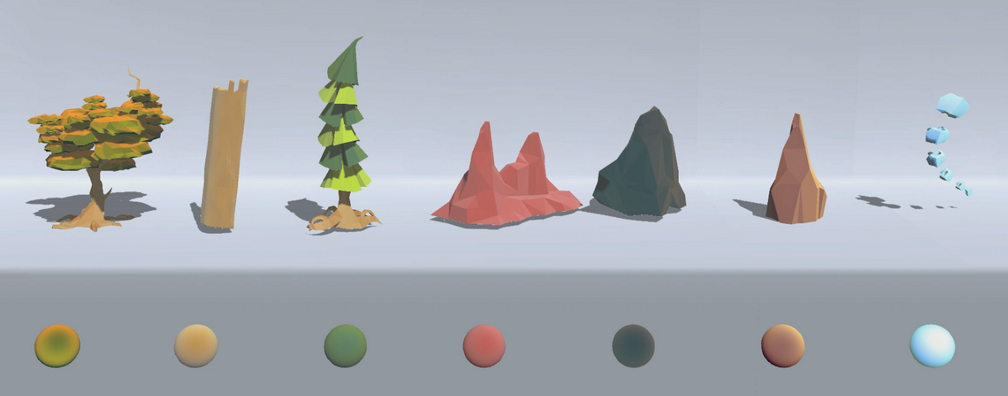
Mercury Shift Low-Poly Shading
For Mercury Shift 3D we've been developing our own custom low-poly shading to create a very unique environmental look that differs from other games and gives us the ability to control the look of all our assets as best as possible.
We're using the Unity Game Engine.
For all those interested in motion pictures here's our most recent Gameplay Teaser.
We'd love to have some feedback and opinions of what you think about Mercury Shift. Feel free to tell us anything you think about it.
Updates and News on the following platforms:
Website: http://klonk-games.com
Twitter: @klonkgames
Artists: @koffeinvampir, @mindlessblahs, @minnalya, @NikoGoetz, @Klonkimon
Gamedesigners: @klonkoli, @MattNeuk, @Klonkbeff
Programmers: @codermic, @Klonkrika
YouTube: https://www.youtube.com/channel/UC04btb2j3dmvtBHXSUxw1lw
we're Klonk, a small German indie game dev team currently working on a two player co-op platformer called Mercury Shift 3D (working title). It's a more advanced implementation of our initial flash game "Mercury Shift" release in 2012.

In Mercury Shift 3D grab a friend (or play solo) and accompany our two blobby characters Bismo and Plom on their journey through an imaginary polygonal environment coming directly out of their minds.
Here's some current in-game environmental art:
Forest Stage
The first stage where our two heroes are confronted with real challenges.

Canyon Stage
In the second stage after the forest Bismo and Plom need both dexterity and puzzle skills to conquer the canyon.

Tutorial (2 Player)
Mercury Shift 3D contains quite some complex gameplay mechanics that our game designers developed and are properly taught in the small chamber called the tutorial levels.

Training Stage
No-one is born a master. And that's what the training levels are here for


Mercury Shift Low-Poly Shading
For Mercury Shift 3D we've been developing our own custom low-poly shading to create a very unique environmental look that differs from other games and gives us the ability to control the look of all our assets as best as possible.
We're using the Unity Game Engine.

For all those interested in motion pictures here's our most recent Gameplay Teaser.
We'd love to have some feedback and opinions of what you think about Mercury Shift. Feel free to tell us anything you think about it.
Updates and News on the following platforms:
Website: http://klonk-games.com
Twitter: @klonkgames
Artists: @koffeinvampir, @mindlessblahs, @minnalya, @NikoGoetz, @Klonkimon
Gamedesigners: @klonkoli, @MattNeuk, @Klonkbeff
Programmers: @codermic, @Klonkrika
YouTube: https://www.youtube.com/channel/UC04btb2j3dmvtBHXSUxw1lw

Replies
can you go into more detail as to how youre going about developing your shaders to help define the environment artstyle? could litspheres be involved?
Hey
I'm Matt, one of the Game/Level Designers of Mercury Shift 3D.
In general, one of the main goals of the game concept has always been that it should be a fun multiplayer experience.
That's how we came up with our main mechanic, the shift. What it basically does is, by hitting a button (both players can do it) our two main characters change their mass and therefore their size as you can see in the .gif below:
There can never be the same two sizes at a time which essentially means you have to cooperate and communicate which player does the shifting.
Don't want to get too much into detail here, but we also had a flash version of the game which u can play on kongregate. Since then, a lot has changed but the main concept is still the same.
Link for trailer of flash version: https://www.youtube.com/watch?v=CkeEBiSZNxU
Hey Funky Bunnies,
glad you like our art style. Hope I can answer your question as best as possible
During the conceptual design stage of Mercury Shift 3D we decided to completely go without using any sort of texture. The reasons for this were practical: That way we can go for a rather unique and unmistakable look while also saving a lot of time we would normally spend on unwrapping/texturing/normal mapping.
So instead we wanted to get a more illustrative look and feel of the environment by focusing on distinctive design vocabulary of the 3d meshes itself combined with rather flat shaded surface colors.
So much for theory.
The practical part on the other hand was a bit more of a challenge. To get our final look (and have it at the same time be as unique as possible) we had to manipulate the way assets in Unity look at a large scale. We tried a combination of subtle visual effects like fresnel, gradient overlays, vertex colors, Unitys Image Effects (as well as our own) and some of the stuff our fellows at Little Chicken Game Company describe over here.
We ended up even interpreting the lightmaps Unity generates in a more customized way
I'm gonna keep track of this topic and gonna release some more theoretical and practical stuff about how we created our game art from time to time.
I hope you understand that I can't really release stuff like our shader code or a description of how exactly our game shading works since we'd like to keep our look as independant and uncopyable as possible. But if you have any more questions on some of the stuff I described here feel free to ask. I'll definitely answer as best as I can.
Our lead programmer @codermic and I (@Klonkimon) put all our brain cells together to create dynamic water system for Mercury Shift. We call it dynamic because it simulates any kind of flow based on an input height map with correctly updated normals in realtime. But see for yourselves:
HQ Still:
For reference, cause gifs are shitty quality.
Features:
Color Control: Simulate low poly fluids water, swamp, lava, tar and anything you can imagine
Depth: Controls the depth transparency of the fluid
Flow Speed, Rotate, Scale: Moves the height map in any direction, flow can be rotated and scaled. Normals are updated correctly.
Height: How high are the waves?
Realtime Light: You want realtime light? Yes? No?
Shading Intensity: Shading is decoupled from wave height and can be adjusted for soft or hard angles.
Heightmap Input: Generates accurately shaded normals based on an heightmap input. Here you can see me imput random textures from our project:
Wow, long post and maybe a bit techy, but please tell us what you think. It also works with any kind of mesh topology as long as the unwrap is correct but I didn't have a gif for that.
this kinda stuff is always a treat
Good point. In the first version we made the mistake to make it two player only. As you have experienced, there is no "real" singleplayer option. you can just try to split your brain in half and play the game.
We saw this happening quite a lot and such we now have a dedicated singleplayer. You swap between the characters and have control over both. Downside: We had to produce extra levels just for singleplayer. This mode feels a bit slower and is more focused on puzzles, but it is actually fun
Hit me up if you're interested in playtesting it
I'm in charge of the Character Art and Animations for Mercury Shift 3D, I'd like to show you some of the progress we made on our characters.
Our protagonists Bismo (red) and Plom (blue) were created during an accident in an laboratory involving mercury and orange juice. They can use their mercury substance to shift their masses and happen to turn back into a small mercury puddles if they get in touch with something dangerous. So far the story.
You can check out more of the Character Design on this blogpost if you like.
Here's how the design for the two currently looks like:
In order to enhance the mercury-blobness we gave them a rim light, more glossiness and reflectivity.
Our plans are to vary the reflection maps depending on the stages to convey the impression that the stages outlines are truly reflecting on Bismos and Ploms skin.
And that's how they look like in motion:
You can check out this video for a Documentation of most of the Gameplay Animations done so far.
If you look closely you might notice how I tried to express the different personalities in their movement. This is especially important because in the past it occured that most players defined our characters by their sizes. I want them to be understood as two different indviduals in spite of the strong characteristics of the big and small shape they can take.
Here's an example how I tried to do it (run animation):
While working on the animations my colleagues often give me feedback about it. Because of that feedbak I often notice that it's the little additions that make the animations work in a game and support and enhance the fun while playing.
Here's and exapmle for it: What happens if a crate is blocked and you can't push or pull them? The result:
I still have more gifs
I think the most interesting thing about animating for games is that you create so many little animations that add to a big picture which makes your characters grow and more loveable with ever tiny piece.
What do you think?
https://www.youtube.com/watch?v=0oc5xmOAcrk
It features some excerpts from our environmental devolopment, character and object design as well as a comparison of the default unity shading with ours. And all of that in motion! OO
Some gameplay's in it as well.
Tell us what you think.