Home 3D Art Showcase & Critiques

Critique my Low-poly assets!

Hey guys! I am a fairly novice 3D artist looking for his way into the industry. My 3D work is something I'm constantly working to improve.

Could you take a moment to give me a few tips on this kind of art style?

Thanks guys!

imperial_shield_of_war_by_greypwalker-d7hnzxe.png

fantasy_dwelling_by_greypwalker-d7hb7ki.png

iron_two_handed_sword_by_greypwalker-d6ryfrt.png

iron_mage_staff_by_greypwalker-d6ruh2q.png

simple_fantasy_bow_by_greypwalker-d6qviyq.png

Replies

  • Karmageddon
    Options
    Offline / Send Message
    Karmageddon polycounter lvl 7
    Are all these assets yours? The first four are pretty great style. The fourth one with the staff though the wood grain texture looks a bit stretched or streaky (there's some woodgrain UV stretching on the blade as well). There's a lot of wasted UV space going on and the metal stuff is larger in scale relative to the wood.

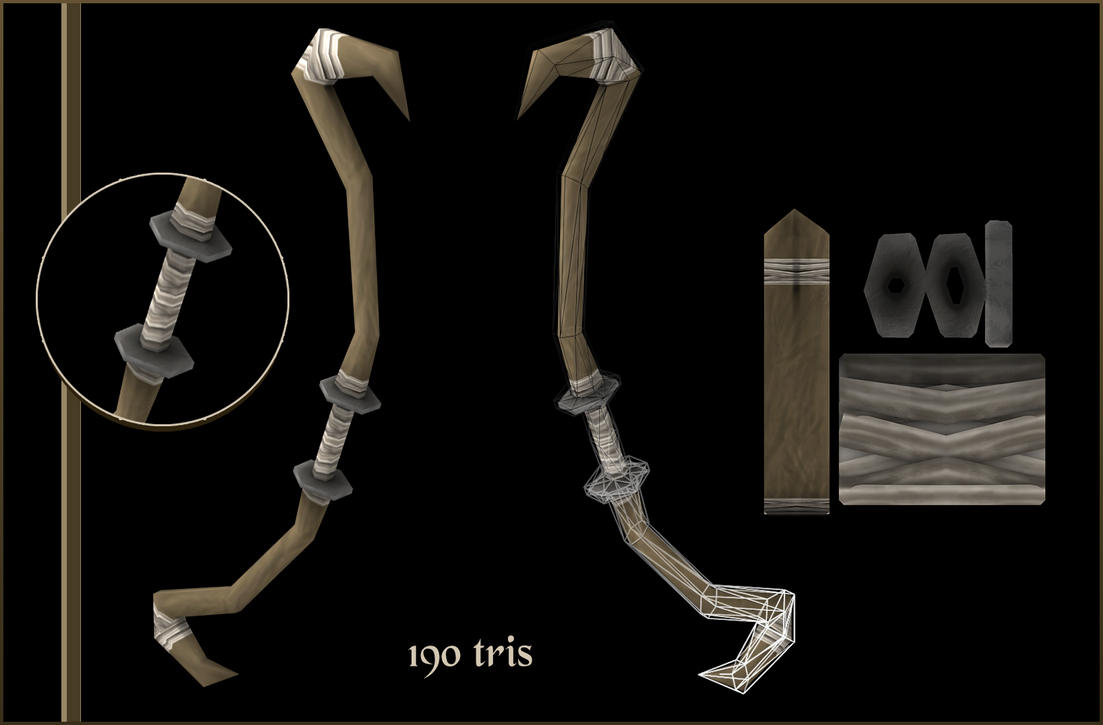
    The last weapon is like night and day, it looks unfinished compared to the others.

    Really dig the first four though, they're very charming.
  • GreypWalker
    Options
    Offline / Send Message
    Yes, these assets are totally mine. Thank you for the comments, they are appreciated. (:

    my Portfolio can be viewed here: http://greypwalker.deviantart.com/
  • Fenyce
    Options
    Offline / Send Message
    Fenyce polycounter lvl 11
    Maybe you should think of better presentation sheets, especially when it comes to placement of your informations. Unify them a little atm every sheet looks diffrent and they don't fit each other very well.

    As for citique... The roof of the house could use some extra geometry, for the shingles along side the edge. Just like you already did on the top of the roof, so the whole roof would look a little more 3D and not just like a painted plane. That would be my suggestion.
  • GreypWalker
    Options
    Offline / Send Message
    Thank you, that is a good suggestion; both for the presentation and the roof geometry.
  • thepapercut
    Options
    Offline / Send Message
    Really nice assets. Digging that dagger and the texture on the blade. I agree with fenyce though; you need a better presentation sheets.
  • Pixelatedkiwi
    Options
    Offline / Send Message
    Pixelatedkiwi polycounter
    I think your models show some promise, my advice would be to take a look at some of the games that have low poly models you think are really awesome and study how they do what they do.

    Try to integrate this into your own workflow and keep creating models, pushing for that standard :).
  • Kimon
    Options
    Offline / Send Message
    Kimon polycounter lvl 6
    Hey man, good job! Especially that house is looking really cool.
    I do think that roof could benefit greatly from doing something like this:


    PJfo42D.jpg

    Sorry for my sloppy modeling, but you get the point!
    You wouldn't even have to change the textures a lot, if even at all.
  • GreypWalker
    Options
    Offline / Send Message
    Thanks guys, these are all very helpful tips!
  • DWalker
    Options
    Offline / Send Message
    The shield's octagonal shape looks very odd; octagons are OK if you're going for a post-apocalyptic world where they're made from stop signs, but odd otherwise. The inner boss seems to contain most of your polygons, yet it's contributing almost nothing to the silhouette; you could get much the same effect with only the normal map.
  • riceart
    Options
    Offline / Send Message
    riceart polycounter lvl 11
    hi
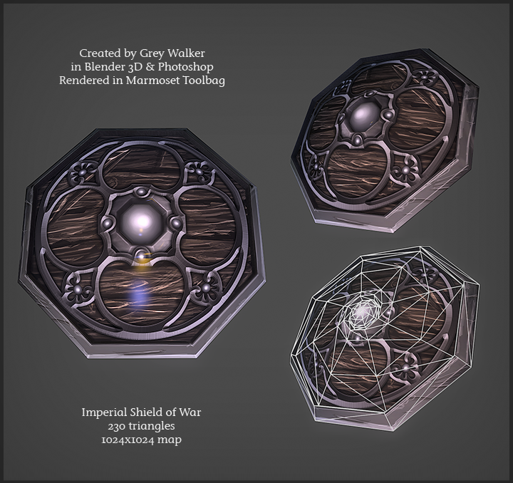
    1. for a low poly asset like this shield you should hit on textures something like 128/128 and it looks like mirrored so you could probably downsize this in half. 1024x1024 way to much.
    Modeling, this simple model could be made of 8 faces + a few to add thicness and back. You did not showed back, this could be made to.
    2. Ive made that house some time ago :D In modeling part i think that this could be improved by exaggerating the silhouette. You did not stick to concet very vell cause your wooden snail blocks door on balcony. You did not showed wires so no help with that :)
    3. dagger looks cool but wooden texture is a bit to stretted on the top part of handle.
    4.5. wand and bow, your texture was badly mapped, you have wasted way to much space
    regards
  • GreypWalker
    Options
    Offline / Send Message
    Riceart, your comments were very helpful to me and I thank you for them. The house that I modeled was based on the same concept you used, but I didn't make it a point to stick to it exactly. It was important for me to make it my own style.
Sign In or Register to comment.