The BRAWL² Tournament Challenge has been announced!
It starts May 12, and ends Oct 17. Let's see what you got!
https://polycount.com/discussion/237047/the-brawl²-tournament
It starts May 12, and ends Oct 17. Let's see what you got!
https://polycount.com/discussion/237047/the-brawl²-tournament
Tavern scene (UDK)
polycounter lvl 7
I've been working on a tavern scene in my spare time, it's inspired by a piece of concept art I found a while back. And yes I'm aware that it was used in a newb thread some time back, I didn't realise this until I was under way but that's why I'm using it as a jump off point for ideas rather than recreating it.
Any tips and suggestions would be great.
Concept in question:

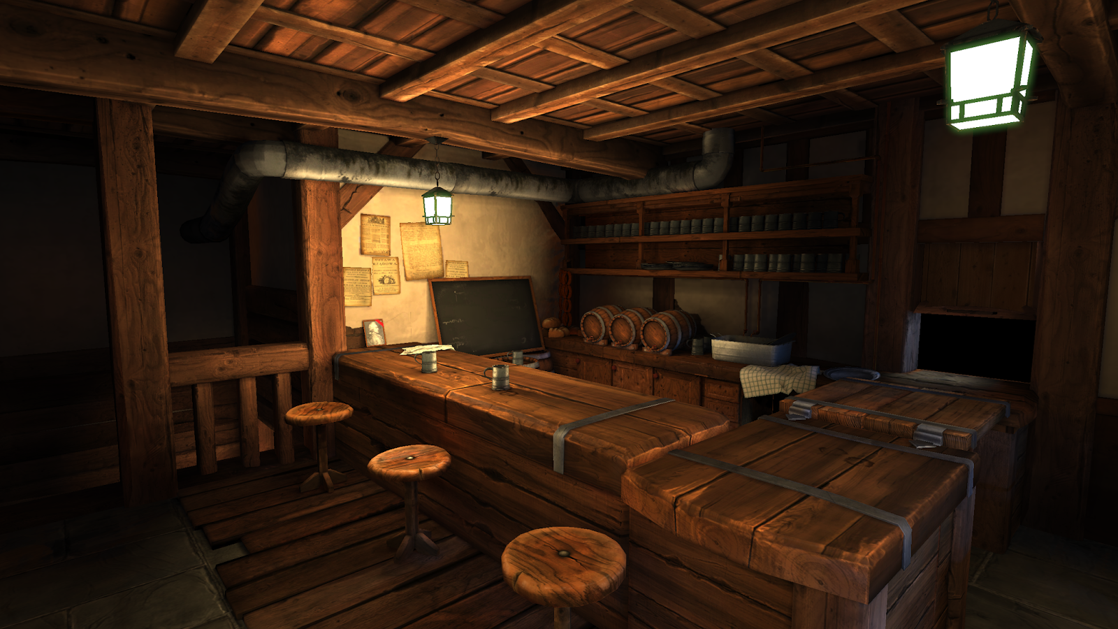
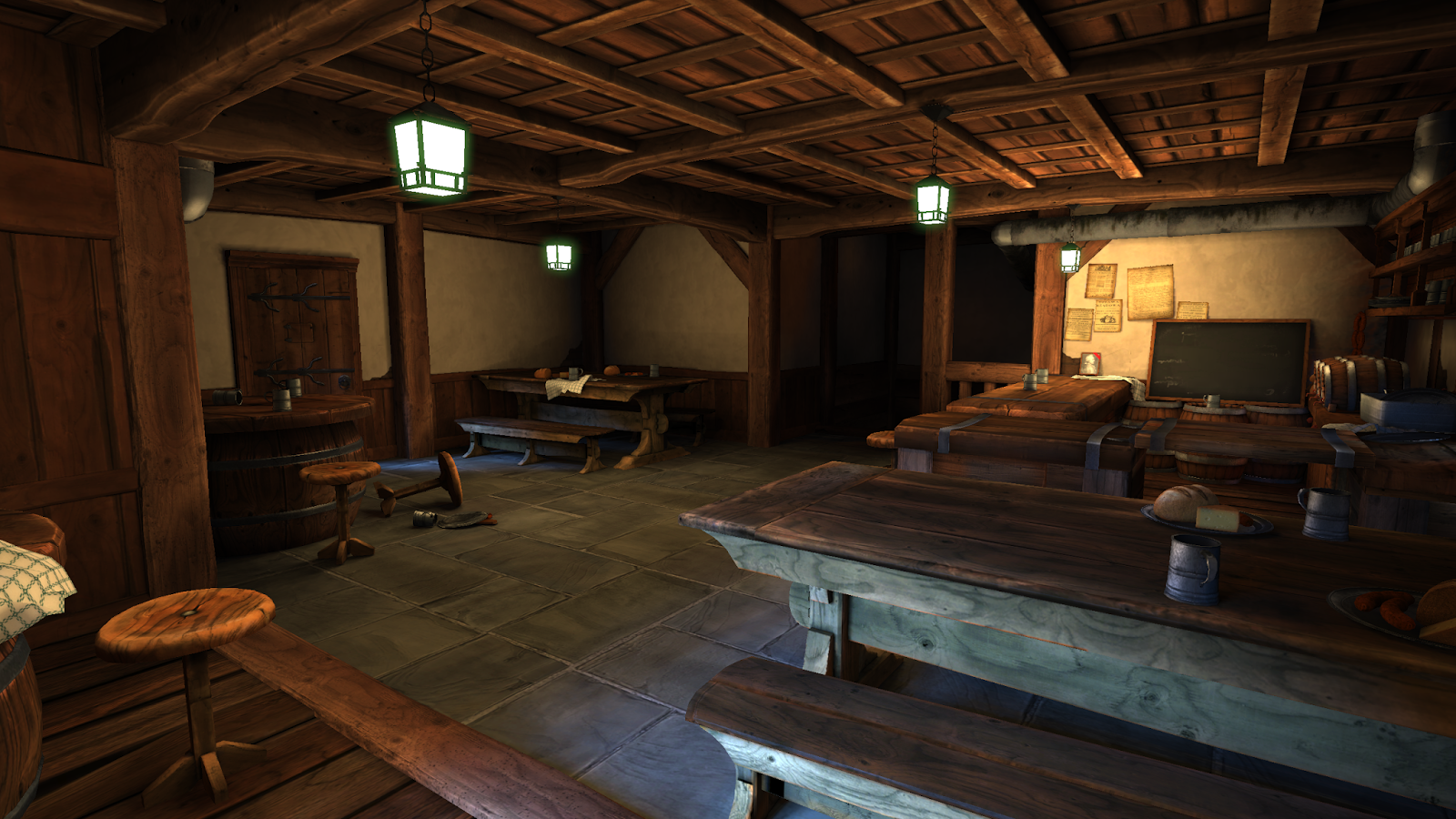
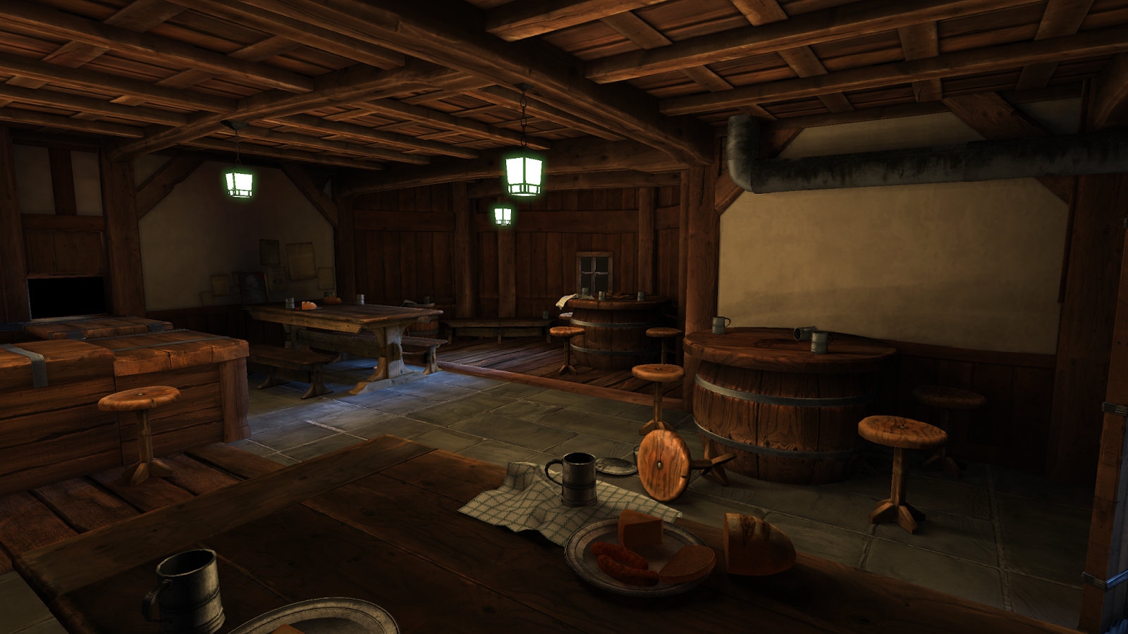
Latest screenshots:
Any tips and suggestions would be great.
Concept in question:
Latest screenshots:
Replies
It seems rather out of place. Too bright, and as you said, too dull.
I Would consider something more "rough" and stone-like. I can't really tell the material as it is. Is it stone? ceramics?
Also what is burning in the lanterns? Maybe that would cause slight darkening right above them as the repeated use causes residue to build up.
Those metal bands around the counter are a bit weird. And it seems a bit poorly constructed compared to the one in the concept. The stones in the concept have a bit more gloss. If you don't want to follow the concept 100% you could try a rougher stone, bigger slabs of stone, or even a wooden floor.
Try to work on your material definition a bit, everything's feeling a bit flat atm.
The color scheme can use some work too. Always try to look at references for your colors, if you're not following the concept. For example; if you google "wood" there's a very wide range of colors. Your wood colors and textures are a bit bland imo.
I'll be remaking the floor altogether over the weekend, I found a good zbrush tutorial for creating tilatble floors that I will follow.
I'm gonna go for stone over ceramic tiles.
@komaokc
I always have trouble making believable wood and metal textures, I'll try to revisit and improve.
Could you suggest any resources?
http://www.philipk.net/tutorials/materials/materials.html
http://www.marmoset.co/toolbag/learn/materials
http://wiki.polycount.com/EnvironmentSculpting#Rock_and_Stone
And loads more on this page:
http://wiki.polycount.com/TexturingTutorials
For wood it helps to either sculpt it, or use ndo2 to create some subtle normal map detail. Also every material should have some specular, just keep it subtle.
If you're going for a varnished wood then it needs to be glossy with high spec. And don't just throw on a tiling map. There will be areas where the glossy wood is scratched off and overlay some stains,dust, grime etc.
Metal is pretty simple. Just put some very subtle detail into the diffuse, make it very dark, and use a high contrast spec map with scratches etc. Gloss map is optional for fingerprints, oil, smudges etc.
And a copy paste from my blog:
Still to do: Further reworking the counter top, probably going to remodel altogether. Put more work into the pipes, specular is still lacking and the grime on top needs detailing. Work more on the variety in wood texture still, the tables are now a really weird colour and frankly I'm not sure how to make them look better.
Work on the lantarns a bit more, fix the odd lighting issues.
@Neox
I'm kind of putting that on hold until I fix all the wood textures but it's the next asset on my list. Yes it's still the entrance.
@locater16
Do you think it's sufficiently bright now? I know the moonlight and window bits are crappy now, I need to replace both.
-fire in the lanterns should be more orange.
-The dark spot in the middle of the stools should be a lot more subtle.
-The wall textures should have dirt and crack around the beams(might be hard to do in this case)
-I'd make the ceiling a different texture than the floor.
More like the above, remember to keep your colors saturated, as just making your scene brighter can drain that.
Also notice how punchy and high contrast the moonlight from outside is in the concept:
Having a strong shadow casting planar lightsource coming in through the windows would make the scene feel connected to something outdoors and give a lot of contrast.
- Finally added the door, and closed off the scene.
- Changed the ceiling, texture is still a wip but it's coming along.
- Replaced the opaque window with a proper one, although you cannot see it in this shot.
- Worked the light rig a lot more, it still needs a lot of tweaking but it's looking better
Thanks A LOT for the continued feedback guys!
Worked further on some of the bad wood textures I had, as you can see the work on that is still not quite done.
Tweeked the light set up some, I think the contrast between the indoor and outdoor lighting looks a lot better now but some areas could be a bit brighter, will still work on this. Also I think I need to find a way to make the outside lights sharper, perhaps mess about with the falloff settings more.
Added some food bits, had way too much fun making those. More to come soon, hopefuly.
In the meantime I'd really appreciate some feedback. Thanks!
I feel like this scene is now nearing completion, I'll most likely tweak the textures more as PhilipK suggested but aside from that I'm not sure if there's anything else I should add here.