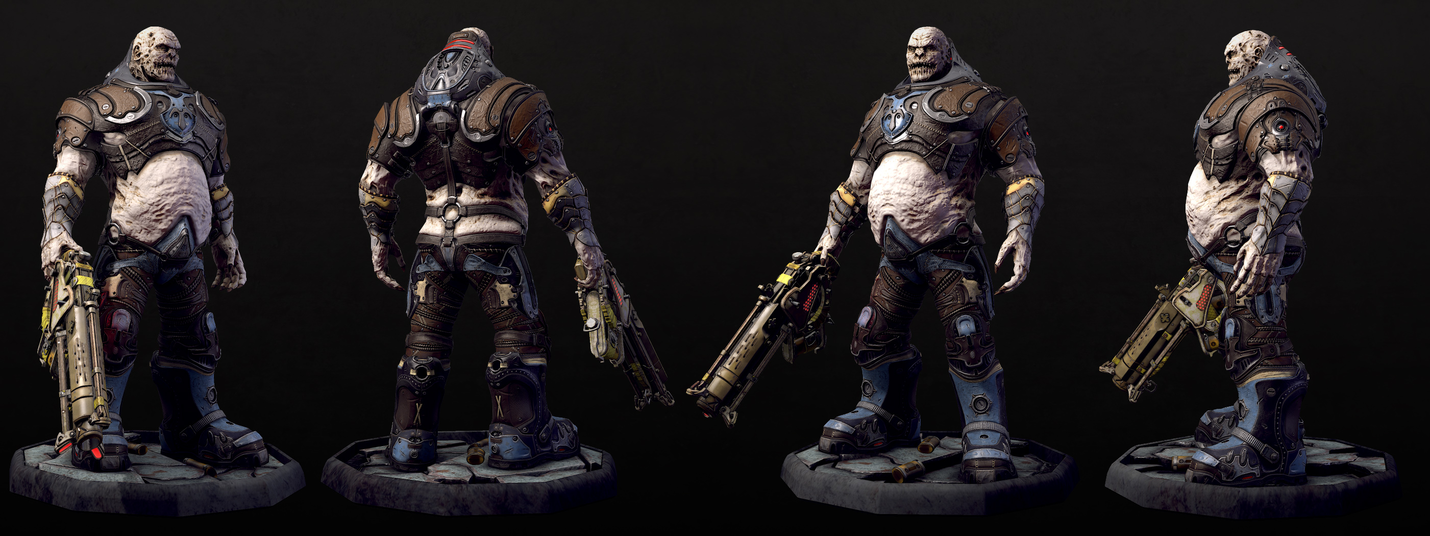
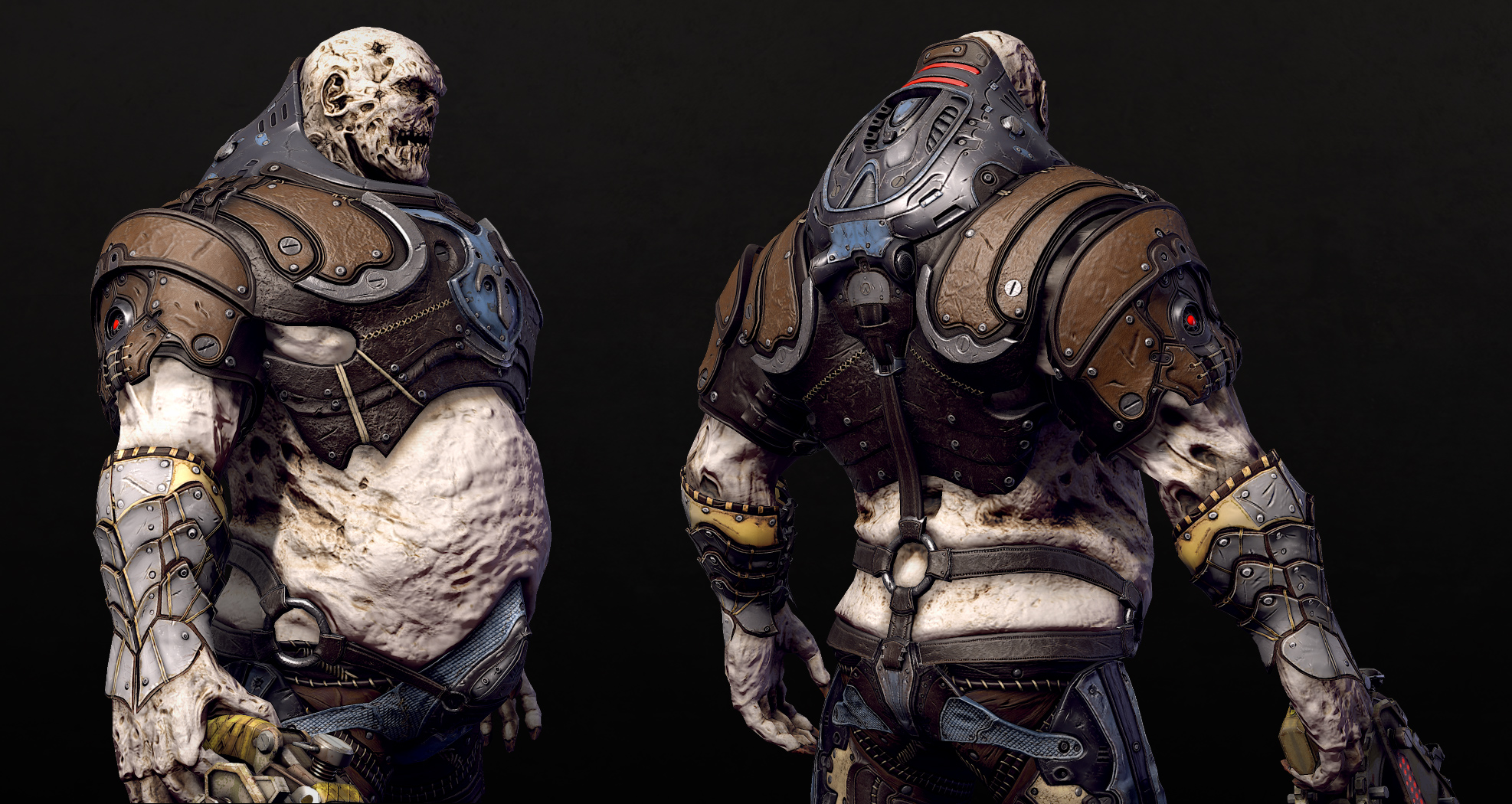
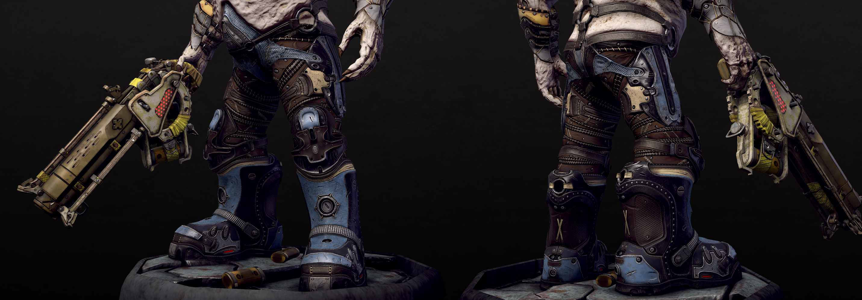
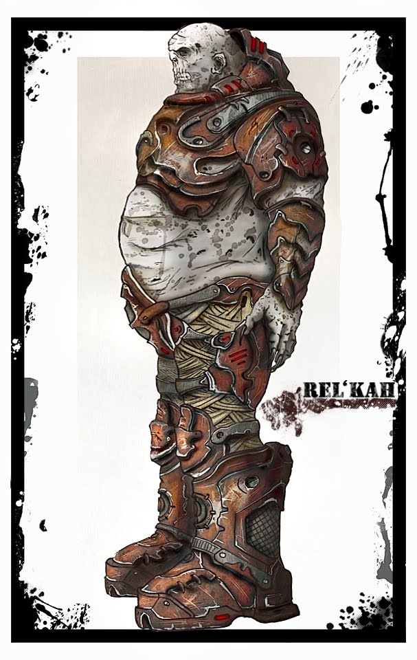
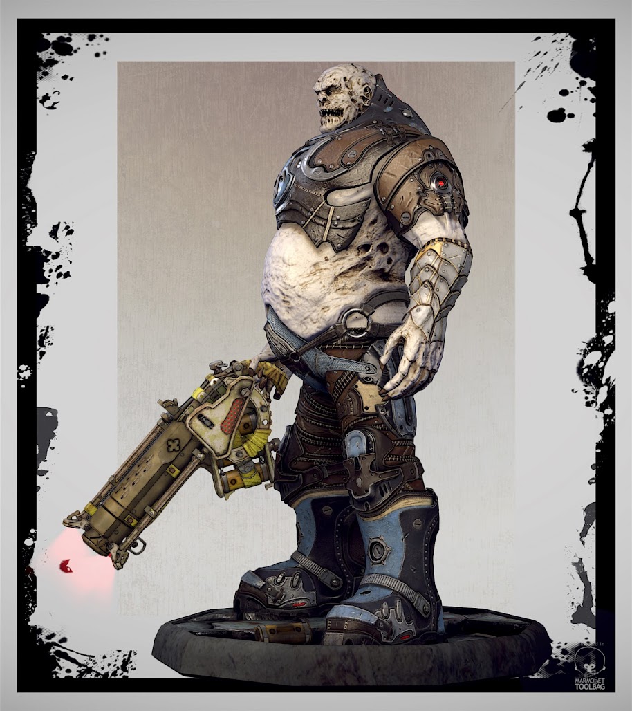
Rel'Kah, GoW character style.

polycounter lvl 6
Hi guys,
I created this character some months ago.
The character is a personal concept.
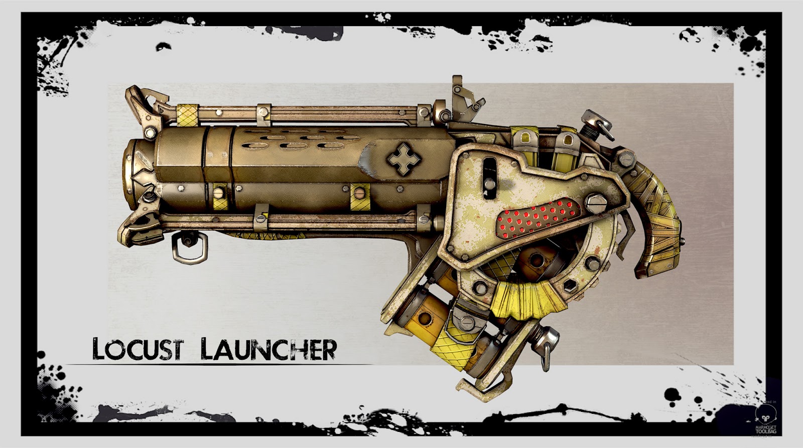
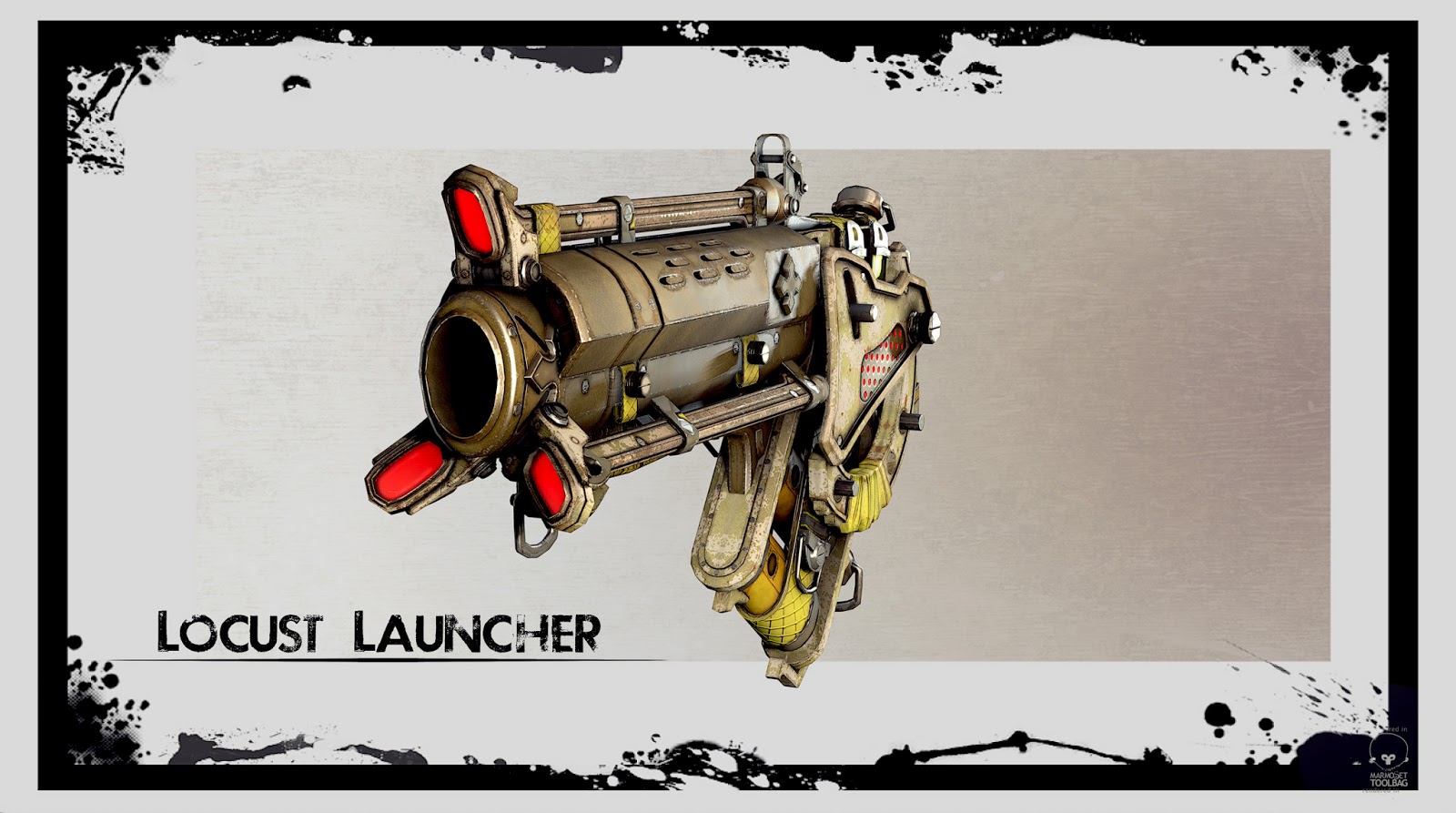
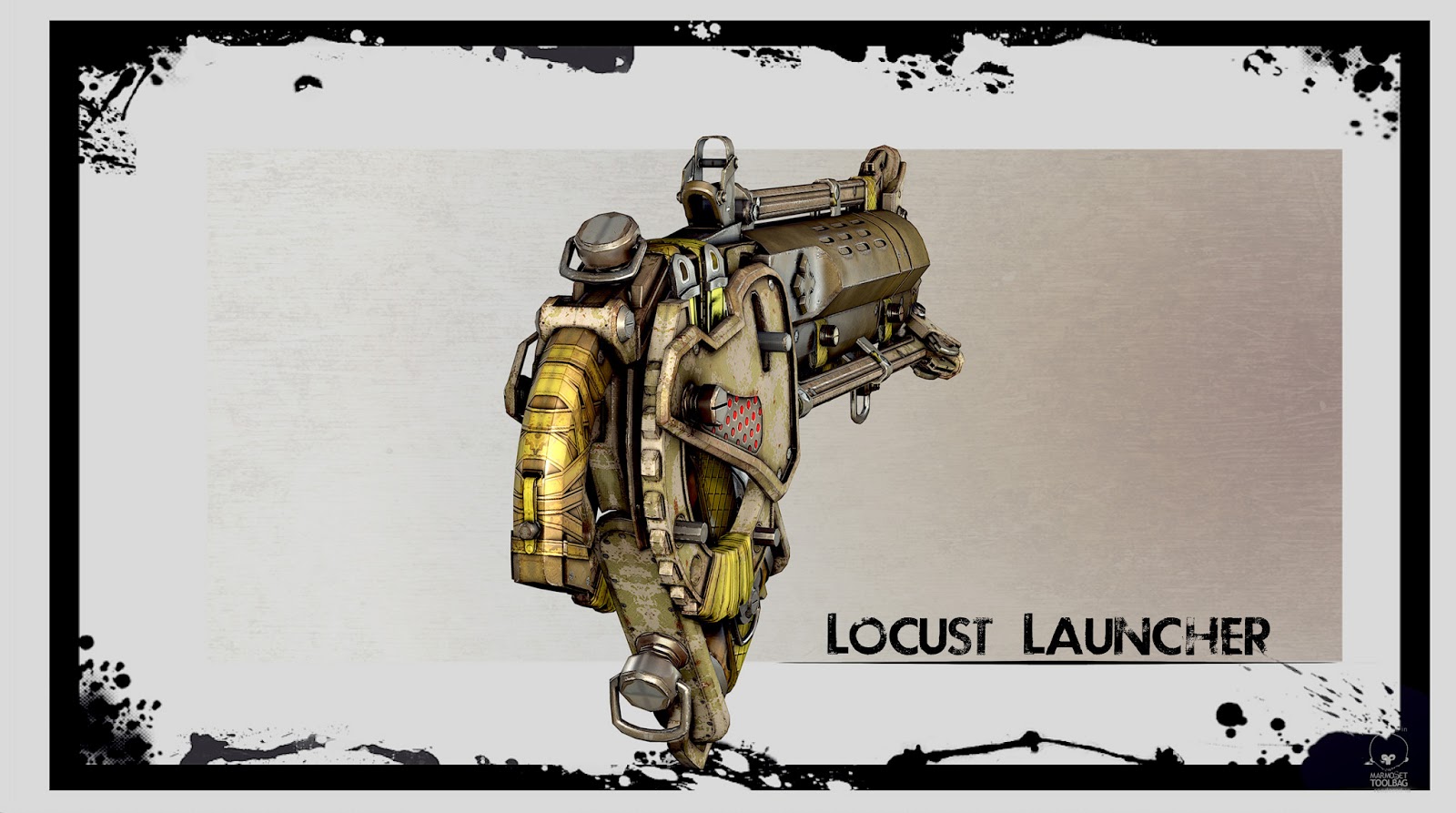
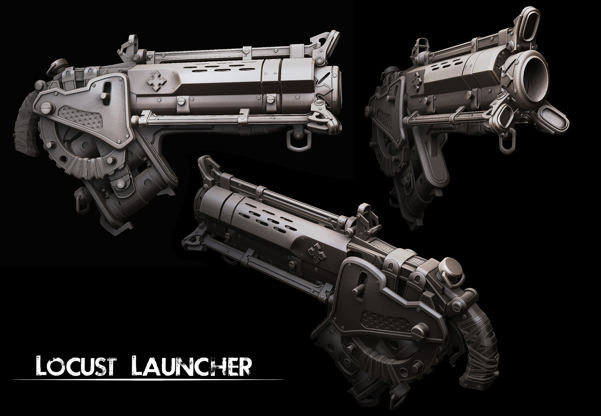
The weapon is a Gow's concept
Lowpoly
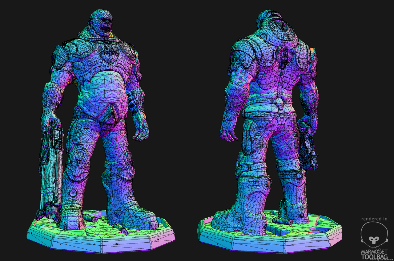
Character 24k tris
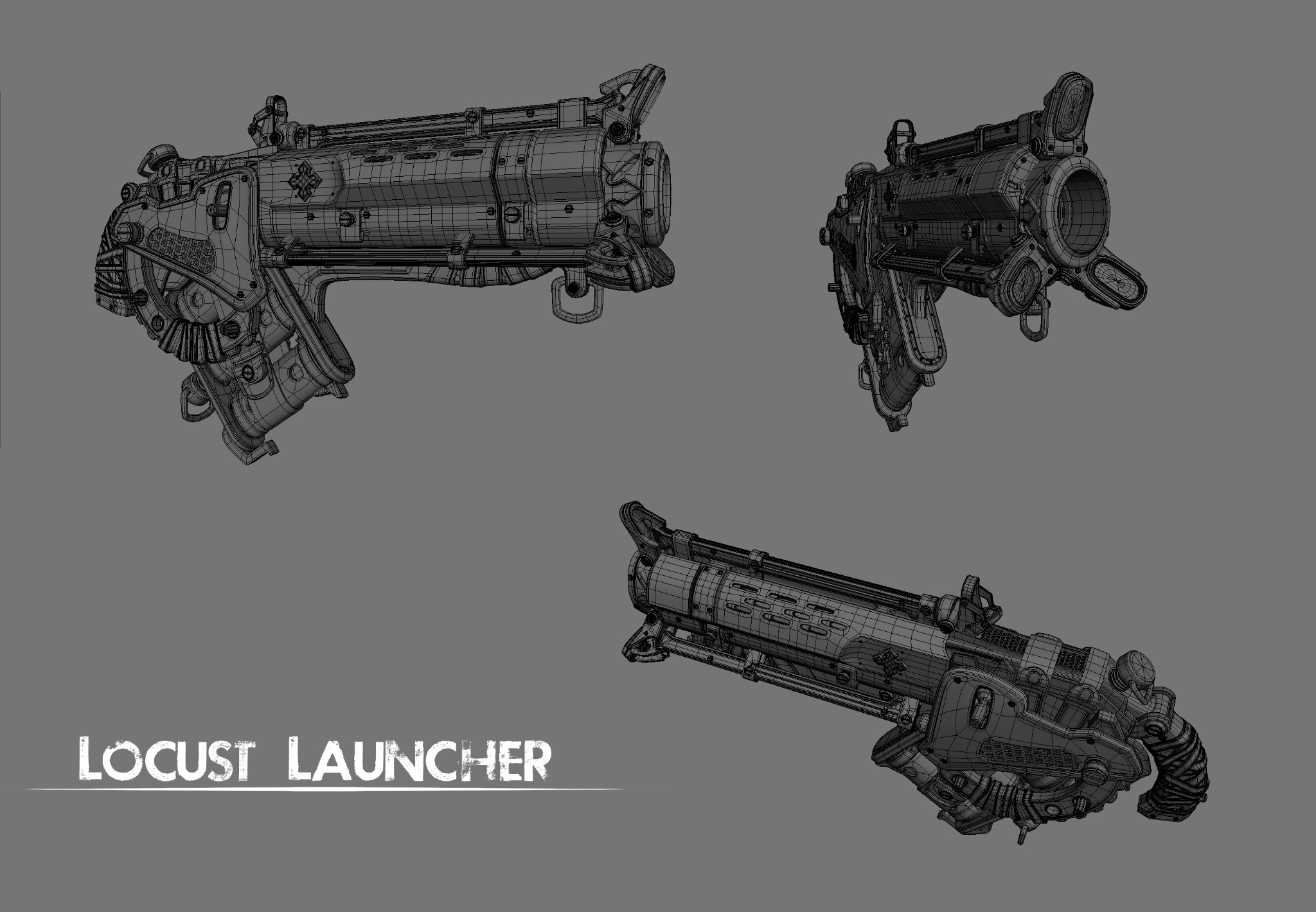
Weapon 11k tris
Rendered by Marmoset
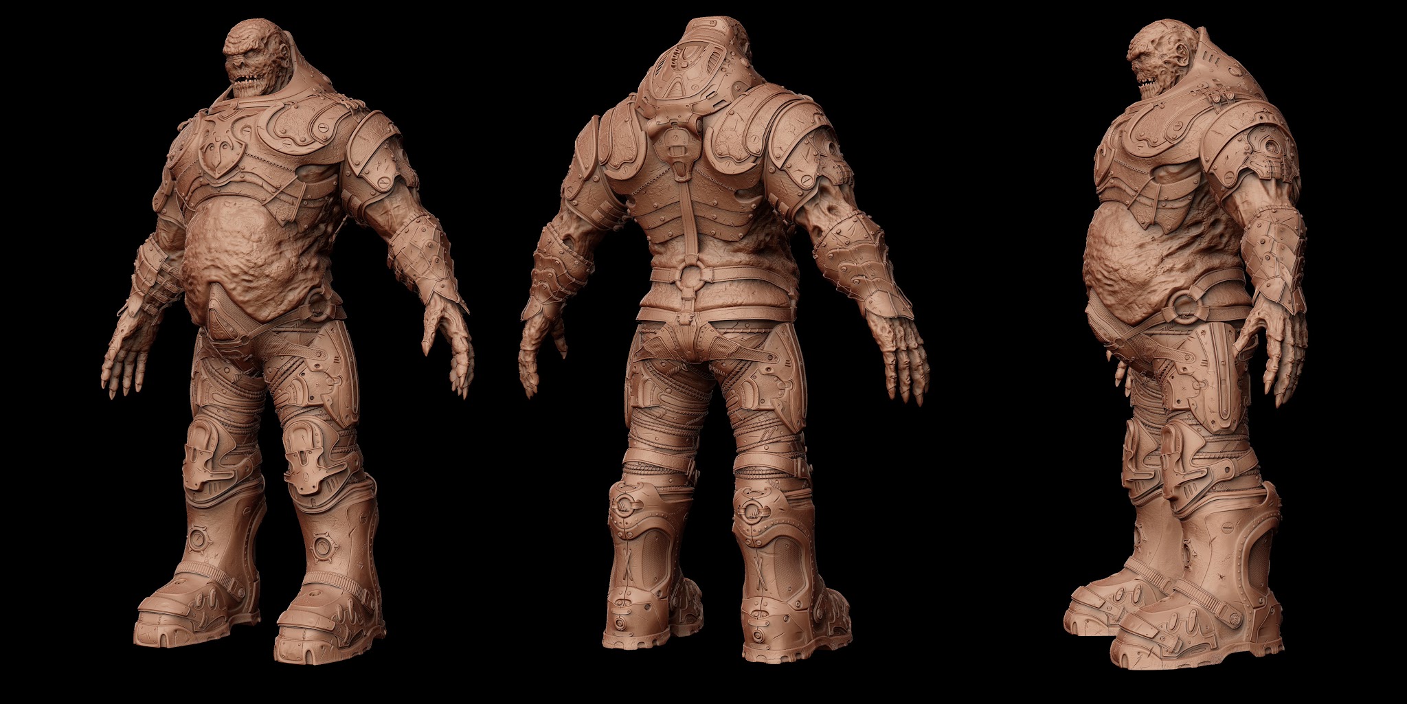
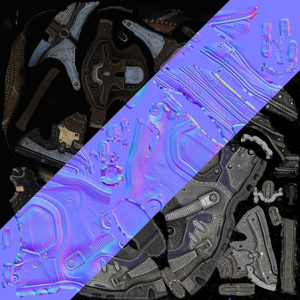
Highpoly
Maya and ZBrush
Feel free to critique.
I hope you like it.
Concept
Highpoly model
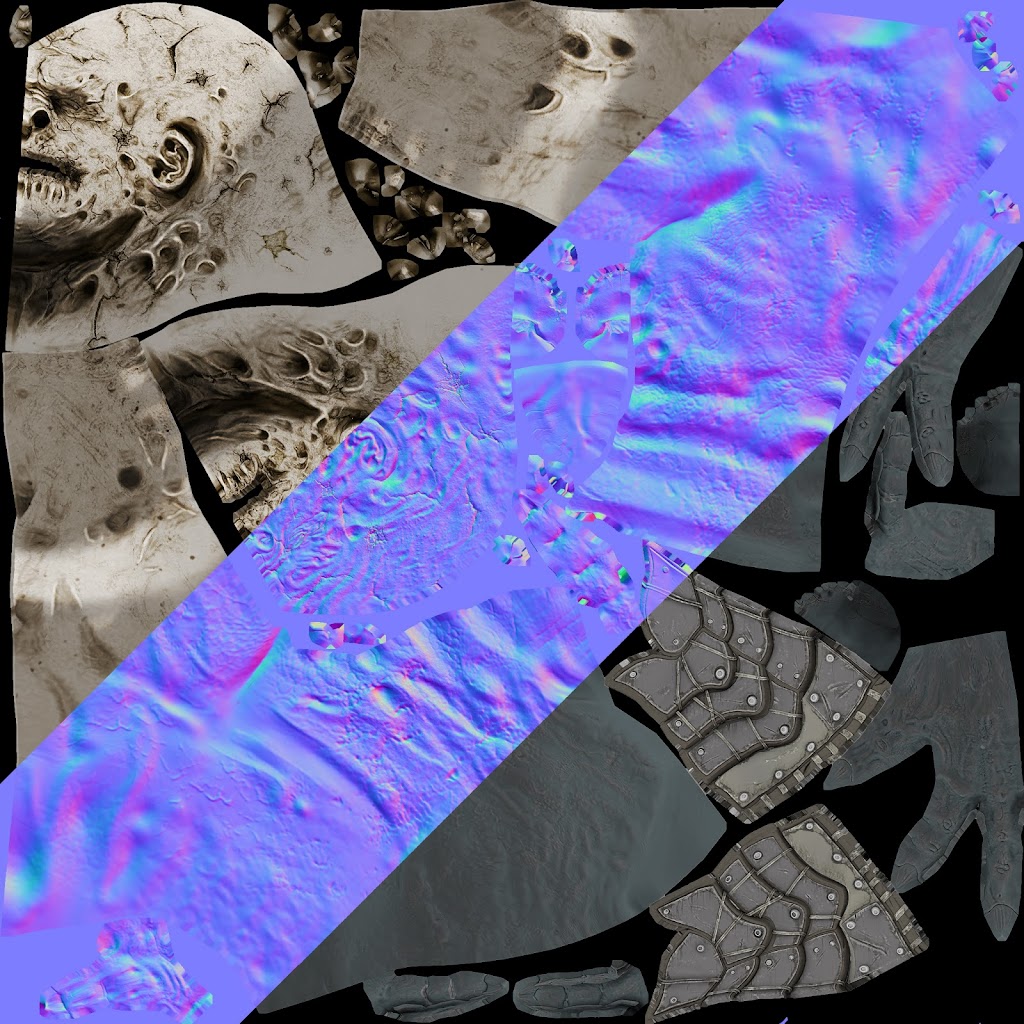
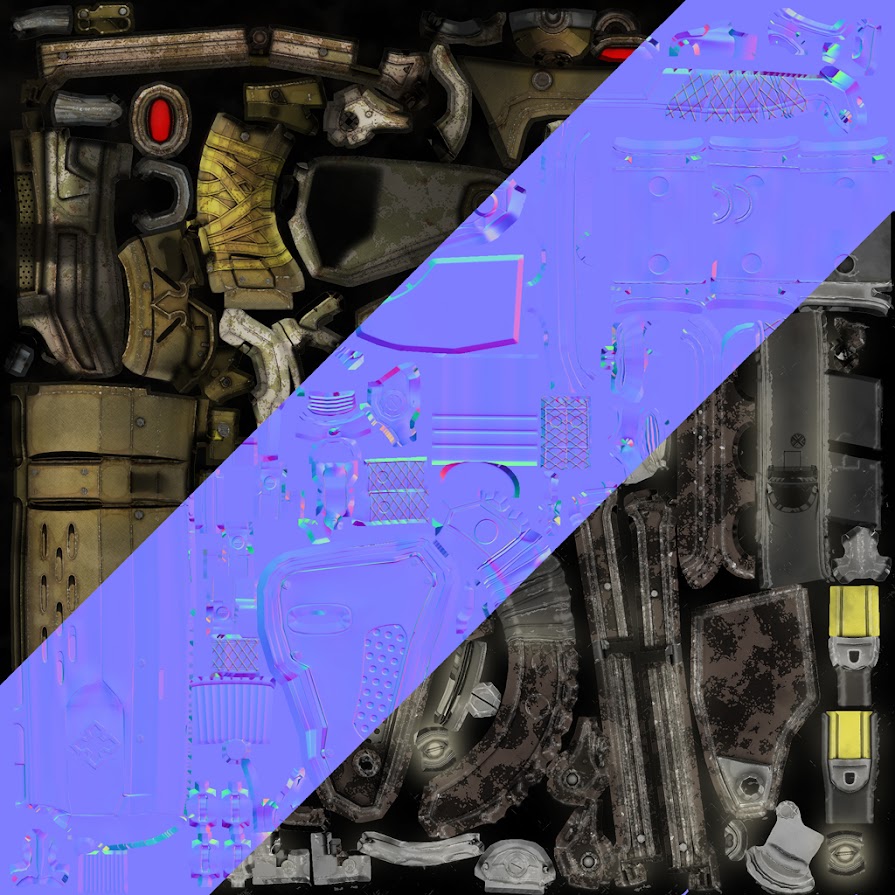
Maps
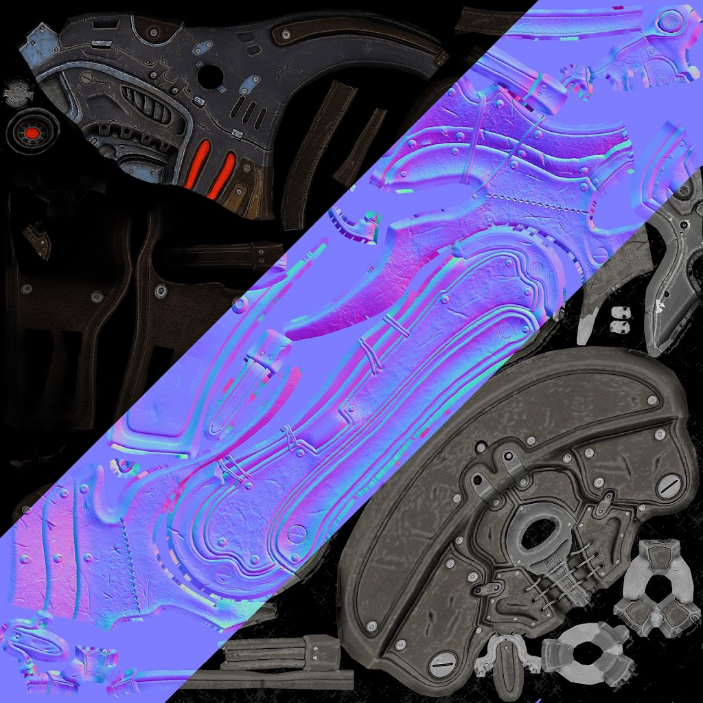
Weapon
Highpoly model
I created this character some months ago.
The character is a personal concept.
The weapon is a Gow's concept
Lowpoly
Character 24k tris
Weapon 11k tris
Rendered by Marmoset
Highpoly
Maya and ZBrush
Feel free to critique.
I hope you like it.
Concept
Highpoly model
Maps
Weapon
Highpoly model
Replies
If I had to pick on something it would be the material definition. Textures look sweet, but there doesn't seem to be much difference between the specular of each material, if that makes sense.
Its a little complicated, but you put this cold blue in, which is kinda fine , but it makes it all a bit too much if you take the red lights in on the character alone.
The character itself is alright in that regard tho, but the weapon is really off.
You cannot mix cold yellow with warm yellow. Wrong yellow tones are probably the most common mistake in color composition. If you want yellow there, use a bright warm tone for the cloth strips and such , and id heavily suggest giving the weapon one of the color finishes your character uses on his armor, the blue, maybe brown
You have 4 main tones in there which are very different and make it hard to get right. The yellow has the same state as the red as highlight, and it would be best if one would go since theyre battling for their spot
The locust launcher on the second pic is even battling with himself because of the red and the yellow tones, they hate each other.
here is a quick paintover , all i did is tone yellows under hue and saturation down by 33, and then you have a nice complementary contrast with nice mid tones and a highlight color
there are other possibilities too, but that would change too much for your liking I think (note how also the brown shoulders change towards warm)
Also a glow on the red highlight lights would make them pop a lot more
If you get the colors right, then nobody can distinguish from a real GOW model by epic id say, really good job on the rest
I used about 2 mounths, but I've worked 7-8 hours for week.
@Shrike The right image's colors are great, for the weapon, I've used the original conceptart colors, but I prefer your colors, I'll fix them. I really appreciated your advices.