Meshes and textures feedback and help
Hi all, the currently studying games art and design at University.
Im in my first year at the moment and currently my skills arn't very good, I wanted to share the something im working on for University at the moment which is creating some meshes for use in Game engines. I have choosen a western theme and have been creating some building and such, I just wanted to ask for some feedback on how to improve my meshes in terms of texture, Uvs and Topology, I currently also stuck on how to texture a cactus which seems fairly stupid, it seems that texturing it my weakest part and I find it fairly difficult.

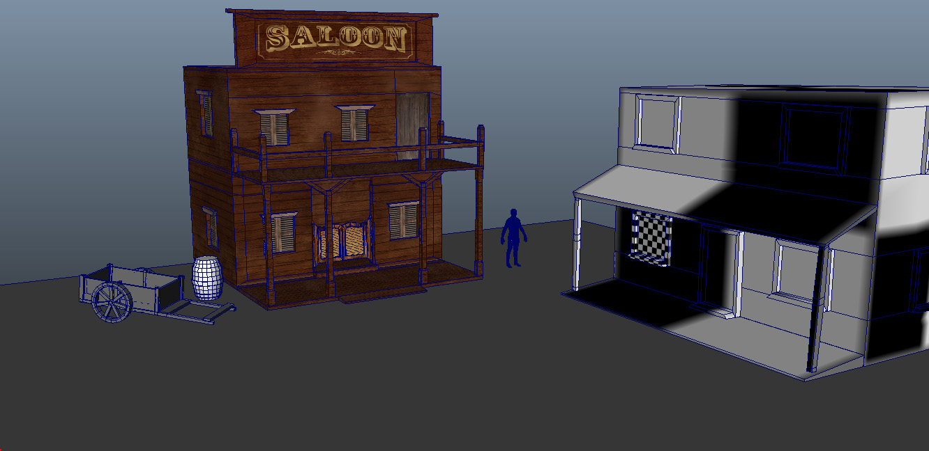
Here is currently what stage im at with some on the meshes, I think the did ok on the saloon texture but still not sure about it.

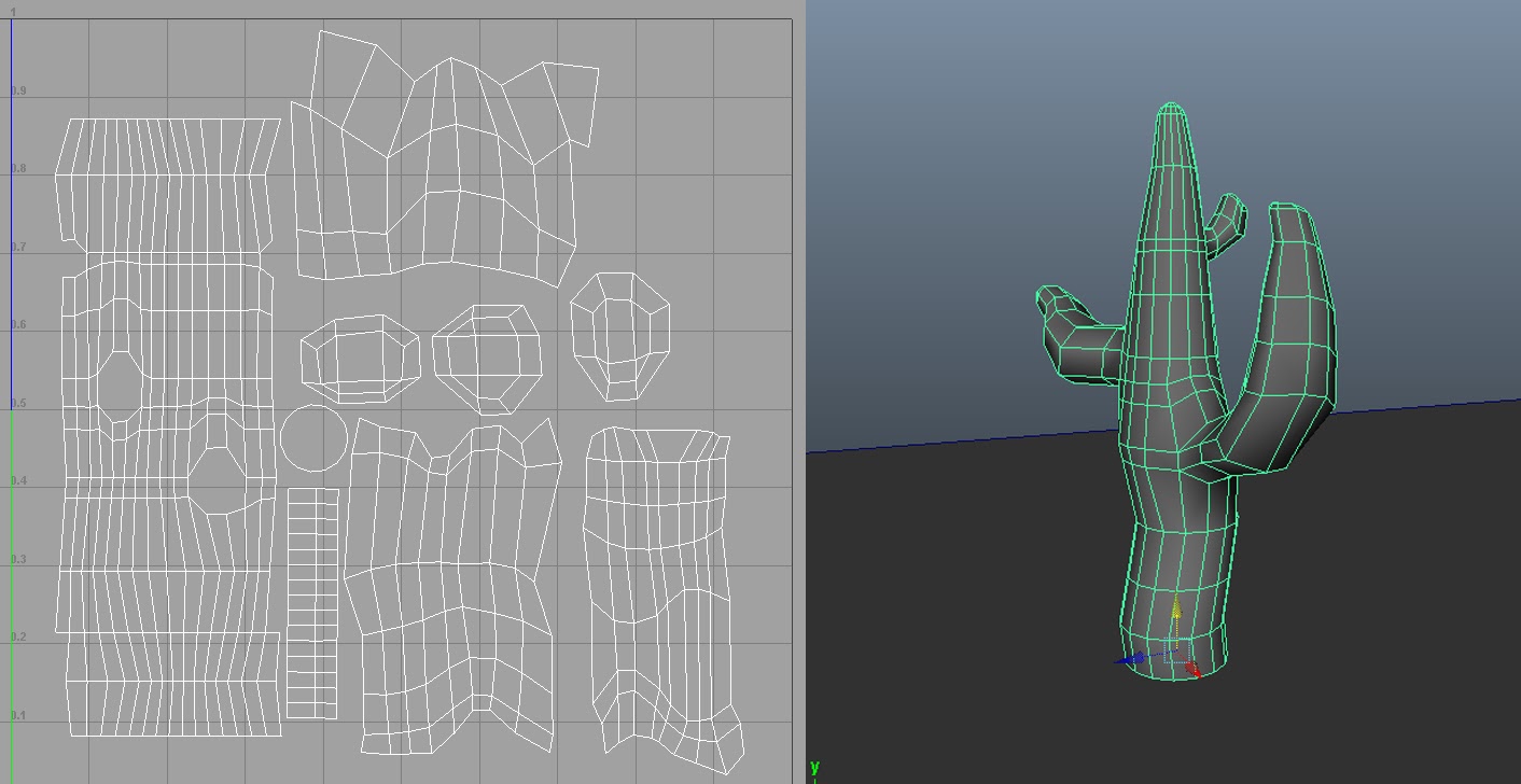
Here is a a picture of the cactus im working on aswell, which im finding hard to texture.
Im open to all sort of criticism even if you just say its shit :P
Im in my first year at the moment and currently my skills arn't very good, I wanted to share the something im working on for University at the moment which is creating some meshes for use in Game engines. I have choosen a western theme and have been creating some building and such, I just wanted to ask for some feedback on how to improve my meshes in terms of texture, Uvs and Topology, I currently also stuck on how to texture a cactus which seems fairly stupid, it seems that texturing it my weakest part and I find it fairly difficult.

Here is currently what stage im at with some on the meshes, I think the did ok on the saloon texture but still not sure about it.

Here is a a picture of the cactus im working on aswell, which im finding hard to texture.
Im open to all sort of criticism even if you just say its shit :P
Replies
Uneven timbers, rot and decay, slightly uneven building construction, settling details ect...
Put some uneven gaps between some of the boards, break a few boards out of the "clumps" to give them character.
Trim EVERYTHING, doors, windows, the sides of buildings, and then trim your trim. In max there is a really great trick for this, select an edge, and click create shape, this gives you a spline based on that edge, then you turn on geometry or sweep a path shape over it to get trim, turn on "generate UVs" and bam instant trim with texture coords. There is probably a similar process for Maya, if not someone probably made a script.
Careful what you google for Saloons, most of those that are pictured were built recently using more modern techniques and modern building codes. They look good but your typical saloon was a crappy building thrown together quickly to milk people out of their money. The drunker your patrons are the less likely they are to care that your women are ugly and your building is leaning to one side =P
Right now there are many perfect right angles and straight geometry. Too little detail which makes it look almost pre-xbox quality let alone 360 quality or next console quality.
Make some significant changes to the pillars, it kind of looks like you have some kind of base to them but from a distance they look pretty straight, exaggerate that detail, you spent the polys make them work.
You have to keep in mind that studios are working on titles that will ship in 1-2-3-4 years from now and think about what the quality of games will be down the road. They want people who hit that bar now. So throw some more poly at those buildings.