thought it was about time i made a thread for this and got some of that lovely heart breaking feedback from you guys and girls :poly142::poly142::poly142:
so for a uni project we, well i have to create a image that tells a story. i wanted to focus on more of a subtle image that was more beauty than in your face actiony... something along the lines of these thumbnails...
my personal favorite is number 5 but from the majority of the feedback i received it seemed like 3 worked the best. the idea for the story is kind of loose at this point not 100% sure what i want it to be... mainly using things around her on the bed to tell the story ( but not to much clutter) things like tattoo's shadows could be used to and using her pose, expression, lighting and colours to add more of a ton to the image.
this is the chick i'm using for reference...
like normal i always try and throw a couple new processes or just go about making stuff in different ways when i work on stuff.... so started with dynamesh, which previously i had only played with.....
felt like i was taking the dynamesh to far and was just banging my head off of a wall so retopo'd and unwrapped the mesh... then projected the details back in....
starting working on the sculpt again... still needing to pose at this point so was just trying to hit the landmarks on the body for now.. adding alil bit of the expression to here face at this point to. hair and eye lashes just temp...
posed with transpose master for the first time.... not really liking the result i got from it tho.. alot more messed up than i was expecting..
second attempt at it with a newer mesh... a tiny bit better but not much!!!
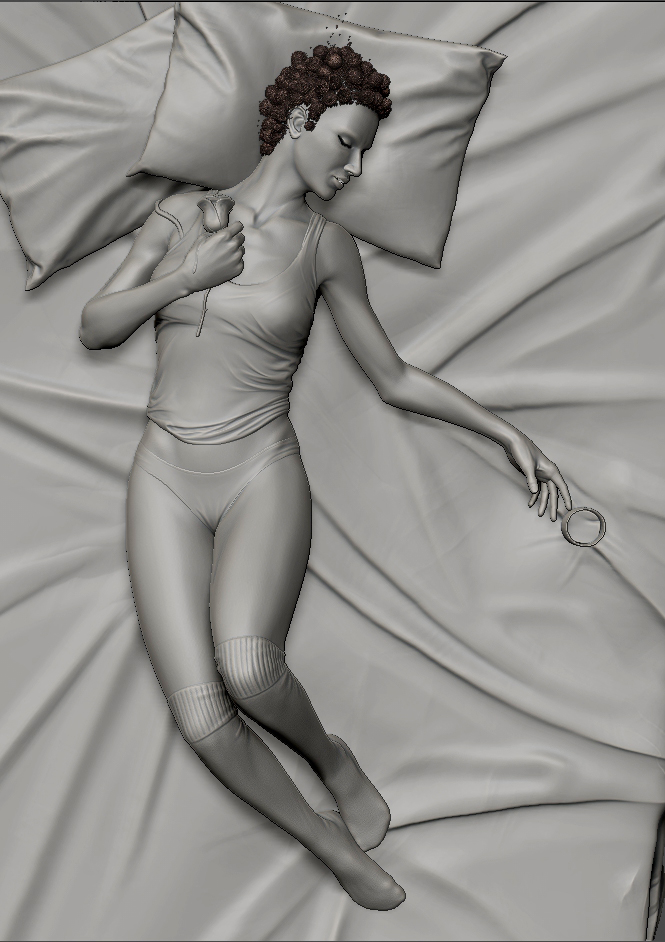
heres where i'm at with the mesh now... still a bunch to do.. not loving the position of her left arm and hand at all!
everything that isn't coloured i've 'fixed' from the horrible posing... the rest still needs some kind of anatomy and again need to repose that left arm/hand....
so yeah kind of where i'm at right now with the sculpt....
so it turns out after having my appendix removed over Christmas after it tried to burst on me i can't sit up enough to comfortably use my tablet and sculpt ( have my desk against a wall so normally i have to sit with a half decent posture while i'm working, that and my tablet is plugged into the back of my machine)... so i moved on to lighting the scene......
was liking the overall result of this but when i tried to add the blinds, all it did was darken the image, as if they where completely blurred out.... couldn't really fix it with the setup i had or keep the look with more lights, so with alil advice i moved onto using a daylight system.
like the lighting of the character, but feel her shadow is alil harsh and the rest of the scene looks kinda blahh..
started to play with materials see if that helped.. just using a tiled skin diff/bump/spec on her right now...
not sure if i like the silk or not... just tried to unflatten the image alil... also the cloth and pillows or just temp so i could play with materials... final cloth will be more like thumbnail....
wanting alil bit moisture on her skin.. havn't spent to much time tweaking it
added the blue light back into the bottom right side... still feel the top left of the image looks plane compared to the first lighting setup...
playing with different colours... whole scene was looking abit brown to me... also these renders have brightened up abit when i uploaded them to flickr for some reason....
how the lighting setup is right now.... will post up my settings if u guys wanna see them to help me out....
still need to work on the story elements for the image... just kind of blanking for ideas right now, that and i just wanna get this part of it done and looking gd first before i add more stuff to the scene.
any help feedback on any part of this would be awesome!!!... and who ever thinks of a really gd story aspect i can use gets a cookie!!
Looking good mate, this will be a sexeh piece indeed.
Right now I think you could position her left arm better, it feels kinda thrown out there and breaks that nice curve you have through her body.
Maybe also try planting her against the bed a bit more, there's light shining through under her back which makes her seem floaty.
I think her breast would hang back and towards her side when affected by gravity in that position, looks kinda perky at the mo.
Go look at pics of naked women sleeping...y'know...for reference. *Cough*
thx pixel!.. yeah the left arm is driving me crazy right now cant find a pose i like for it.... :poly122:
going to sculpt the bed alil to form around her and add alil variation to the rest of it, once i get done with her... so that should fix that up.
was thinking the way she is pulling the cloth would hold her breast up alil more, but yeah probably could relax it abit...
If you are trying to express beauty, maybe you could use more extreme feminine proportions, like for example, make the rib cage thinner (I think it is too wide atm, anyway), soften the jaw line, make teh fingers taper at the end. Ofc, Its personal preference, but thought I would say. I also think the forehead slants back too much, compared to your reference. With the eyes, you could blend the lids into the top brow, as the eyes are closed check this out. Could be better if you tilt her nose up a bit aswell. AND I think her mouth doesnt look relaxed.
As for the scene, I think the blinds might be better closer together and/or thinner, cus it makes her look small. You wanna tell a story to set the scene, rite? so maybe that blue light can be from a TV (so a brighter, stronger light, it could also act as a way to create a silhoette of her body). If you put some verticle lines in teh window, you might be able to create a natural frame around the body, similar to what you've done in your other thumbnails.
ANother suggestion would be, when you tweak her pose, think about body language. So I guess, if u have her legs more liek she started off layin on her side, then her top half sprawled out, like shes trying to escape from a dream or something. That's what your current pose is suggesting to me, at the moment anyway, but I feel it could be done more.
Anyway, I have written a lot, but I think its all minor changes anyway, if you choose to do them. It's looking good!
not sure if anyone mentioned this already but the eye brow area or the eye socket in general makes her look a bit masculine. if you just lower the eyeballs+eyelids while keeping the brow ridges in same place it would improve a lot i think.
also, may i suggest that you soften up some of the facial curves a little bit. that would add some more sense of flesh and skin. right now your model feels too sharp and rigid.
i know that beauty is very subjective and it is up to you to define what you think is beauty but you reference "chick" has a very generic looking in terms of shape and form. you may want to add some uniqueness to her to make it look more interesting.
@brwnbread: thx for the feedback pav! tried to get most of what you said in there for now.. will fix the fingers up when i have a idea for the pose of that arm. thx for the suggests for the scene 2 will try them out here in alil bit!
@MM: yeah you where right about the harsh edges... whole face looks alot softer and more natural now!
thx for the feedback guys!!! :thumbup:
ight so heres how it sits now... again any feedback is encouraged, harsh or not as long as its helpful!
oh and i forgot to sag her left breast alil 2.. will do that soonish..
This is looking nice man, i agree with brwnbread about the pose, id also (when u do tweak it) think about how her facial expression would be, as its symmetrical atm, even small tweak would help. For the arm, i tried out the pose you have atm, and the left arm naturally was lower and bent more, but it will not look as dynamic that way.
Im enjoying this so far man, gl on getting it finished
It looks really nice and just keep getting better. One thing that came to my mind though is the mouth, it looks nice but a bit tense, you often don't bite your teeth like that when you sleep. Most of the time it's quite relaxed, but maybe it's just me and it won't matter for the final render. :]
@jfeez: the only reason i havn't been to fussed about the symmetry in the face so far is the camera angle.. think it would still make a huge difference? and yeah imma paint over the pose for the arm today maybe. see what i can think off.. but right now making her a amputee is sounding better and better
@kerstin: my idea for this is she's kinda angry looking, tense and not very relaxed in her facial expression... she wasn't supposed to be asleep just eyes closed .. but i didn't want to over do it so it might of gone the other way and looking wrong.. dunno, what you guys think?.. keeping in mind that the final render will be from the side.
@dash: didn't know that!.. was just going for a tensed look.. fits in gd tho thx!
thx candy and everyone for the feedback you guys rock!! keep it coming!
working on the pose for the arm right now... nothing so far i'm in love with will post them up when i get a few more done for some feedback... oh and forgive my crude drawing just trying to find a nice flow/shape for the arm, and just through the hair and cloth in when i was thinking
hand puppet would go with the other tense hand. wouldn't it be weird to tense one, and have the other entirely relaxed? not sure though lol. And with your face changes, I would still push the eyelid thing a bit more
wasn't really liking those at first but they are growing on me!
yeah the hand puppet one would probably look better with a hand like 12 o'clock 1.. got distracted with drawing a hand puppet lol ... the right hand was just quickly posed right now.. was going to relax it alil... but could relax it more to fit if you guys think it's necessary... yeah i've been thinking that 2 today, will take a look at that next! thx pav!
What about an arm position similar to the original, but with the elbow more straight and the hand facing palms down, gripping the bed just a little. If she is angry and not all the way asleep, that would fit her mood.
Hey man now this is looking better! I think you should go for the 12 o'clock, but plam facing up looking down the inside of her forearm and having a relaxed point in her hand. Something like in these pics I ripped from google image search.
But if your really stuck I would start working on the rest of the scene and maybe its something you can come back to when you know the composition of the rest of the assets and their placement.:thumbup:
But if your really stuck I would start working on the rest of the scene and maybe its something you can come back to when you know the composition of the rest of the assets and their placement.:thumbup:
thx ciaran! yeah i think i need to do that lol!!... hows your project coming along?
playing with a idea i had while i was working on the anatomy....
any thoughts?...
remember with the lighting setup up, it won't be that visible but would give the image an extra little layer like i've been asked to add to it.
just a quick test tho would draw something up myself if i were to add it... rose on her shoulder alot further up and bigger... one of skulls move visible etc etc...
another idea is to make her into a cyborg..... but realllllllllyyyyyyyyyy subtle.. like small creases between the major joints.. similar to that chick from cyberpunk 2077 trailer.. and then hide the majority of them with the shadows from the blinds, as well as adding some wires that plug into the side of her head but blend it in with her hair and the shadows to hide most of it.
not sure if i'm feeling cyborg one.. liking the idea of the tattoo, that with her moody pose the lighting and whiskey glass and maybe a rose by her left hand.. but not sure if that would be enough to cover the 'story' side of the image we've been asked to add?
You should definitely go with oops. It adds a splash of color to the scene that could react great with your light setup.
Actually as a more serious response to your most recent post that I didn't notice, I really like the idea of a tattoo. However, one sleeve tattoo like that seems a little out of place and I'd think she'd have ink in some other places too.
However, one sleeve tattoo like that seems a little out of place and I'd think she'd have ink in some other places too.
a very small tat maybe even just a simple outline object like a heart that could have been the first tat right above the left leg / lower stomach area - or not :P
yea i was thinking that to tristan... dont wanna just throw another a shitty tattoo on her if it dont fit tho... going to play with the tattoo idea when i'm nearly finished this, since its something that can be easily added
the final shot is going to be alil closer in so it should get rid of most of that space... only thing that is going to be on the bed is a whiskey glass and maybe a rose.. but then you have alot of sheets, folds etc going to throw the end of the bed in the top left with more of the sheet falling down.. and then framing it with the window etc... imo should help even it all out.. we'll have to see i guess.. thoughts?
going to try and crank out the majority of this hopefully next week, just needed a couple days away from it
was feeling all urgh another toe.. so i left the feet for alil while and moved onto the cloth...
got ever thing blocked in now just trying to work out the flow of the bed sheet... not sure if i like how harsh i have it right now..? think it might be alil distracting for the final image, but then again something as plain as the top is way to simple...
abit more work on the cloth... still trying to get the flow in then i'll go back and clean it up alil. although seems like most of the cloth i've worked on will probably be cut out of the final image :poly141:
also through in the whiskey glass ( which is mainly there for caustics) and a rose ( maybe have it roughed up and old) not sure about the placement of them yet, any thoughts?...
Hey man, I think your concentrating on the visual details that cloth makes and not the big forms, your cloth seems really flat. Though out of them, the soft version look best. If you go again, maybe get it so that a load of the wrinkles point to the woman
Also, I don't know how big beds can get, but yours looks huuuuge, which makes the girl look really small. The size of the pillows and other props might help sort this out though in the final scene
I shoulda said earlier, but I assumed you were gonna sort it out when you said you will fix the pose; I think her right leg is too bent, it doesnt look natural, feels bent in the wrong direction. It looks like you were going for a nice line of action, but in this case, it doesn't work - for me at least. Maybe try do the pose yourself and analyse it lol.
Maybe you can have the rose in her clenched hand, and her fingers slightly brushing against the glass. And in the clenched hand, maybe there cud be blood dripping down her shoulder from the thorny stem? Also, maybe you can have a bit of the bed next to her sunken in as if someone was sleeping there before and had just left. Just some ideas
Looking forward to seeing it finished , how are you gonna do the hair, btw?
guess i should update this since i've started to work a little more on it, and get some of that PC feedback :poly142::thumbup:
progress over the past week.....
where its at right now.....
a REALLY quick and DIRTY paint over to give you guys and girls a idea of how i'm taking this now... after starting to work on it again i was finding the original direction boring and a bit plain
still not digging the folds on the bed sheets, hence why i havn't cleaned them up...
also not really liking the whiskey glass anymore.... should i get rid of it or replace it with something else?
here is a better but still super dirty version i made to hand in ( appendix burst/ got screwed on an extension/ bad uni/ could only get a pass..... long story), so only spent as much time as i needed to on it :shifty:
yea... no where near the quality i want the final piece to have, but thought i'd post it up to get a bit of feedback on the new direction and piece overall.. and i guess it gets the idea across better than that 2 second scribble above :poly142:

Replies
so for a uni project we, well i have to create a image that tells a story. i wanted to focus on more of a subtle image that was more beauty than in your face actiony... something along the lines of these thumbnails...
my personal favorite is number 5 but from the majority of the feedback i received it seemed like 3 worked the best. the idea for the story is kind of loose at this point not 100% sure what i want it to be... mainly using things around her on the bed to tell the story ( but not to much clutter) things like tattoo's shadows could be used to and using her pose, expression, lighting and colours to add more of a ton to the image.
this is the chick i'm using for reference...
like normal i always try and throw a couple new processes or just go about making stuff in different ways when i work on stuff.... so started with dynamesh, which previously i had only played with.....
felt like i was taking the dynamesh to far and was just banging my head off of a wall so retopo'd and unwrapped the mesh... then projected the details back in....
starting working on the sculpt again... still needing to pose at this point so was just trying to hit the landmarks on the body for now.. adding alil bit of the expression to here face at this point to. hair and eye lashes just temp...
second attempt at it with a newer mesh... a tiny bit better but not much!!!
heres where i'm at with the mesh now... still a bunch to do.. not loving the position of her left arm and hand at all!
everything that isn't coloured i've 'fixed' from the horrible posing... the rest still needs some kind of anatomy and again need to repose that left arm/hand....
so yeah kind of where i'm at right now with the sculpt....
so i started off using a setup similar to this http://jeffpatton.cgsociety.org/blog/archive/2007/12/
was liking the overall result of this but when i tried to add the blinds, all it did was darken the image, as if they where completely blurred out.... couldn't really fix it with the setup i had or keep the look with more lights, so with alil advice i moved onto using a daylight system.
like the lighting of the character, but feel her shadow is alil harsh and the rest of the scene looks kinda blahh..
started to play with materials see if that helped.. just using a tiled skin diff/bump/spec on her right now...
not sure if i like the silk or not... just tried to unflatten the image alil... also the cloth and pillows or just temp so i could play with materials... final cloth will be more like thumbnail....
wanting alil bit moisture on her skin.. havn't spent to much time tweaking it
added the blue light back into the bottom right side... still feel the top left of the image looks plane compared to the first lighting setup...
playing with different colours... whole scene was looking abit brown to me... also these renders have brightened up abit when i uploaded them to flickr for some reason....
how the lighting setup is right now.... will post up my settings if u guys wanna see them to help me out....
still need to work on the story elements for the image... just kind of blanking for ideas right now, that and i just wanna get this part of it done and looking gd first before i add more stuff to the scene.
any help feedback on any part of this would be awesome!!!... and who ever thinks of a really gd story aspect i can use gets a cookie!!
Right now I think you could position her left arm better, it feels kinda thrown out there and breaks that nice curve you have through her body.
Maybe also try planting her against the bed a bit more, there's light shining through under her back which makes her seem floaty.
I think her breast would hang back and towards her side when affected by gravity in that position, looks kinda perky at the mo.
Go look at pics of naked women sleeping...y'know...for reference. *Cough*
thx pixel!.. yeah the left arm is driving me crazy right now cant find a pose i like for it.... :poly122:
going to sculpt the bed alil to form around her and add alil variation to the rest of it, once i get done with her... so that should fix that up.
was thinking the way she is pulling the cloth would hold her breast up alil more, but yeah probably could relax it abit...
sounds like gd advice!!!! haha
As for the scene, I think the blinds might be better closer together and/or thinner, cus it makes her look small. You wanna tell a story to set the scene, rite? so maybe that blue light can be from a TV (so a brighter, stronger light, it could also act as a way to create a silhoette of her body). If you put some verticle lines in teh window, you might be able to create a natural frame around the body, similar to what you've done in your other thumbnails.
ANother suggestion would be, when you tweak her pose, think about body language. So I guess, if u have her legs more liek she started off layin on her side, then her top half sprawled out, like shes trying to escape from a dream or something. That's what your current pose is suggesting to me, at the moment anyway, but I feel it could be done more.
Anyway, I have written a lot, but I think its all minor changes anyway, if you choose to do them. It's looking good!
also, may i suggest that you soften up some of the facial curves a little bit. that would add some more sense of flesh and skin. right now your model feels too sharp and rigid.
i know that beauty is very subjective and it is up to you to define what you think is beauty but you reference "chick" has a very generic looking in terms of shape and form. you may want to add some uniqueness to her to make it look more interesting.
@MM: yeah you where right about the harsh edges... whole face looks alot softer and more natural now!
thx for the feedback guys!!! :thumbup:
ight so heres how it sits now... again any feedback is encouraged, harsh or not as long as its helpful!
oh and i forgot to sag her left breast alil 2.. will do that soonish..
again thx guys! keep that feedback coming!!
Im enjoying this so far man, gl on getting it finished
http://en.wikipedia.org/wiki/Bruxism
It's a thing. And quite a serious issue. Especially if you're stressed out about something, but aren't quite aware that it's stressing you out.
+1
@kerstin: my idea for this is she's kinda angry looking, tense and not very relaxed in her facial expression... she wasn't supposed to be asleep just eyes closed .. but i didn't want to over do it so it might of gone the other way and looking wrong.. dunno, what you guys think?.. keeping in mind that the final render will be from the side.
@dash: didn't know that!.. was just going for a tensed look.. fits in gd tho thx!
thx candy and everyone for the feedback you guys rock!! keep it coming!
yeah the hand puppet one would probably look better with a hand like 12 o'clock 1.. got distracted with drawing a hand puppet lol
thx for the feedback everyone!! keep it coming!!!
I really love this by the way.
i agree with 10 or 12 o'clock people above
but giving it a second look, kinda liking the second one more - the "Shadow on face? Too sexy?" one
But if your really stuck I would start working on the rest of the scene and maybe its something you can come back to when you know the composition of the rest of the assets and their placement.:thumbup:
thx ciaran! yeah i think i need to do that lol!!... hows your project coming along?
any thoughts?...
remember with the lighting setup up, it won't be that visible but would give the image an extra little layer like i've been asked to add to it.
just a quick test tho would draw something up myself if i were to add it... rose on her shoulder alot further up and bigger... one of skulls move visible etc etc...
another idea is to make her into a cyborg..... but realllllllllyyyyyyyyyy subtle.. like small creases between the major joints.. similar to that chick from cyberpunk 2077 trailer.. and then hide the majority of them with the shadows from the blinds, as well as adding some wires that plug into the side of her head but blend it in with her hair and the shadows to hide most of it.
not sure if i'm feeling cyborg one.. liking the idea of the tattoo, that with her moody pose the lighting and whiskey glass and maybe a rose by her left hand.. but not sure if that would be enough to cover the 'story' side of the image we've been asked to add?
.......... thoughts?
Actually as a more serious response to your most recent post that I didn't notice, I really like the idea of a tattoo. However, one sleeve tattoo like that seems a little out of place and I'd think she'd have ink in some other places too.
a very small tat maybe even just a simple outline object like a heart that could have been the first tat right above the left leg / lower stomach area - or not :P
the final shot is going to be alil closer in so it should get rid of most of that space... only thing that is going to be on the bed is a whiskey glass and maybe a rose.. but then you have alot of sheets, folds etc going to throw the end of the bed in the top left with more of the sheet falling down.. and then framing it with the window etc... imo should help even it all out.. we'll have to see i guess.. thoughts?
going to try and crank out the majority of this hopefully next week, just needed a couple days away from it
just about done with the body... hands and feet still need more than just posed and then a few other small tweaks...
any feedback before i move onto the cloth?
got ever thing blocked in now just trying to work out the flow of the bed sheet... not sure if i like how harsh i have it right now..? think it might be alil distracting for the final image, but then again something as plain as the top is way to simple...
also through in the whiskey glass ( which is mainly there for caustics) and a rose ( maybe have it roughed up and old) not sure about the placement of them yet, any thoughts?...
the hard look... maybe alil too hard...
soft.. again probably too soft...
alil bit of a mix
and the above 1 with a few small creases to make it look even more slept in
again i'll be going in and cleaning it up alil depending on which 1 i choose, what you guys and girls think??..
Also, I don't know how big beds can get, but yours looks huuuuge, which makes the girl look really small. The size of the pillows and other props might help sort this out though in the final scene
I shoulda said earlier, but I assumed you were gonna sort it out when you said you will fix the pose; I think her right leg is too bent, it doesnt look natural, feels bent in the wrong direction. It looks like you were going for a nice line of action, but in this case, it doesn't work - for me at least. Maybe try do the pose yourself and analyse it lol.
Maybe you can have the rose in her clenched hand, and her fingers slightly brushing against the glass. And in the clenched hand, maybe there cud be blood dripping down her shoulder from the thorny stem? Also, maybe you can have a bit of the bed next to her sunken in as if someone was sleeping there before and had just left. Just some ideas
Looking forward to seeing it finished
progress over the past week.....
where its at right now.....
a REALLY quick and DIRTY paint over to give you guys and girls a idea of how i'm taking this now... after starting to work on it again i was finding the original direction boring and a bit plain
still not digging the folds on the bed sheets, hence why i havn't cleaned them up...
also not really liking the whiskey glass anymore.... should i get rid of it or replace it with something else?
thx!
yea... no where near the quality i want the final piece to have, but thought i'd post it up to get a bit of feedback on the new direction and piece overall.. and i guess it gets the idea across better than that 2 second scribble above :poly142: