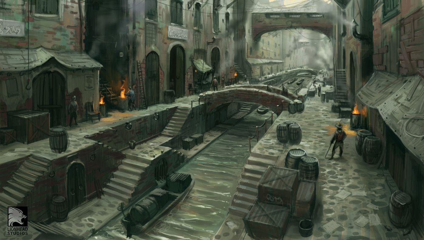
Lionhead Concept: Fable 3... I think.
Hey guys, I have decided to throw myself at the mercy of google and its search result of "game concept art", I saw this in the results and I thought it was suitable :thumbup:
Here is the image:
So as an update, I made a complete hash of it first time round, not to say what I made was incredibly poor... but I was getting carried away with creating pieces then finalising them before I even did a block out, so I was trying to create pieces for a blockout I was making as I went along, thus you can work out for yourselves I was failing... failing HARD.
So here is my blockout as it stands, I know from the concept it has a strange FOV, so I have tried to recreate it in Max, however I was wondering will it be possible to recreate the camera in UDK? I know you can change the FOV, but I am using, from the top of my head a 15mmish lens and I can't remember UDK having that feature.
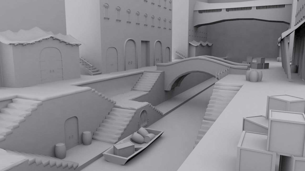
Also I was wondering, should I stay faithful to concept in terms of colours etc or could I try and warm it up a bit, from what I had in UDK already, it looked better when I was using warmer colours, the shadows contrasted better as well, so now the results I am getting look murky... which works with the concept but I am going to put this in my portfolio and I want to ideally have something quite crisp so it doesnt look like I am hiding poor textures.
On a note of textures I have created a tileable concrete texture for the paths, cobbles for the top path (maybe vertex blend them in?), and I have a nice brick texture that tiles incredibly well which was total fluke. I have a nearly finished the barrels, I am not happen with the rivets, they dont look right :poly127:.
So yeah throw whatever you want at me for what your advice would be with this piece.
Do you guys think I am on the right road, do I have the proportions right? I know the bottom door doesnt look right, but I went with working out the height of the door with the barrels which I made 64units high, the concept distorts proportions in a few areas, also the side stairs that go down, I am pretty sure its a single staircase because the bottom matches up to the water, but obviously you look to the side and it doesnt match up correctly size wise.
Also is it OK that I am putting in windows where there should be 2nd floor wooden doors? I put windows in because there are no windows in the concept, so I was hoping it would add variety.
Anything that comes to mind please say") , I really want honest critisms, so don't hold back :poly121:
, I really want honest critisms, so don't hold back :poly121:
Here is the image:
So as an update, I made a complete hash of it first time round, not to say what I made was incredibly poor... but I was getting carried away with creating pieces then finalising them before I even did a block out, so I was trying to create pieces for a blockout I was making as I went along, thus you can work out for yourselves I was failing... failing HARD.
So here is my blockout as it stands, I know from the concept it has a strange FOV, so I have tried to recreate it in Max, however I was wondering will it be possible to recreate the camera in UDK? I know you can change the FOV, but I am using, from the top of my head a 15mmish lens and I can't remember UDK having that feature.
Also I was wondering, should I stay faithful to concept in terms of colours etc or could I try and warm it up a bit, from what I had in UDK already, it looked better when I was using warmer colours, the shadows contrasted better as well, so now the results I am getting look murky... which works with the concept but I am going to put this in my portfolio and I want to ideally have something quite crisp so it doesnt look like I am hiding poor textures.
On a note of textures I have created a tileable concrete texture for the paths, cobbles for the top path (maybe vertex blend them in?), and I have a nice brick texture that tiles incredibly well which was total fluke. I have a nearly finished the barrels, I am not happen with the rivets, they dont look right :poly127:.
So yeah throw whatever you want at me for what your advice would be with this piece.
Do you guys think I am on the right road, do I have the proportions right? I know the bottom door doesnt look right, but I went with working out the height of the door with the barrels which I made 64units high, the concept distorts proportions in a few areas, also the side stairs that go down, I am pretty sure its a single staircase because the bottom matches up to the water, but obviously you look to the side and it doesnt match up correctly size wise.
Also is it OK that I am putting in windows where there should be 2nd floor wooden doors? I put windows in because there are no windows in the concept, so I was hoping it would add variety.
Anything that comes to mind please say
Replies
A few thoughts that jump out:
I feel like some of the architecture "feels" asian in yours. Specifically the wavy rooftops and the bridge. The bridge seems to have a more uniform arch at the top and the underside does not arch as much as yours. The rooftops just have that one peak and then are straight across.
The underside of the raised causeway/bridge-thing in the rear is kind of lumpy in yours. It doesn't have the smooth curve of the concept. I am sure it was intentional but it seems like an error to me.
IMO you should at least have SOME of the larger doors on the second floor. Have lots of tiny windows kind-of throws off the scale to me. At least based on the scale of the concept.
@nyx702, Those wavy rooftoops are meant to be cloth... so I have obviously failed in that haha. The bridge as well I wasnt sure about from the concept, it looked a bit stale and I wasnt sure from a portfolio piece wise, that it would be good to have something that is pretty center stage as flat as that, so I did try to add some more shape. Admittdly the bridge was a piece I was half way through before I tried this blockout and the results were that the handrail looked like toothpaste cement, so I was wondering, should I revert to the concept? or maybe throw some bigger bricks on top to just add to the silloute?
Also I agree it doesnt match up correctly, I didnt measure it up correctly when I was building it because the scale didnt seem right of a few surrounding things such as a the path to the sides and the river below.
I also agree again, I did oringally have doors/spaces for the doors to go in, and it looked a bit odd so I thought I would try out the windows. THe reason why the windows look small is because the doors are massive xD, I try and find a close thing to scale from in the concept and then build the rest around it, so for this I went with the barrels which were 64units high. (I use the UDKGAME mode for walking around which the height is 128 units I think), so the windows I think are scaled properly, however because you have massive doors below that are over 200 units high, it dwarfs the pieces around.
@KennnyTies, Yeah I agree from the stand alone the doors look to small, however the reason being is that I scaled the steps to (i think it was 12 or 16units) per step, mainly because I quickly bsp'd the size, and walked up and down to see if was right to the player view (which is how I scale things when I make them, which is also why I have lots of scaling issues when compared directly to the concept
@BobtheGreatll, Yeah I do agree they look tiny however (if you have already read my response to the others you may look away now :P), the scale of the windows I think is correct to the player relative to the world they are in, however because the doors are over 200units high, to make the windows as big they would have to be massive aswell, which may look better for a stand alone shot, however walking around they would look massive, in a place that looks like a bit of a backstreet dock type place.
@Gannon, I shall indeed, my like everything else I scaled the bridge so it was correct to the player and not exactly the concept image :P.
So it seems; and quite rightly I have massive scailing issues, instead of repeating the same question to everyone, I'll just ask it here,
Should I scale things (unfortunaly I cant afford the time to redo some parts as I need to get this done asap) to what looks correct in the concept but if the player was to walk around it would be massively off, or should I try keep what I am doing but replace the things that look to small, but with bigger things, ie. doors instead of windows? or should I just make massive windows :P. Is it ok to have things that in a game would look to big or small for portfolio pieces? I wouldnt like to get picked up on "your windows are really big", or would people be more bothered about the scaling not matching up. OR should I put things next to the large things to give the sense of their scale, for example in the picture above I dont have anything to give it a relative scale to.
Finally, thanks again for the positive comments on how its looking so far, I didnt give the most update image as I carried on working on it last night, so I have better looking staircases, and second floor walkways etc. All looking pretty cool
I have changed quite a few things such as the bridge, I have increased the steepness of the wooden stairs, I have add railings, placed doors on the second floor etc. I think progress of it is coming along nicely. I am planning to make it more crooked looking so it wont be as boxy as it looks at the moment.
So yeah, I think its slowly taking shape in to how I want it, its just trying to get everything to look right as its proving a bit tough to keep in lines of the concept without messing about with the scale of things in the world. Even just navigating around in the default max viewport there is a noticeable difference in how it looks, mainly not as spread apart. However I am happy enough that I am starting to nail the perspective of the concept
Any comments and crits are welcome as always. Sorry its nothing colourful yet.
I worked on the same concept peice a couple years back, Unfortunatly i never finished it.
Good going though, i look forward to seing you complete it
@TemporalDrift, haha it must be a curse because I never completed it. By the looks of yours, you obviously went in with a heavier polycount, I tried to be as fruggle as humanly possible. Plus yours is lets be honest a totally different league to mine. Amazing work.
I became side tracked and decided to do some R&D on the materials I was going to use. The only thing I can say from the "estimated" end differences would be, I think mine was heading towards quite a realistic representation, while yours looks alot clunky'er and stylised which I prefer xD.
Hopefully I can return to this project a bit later on. It was quite fun to work on
@Johan3043 I think you are getting confused with his work and not mine :P easily made and I agree, his work looks awesome.
@b4volpe Erm no I didnt get permission. I wasn't aware that I had to? I guess its poor manners to do so, I would have mentioned and linked the artist of his work on my portfolio of course, however I just literally googled "game environment concept art" or something similiar, this popped up and I went for it. Again I think you have thought my work was that guys above :P if not thank-you
Sorry again for this, but I thought with the questions etc a bit rude not to reply. I have been super busy and I am currently relocating so I have not had access to polycount recently.
I worked on Fable III on the environment art team and I think this concept was either Emrah Elmasli or Mike McCarthy. It would have been great to get the same level of detail into the game - the joy of game engine restrictions. I remember somebody in Lionhead pointing out this thread before, and there was a positive response to your work so nice one